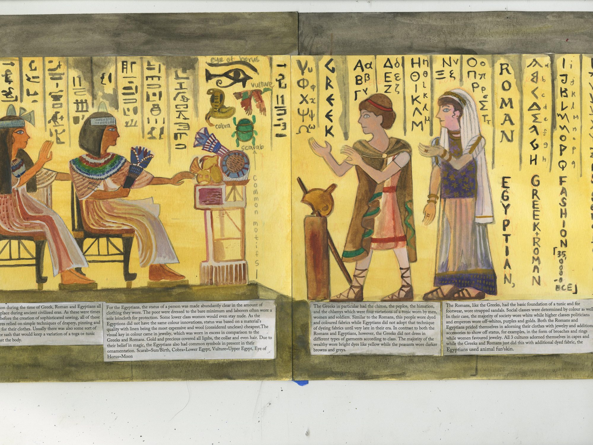
For my spread, I decided to use an Egyptian wall painting style as my main theme as Egyptian was my assigned research topic. I thought the 2D wall art would translate very well as a spread for the yearbook. Since the costumes of the Egyptians are showcased very well in their art I thought it would make sense to show the fashion of the Greeks and the Romans and through the spread we are able to compare and contrast the fashions, motifs, and usages of colour of the different cultures. Surrounding the main figures are hieroglyphics as seen in ancient Egyptian art as well. To compliment this aspect of the culture, I included the ancient Roman and Greek alphabet as well on the right side of the spread to tie the whole image together and hopefully give more cohesion as to what the figures represent and add visual interest. The headline, date and my name were also added in the up to down reading method as a way to blend the title well and make my name fit in subtly. I believe I did a good job in including major points of our research and condensing them together in the white black text underneath the image. Additionally I think the spread is faithful to the period it represents (Egypt) and even though the other cultures are clearly different I thought I had a well thought out concept in blending them into the Egyptian Wall art. For these reasons, I would give myself an 8/10. If I could do it again I would probably center the composition of the figures and reconsider the position of the headline+name. Additionally, the colours are a bit washed out so I could probably go over with a fineliner so the visuals are more striking.