IDES 244 – GDC.DESIGN/STUDENT

I had an enjoyable time working with GDC, and with Sophie in my first group project in the IDEA Program. I find that I usually work well under design systems, and following them correctly, which ended up taking a slight toll on the visual design process for this project. I believe I was too caught up in continuing GDC’s current brand into the new website design, which was partly the problem in the original design.

I appreciated getting honest and constructive feedback from my peers, with the suggestion of a separate colour pallet for the student page. The thought of adding more colours had honestly never come up during my ideation process, even though I was aware of the feedback from the survey and my peers on the current site were the bright, aggressive red. Changing the banner colours changed the vibe of the website so much (much love for our class!!).

For the rationale of the decisions Sophie and I made for the revamped student landing page, a big part was making GDC’s visual look and tone of voice friendlier. This meant introducing the light blue and yellow into the colour scheme, adding illustration banners and iconography, including testimonials, and making the overall information much more digestible

Students are often impatient and when faced with a long long page with just 12pt text, we often decide to leave the page or to skim along, potentially missing key information. Iconography really helped to visually represent the information, while giving users a break from all the text in the page.

I would give Sophie and I a 9/10 for this assignment, as I believe if we were able to take more “risks” to make the website different earlier on during the design process, our execution could have been even stronger than what we had during presentation day. I believe our presentation went smooth on the day of, our prototype worked correctly with no errors (yay!), we executed the project to our expectations, and Sophie did a fantastic job with the illustrations! I believe this project gave me a good feel into presenting to clients, and enjoyed the whole process working with GDC.

Moodboard: https://invis.io/TYRJDNF7ABN

Site Prototype: https://invis.io/TYRJDNF7ABN
Decolonizing IDEA

Although this project was one of the most difficult projects I had faced so far, it was the most eye-opening and educational projects given in this program. Before this project, I had an embarrassing amount of knowledge about first nations (basically nothing), and it is amazing to learn so much in the past few weeks.

Getting to meet the students in the Indigenous Film Program was the most vital and important step during the process of developing our concepts. I was educated by the students on the wide variety of the dialects spoken in a language, and the importance of not using an umbrella term to group all the languages together. The students also mentioned how it would be nice to accompany a wide variety of languages, instead of just focusing on one language, which I had done.

A big topic that came up in most of the feedback with my classmate and I’s project was permission; whether we had asked the writers, the poets, the models, the photographers, if we were communicating the right message with their work, that was not offensive in any way. Although this is a school project and we may not be able to do so in the time frame we were given, this was the biggest takeaway I had during the conversation. If I were to ever work on a project involving the First Nation community, I now know the importance of asking, instead of assuming.

After getting the feedback from the students, I went off and revamped what I had before, starting with the name of the app. The app was initially named “Acimona” which meant storytelling in Cree according to the online resource. The Indigenous Film student I met said that it had meant “city/lifestyle” in his dialect of Cree, which was entirely off from the online translation. I decided to stay safe with a more straightforward app name.

I will give myself 8/10 on this project. I believe I incorporated the imagery of the book/door which symbolized the USP, well into the interface. I decided not to make a menu bar to keep the user experience simple enough to be used by children, but there is perhaps areas that could be changed to create a smoother process. One example would be to select the grade and language on one screen instead of two. The overall look is friendly looking, and would appeal to older elementary students, but I could have done a better job to appeal to the younger students as well. I also sketched out ideas around filtering through the library selection, to find books specifically about history or culture, but I had run out of time to do so. This could have been accomplished if I had managed my time better.

Final PDF: https://eportfolios.capilanou.ca/halukayagi/wp-content/uploads/sites/1410/2019/03/halukayagi-final-presentation.pdf

Live Invision Link: https://invis.io/D3QXAFYG7E2

App Walkthrough Video: https://drive.google.com/open?id=1tJ0Os7UShMbqID4RJbQSyyXTxVNYkcdH

Sustainability 101 Design Manifesto

In today’s world, there is a great emphasis on sustainability; whether it be about the environment, the economy, social issues, or cultural aspects.

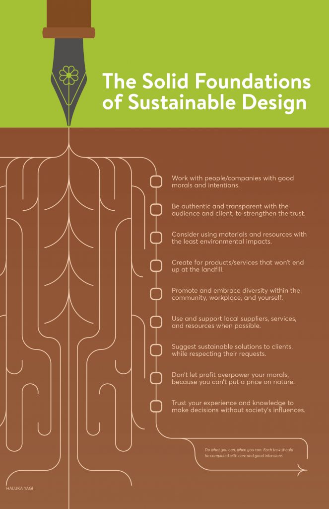
For this manifesto, my target market is the young designers stepping into the design industry. Young graphic designers may find that it is overwhelming to work sustainably in the advertisement industry, which heavily focuses on consumerism. They often may not even have the choice to work along the principles they stand for.

The message I wanted to translate through this poster was that we could take our time to implement aspects of sustainable design, instead of pressuring yourself to change completely. The manifesto was written in a friendly and approachable tone, which reflects the message as well as the target market.

The final poster was created with a flat, modern illustrated look to appeal to the younger target audience.

If I were to give myself a mark, it would be 8/10. I believe I executed my concept well regarding the overall look and content, but I think I could have pushed my thinking more to create a stronger solution for this assignment.

Resources:

https://www.core77.com/posts/40586

http://www.manifestoproject.it/bruce-mau/

https://gdc.design/sustainable-design

https://pjrvs.com/manifesto/

https://backspace.com/notes/2014/03/first-things-first-2014.php