IDES 320 – Mentorship Project Phase 2

Phase 2: Imagine/Ideate/Explore March 2-19

I’ve never sketched so many logos in my life!!

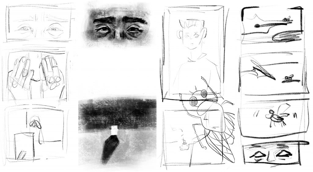
I struggled through the initial part of this phase because it really forced me to get rid of some of my unproductive logo ideation habits. Before, I would sketch small logos with a pencil and draw as cleanly as possible. I also had a continuous struggle with creating logos that were too literal, which I think I overcame in this mentorship.

After bringing in my first round of sketches, all three of my mentors told me that my sketches were way too clean and that what’s most important is whether the idea comes across clearly or not. I was told to use big sheets of paper and permanent pens or markers to sketch onwards, which really helped me loosen up and ideate at a quicker pace. They also pointed out that I got too caught up in logo ideas around roads/road signs inspired off of the name, and recommended I explore other avenues.

For the next 3 weeks, this logo-marathon continued as my brain cells slowly dwindled away, but it felt rewarding to find a golden nugget logo in the last few sketches. I am really thankful that my mentors kept pushing me when I thought was my limit but also helping me with group brainstorms when I hit a roadblock!

After I finally ended my logo ideation stage, I began developing buckets (1 bucket = 1 concept) of ideas.

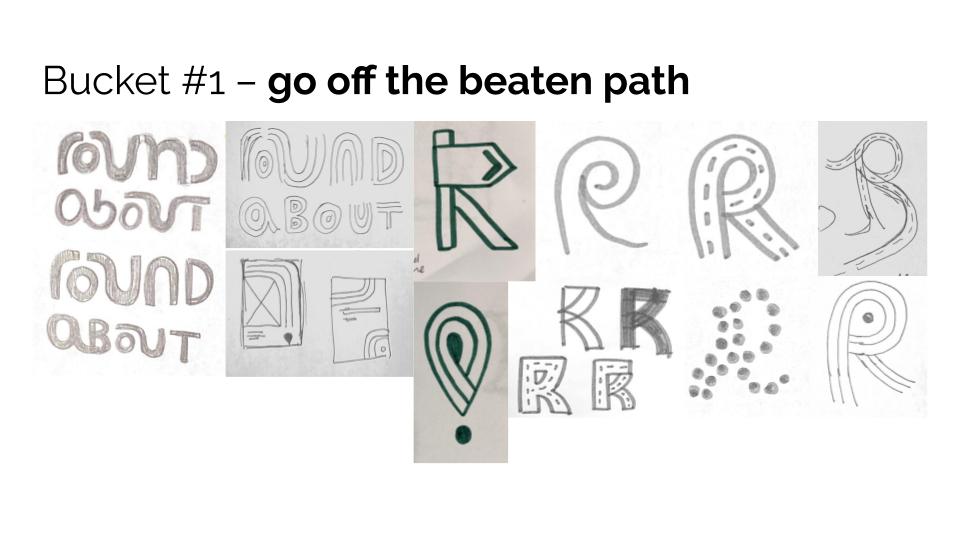
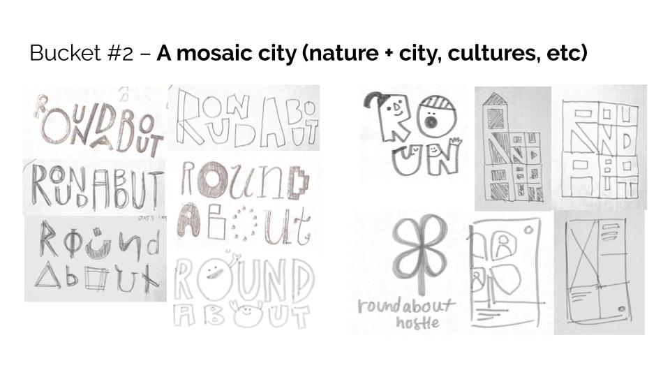
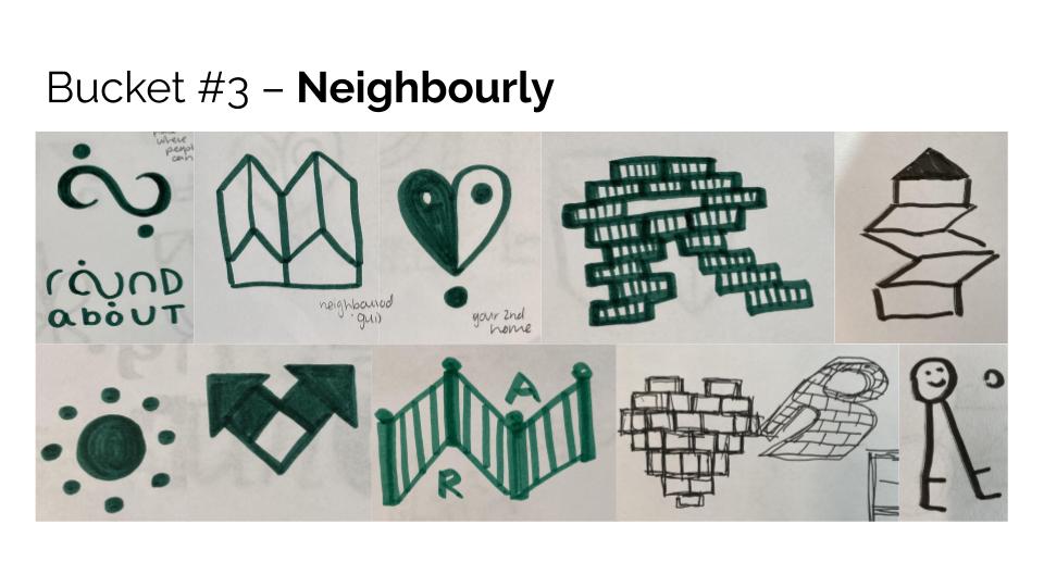
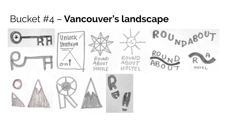
The team recommended I also sketching ideas for hoarding (also known as wild postings) as I sketch out more logos for each bucket, which is a series of posters that demonstrate a brand’s visual language. The devices that are used in the hoarding could essentially be applied to any medium.

An example of hoarding by Will Creative Inc. for Speed Skating Canada

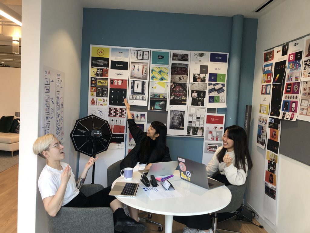
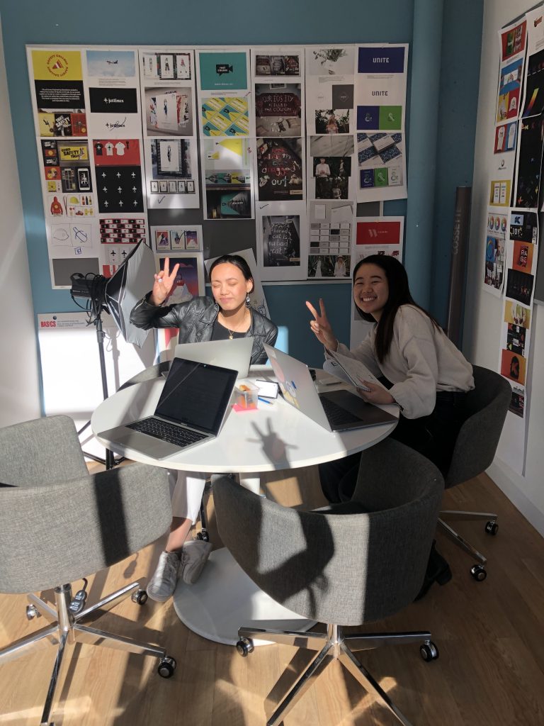
This was also around the time when the COVID-19 pandemic hit, and although I would’ve loved to continue working at the office on Mondays, it wasn’t too difficult to adjust to the google hangout calls with my mentors!

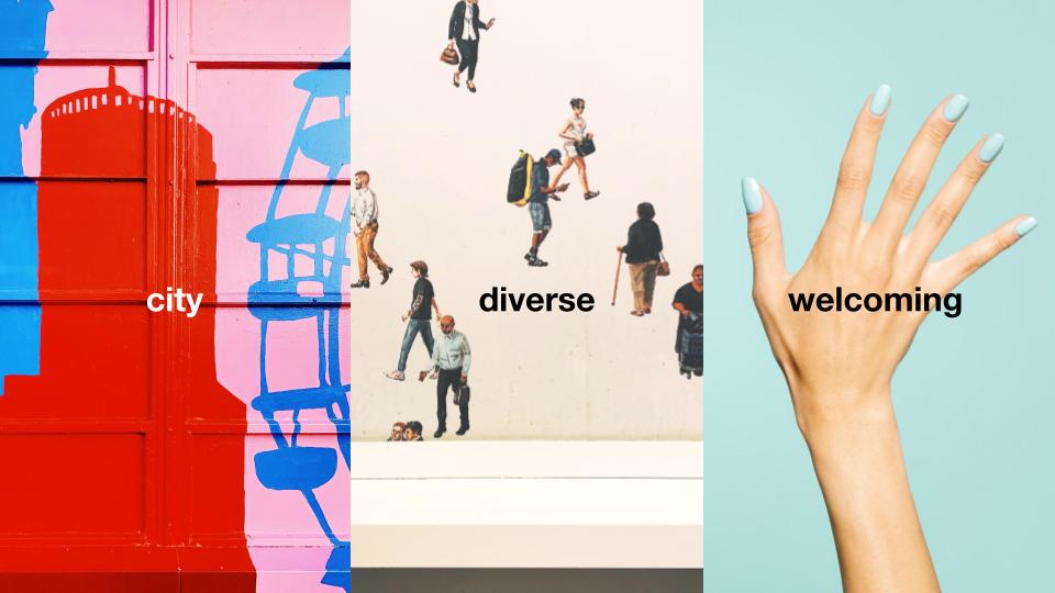
After determining my buckets of ideas, Janice and Shanene showed me some of their old concept pitches to explain the formating I should follow for my next presentation. What was most interesting was cossette’s way of presenting a concept’s value/personality. My mentors mentioned how people perceive words differently, and that by adding a visual, it can portray how we interpret the trait as a designer.

One thing I struggled to do while building this deck was to make sure that my moodboards were cohesive in style. Usually, my moodboards are for me, or for an instructor who I can explain my thinking to. When building a deck for a “client”, my mentors mentioned how it is important to have a strong, cohesive moodboard that can visually represent how each concept would be executed. Making the moodboard took a lot longer than I expected!

I give myself a 9/10 for this phase, as I initially had a slow start to getting my ideas rolling, but I think in the end, I pushed out a lot more sketches than I had anticipated. After improving my ideation process, sketching for my other projects has also gone a lot quicker and smoother than before too! There was a lot of learning in this phase, and I think I adapted well to my mentor’s method of approaching a project.

Sketches

Concept Pitches

BADM 318 – COVID-19 Self-Isolation Life

As this spring term ends with my courses all online, I think most students have had an interesting experience working from home.

Personally I’ve quite enjoyed this time, as my usual three-hour commute was taken out of my day. Gaining three hours has really allowed me to spend more time mainly cooking and baking which has been great, and I’m enjoying all of my banana bread and muffins.

This has also been a nice time to experience working from home as well. As I inch closer to graduation, which is a year from now, I’ve started to think more seriously about what kind of job I would be best suited for. Every time I’ve had the opportunity to meet and talk to freelance designers, I think I’ve idealized their job and lifestyle, not realizing how much diligence and organization is required.

A month into working from home, I’ve realized that maybe freelance isn’t a route that fits me well, as of right now. A big part of my motivation comes from having a separate work environment from home, as well as talking to people face to face. This has all been a really good learning experience though, as I was able to practice presenting through Zoom and Google Hangouts, and making sure that all the pdfs or google slides I share with instructors and mentors are executed properly.

I hope everyone is having a nice and safe time at home, and see you back in the fall time (hopefully)!

IDES 320 – Mentorship Project Phase 1

Phase 1: Listen, Gather, Define Feb 24–March 2

For this mentorship project, I had the amazing opportunity to work with Car Beddice, who is an Associate Creative Director at Cossette, and IDEA alumnae Janice Callangan (Grad 17) and Shanene Lau (Grad 18)!

Car (left), Shanene (middle), and I (How cute is that Pantone mug!!)
Janice and I ft. Shanene’s shadow!

At our first meeting, I was able to show my portfolio and get some really amazing feedback from my three mentors. They helped point out some things my portfolio is missing; one was showing how a brand could extend onto different mediums using a visual language.

They also gave me the option to work at the office on Mondays from 9-5, which ended up being an amazing experience! It helped me focus during the time I spent there, so I was able to show my progress and receive feedback at the beginning and end of the day. Plus, I got to know my mentors better, and was blessed weekly by the office dogs!

The three ideas I pitched to the team the following week were:

  1. Inkswell is a tattoo boutique owned by a daughter of a classically trained calligrapher, who creates one of a kind calligraphy tattoos that have an exquisite meaning and look.
  2. Roundabout is a community-oriented hostel in Vancouver that is targeting millennial solo travellers and urban explorers, who want to travel for unique and local experiences at an affordable cost.
  3. Mush! is a luxury dog food brand based and made in Canada that uses locally sourced and ethically farmed ingredients to help raise dogs to be strong and healthy like the arctic sled dogs.

The team thought Roundabout and Mush! were interesting, and I ended up going with Roundabout.

The next step was doing a visual audit, which I initially mistook as competitive analysis, but learned that a visual audit is more about looking at the competitor’s visual language and brand. I continued on after developing the written aspects of the brand, such as insight, essence, characteristics, etc.

For this phase, I give myself an 8.5/10 because I got the deliverables done quickly, but I should’ve asked my mentors in advance about what format they usually do the brand development in, as I had to alter some of the work I did so that it follows the team’s usual workflow. I learned that asking questions is super important so I can deliver properly to their expectations.

Next up: all the fun stuff imagining, ideating, and exploring in phase 2!

Creative Brief

Visual Audit and Brand Development

IDES 320 – Moodboards

This was the first time I really struggled with creating a mood board; probably because of the lack of direction, I had for my personal branding. There was initially a gap between just gathering design content that I liked, versus gathering design content that I would want to be recognized from.

I found that it was very valuable to get others to look at these mood boards, and write down keywords that they think of while looking at these images. The list I have gathered from my peers has helped me gain a clearer idea of my qualities and what differentiates me.

After creating the mood boards and gaining my keywords, I believe I have a strong foundation to work off of, and come back to when I am lost in the process of creating my personal branding.

AHIS 430 – Glossary

Icon: an graphic representation of a person, place, thing, idea, etc

example: an icon of a person on a wheelchair is often painted on parking stalls to communicate that it is reserved for disabled individuals

Gutter: the space in-between comic panels


Bleeding Panel: When a panel runs off the end of the page

the panel on the right is an example of a panel bleeding off the page

Closure: inspecting part of the image, while still observing the whole picture


Panels/Frames: shapes that contain the images, that act as an indicator of how the time is being divided

Example of a page of panels/frames

Streaking: photographic horizontal lines that suggest that the person/object is moving


Comic: sequentially ordered words and images that conveys information/a story


Movement-to-movement transition: panels show basic movements happening in sequential order


Action-to-action transition: panels show a single subject going through specific movement in a sequential order


Subject-to-subject transition: panels show one scene/idea and show different perspectives/point of views


AHIS 430 – Finished Comic of “The Fly”

initial sketches

This was quite a challenge to visually convey the message and symbols of the story, but I enjoyed creating the imagery for this short story!

I used line art throughout the comic, which aren’t perfect lines but are crooked and imperfect. I chose to do this because I believe it represented his emotional state, which was very unstable due to his reminder of his son’s death. I decided to keep this in black and white, to convey a somber feel of the short story. I believe the contrast also adds tension to some of the panels I drew. I also chose to have particular objects sticking out of the frame, such as the pen, to bring the viewer closer to the environment of the story.

Below is a link to my finished comic in pdf form.

https://eportfolios.capilanou.ca/halukayagi/wp-content/uploads/sites/1410/2019/04/thefly-drawnbyhaluka.pdf

IDES 244 – GDC.DESIGN/STUDENT

I had an enjoyable time working with GDC, and with Sophie in my first group project in the IDEA Program. I find that I usually work well under design systems, and following them correctly, which ended up taking a slight toll on the visual design process for this project. I believe I was too caught up in continuing GDC’s current brand into the new website design, which was partly the problem in the original design.

I appreciated getting honest and constructive feedback from my peers, with the suggestion of a separate colour pallet for the student page. The thought of adding more colours had honestly never come up during my ideation process, even though I was aware of the feedback from the survey and my peers on the current site were the bright, aggressive red. Changing the banner colours changed the vibe of the website so much (much love for our class!!).

For the rationale of the decisions Sophie and I made for the revamped student landing page, a big part was making GDC’s visual look and tone of voice friendlier. This meant introducing the light blue and yellow into the colour scheme, adding illustration banners and iconography, including testimonials, and making the overall information much more digestible

Students are often impatient and when faced with a long long page with just 12pt text, we often decide to leave the page or to skim along, potentially missing key information. Iconography really helped to visually represent the information, while giving users a break from all the text in the page.

I would give Sophie and I a 9/10 for this assignment, as I believe if we were able to take more “risks” to make the website different earlier on during the design process, our execution could have been even stronger than what we had during presentation day. I believe our presentation went smooth on the day of, our prototype worked correctly with no errors (yay!), we executed the project to our expectations, and Sophie did a fantastic job with the illustrations! I believe this project gave me a good feel into presenting to clients, and enjoyed the whole process working with GDC.

Moodboard: https://invis.io/TYRJDNF7ABN

Site Prototype: https://invis.io/TYRJDNF7ABN

Decolonizing IDEA

Although this project was one of the most difficult projects I had faced so far, it was the most eye-opening and educational projects given in this program. Before this project, I had an embarrassing amount of knowledge about first nations (basically nothing), and it is amazing to learn so much in the past few weeks.

Getting to meet the students in the Indigenous Film Program was the most vital and important step during the process of developing our concepts. I was educated by the students on the wide variety of the dialects spoken in a language, and the importance of not using an umbrella term to group all the languages together. The students also mentioned how it would be nice to accompany a wide variety of languages, instead of just focusing on one language, which I had done.

A big topic that came up in most of the feedback with my classmate and I’s project was permission; whether we had asked the writers, the poets, the models, the photographers, if we were communicating the right message with their work, that was not offensive in any way. Although this is a school project and we may not be able to do so in the time frame we were given, this was the biggest takeaway I had during the conversation. If I were to ever work on a project involving the First Nation community, I now know the importance of asking, instead of assuming.

After getting the feedback from the students, I went off and revamped what I had before, starting with the name of the app. The app was initially named “Acimona” which meant storytelling in Cree according to the online resource. The Indigenous Film student I met said that it had meant “city/lifestyle” in his dialect of Cree, which was entirely off from the online translation. I decided to stay safe with a more straightforward app name.

I will give myself 8/10 on this project. I believe I incorporated the imagery of the book/door which symbolized the USP, well into the interface. I decided not to make a menu bar to keep the user experience simple enough to be used by children, but there is perhaps areas that could be changed to create a smoother process. One example would be to select the grade and language on one screen instead of two. The overall look is friendly looking, and would appeal to older elementary students, but I could have done a better job to appeal to the younger students as well. I also sketched out ideas around filtering through the library selection, to find books specifically about history or culture, but I had run out of time to do so. This could have been accomplished if I had managed my time better.

Final PDF: https://eportfolios.capilanou.ca/halukayagi/wp-content/uploads/sites/1410/2019/03/halukayagi-final-presentation.pdf

Live Invision Link: https://invis.io/D3QXAFYG7E2

App Walkthrough Video: https://drive.google.com/open?id=1tJ0Os7UShMbqID4RJbQSyyXTxVNYkcdH

Resume

For this assignment, I chose Glasfurd & Walker as the company I was targetting my resume for. I decided to use the font, Kozuka Mincho to be used for my name to give a friendly but elegant feel, and the Avenir family for the content of the resume to provide a modern look, which fits well in with Glasfurd & Walker’s brand.

For this project, I found it challenging to show personality while keeping the resume looking clean and simple. My other drafts consist of designs using more shapes and colour, but I believe those looked more cluttered and busy. This was a good project that helped improve my understanding of typographic hierarchy and laying out large amoiuntss of text.

If I were to give myself a mark out of 10, I would give myself 7.5 because I believe I could’ve added more personality to the resume without creating clutter. I am content with how I laid out the information, and I hope to add on and improve this resume as I gain more design knowledge and a sense of my own identity ongoing this term.

Link to Resume:

https://eportfolios.capilanou.ca/halukayagi/wp-content/uploads/sites/1410/2019/01/haluka-yagi-resume.pdf

Sustainability 101 Design Manifesto

In today’s world, there is a great emphasis on sustainability; whether it be about the environment, the economy, social issues, or cultural aspects.

For this manifesto, my target market is the young designers stepping into the design industry. Young graphic designers may find that it is overwhelming to work sustainably in the advertisement industry, which heavily focuses on consumerism. They often may not even have the choice to work along the principles they stand for.

The message I wanted to translate through this poster was that we could take our time to implement aspects of sustainable design, instead of pressuring yourself to change completely. The manifesto was written in a friendly and approachable tone, which reflects the message as well as the target market.

The final poster was created with a flat, modern illustrated look to appeal to the younger target audience.

If I were to give myself a mark, it would be 8/10. I believe I executed my concept well regarding the overall look and content, but I think I could have pushed my thinking more to create a stronger solution for this assignment.

Resources:

https://www.core77.com/posts/40586

http://www.manifestoproject.it/bruce-mau/

https://gdc.design/sustainable-design

https://pjrvs.com/manifesto/

https://backspace.com/notes/2014/03/first-things-first-2014.php