First time using InVision, please don’t take it seriously.

A screenshot of a mood-board project, 2020

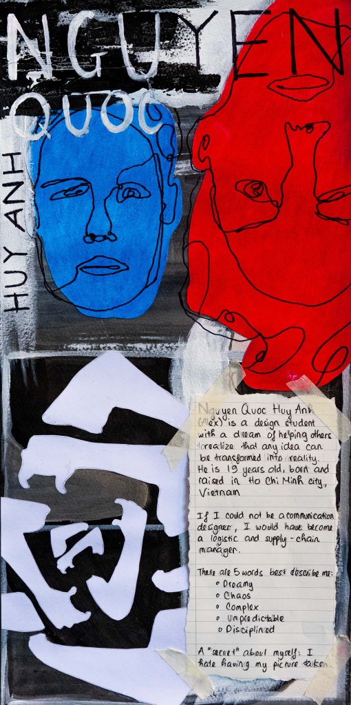
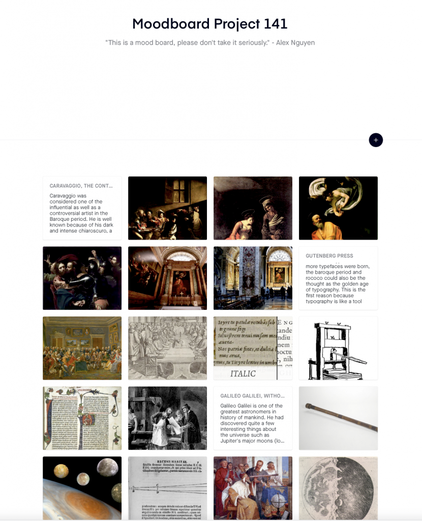
InVision is great for making mood-board; however, I still think Google Presentation or Powerpoint would be easier to assemble pieces of information and to present. The period in history that I was given is the Baroque and Rococo (1450 – 1750). There were 3 events that I chose to make some research in this project, which was:

  1. The discovery of using a telescope to observe celestial objects (Galileo Galilei)
  2. The invention of The Gutenberg Press (Johannes Gutenberg) 
  3. Caravaggio and how he had made an impact in the world of painting

This project is a fairly good project for entry-level designers, or first-year design student to study the process of making a mood-board. As I mentioned, InVision is good but it is certainly not the one that I would recommend to others. In reality, creating a mood-board is a more complex process because of the diversity and flexibility of the brief. Time and the size of the project will decide on the number or the complication of the mood-board. By saying this, I am not trying to devalue the importance of this project but only for the reflection of my experience in the creative field. I love this project despite its boringness content and the kind-of-confusing tool because it reminds me of the reality of being a communication designer, which is to create for others and to others. Indeed, designing is not a medium for self-expression as Peter Saville once said in his interview. The truth of being a communication designer is that we are not artists, but we are the experts in solving problems by using images. There will always be work that would make us want to question ourselves that “if this has been the right choice?”. For all of the reasons I have said in this blog, I would again want to clarify that this is a great project and I would love to recommend this to the later first years. I know that InVision is not the best way to create mood-boards but sometimes you just gotta do what needs to be done.

Self – Assessment: I would happy to give myself 7/10 for this project because I can’t even believe that I would be able to pull this project off. Personally, I don’t think this moodboard project requires any creativity but somehow I did manage to have some connections between topics. Although some of the connections might seem vague but due to the oddness of the brief, I would say I am satisfied of my ability to tie unrelated things together. I did more than what needs to be done; therefore, 7/10 might be a good marks to be considered.

Survey 1# Blue eyes, a symbol of god

Uruk archaeological site in 2008, the largest city in the world around 2900 BCE.

Background history of the Sumerians Civilization:

  • The Sumerians were one of the earliest civilizations, along with Ancient Egypt and Indus Valley.
  • The Sumerians are arguable to have one of the largest cities in the world; At its peak, their city used to contain about 40,000 to 80,000 people living inside of multiple defensive walls.
  • One of the most crucial cultural achievements of the Sumerians was the linguistic record. They had the oldest as well as the earliest form of writing that appeared as far back as 4000 BCE. It is called Cuneiform, the main purpose of this writing was to make records of trades, rationale, and ownership.  
A cuneiform clay tablet dating to the Early Dynastic period in Sumer, approximately 2500 B.C.
Photo courtesy of the Oriental Institute of the University of Chicago

Sumerian Art and Statues – The mystery behind the blue eyes:

  • It is effortless to recognize the Ancient Sumerian statues because of the big eyes. The statues were created differently, nothing was alike. 
  • Art at the beginning of times were often related to the spiritual world, especially from the Sumerians civilization. They used to have a complex pantheon of gods and goddesses, and their gods were represented in human form as any other gods from the ancient civilizations.
  • Some of the statues that represented gods and goddesses usually had enormous blue eyes. This representation of gods was not only existed in the Sumerians culture but also many other civilizations. 
  • There is no certainty of the meaning behind the big blue-eyes statues due to the limitation of recorded texts from that period. However, despite the limitation, blue eyes were seen as a symbol of gods because the majority of them are looking up upon the blue sky, which can be depicted as heaven.
Pictures of different statues from different ancient civilizations, the Sumerians civilization was one of them

Opinion of my own about week 3 lecture:

The week 3 lecture is the first lecture and it is indeed an interesting one. I have got to say that I was impressed by how early they used to recognize the importance of images and words. After going over this lecture by myself again, I have had a much clearer understanding of the development and power of symbols and images in our lives. History had proven for thousands of years that an image could hold much more meaning than 1000 words, and we as future communication designers must acknowledge that it is our heritage to preserve and continue to build upon it.

“Communication is the key to us to thrive upon other species, without it, we would never be able to be seen as human.” – Nguyen Quoc Huy Anh

Sources:

  1. Lloyd, Ellen. “Mysterious Sumerian Statues With Big Blue Eyes – A Sign From The Gods.” Ancient Pages, 11 June 2020, www.ancientpages.com/2017/02/23/mysterious-sumerian-statues-big-blue-eyes-sign-gods/?utm_source=newsletter. 
  2. Lerner, Louise. “Miguel Civil, World’s Leading Scholar of Ancient Sumerian, 1926-2019.” University of Chicago News, 1 Feb. 2019, news.uchicago.edu/story/miguel-civil-worlds-leading-scholar-ancient-sumerian-1926-2019. 
  3. History.com Editors. “Sumer.” History.com, A&E Television Networks, 7 Dec. 2017, www.history.com/topics/ancient-middle-east/sumer. 

Visual Research II

Closure

Skopje is a poster designed by Fons Hickmann for an international competition with a purpose of celebrating the competition’s 10th anniversary in 2017. Fons Hickmann had used the closure of adhesive yellow strips to create a red star shape. The colors represent the Macedonian flag.

Skopje Poster, 2017

Proximity

Poster designed by Boris Bućan for Zagreb Symphony Orchestra and Chorus RTZ in 1986. He had altered the lines close together to create shapes of human figures by using proximity.

Musical Experiences: Zagreb Symphony Orchestra and Chorus RTZ (Radio-
Televizija Zagreb) (Poster for a performance at Lisinski Concert Hall, Zagreb), 1986

Addition interesting work (combination of different Gestalt principles)

Print by Larry Carlson. This piece/poster/artwork is super interesting because I think he had used proximity and closure to create this trippy, illusion effect of two women hugging each other.

Wavy 2, 2020

First Assignment – Yearbook Spread (Who am I?)

Untitled, 2020

This yearbook spread represents me best as a first-year graphic designer student because it shows my personality as well as the way I communicate through images. It had taken me 2 failed attempts and various sketches to produce the final one. Before I explain the details in my yearbook, I would like to say thank you to Judy for the advice she had along with this first project, I would not be able to have the finest version if she didn’t help me realize how important it is to be original.

I did not draw complex imagery because drawing is not my strongest skill in terms of designing. Instead, I used paint combine with a little of my knowledge about expressionism art to create this yearbook spread. There are only three elements that I used in this piece, which are lines, repetition of shapes, and a bit of assemblage.

To begin with, there are two small portraits which have been placed opposite of each other because it shows the interpersonal conflict between social expectations and my rebellious desire. I am a very rebellious person when it comes to ideas because I recognize what aesthetic style fits me well; however, no one seems to be able to understand my interpretation through art. I have to fake being loving what others love to fit in with society. The background is a combination of three shapes, which are triangle, square, and squiggle. The shapes all speak three distinct characteristics of an individual. The triangle shows my ability to work well under pressure, square stands for a perfectionist and squiggle means that I could sometimes be aggressive and dramatic as a creative person. Last but not least, the repetition of two arms in an embracing position in which I had assembled so it could both resemble a rose and an infinitive loophole of my endless internal conflict. Overall, this has been an intriguing assignment and I would give myself a 4 as a first-year student ought to get. I hope it could be a 9 by the time I graduate because 9 means my skills are ready to be used in the real world.

Blog post #1 Late Gothic & Early Renaissance

Giovanni Bellini

To introduce the artist.
Portrait of a man (Giovanni Bellini)

Giovanni Bellini was known for his ability to work with natural light and his serene style. He was a leading artist in the fifteenth-century Venice, and his work had so much influence that he could be seen as “the founder of the golden age of Venetian painting” (National Gallery of Art). Bellini’s style had become one of its own, and it had inspired many famous artists later such as Titan, Giorgione, Tintoretto, and Veronese. Giovanni was a man of religion, and he had been creating various pieces that contained religious subjects at the beginning of his career. The “Madonna and Child” was once his favorite compositions to paint; however, his interests shifted to history paintings later in his career where he worked with his brother for the doge’s palace. From my point of view, Giovanni Bellini is an extraordinary artist when it comes to naturalism. For example, in the piece The Agony in the Garden, I could see how he had used different perspectives to add a sense of depth into the painting. To be more specific, the main subject in the painting is Jesus but when I look at the painting, I could feel he had created a complete circular composition starting from the Roman soldiers to the sleeping monks, back to Jesus and then the angle up in the sky right above the castle. Overall, Giovanni Bellini was a great artist because he had changed the way on how Venetians painted by applying the new techniques of light and color. 

The Virgin and Child

I love the blue sky because it enhances the holy mood of this painting. Also, the child in the painting is not looking at his mother, but he is looking up at the sky. I think that is the factor that has bring uniqueness to this painting

The Blood of the Redeemer

I love this painting because of the body proportions of a young Christ, it had been drawn so perfectly that I can feel like the painting itself is alive. The blue sky in the background really separates the main subject and enhances the mood of the subject, which is idyllic.

The Dead Christ supported by Two Angles

This also one of his paintings that I love. The painting illustrates the death of Christ, but it gives me a peaceful feeling when looking closely at it. If anyone cares to pay attention to the details, they would be able to see that Christ is somewhat smiling. I am not a religious person, nor have been following any religion but I do love the idea that the death of Christ can also mean peace for humanity. 

The Agony in The Garden

I love how Giovanni had manipulated the perspectives in this piece. The way he used colors gives me a sense of comfort when I observe it for a long time. One of the most stand out details in this painting is the sleeping figures because I can feel like they are sleeping in peace while Jesus is praying. 

The Assassination of Saint Peter Martyr

I am not a fan of this painting because it gives me a feeling that I am seeing a picture from a comic book. Although it does convey the story that Saint Peter Martyr is being killed. However, there are no doubt that this is Giovanni’s painting because of the harmonious of the colors. 

Source: https://www.nationalgallery.org.uk/artists/giovanni-bellini

Visual Research I

Line

Berlin Layout, logo and style manual by Anton Stankowski, designed in 1970 for the city of Berlin.

Berlin Layout, 1970

2D Shape

Poster by Stephan Bundi, designed in 2007 for the opera about cuckold husbands.

Boccaccio, 2007

3D Shape

Poster by Gunter Rambow, designed in 2017 for Oper Frankfurt, an opera company in Germany.

Il Trovatore, 2017

Size

Poster by Gunter Rambow, designed in 1967. 

Egoist, 1967

Space

Book cover by Paul Rand, designed in 1945. The book name is The Fervent Years by Harold Clurman.

The Fervent Years, 1945

Texture

Poster by Issay Kitagawa, designed in 2013 for an Ellie Omiya Exhibition at a Ginza graphic art gallery.