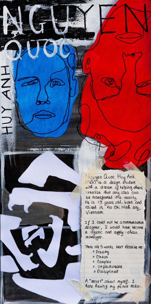
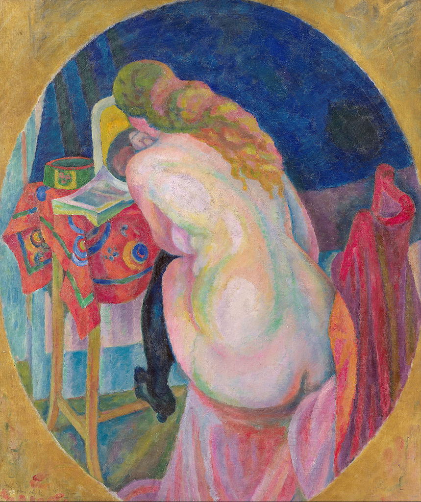
This yearbook spread represents me best as a first-year graphic designer student because it shows my personality as well as the way I communicate through images. It had taken me 2 failed attempts and various sketches to produce the final one. Before I explain the details in my yearbook, I would like to say thank you to Judy for the advice she had along with this first project, I would not be able to have the finest version if she didn’t help me realize how important it is to be original.
I did not draw complex imagery because drawing is not my strongest skill in terms of designing. Instead, I used paint combine with a little of my knowledge about expressionism art to create this yearbook spread. There are only three elements that I used in this piece, which are lines, repetition of shapes, and a bit of assemblage.
To begin with, there are two small portraits which have been placed opposite of each other because it shows the interpersonal conflict between social expectations and my rebellious desire. I am a very rebellious person when it comes to ideas because I recognize what aesthetic style fits me well; however, no one seems to be able to understand my interpretation through art. I have to fake being loving what others love to fit in with society. The background is a combination of three shapes, which are triangle, square, and squiggle. The shapes all speak three distinct characteristics of an individual. The triangle shows my ability to work well under pressure, square stands for a perfectionist and squiggle means that I could sometimes be aggressive and dramatic as a creative person. Last but not least, the repetition of two arms in an embracing position in which I had assembled so it could both resemble a rose and an infinitive loophole of my endless internal conflict. Overall, this has been an intriguing assignment and I would give myself a 4 as a first-year student ought to get. I hope it could be a 9 by the time I graduate because 9 means my skills are ready to be used in the real world.
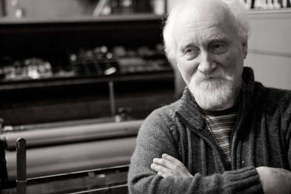
It is impossible for graphic design students studying in Canada to not know who Jim Rimmer is because he is one of Canada’s most remarkable typographic figures.
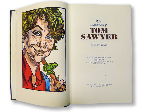
Jim Rimmer was known for playing many roles in the design industry such as a commercial artist, type designer, book designer, and mentor to countless artists; however, the works that had helped him become famous were his book design and type design. Shadow River, Charles Dickens’s A Christmas Carol, Mark Twain’s The Adventures of Tom Sawyer, Twain’s Adventures of Huckleberry Finn are some of the few books he had designed and participated in the printing process back in the 1990s. Moreover, Jim Rimmer was also an excellent type designer. There are six typefaces made traditionally by cutting out the metal and a lot more in digital format. The six typefaces were named to those important to him, such as Nephi Mediaeval (after his father, John Nephi), Juliana Oldstyle (after a daughter), Fellowship (in honor of the American Typecasting Fellowship), Albertan (after his wife), Hannibal Oldstyle (after Mark Twain’s birthplace), and Duensing Titling (after long-time friend Paul Duensing) (The Jim Rimmer Collection, 2005).
Overall, Jim Rimmer had left a legacy of design works with top-notch quality, and I think that we as design students should learn more from him. His works might not be as appealing as the designs that we see today but they will never be outdated.
Wolfgang Weingart is one of the iconic swiss designers known as the pioneer of ‘New Wave’ or Swiss Punk typography.
To understand how he had developed the style known as Swiss Punk, we need to go back to the beginning of Weingart’s career in design. Weingart first started to take a step in the design world in April 1958 when he returned to Germany to attend a two-year program of applied graphic arts at the Merz Academy in Stuttgart. In those years, he had learned the fundamentals of typography, such as typesetting, linocut, and woodblock printing. However, the actual turning point of his life happened while he continued an apprenticeship at Ruwe Printing because he was able to discover a style called “Swiss Style”. The discovery of the International style was a start, but he was not consumed by it. In other words, after years of teaching and conducting numerous experiments with his students, he later found a way to create a new style called Swiss Punk by eliminating the strict elements of the Swiss-style as well as incorporated with his playful style.
Weingart is indeed one of the special designers that had become successful because he was not afraid of breaking the rules of graphic design. Later when he became an instructor at Basel School of Design, Weingart had tried to teach the new generations of designers to take a more adventurous path toward design because he believes in the limitless creativity that this career offers.
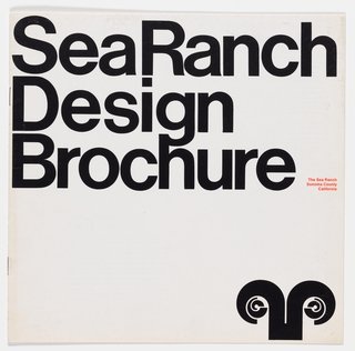
Barbara Stauffacher Solomon is a designer based in San Francisco that specialized in designing Supergraphics. Besides being a graphic designer, she has also trained as a classical dancer, an artist, architect and historian.
Before diving into the projects that made Barbara become famous, we must understand her styles. Her work often mixes between Swiss Modernism and Californian Pop into a style called California Cool. In other words, it is a kind of style that evolves a lot of geometric shapes combined with the signature colors of Californian Pop such as blues, yellows, reds, greens and oranges. The colors all represent California at its best.
Barbara became well known after her supergraphics design had been published in Life magazine. Although she was hired only to design a logo and brochure; However, as one thing led to another, she got commissioned to decorate the inside of one of Sea Ranch’s areas. In my opinion, I think the most important lesson here is not about Barbara’s skills but her passion as a designer. She always treats design as a mystery that needs to be solved.
Overall, Barbara is a very good example for the young designers working among all forms of design to learn from because she has shown the world that you don’t need to be exceptional to become successful. Design at the end of the day is just design, our purpose as designers is to make things easier to understand, not the other way around
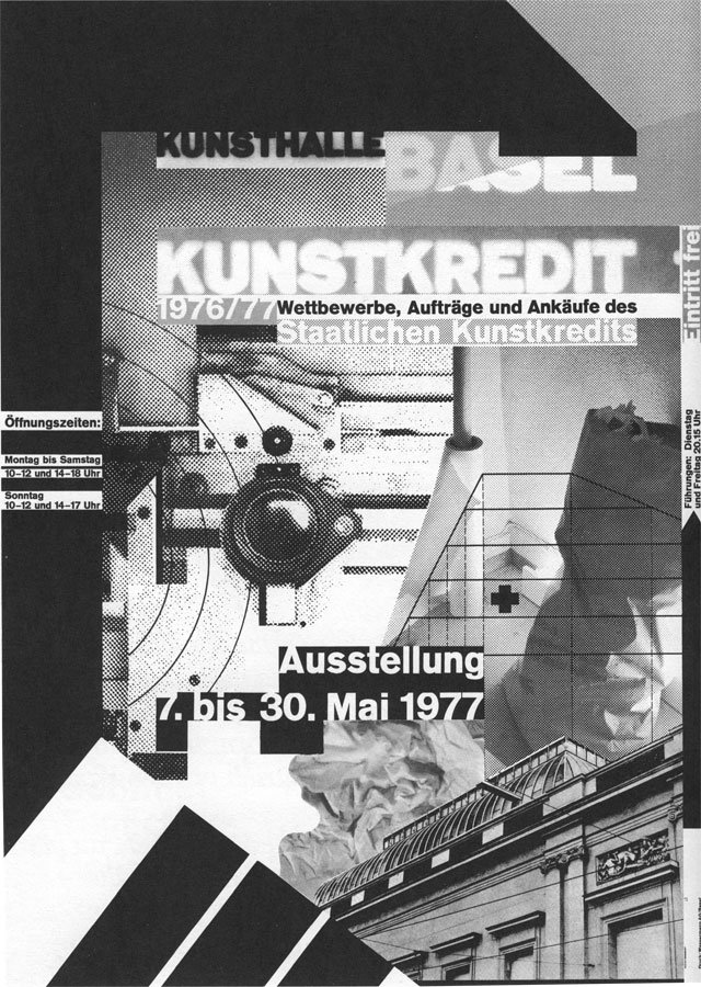
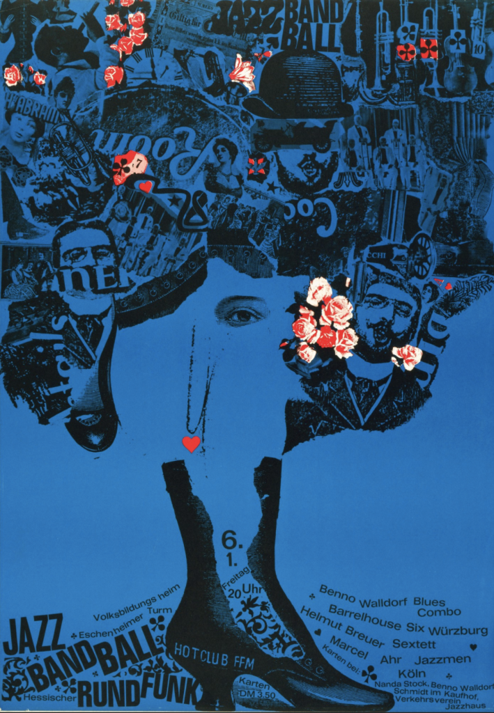
Gunther Kieser is an exceptional designer who is not only well-known in the psychedelic era but also takes a further step in incorporating photographic elements in his works. Gunther Kieser is a German designer born in 1930 in Kronberg, Frankfurt. He has his studio where he founded with his friend, Hans Michel, in 1952.
It would be impossible to introduce the designer in a blog post because no words can describe enough the craziness and uniqueness of this man. Therefore, I would like to dive in some of the actual pieces created by him.
Personal Insights:
This is a poster he created in 1963 titled Jazz Band Ball, and it was a gift of the artist to an unknown person. I love how chaotic it feels because of the texture of the offset lithography printing technique. Although the poster was created a long time ago, it amazed me how modern it is if I could compare it with David Carson’s work. The fact that he had contrasted the blue background with the red/white flowers was so subtle that it is impossible to not say that it was a genius move.
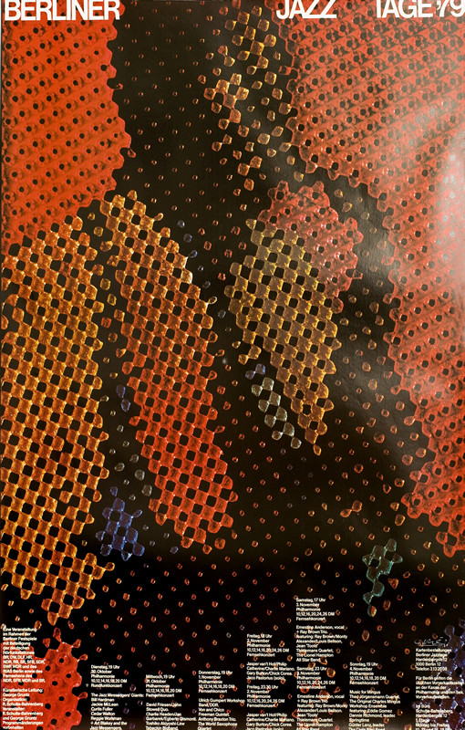
Last but not least, I will end this blog post with a poster he created for a jazz concert in 1979. This particular caught my sight because of how Kieser was manipulating the texture to create a trippy effect. In my opinion, I believe he had used bubble wrap paper to achieve the overall bubbly effect of the jazz musician for the background.
Helmut Krone was an art director and a graphic designer who was considered the pioneer of modern advertising. As one of four art directors for Doyle Dane Bernbach, he had succeeded in building his career through the two most successful campaigns: the 1960s campaign for the Volkswagen Beetles and the print advertising campaign for Avis in 1963.
Personal Insights:
I don’t choose to write about any important person without any reasons as in the case for Helmut Krone. I am fascinated by how he had art directed such a simple advertising campaign but had so much impact until these days, especially the one for Avis.
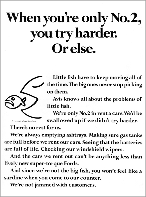
I love how he always tried to fight logos because he thought logos are too much of a give-away element of an ad. This particular work below is one of the many pages he had directed for Avis. I also like how he emphasized the importance of typography and how much impact it could make if we knew how to use it correctly.
Print advertisement for Avis. Copy by Paula Green, art direction by Helmut Krone, Doyle Dane Bernbach, 1963
Overall, I think Helmut Krone is one of the art directors everyone should learn or at least take a closer look at his works because it does not only represent the beauty of design, but it is because it works and relevant until these days.
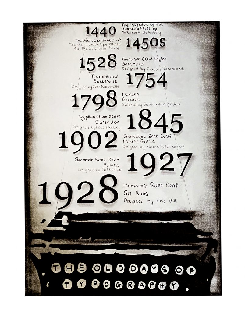
Although there was some confusion as I started this project, I had managed to finish it. I think the most captivating factor about this poster is the vintage appearance, which gives it an “old typography” vibe.
I decided to draw a typewriter because I love the aesthetic look of it. Also, besides the fact that it is much smaller than the Gutenberg to draw, it fits with the concept that I wanted. For the context, I put in information about the essential type classifications from the invention of the Gutenberg Printing Press until the end of WW2. I stopped at 1928 because I would go over 1945 if I continued with the classifications.
The classifications I talk about are:
Humanist or Old Style
Modern
Egyptian or Slab Serif
Transitional Sans Serif
Geometric Sans Serif
Humanist Sans Serif
In addition, I include a piece of information that I don’t think is popular in the typography world, which is the NAME of the type Gutenberg used for his bible, which is: Donatus Kalender or D-K
Overall, this is a good assignment to help first-year like me to get an idea of what are infographic posters.
Self-Assessment: I would give myself a 9/10 because I love the concept of the poster, and I think others would appreciate it as I do too. The reason why I don’t give myself a 10/10 because of my hand-writing; I reckon it is not that good to receive a 10/10.
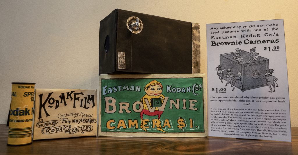
I would say that this project is enjoyable because it reminds me of the joy of handmade art. The most important thing that I learned from this project is to fall in love with the process of making art.
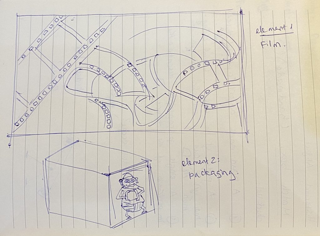
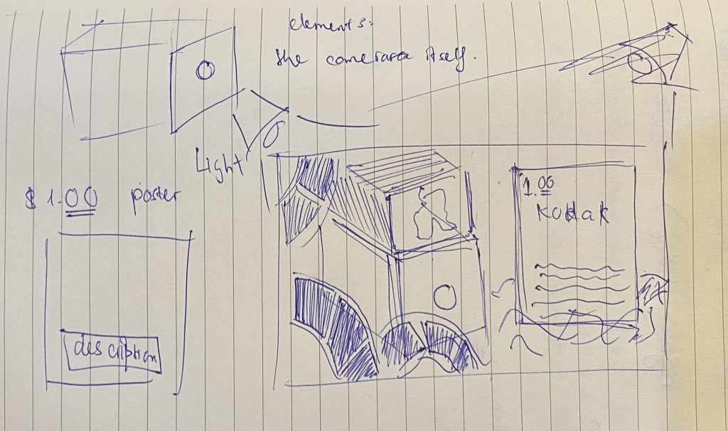
To begin with, I chose to make the Eastman Kodak Brownie Camera because I love photography, especially portrait photography. Also, I have been a freelance photographer for two years, and I love every single moment during those times. Therefore, to recreate the one dollar camera box was the perfect choice for this assignment because it was an opportunity and a motivation for me to expand my knowledge about the history of photography
Planning Process:
I started by sketching the imaginary shot because I wanted to make sure I knew what I was doing. I also sketched out the elements that would be included in the picture to enhance the message. After I finished my planning process, I began to move on to the camera itself.
Props:
There are two crucial elements in the shot: the films and the camera package (camera and the box). However, I could not re-create the roll film. Because of that, I had to buy it as props. The film I used in the shot was the film that people used in the late 1900s. Besides, the description that I made looked like an actual advertisement poster when Kodak introduced the camera.
Self-Self-Assesment:
I would give myself a 9/10 because I had put tons of effort into perfecting the shot. The shot is not as perfect as I wanted because I did not have the luxury of finding a similar background as in the 1900s; however, I did try my best to both meet the expectations of the assignment and made it looked like it belonged together.
My full name is Nguyen Quoc Huy Anh but I prefer to be called by Alex. To have an opportunity to be a part of this program has been one of my greatest accomplishments to date. For as long as I can remember, I had been advised to not follow art because art is considered unsustainable when it comes to seeking a sustainable career. However, since art has been the only thing that I am good at, I had decided to apply to various art/design schools around the world and Capilano was one of the universities I had been accepted to. Hence, I choose Capilano because I believe that with an effective compact studying system, this is where I could unlock all of my artistic potentials. Capilano is the beginning of my journey, yet it wouldn’t be its finish. The path I have picked probably won’t be the fastest way to success, yet it is without a doubt the proudest path in my life.
Summary of “The Importance of Urban Forests”
I wrote this summary as a small assignment for English 100 on an article about the benefits of having trees in urban areas.
Amy Fleming’s article “The Importance of Urban Forests: why money really does grow on trees” (2016) suggests that the people who are responsible for the development of urban areas should take a closer look at the values of growing more trees. Trees can help improve air quality, prevent water flooding, and save energy. A report from the New York City Park Department states it only costs $22m annually to maintain parks while the benefit of trees could save “up to $120m a year” (qtd. Fleming 3). Fleming’s point is that the benefits come from parks that are worth more than the maintenance cost. On the other hand, Fleming also lists out different ways that urban forests could influence the quality of life. For example, Geoffrey Donovan, a member of the US Forest Service, says that “the impact of trees on birth outcomes and found that mothers with more trees within 50m of their homes are less likely to have underweight babies” (qtd. in Fleming 5). Donovan is saying that trees can help reduce the general anxiety level of urban residents and reduce unwanted health problems. Overall, we need to settle on a choice whether we wish to preserve these values since it requires some investment to create a green environment because trees don’t grow overnight.
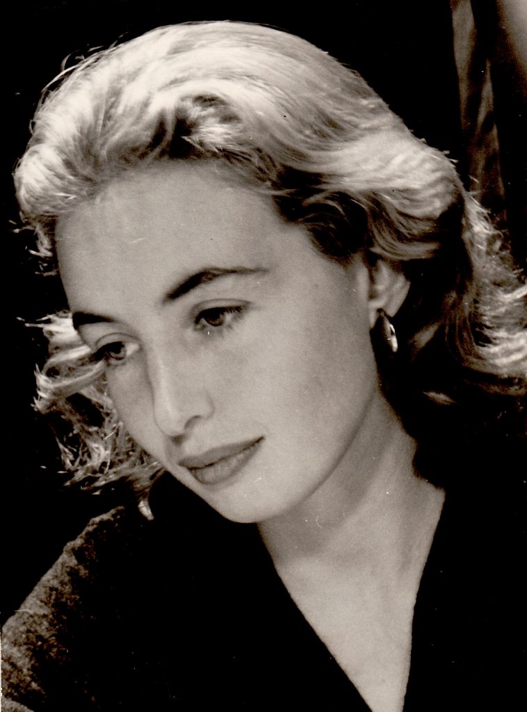
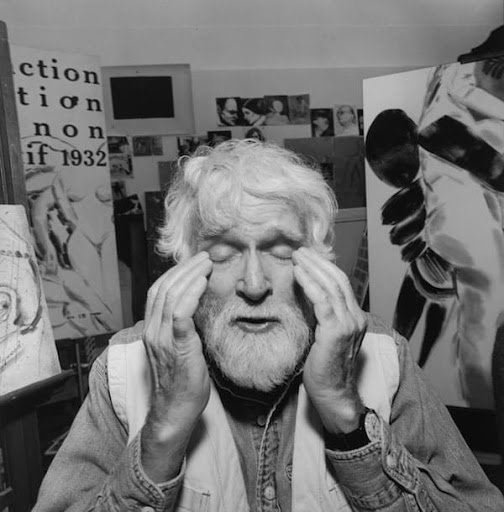
Portrait of R.B. Kitaj. Credit Lee Friedlander, courtesy Fraenkel Gallery, San Francisco
R.B. Kitaj, or in full name Ronald Brooks Kitaj is an American-born painter which considered to be an influential figure in contemporary painting. He is known for his controversial, eclectic as well as his highly personal works. Kitaj was deeply interested in contentious themes such as war, political ideologies, and issues of identity. Besides, Kitaj has a strong foundation of knowledge since he had completed several art degrees in different countries such as America, Italy, and England. At the beginning of his career as an artist, he started right at the movement of Pop art. Because of that, his works were greatly inspired by the impersonal style of Pop mixed with a few abstract brush works. R.B. Kitaj’s career collapsed with a scandal created by himself in 1994 at the Tate Gallery, London where he presented a major retrospective of his works. After the repetition of harsh criticism he received, his wife had suicided and followed by him unexpectedly at the age of 47. R.B. Kitaj was a great artist in his way although some of his pieces did not seem to be consumable. Art in the end is art, it is a platform for artists to express themselves despite if others like it or not.
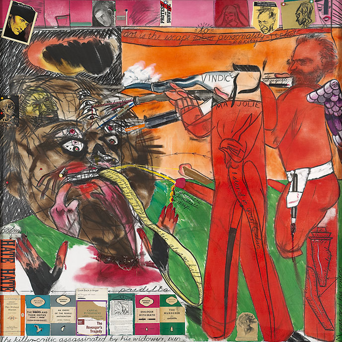
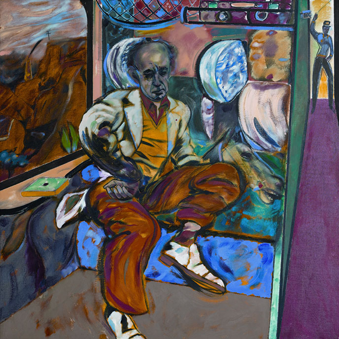
The Killer-Critic assassinated by his Widower, Even, 1997
The Killer-Critic assassinated by his Widower, Even, 1997 is an abstract piece that represents his anger toward the British critique because he believed those words had made his wife killed herself. The painting is only a part of a three-part series he called “Sandra”. Sandra is Kitaj’s second wife, who had committed suicide after his major presentation in London. I like how he had used art as a method to express his feelings, which represent the characteristics of contemporary art. Furthermore, an art student needs to understand the difference between old and new forms of art. I can feel the anger through his brush works and his way of using warm colors such as red to describe the evilness of the critics.
The Jewish Rider, 1984 – 1985
This piece is called The Jewish Rider, 1984 – 1985, and it is a powerful piece. The painting describes a Jewish taking a visit to the Death Camps in Poland, many years after the war. In addition, the main figure in the painting is his friend Michael Prodo, who posed for Kitaj for almost one year to complete. I like that Kitaj had chosen a quite interesting point of view to paint, which is in the middle between the corridor of the train and the cabin where the man sits. I also like the fact that he had used multiple symbols of death, loneliness, and power to convey the atmosphere of going into a place where once known as a one-way ticket to death. Overall, this is indeed a powerful piece with a thoughtful story about the dark past of the Jews.
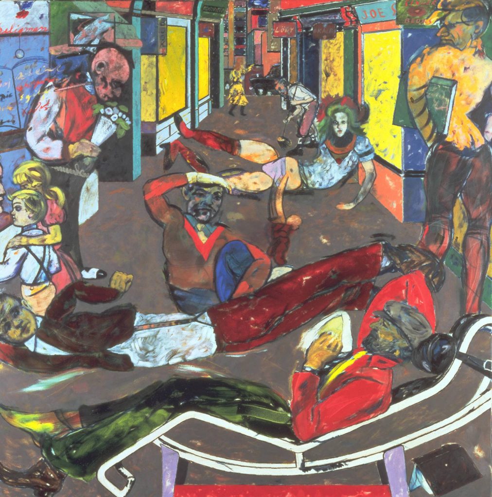
Cecil Court, London W.C.2. (The Refugees) 1983-4
The reason why this piece is called Cecil Court, London W.C.2. (The Refugees) because it is set in Cecil Court, which is a street known for its bookstores. Also, this piece reveals a lot about Kitaj himself as a Jewish because of the figures lying on the street, representing his experience with refugees. In addition, he and his family once had to flee Germany because of the Nazis. In my opinion, I like the composition where a man is lying on a sofa at the bottom. It is said to represent the Kitaj in his dream. It is a thoughtful painting with lots of color elements that helps tell a story of Kitaj’s life as a kid.
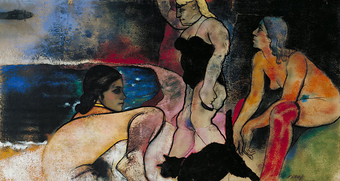
The Rise of Fascism, 1975-1979
This is the painting where Kitaj was interested in the Holocaust and Jewish history. It is called “The Rise of Facism”, which belongs to a series of in-depth research about the human body and its vulnerability. I can clearly see that the figures in the painting represent women in the Death Camp. Also, I love how he had limited the amount of fabric and presented more skin to show how fragile they are. It is astonishing how he could create a sense of dirtiness within a compact space with different shades of blues and greens. Hence, this is one of my favorite pieces of R. B. Kitaj.
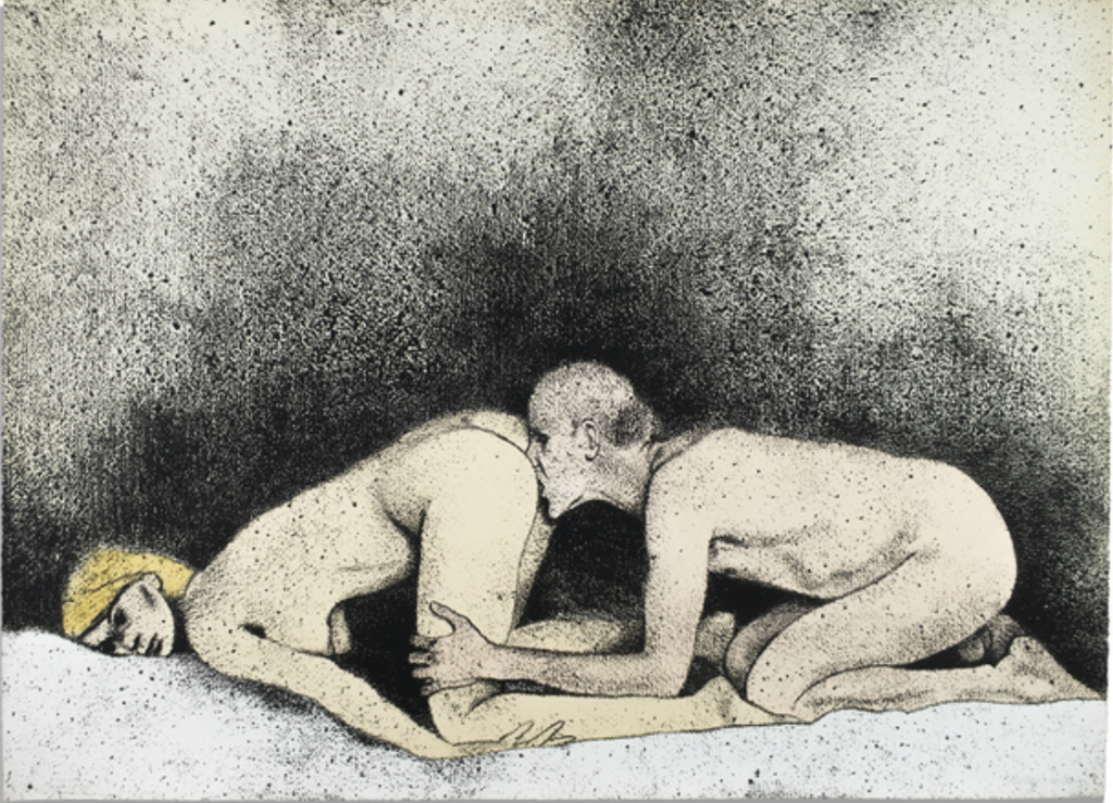
Some Do Not (A), 1975
Some Do Not is an erotic kind of painting that shows Kitaj’s interest in nudity art. I like how he had managed to create a grainy texture, which gives a sense of vintage and filmy look. Also, I love the unusual composition where their sex position is combined to create a balanced feeling. The colors are simple yet still be able to convey the softness of the figures’ skin and the mattress. This is also my favorite piece because I am also interested in erotic and nudity art.
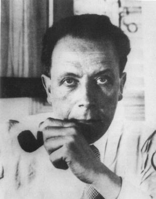
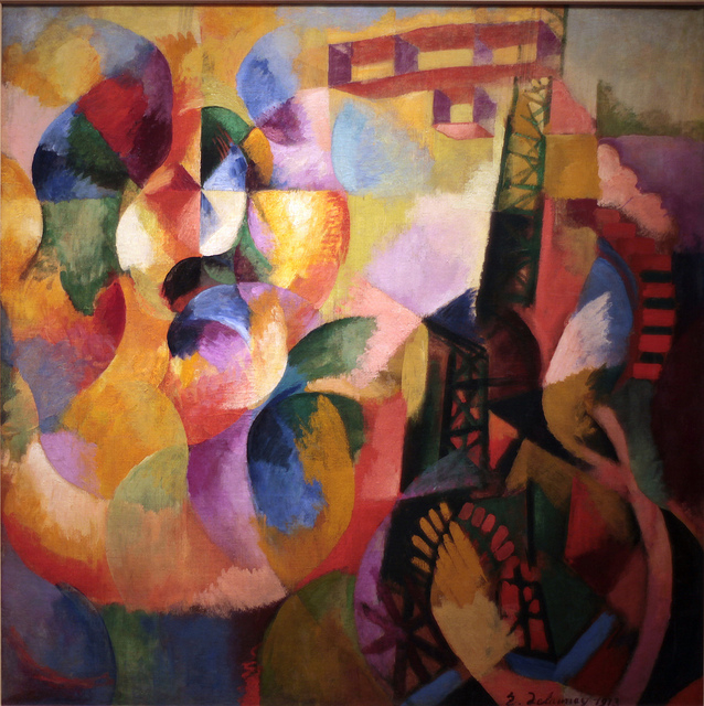
Robert Delaunay was a phenomenon French painter that first introduced bright colors into Cubism and created a movement known as Orphism. Also, he was heavily influenced by the use of color of the Neo-Impressionists. Although he was only a part-time painter when he created his first series of paintings about abstract art. At the beginning of Robert Delaunay’s career, his works were usually figuratively like reading, nude women, and portraits. However, a major shift in his works changed dramatically when he decided to take on full abstraction. Hence, a large number of Delaunay’s paintings afterward were compositions with circles with a fine touch of vibrant colors. There is no doubt that he was an influential figure in 20th-century French painting.
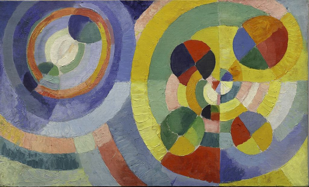
Circular Forms, 1930
I am very much into abstract art because I love how abstract artists often find ways to tackle problems related to color science. I think Robert Delaunay had succeeded in showing the contrast between the yellow circle and the blue circle. Although it looked a bit chaotic; However, if we stood further away from the painting, we would be able to see the perfect combinations of colors. The fact that he only used various forms of circles but still managed to pull this off astonished me. I love this one!
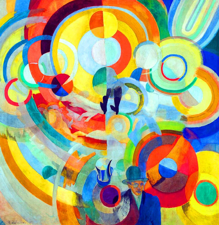
Carousel of Pigs, 1922
This is also my favorite piece of abstract art by Robert Delaunay. I can see that this is more sophisticated than the Circular Forms. He had integrated some figurative elements on the bottom, which add another layer of meaning to the painting. I think that the bright colors represent the effect of lights when you see the merry-go-around in slow-motion. However, I don’t know why he named it Carousel of Pigs since I can’t see any movement of any pigs. Overall, it is an interesting piece to look at despite the confusing meaning.
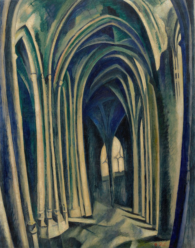
Saint-Séverin No. 3, 1909
Robert Delaunay had chosen to paint the interior of the Parisian Gothic church Saint-Severin for this painting. Although this is not a complete abstract, it is a form of abstract called cubism. The lines and forms within in piece are very straight, bold, and geometric. Furthermore, Robert only used about 4 colors but still be able to present the effect of lights. I like that it has a sense of depth although it is only a painting of a corridor, which proves that his skills are incredible.
Nude woman reading, 1915
Nude Woman Reading is another piece of my favorite since I am very much into nudity art. I think the way he played with lights was clever because it enhances the body forms beautifully yet remains abstract. I wish there would be more of this painting in terms of visually. Overall, this indeed one of his most beautiful works.
Sun, Tower, Airplane, 1913
Once again, nobody could deny that Robert Delaunay was a genius in controlling vibrant colors. He did an outstanding job of drawing attention to the left upper corner by introducing strong contrast between colors. The name of this painting is Sun, Tower, and Airplane, which is explicit because I can realize all those factors. The tower looks like it is the Eiffel tower since I recognize the shape from his other paintings. Furthermore, the boxes in the upper-middle seem like a plane without its machine. All those little parts combined had created such nice color harmony. I am a true fan of this particular piece because of all the things I have described above.