Survey 9: The American Dream and The Kool Drinks

“The Great American Novel”

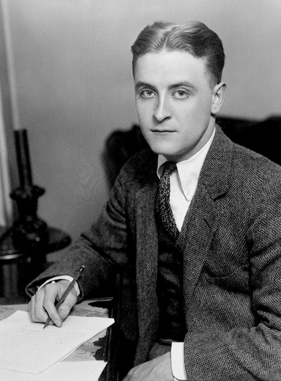
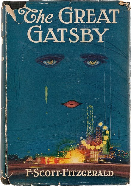
The Great Gatsby is a novel written by an American author F. Scott Fitzgerald. It is a novel that could be one of the best representations of America’s culture in the ’90s as well as the “American dream”. Besides, the 1920s was the time when the majority became disillusioned of the societal norms. In other words, the lifestyle whereas self-pleasure was the main focus. The reason why it became so popular was because of the moral of the story, which is: we must learn how to be satisfied with the circumstances we are living in.

Photograph of F. Scott Fitzgerald c. 1921, appearing “The World’s Work” (June 1921 issue)
Cover illustration by Francis Cugat (1893–1981). Published by Charles Scribner’s Sons. 

It is not just a book; it is a culture. 

The fact that the book was written in the 1900s, about the 1900s, and for the 1900s’ people made it a representation of its own. Also, it has become a part of American high school and now Canada, which also enhances this fact. 

In summary, the Great Gatsby is about a millionaire Jay Gatsby who has worked “hard” his whole life but ends up with an unhappiness death because he always wanted more. Gatsby wants not only a perfect life but also a future of his true love, which he never gets. The whole story signifies the American dream, or to be exact, the illusion of having a great life in America.

The Great Gatsby Movie, 2013

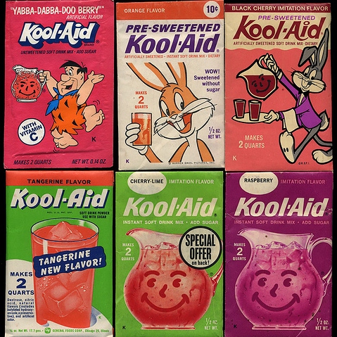
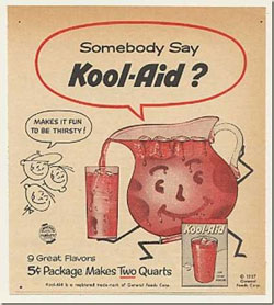
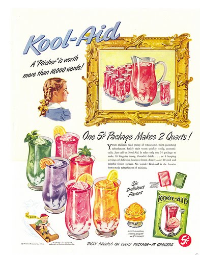
Kool-Aid, 6 packs of instant cool drinks with vitamin D for only 5 cents

Kool-Aid is a powdered instant drink that comes with a variety of fruit flavors. Originally, there were only 6 different flavors such as Cherry, Grape, Lemon-Lime, Orange, Raspberry, and Strawberry that came out later. There is an interesting fact about Kool-Aid: the recipe for Kool-Aid was created in the creator’s mother’s kitchen.

Kool – Aid flavors, 8track.com

Kool – Aid. So Cheap!

Kool-Aid started to become popular when the Great Depression began. It was not only about the flavors or the bright colors that helped the company successful. The price of a single packet of Kool-Aid is as low as 29 cents today and less in the past, which makes it difficult to compete with other competitors. The fact that the demand for Kool-Aid rose during the Great Depression proved that Kool-Aid was and still a unique product to date.

Personal opinions about the topics:

The Great Gatsby is indeed a unique novel in its way.  The book has inspired me in many ways, especially in terms of achieving the actual dream of having a perfect life. I am happy that I could have a chance to come across it again in this blog post. 

I find that I am more informed about Kool-Aid because I have never heard of this type of drink before. I learn that Kool-Aid is almost as big as other beverage companies like Coca-Cola or Pepsi. Furthermore, there is a story about a massacre that is related to Kool-Aid, which is Kool to read but not Kool because almost 900 people had died. 

In my opinion, there will always be stories in every period, and as graphic designers, we must try to read as much as we could. Researching will always be a vital skill because it helps us gain more insights about the company or the product. The topics assigned might not be absorbed; however, the purpose of the blog posts is not for us to remember the facts since it serves as a way for a design student to develop a habit of doing in-depth research about different topics. Hence, I would say this has been a not-fun assignment, but it does build up my tendency to do research and give my voices to the subjects.

Sources:

  • https://www.theguardian.com/books/2013/may/03/what-makes-great-gatsby
  • https://www.britannica.com/topic/The-Great-Gatsby
  • https://blog.prepscholar.com/the-great-gatsby-american-dream
  • https://kool-aiddays.com/history/
  • https://incitrio.com/how-kool-aid-a-90-year-old-icon-has-stayed-famous-for-so-long/

Survey 6: Level Up! We are not playing with paintings anymore, this is the new age. The age of motion pictures and great graphic designers.

The Lumiere Brothers and The First Moving Picture

All of us need to know who are the ones that had built a foundation for the big screen and movies. The ones who showed the first moving pictures were the Lumiere brothers, Louis and Auguste Lumiere.

The Lumber Brothers, national geographic.com

What did they actually invent?

The Lumiere brothers invented a camera that is capable of record, develop and project film. It was a phenomenon at the time when they released their first movie night. The invention was not just about movies, it was the start of a new design aspect in communication design. In other words, it created new jobs such as designing posters, advertising campaign for the entertainment industry.

The world’s first movie poster, photograph by Oronoz/album, national geographic.com

The race for better quality

The success of the Lumiere brothers sparked a light of opportunity for others to take part in the industry. Same as today, there is always some new technology advances in terms of quality of the still and motion pictures. As the cinema industry grew, many people as well as the brothers started to develop in new projects. Because of that, the creation of color photography and later the color film was invented.


Will H. Bradley, the guy who used graphic design as a medium for creating art

The demand for books grew, so as the need for decoration of cover books. Will H. Bradley was known as an American graphic artist in the late 19th and early 20th centuries. He was specialized in designing book covers and some aspects of architecture. However, the unique thing about this graphic designer is that his style was quite different from the other designers. Bradley had used quite a few designing techniques of gestalt principles, which made it so modern compared to other designer’s work.

Posters in Miniature by Percival Pollard

The Chap Book, what is it?

The Chap Book is the name for an American literary magazine from 1894 to 1898. It was a small publication, or can even be considered as a mini zine. 

The Chap Book Covers. Covers or Art?

There were a variety of covers versions of the Chap Book, mostly designed by Will H. Bradley. The Chap Book had become so successful because the masses were obsessed with his work. Therefore, he had to create many separated “The Chap Book” posters for poster collectors or favorite customers. It came to the point where the publisher had printed some posters designed by him as a limited edition, signed by Will H. Bradley himself and marketed as “fine art”.

The Chap-Book, Thanks Giving No., 1895
The Chap-Book, 1895
The Chap-Book, 1895

Personal opinions about the topics:

I think this is one of my favorite surveys because of the creation of motion pictures. The Lumiere brothers had left a legacy for the visual communication world. They might think that they have only invented movies, but the truth is they had raised the industry to another level of the playing field. Creativity is built upon the past. Hence, without the knowledge of the past, we would never be able to thrive and become better.

Sources:

  • https://collection.cooperhewitt.org/objects/18697935/
  • https://exhibitions.lib.udel.edu/will-bradley/
  • https://www.nationalgeographic.com/history/magazine/2019/01-02/creation-of-the-motion-picture-lumiere-brothers/
  • https://www.nationalgeographic.com/news/2015/01/150131-pictures-autochrome-color-photography-history-people-culture/

Futura, The Type of The Future

This is one of my favorite projects to date in this class. The most important thing that I can take out of this project is the process of creating things by hand. As a designer, it is important that we need to understand the basics of designing. In addition, software should only be seen as tools and tools only. 

For this particular project, I chose Futura as my topic for research. Futura is an interesting typeface that has been inspired by my favorite design movement: the Bauhaus. I had decided to use multiples mediums for my zine because I wanted to have different textures. Typography is not a compelling subject when it comes to adding pictures and illustrations; However, having textures will give it a sense of crafting like old typo masters had done in the past. Personally, I think this project helped me to remember the history and characteristics of the typeface that I chose. It is a useful assignment for learning purposes, and to have a deeper insight into the technical side of the typeface. Overall, I would give myself an 8/10 because I had spent a lot of time on this project including printing, gluing, cutting, etc. I would not say that I have the prettiest zine of all, but I am happy with the outcome of mine.

Survey #4 Equality for everyone, an idea that had changed the world

Equality. A never-ending-problem in human’s society.

Pyramid of Capitalist System

Before the invention of printing, exchanging ideas was not an easy task because the majority were illiterate and books were expensive. However, revolutions started to occur when the masses could read and realized that they did not have to abide their whatever circumstances given to them.

We would always seek for equality, despite any ideas that promote it. An idea is just a way for us to achieve it faster because we don’t have to fight alone. Although the intention of Communism had been proven wrong, the core value remains relevant to today’s society. It is the encouragement that children must have a proper education to get a career and ends up with a sustainable life. In other words, to be obedient and follow the hierarchy is essential to our life. It acts like a cycle that never ends. Is it true that we are equal, or the system has gotten much more advanced?

I believe a doubt has given that we could be excellent in some areas of our life, and with those skillsets, we could become successful. The fact that we are all humans, we are alike, make us think that we are not different is indeed compelling. However, there is a hidden truth that most people would never understand: no one wants to give up their position in life. Hence, the creation of equality and the middle class is the key to convince the masses that we could always be successful if we worked hard enough.  

How could a 30-pages book had developed into an idea for numerous revolutions around the world?

The Communist Manifesto, First Edition in German

The Communist Manifesto was not just a book. It was an idea that a society must not exist only in two classes, which were the capitalist and the working class. At the beginning of the industrial revolution, there were some issues regarding wages and exploitation. The gap between the wealthy and the poor was too far. People went mad and revoked when they realized they could do it successfully as a collective. The idea gave them strength and acted as a light among the darkness when people were at their lowest point in life.

A scene from the German March 1848 Revolution in Berlin

The best-seller

Ironically, an idea hated by most countries in the world has become one of the best-selling books of all time. According to Deutschland.de, there are about more than 500 million copies sold. The book had also earned its achievement as the world UNESCO Heritage document.

This particular object has marked a vital phase in the history of humankind. It shows the basic needs of human rights, and the will to speak up for those needs.

(This blog post alone only talks about the idea itself, not on how leaders in the world have manipulated it for their own benefits. An idea does could not cause any form of harm but the one who controls it can.) 

Sources:

Survey 3# The Medici Family

Art is not only for the rich

The Italian Renaissance would never be born without the money from the wealthy family from the first half of the 15th century. Florence, the city where all famous artists and architects had gathered such as Leonardo Da Vinci, Brunelleschi, Sandro Botticelli, Michelangelo Buonarroti, and many others. There was a powerful family that had brought all of them together: it was the Medici Family, especially Lorenzo De Medici, the catalyst for an enormous amount of art commissions.

The Medici Family

How did the Medici contribute to the design world?

In terms of design, funding money for extraordinary architectures and sculptures might be their biggest accomplishment/contribution. For example, the Uffizi Gallery, the Boboli Gardens, the Belvedere, the Medici Chapel, and the Palazzo Medici are some of the notable architectural commissions by the Medici. Hence, this foundation of Renaissance art had become an inspiration for many other artists in every kind to thrive and to create more art in many different ways. 

As art thrives, so does the church and the need to believe in something larger than ourselves. The purpose of art in the 15th century was very different from today; art was seen as a way to communicate with the mass population in which most of them were illiterate. Human tends to seek for the help of the above for strength as we face the pain of this world, and God was the only one who could give them that kind of belief. The increase of the need to understand God had contributed to the creation of books and typography, which later became the foundation for communication design.

Florence, Tuscany, Italy: the outside of the Uffizi Gallery (Italian: Galleria degli Uffizi), famous art museum which holds a collection of priceless works, especially from the Renaissance period
The Medici Chapel in
Cappella dei Principi, Medici Chapels, Florence Florence
Example of pages of an Illuminated Script (The book of god)

Art was just art, or it was power?

This has been an on-going topic for various art critics because it is indeed easy to think that the church and the wealthy family were working together to use art as a tool to get money from people. Most of the large projects often got paid by the taxes of the people throughout Europe. Michelangelo’s ceiling for the Sistine Chapel was a major example of those payments. However, it is also hard to not believe that art was not power since almost everybody was happy with the masterpieces. 

Art could be seen as power to the wealthy people, but to the working class, art is how they could communicate with god. If that believes helped them got through the day, then art might as well be seen as just art because it gave humanity a purpose to live.

The Sistine Chapel, Michelangelo

Sources:

  • https://www.artsy.net/article/artsy-editorial-italian-renaissance-wealthy-patrons-art-power
  • https://courses.lumenlearning.com/suny-hccc-worldhistory/chapter/art-and-patronage/
  • http://www.themedicifamily.com/Cosimo-I-de-Medici.html
  • https://www.ancient-origins.net/artifacts-ancient-writings/beautiful-decorative-and-sometimes-crude-illuminated-manuscripts-020670
  • https://www.italymagazine.com/point-of-interest/uffizi-gallery
  • https://www.thoughtco.com/the-sistine-chapel-ceiling-by-michelangelo-183004
  • http://www.florencemuseumguide.com/medici-chapels/

Blog post #3 Baroque

Annibale Carracci Self Portrait

Annibale Carracci, a member of the Carracci family that consists of three painters: Agostino Carracci, Lodovico Carracci, and Annibale Carracci. He was the most standout of the three painters in his family and the one who was creating a movement about “recovering the old tradition of the High Renaissance from the affections of Mannerism” (Britannica.com). Unlike what the Mannerist had done, Annibale Carracci was aiming for recapturing the simplicity and beauty instead of deliberately contradict those two factors. This unique way of approaching art could be seen from some of his works such as The Beaneater, The Laughing Youth, and Butcher’s shop. In other words, Annibale Carracci wanted to bring back the simplicity of the Renaissance style combined with the way artists use light and colors in the Baroque era. In my opinion, I would prefer Annibale Carracci’s style rather than the Renaissance because of the playfulness of his themes; He would paint ordinary subjects and still be able to convey such beauty as the Renaissance’s artists would paint about religious stories. Hence, there is no doubt that Annibale Carracci could be seen as one of the founder of the Baroque art, in which had inspired many artists after his time.

The Beaneater, 1583

The Beaneater is probably one of my most favorite pieces of Annibale Carracci because of its candid atmosphere. Although this painting would not be considered as innovative today, it had been seen as different in the 19th century when most artists would choose to paint biblical figures and portraits of prominent society members. I love how Annibale had given the people nowadays an insight of a glimpse of a working-class person in the Baroque era. 

The Laughing Youth, 1583

There aren’t many pieces back then that could capture the expression of a person’s face, especially when they are laughing. This piece might not show any influence in the history of art but it does give us a bit of information about the artist himself that Annibale Carracci was a huge fan of caricature. It also shockingly appears to me about this painting is the fact it looks very modern, which proves that Annibale’s vision was ahead of his time. 

The Butcher’s Shop, 1580s

I love the fact that although this painting has some disturbing elements such as flesh, blood, and death; however, it does not make me feel disturbed at all. I think Annibale Carracci had succeeded in creating harmony in a butcher’s shop, which was not an easy task for any artist in that period because of its negativity and chaos.  

Boy Drinking, 1582 – 1583

Boy Drinking is a perfect example of Annibale’s vision of reforming the world of art at his time. It shows a close observation of the real world as a naturalist like him should do. I like the inelegant movement of the figure, the distorted lights, and images through the glass. Overall, this painting alone would not be able to tell us anything. However, if we placed it with the other painting of early Baroque, we would see a huge difference in terms of innovation and revolution. 

The Love of the Gods, 1597 – 1607

This is his most gigantic work, and it was also his final work as an artist. The fact that it took about 11 years proves that this could be one of the most important works in the Baroque era. I love this combination of paintings because of its joyfulness and the harmony connections between the pieces. There were a few nude paintings in the Renaissance and Baroque, but to reach this level of massiveness was something that can be considered unbelievable. 

Source:

  1. https://www.theartstory.org/artist/carracci-annibale/artworks/#nav
  2. https://www.metmuseum.org/toah/hd/carr/hd_carr.htm
  3. https://www.britannica.com/biography/Annibale-Carracci
  4. https://www.nationalgallery.org.uk/artists/annibale-carracci

Blog post #2 Mannerism & High Renaissance

Raphael’s Self – Potrait

Raphael was known as an exceptional Italian artist and famous in the High Renaissance, particularly the Italian Renaissance. He was well known because of his “intricate and expressive personal style” (Biography), which was heavy influenced by his principal teachers in Florence. There are resemblances of Leonardo Da Vinci and Michelangelo techniques in Raphael’s paintings since he had moderately used Leonardo’s chiaroscuro and sfumato in most of his work. However, the goal that Raphael was aiming at was nowhere near those masters, it was a completely different path. He wanted his style to touch every single aspect accessible form of visual communication yet has a calmer feeling compared to the dark intensity of his teachers. In my opinion, Raphael is a master of his style because of the way he had harmonized all of the figures despite the chaos atmosphere, which was an outstanding achievement back then. “School of Athens” is a great example of this chaotic beauty, it looks vivid as well as engaging like it is inviting the viewers to “enter the space” (theartstory) and to be engulfed in the scene. I could feel the bright, cool light within those marvelous marble walls and statues. It is indeed that Raphael was a leading artist of Italian High Renaissance classicism which had later influenced many in the Baroque era.

The Deposition, 1507

I think it is the mixed feelings that make me fall in love with this piece. I could both feel disrupted yet pleasant at the same time. Raphael had used his chiaroscuro technique to convey the pain of the figures, especially the face of Jesus against the man’s chest which created these deep shadows that look like Jesus slowly sinks in the darkness. The pleasant feeling comes from the background, it reminds me of the rural paintings that always give the viewer a sense of calmness.

Transfiguration, 1520

 From my point of view, this painting is so powerful because of how Raphael had separated it into two different atmospheres. It has this strong contrast that draws the viewer’s’ attention to Jesus and the glow behind his back. I love the fact that I could feel the surprisingness of the figures on the ground as Jesus about to soar into the sky. Raphael was good at showing the tightness of the scene, which I think is also another excellent proof that he was a great artist at the time.

The Marriage of the Virgin, 1504

I love how Raphael was playing with perspective in this piece. I also love the feeling it gives me as I take a closer look at it, which is the pleasantness and loveliness of this marriage. It is not a very crowded marriage, but only with a few important figures. He also created groups of figures far away, circling the building which contributed to the overall dept. The painting is easy to understand yet does not make one feels bored. It appears that Raphael had put mindful thoughts into this piece.

Disputation of the Holy Sacrament, 1510

This is another painting of Raphael that shows how good he was with his techniques. I think that ‘Disputation of the Holy Sacrament’ is not lively as ‘The School of Athens’ but it allows us to take a look at another Raphael’s techniques, the ability to create liveness within a crowded space (tight space). If anyone could observe this piece close enough, they would be able to see that there is an order within the chaos. Every single figure in the painting is interacting differently, it seems like they are all engaging in the subject matter placed in the middle. 

The School of Athens, 1509 – 1511

Depth and Brightness are the two most standout elements of this piece, and it is also the reason why I love this painting more than the others. As a viewer, I feel like as I am standing in another room of the building, watching the figures having conversations. It feels so lively, which is super extraordinary that an artist could pull this off. Sometimes I wondered if Raphael’s method of painting is better than Michelangelo’s just because of this particular piece.

Source:

  • http://www.raphael-sanzio.com/self-portrait/
  • https://www.theartstory.org/artist/raphael/artworks/
  • https://www.biography.com/artist/raphael
  • https://www.britannica.com/biography/Raphael-Italian-painter-and-architect

First time using InVision, please don’t take it seriously.

A screenshot of a mood-board project, 2020

InVision is great for making mood-board; however, I still think Google Presentation or Powerpoint would be easier to assemble pieces of information and to present. The period in history that I was given is the Baroque and Rococo (1450 – 1750). There were 3 events that I chose to make some research in this project, which was:

  1. The discovery of using a telescope to observe celestial objects (Galileo Galilei)
  2. The invention of The Gutenberg Press (Johannes Gutenberg) 
  3. Caravaggio and how he had made an impact in the world of painting

This project is a fairly good project for entry-level designers, or first-year design student to study the process of making a mood-board. As I mentioned, InVision is good but it is certainly not the one that I would recommend to others. In reality, creating a mood-board is a more complex process because of the diversity and flexibility of the brief. Time and the size of the project will decide on the number or the complication of the mood-board. By saying this, I am not trying to devalue the importance of this project but only for the reflection of my experience in the creative field. I love this project despite its boringness content and the kind-of-confusing tool because it reminds me of the reality of being a communication designer, which is to create for others and to others. Indeed, designing is not a medium for self-expression as Peter Saville once said in his interview. The truth of being a communication designer is that we are not artists, but we are the experts in solving problems by using images. There will always be work that would make us want to question ourselves that “if this has been the right choice?”. For all of the reasons I have said in this blog, I would again want to clarify that this is a great project and I would love to recommend this to the later first years. I know that InVision is not the best way to create mood-boards but sometimes you just gotta do what needs to be done.

Self – Assessment: I would happy to give myself 7/10 for this project because I can’t even believe that I would be able to pull this project off. Personally, I don’t think this moodboard project requires any creativity but somehow I did manage to have some connections between topics. Although some of the connections might seem vague but due to the oddness of the brief, I would say I am satisfied of my ability to tie unrelated things together. I did more than what needs to be done; therefore, 7/10 might be a good marks to be considered.

Survey 1# Blue eyes, a symbol of god

Uruk archaeological site in 2008, the largest city in the world around 2900 BCE.

Background history of the Sumerians Civilization:

  • The Sumerians were one of the earliest civilizations, along with Ancient Egypt and Indus Valley.
  • The Sumerians are arguable to have one of the largest cities in the world; At its peak, their city used to contain about 40,000 to 80,000 people living inside of multiple defensive walls.
  • One of the most crucial cultural achievements of the Sumerians was the linguistic record. They had the oldest as well as the earliest form of writing that appeared as far back as 4000 BCE. It is called Cuneiform, the main purpose of this writing was to make records of trades, rationale, and ownership.  
A cuneiform clay tablet dating to the Early Dynastic period in Sumer, approximately 2500 B.C.
Photo courtesy of the Oriental Institute of the University of Chicago

Sumerian Art and Statues – The mystery behind the blue eyes:

  • It is effortless to recognize the Ancient Sumerian statues because of the big eyes. The statues were created differently, nothing was alike. 
  • Art at the beginning of times were often related to the spiritual world, especially from the Sumerians civilization. They used to have a complex pantheon of gods and goddesses, and their gods were represented in human form as any other gods from the ancient civilizations.
  • Some of the statues that represented gods and goddesses usually had enormous blue eyes. This representation of gods was not only existed in the Sumerians culture but also many other civilizations. 
  • There is no certainty of the meaning behind the big blue-eyes statues due to the limitation of recorded texts from that period. However, despite the limitation, blue eyes were seen as a symbol of gods because the majority of them are looking up upon the blue sky, which can be depicted as heaven.
Pictures of different statues from different ancient civilizations, the Sumerians civilization was one of them

Opinion of my own about week 3 lecture:

The week 3 lecture is the first lecture and it is indeed an interesting one. I have got to say that I was impressed by how early they used to recognize the importance of images and words. After going over this lecture by myself again, I have had a much clearer understanding of the development and power of symbols and images in our lives. History had proven for thousands of years that an image could hold much more meaning than 1000 words, and we as future communication designers must acknowledge that it is our heritage to preserve and continue to build upon it.

“Communication is the key to us to thrive upon other species, without it, we would never be able to be seen as human.” – Nguyen Quoc Huy Anh

Sources:

  1. Lloyd, Ellen. “Mysterious Sumerian Statues With Big Blue Eyes – A Sign From The Gods.” Ancient Pages, 11 June 2020, www.ancientpages.com/2017/02/23/mysterious-sumerian-statues-big-blue-eyes-sign-gods/?utm_source=newsletter. 
  2. Lerner, Louise. “Miguel Civil, World’s Leading Scholar of Ancient Sumerian, 1926-2019.” University of Chicago News, 1 Feb. 2019, news.uchicago.edu/story/miguel-civil-worlds-leading-scholar-ancient-sumerian-1926-2019. 
  3. History.com Editors. “Sumer.” History.com, A&E Television Networks, 7 Dec. 2017, www.history.com/topics/ancient-middle-east/sumer. 

Visual Research II

Closure

Skopje is a poster designed by Fons Hickmann for an international competition with a purpose of celebrating the competition’s 10th anniversary in 2017. Fons Hickmann had used the closure of adhesive yellow strips to create a red star shape. The colors represent the Macedonian flag.

Skopje Poster, 2017

Proximity

Poster designed by Boris Bućan for Zagreb Symphony Orchestra and Chorus RTZ in 1986. He had altered the lines close together to create shapes of human figures by using proximity.

Musical Experiences: Zagreb Symphony Orchestra and Chorus RTZ (Radio-
Televizija Zagreb) (Poster for a performance at Lisinski Concert Hall, Zagreb), 1986

Addition interesting work (combination of different Gestalt principles)

Print by Larry Carlson. This piece/poster/artwork is super interesting because I think he had used proximity and closure to create this trippy, illusion effect of two women hugging each other.

Wavy 2, 2020