First Ever Infographic Poster

Although there was some confusion as I started this project, I had managed to finish it. I think the most captivating factor about this poster is the vintage appearance, which gives it an “old typography” vibe.

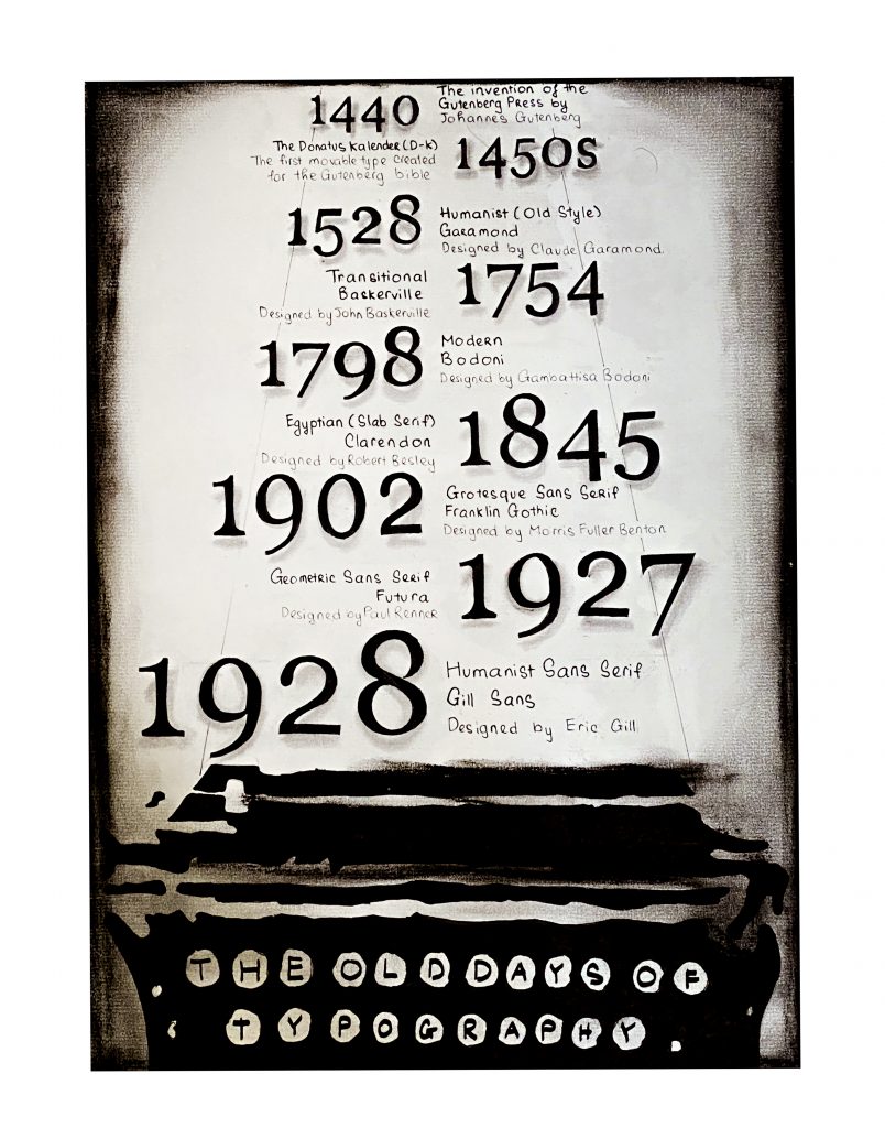
I decided to draw a typewriter because I love the aesthetic look of it. Also, besides the fact that it is much smaller than the Gutenberg to draw, it fits with the concept that I wanted. For the context, I put in information about the essential type classifications from the invention of the Gutenberg Printing Press until the end of WW2. I stopped at 1928 because I would go over 1945 if I continued with the classifications.

The classifications I talk about are:

  1. Humanist or Old Style
  2. Modern
  3. Egyptian or Slab Serif
  4. Transitional Sans Serif
  5. Geometric Sans Serif
  6. Humanist Sans Serif

In addition, I include a piece of information that I don’t think is popular in the typography world, which is the NAME of the type Gutenberg used for his bible, which is: Donatus Kalender or D-K

Overall, this is a good assignment to help first-year like me to get an idea of what are infographic posters.

Self-Assessment: I would give myself a 9/10 because I love the concept of the poster, and I think others would appreciate it as I do too. The reason why I don’t give myself a 10/10 because of my hand-writing; I reckon it is not that good to receive a 10/10.

Research Links:

The Gutenberg Press:

https://www.google.com/url?sa=t&rct=j&q=&esrc=s&source=web&cd=&cad=rja&uact=8&ved=2ahUKEwishaDU3JbtAhWWPXAKHW9JB20QFjAPegQIFBAC&url=https%3A%2F%2Fwww.newworldencyclopedia.org%2Fentry%2FJohannes_Gutenberg&usg=AOvVaw0jqlnHJiG9sVOppY0APT0u

Bodoni:

https://www.google.com/url?sa=t&rct=j&q=&esrc=s&source=web&cd=&cad=rja&uact=8&ved=2ahUKEwiZoYL81JbtAhUEMN4KHRGVDPcQFjADegQIBxAC&url=https%3A%2F%2Fwww.fonts.com%2Ffont%2Flinotype%2Fbodoni%2Fstory&usg=AOvVaw19YyXQZ1BRcM0YYRRNPC1J

Baskerville:

https://www.google.com/url?sa=t&rct=j&q=&esrc=s&source=web&cd=&cad=rja&uact=8&ved=2ahUKEwiwyLaf1ZbtAhXKbt4KHbs3CX8QFjASegQIBBAC&url=http%3A%2F%2Fidsgn.org%2Fposts%2Fknow-your-type-baskerville%2F&usg=AOvVaw2d-UxmuxrJc4HkNNVCSGP0

Garamond: 

https://www.inkwell.ie/typography/

Clarendon:

http://www.meaningfultype.com/clarendon.html

https://www.google.com/url?sa=t&rct=j&q=&esrc=s&source=web&cd=&cad=rja&uact=8&ved=2ahUKEwjNpe3j_pbtAhWVLqYKHQouC6MQFjAQegQIDBAC&url=http%3A%2F%2Fidsgn.org%2Fposts%2Fknow-your-type-clarendon%2F&usg=AOvVaw3cFSJDnEidygCNQrMFLDjW

Gill Sans:

https://www.google.com/url?sa=t&rct=j&q=&esrc=s&source=web&cd=&ved=2ahUKEwjV1vXS15btAhVXQd4KHaaXB1IQFjACegQIBRAC&url=https%3A%2F%2Fwww.wired.com%2F2015%2F11%2Fgill-sans-one-of-the-most-popular-typefaces-ever-is-reborn-for-the-digital-age%2F&usg=AOvVaw1EdN9Fr6msvXrEeTt8rSCl

https://www.google.com/url?sa=t&rct=j&q=&esrc=s&source=web&cd=&cad=rja&uact=8&ved=2ahUKEwiDjO3y_5btAhWnyIsBHV0OAuAQFjABegQIDBAC&url=https%3A%2F%2Fwww.bbc.com%2Fnews%2Fmagazine-35916807&usg=AOvVaw1c1vAGVUH6NYegLajX-JuA

Futura:

https://design.tutsplus.com/articles/all-about-futura-font-and-its-history–cms-35382

Franklin Gothic: 

https://www.fonts.com/font/itc/itc-franklin-gothic/story

D-K:

https://www.liquisearch.com/old_english_text/forms_of_black_letter/donatus-kalender

Eastman Brownie Kodak, The One Dollar Camera Box

I would say that this project is enjoyable because it reminds me of the joy of handmade art. The most important thing that I learned from this project is to fall in love with the process of making art. 

To begin with, I chose to make the Eastman Kodak Brownie Camera because I love photography, especially portrait photography. Also, I have been a freelance photographer for two years, and I love every single moment during those times. Therefore, to recreate the one dollar camera box was the perfect choice for this assignment because it was an opportunity and a motivation for me to expand my knowledge about the history of photography

Planning Process:

I started by sketching the imaginary shot because I wanted to make sure I knew what I was doing. I also sketched out the elements that would be included in the picture to enhance the message. After I finished my planning process, I began to move on to the camera itself.

Props:

There are two crucial elements in the shot: the films and the camera package (camera and the box). However, I could not re-create the roll film. Because of that, I had to buy it as props. The film I used in the shot was the film that people used in the late 1900s. Besides, the description that I made looked like an actual advertisement poster when Kodak introduced the camera.

Self-Self-Assesment:

I would give myself a 9/10 because I had put tons of effort into perfecting the shot. The shot is not as perfect as I wanted because I did not have the luxury of finding a similar background as in the 1900s; however, I did try my best to both meet the expectations of the assignment and made it looked like it belonged together.

First English 100 Post

About me:

My full name is Nguyen Quoc Huy Anh but I prefer to be called by Alex. To have an opportunity to be a part of this program has been one of my greatest accomplishments to date. For as long as I can remember, I had been advised to not follow art because art is considered unsustainable when it comes to seeking a sustainable career. However, since art has been the only thing that I am good at, I had decided to apply to various art/design schools around the world and Capilano was one of the universities I had been accepted to. Hence, I choose Capilano because I believe that with an effective compact studying system, this is where I could unlock all of my artistic potentials. Capilano is the beginning of my journey, yet it wouldn’t be its finish. The path I have picked probably won’t be the fastest way to success, yet it is without a doubt the proudest path in my life. 

Summary of “The Importance of Urban Forests”

I wrote this summary as a small assignment for English 100 on an article about the benefits of having trees in urban areas.

Amy Fleming’s article “The Importance of Urban Forests: why money really does grow on trees” (2016) suggests that the people who are responsible for the development of urban areas should take a closer look at the values of growing more trees. Trees can help improve air quality, prevent water flooding, and save energy. A report from the New York City Park Department states it only costs $22m annually to maintain parks while the benefit of trees could save “up to $120m a year” (qtd. Fleming 3). Fleming’s point is that the benefits come from parks that are worth more than the maintenance cost. On the other hand, Fleming also lists out different ways that urban forests could influence the quality of life. For example, Geoffrey Donovan, a member of the US Forest Service, says that “the impact of trees on birth outcomes and found that mothers with more trees within 50m of their homes are less likely to have underweight babies” (qtd. in Fleming 5). Donovan is saying that trees can help reduce the general anxiety level of urban residents and reduce unwanted health problems. Overall, we need to settle on a choice whether we wish to preserve these values since it requires some investment to create a green environment because trees don’t grow overnight.