Blog Post #5 Canadian Design Today

It is impossible for graphic design students studying in Canada to not know who Jim Rimmer is because he is one of Canada’s most remarkable typographic figures. 

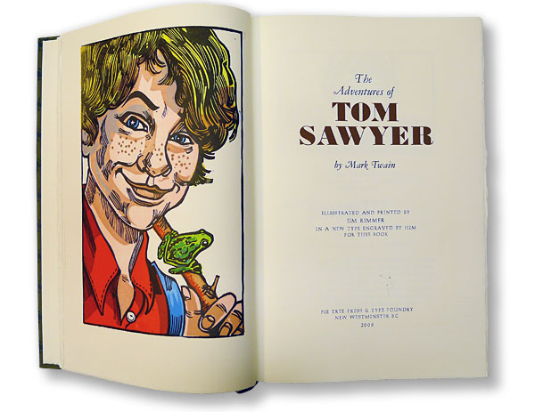
Jim Rimmer was known for playing many roles in the design industry such as a commercial artist, type designer, book designer, and mentor to countless artists; however, the works that had helped him become famous were his book design and type design. Shadow River, Charles Dickens’s A Christmas Carol, Mark Twain’s The Adventures of Tom Sawyer, Twain’s Adventures of Huckleberry Finn are some of the few books he had designed and participated in the printing process back in the 1990s. Moreover, Jim Rimmer was also an excellent type designer. There are six typefaces made traditionally by cutting out the metal and a lot more in digital format. The six typefaces were named to those important to him, such as Nephi Mediaeval (after his father, John Nephi), Juliana Oldstyle (after a daughter), Fellowship (in honor of the American Typecasting Fellowship), Albertan (after his wife), Hannibal Oldstyle (after Mark Twain’s birthplace), and Duensing Titling (after long-time friend Paul Duensing) (The Jim Rimmer Collection, 2005). 

Overall, Jim Rimmer had left a legacy of design works with top-notch quality, and I think that we as design students should learn more from him. His works might not be as appealing as the designs that we see today but they will never be outdated.

Blog Post #4 Postmodernism in Europe

Wolfgang Weingart is one of the iconic swiss designers known as the pioneer of ‘New Wave’ or Swiss Punk typography. 

To understand how he had developed the style known as Swiss Punk, we need to go back to the beginning of Weingart’s career in design. Weingart first started to take a step in the design world in April 1958 when he returned to Germany to attend a two-year program of applied graphic arts at the Merz Academy in Stuttgart. In those years, he had learned the fundamentals of typography, such as typesetting, linocut, and woodblock printing. However, the actual turning point of his life happened while he continued an apprenticeship at Ruwe Printing because he was able to discover a style called “Swiss Style”. The discovery of the International style was a start, but he was not consumed by it. In other words, after years of teaching and conducting numerous experiments with his students, he later found a way to create a new style called Swiss Punk by eliminating the strict elements of the Swiss-style as well as incorporated with his playful style.

Weingart is indeed one of the special designers that had become successful because he was not afraid of breaking the rules of graphic design. Later when he became an instructor at Basel School of Design, Weingart had tried to teach the new generations of designers to take a more adventurous path toward design because he believes in the limitless creativity that this career offers. 

Blog Post #3 Supergraphics Innovator

Barbara Stauffacher Solomon is a designer based in San Francisco that specialized in designing Supergraphics. Besides being a graphic designer, she has also trained as a classical dancer, an artist, architect and historian. 

Before diving into the projects that made Barbara become famous, we must understand her styles. Her work often mixes between Swiss Modernism and Californian Pop into a style called California Cool. In other words, it is a kind of style that evolves a lot of geometric shapes combined with the signature colors of Californian Pop such as blues, yellows, reds, greens and oranges. The colors all represent California at its best. 

Barbara became well known after her supergraphics design had been published in Life magazine. Although she was hired only to design a logo and brochure; However, as one thing led to another, she got commissioned to decorate the inside of one of Sea Ranch’s areas. In my opinion, I think the most important lesson here is not about Barbara’s skills but her passion as a designer. She always treats design as a mystery that needs to be solved. 

Overall, Barbara is a very good example for the young designers working among all forms of design to learn from because she has shown the world that you don’t need to be exceptional to become successful. Design at the end of the day is just design, our purpose as designers is to make things easier to understand, not the other way around

Blog Post #2 Psychedelic Design Hero

Gunther Kieser is an exceptional designer who is not only well-known in the psychedelic era but also takes a further step in incorporating photographic elements in his works. Gunther Kieser is a German designer born in 1930 in Kronberg, Frankfurt. He has his studio where he founded with his friend, Hans Michel, in 1952.

It would be impossible to introduce the designer in a blog post because no words can describe enough the craziness and uniqueness of this man. Therefore, I would like to dive in some of the actual pieces created by him.

Personal Insights:


This is a poster he created in 1963 titled Jazz Band Ball, and it was a gift of the artist to an unknown person. I love how chaotic it feels because of the texture of the offset lithography printing technique. Although the poster was created a long time ago, it amazed me how modern it is if I could compare it with David Carson’s work. The fact that he had contrasted the blue background with the red/white flowers was so subtle that it is impossible to not say that it was a genius move.

Last but not least, I will end this blog post with a poster he created for a jazz concert in 1979. This particular caught my sight because of how Kieser was manipulating the texture to create a trippy effect. In my opinion, I believe he had used bubble wrap paper to achieve the overall bubbly effect of the jazz musician for the background.