Eric Gill Designed Gill Typeface Family for Monotype
(1928-30)
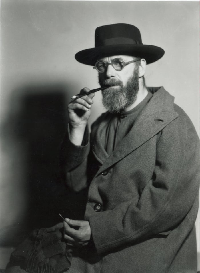
Eric Gill was an English sculptor, typeface designer and printer. He is with the arts and crafts movement which was a movement that start in England around 1860 until the 1920s where it slowly began to diminish. He was known as a controversial figure for his well-known religious views and subject matter generally being viewed in contrary to his rumoured sexual behaviour with his own daughters and erotic art in his sculptors.
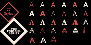
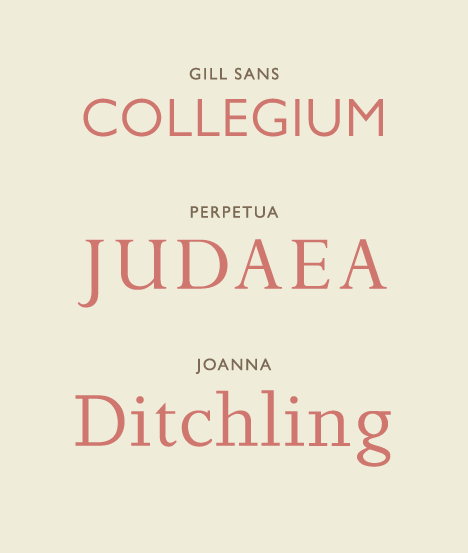
Eric Gill’s first typeface, Gill Sans was created in 1928 and is the type designer’s most successful typeface to this day. It was from the motivation and consultation of Stanley Morrison that Gill Sans was created. While both typographers were working together for Monotype Imaging Co. the two were able to develop many classical styles to serve the foundation of the new Monotype typeface library. Morrison was wanting to develop a modern face that could compete with the other popular sans serif typefaces of the time such as Futura that was created not too long before Gill Sans. It was Eric Gill’s letterforms that really intrigued Morrison giving him the job to create what is now calls the Gill Typeface Family; some of the typefaces included are Perpetua, Joanna, Aries, Pilgrim and more.
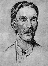
Eric Gill’s success really had his mentor to blame for his success, Edward Johnston. Johnston was famous for his typeface “Johnston” which was the London Underground’s Railways first typeface in 1918. Ironically Eric Gill superseded his mentor’s typeface with his Humanist sans serif typeface being more legible it took the Johnston typeface’s place for the London Underground. Gill’s influence from Edward Johnston was interesting as there is obvious visual similarities to one another’s typefaces keeping a classical renaissance style to the figures, but Gill went further than just keeping it classical, – and is probably why Gill Sans became so successful – since he added geometry features to the figure’s structure.
In conclusion to Gill’s typography designs, he would not have made it into the spotlight if it weren’t for his mentors pushing and influencing him along the way. It really opens up your eyes to how important a support system really is.
Citation
https://www.linotype.com/391/eric-gill.html