Times New Roman
Design Rational
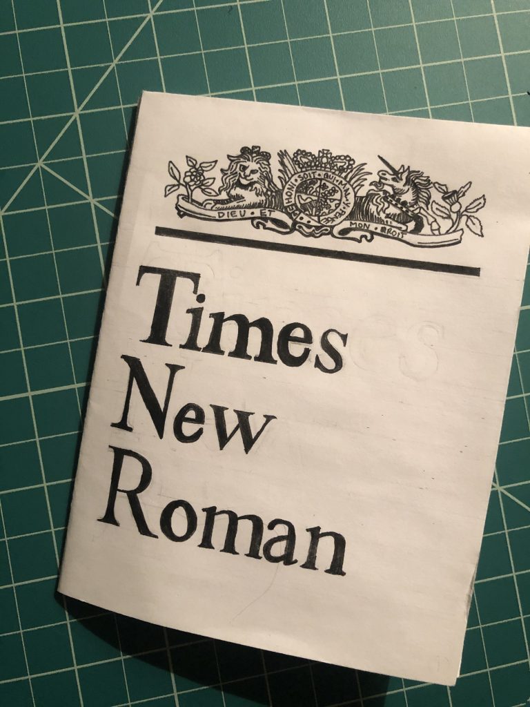
The reason I chose Times New Roman was originally because of its versatility throughout other languages and “glyphs”. I have always loved the Grecian letterforms and Times New Roman has the ability to use them (not that I incorporated them into my zine). Times New Roman was created for “The Times” Newspaper in London, England in 1932. In spirit of that my theme is a newspaper from the 1930s and because of this, it is purposely left black and white for that effect. The words are all tightly boxed together giving the feel of a multi-columned newspaper with overwhelming articles one after the other separated by their big headings which I attempted to draw in Times New Roman. To add the slightest amount of colour, I added in red for certain areas for emphasis but besides that I wanted to keep the theme as is.
From this assignment I was able to go outside of my comfort zone where I rarely even think to use a serif typeface as well as make a zine. I enjoyed working on this project quite a lot actually. Some information I found was quite interesting, for example the fact that Times New Roman is so overused and such a ‘default’ typeface that it is suggested by a number of articles NOT to be used and try something different.
Information from the Zine
Just in case there is difficulty reading the intentional tightly written writing, here is a digital copy below.
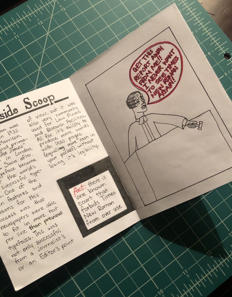
Times New Roman first was created in 1932 by Stanley Morrison. It was created primarily for The Times Newspaper in London, England and soon became one of the world’s top successful typefaces. One of the main features and reason for it’s success was that Newspapers were able to fit in more text per line than previous typefaces. This was not only successful from a journalist and editors’ point of view, but it was also very commonly used for law firms and research facilities. All for it’s ability to produce more words on less pages (equalling more cash in your pocket), without loose it’s legibility.

Stanley Morrison, a British typographer and historian of printing was hired to “The Times” in 1929 where he was appointed to create a typeface for them. “The Times” newspaper was in fact the reason for Morrison to be interested in studying type design in the first place after reading an article in 1912. From this new inspiration, he joined many publishers building his typographic experience. After a decade of experience, he was appointed the typographic advisor to Cambridge University Press where he worked intermittently till his retirement in 1960. Morrison for the majority of his career at the university, was also involved in other establishments, one of course being The Times Newspaper. While leading the creation of a new typeface, he was the supervisor of Victor Lardent. Lardent was an advertising artist for “The Times” and during the process of creating the typeface, he drew the letterforms. Unfortunately, there is no extensive information about Lardent other than being the hands behind the successful Times New Roman.
Citation
https://docs.microsoft.com/en-us/typography/font-list/times-new-roman
https://typographyforlawyers.com/a-brief-history-of-times-new-roman.html