Typography through the Years
Design Rational
For this project I was first very excited to start but when it came to the execution of it I failed quite miserably to my intentions. At first I was thinking to do an extensive timeline on typography highlighting selected type categories and typefaces and giving them all individual backgrounds to something they represent (eg. Gill Sans was made for the London Underground so the background would be a sign based off of that). Of course this was too ambitious soI decided to just colour the infographic is a few different colours. This did not turn out the way I wanted so I started to cut out the lettering I did and stick it onto a new piece of paper as well as the timeline. All the information is there which is why I am still giving myself 9.5/13 since all the research and information is there (and I will type it in here again as it may be hard to read), but my creativity was not successful as my self-doubt drove me into disliking my project. In light of my failure to be proud of this work, for myself I am going to redo this project. Not to be marked on but just to prove to myself that my initial idea can be handled and I can do it.
Writing & Research on the Infographic
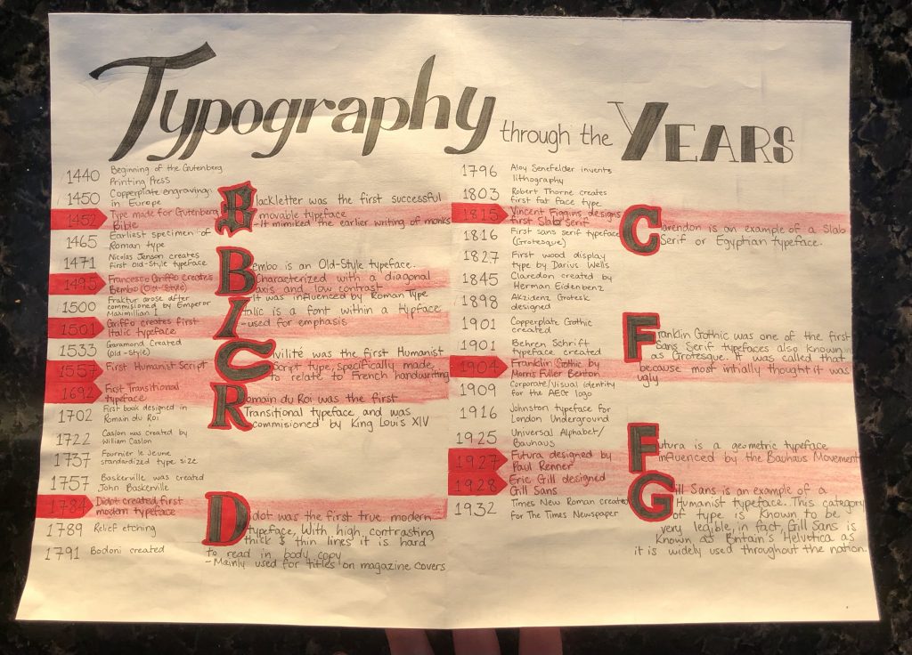
- 1440 – Beginning of the Printing Press
- 1450 – Copperplate engraving in use in Europe
- 1452 – Blackletter first moveable type created for Gutenberg Bible
Blackletter was the first successful movable type. It mimicked the earlier writing of monks.
- 1465 – First specimen of a Roman style typeface (Sweynheym and Pannartz)
- 1471 – Nicholas Jenson creates first Old Style Faces, Jenson
- 1495 – Francesco da Bologna (Griffo) created Bembo
Bembo is an Old-Style typeface. Characterized with a diagonal axis and low contrast. It was influenced by Roman Type.
- 1500 – Fraktur arose
- 1501 – Francesco Griffo creates the first italic typefaces
Italic is a font within a typeface family. It is a fully new creation of type, not just a slanted version of the regular font. It is used for emphasis and quotation.
- 1533 – Garamond typeface designed
- 1557 – Humanistic Script
Civilite was the first Humanist Script typeface. It was specifically made to relate to French handwriting
- 1692 – First Transitional typefaces, Romain du Roi
Romain du Roi was the first Transitional typeface and was commissioned by King Louis XIV. It is similar to Old-Style but the axis is vertical.
- 1722 – Caslon, old style typefaces
- 1737 – Fournier le Jeune, standardize type size
- 1757 – Baskerville created John Baskerville
- 1784 – Didot, first true modern typeface
Didot was the first true modern type, with high contrast with thick and thin lines. It is hard to read as body copy. Mainly used as a titles for magazine covers.
- 1789 – relief etching
- 1791 – Bodoni created (modern typeface)
- 1796 – Aloys Senefelder invents lithography
- 1803 – Robert Thorne, first fat faces typeface (display typefaces)
- 1815 – Vincent Figgins designs first slab serif typeface
- 1816 – First sans serif typeface by William Caslon IV (Grotesque)
- 1827 – Wood Display type by Darius Wells
- 1845 – Clarendon created by Herman Eidenbenz
- 1898 – Akzidenz Grotesk designed
- 1901 – Behrens Schrift typeface
- 1901 – Copperplate Gothic designed
- 1904 – Franklin Gothic by Morris Fuller Benton
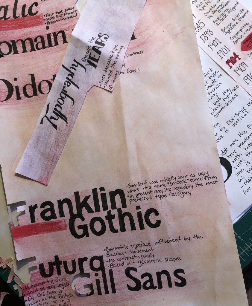
Franklin Gothic was one of the first Sans Serif typefaces also known as Grotesque. It was called that because most saw it as ugly.
- 1909 – corporate identity or visual identity for the AEG logo
- 1915 – Goudy Old Style was created by Frederic W. Goudy
- 1916 – Johnston typeface by Edward Johnston for the London underground
- 1925 – Universal Alphabet
- 1927 – Futura Designed by Paul Renner
Futura is a geometric typeface, influenced by the Bauhaus Movement
- 1928 – Gill Sans designed by Eric Gill
Gill Sans is an example of a Humanist typeface. This category of type is known to be very legible, in fact, Gill Sans is known as Britain’s Helvetica it is widely used throughout the nation.
- 1932 – Times New Roman designed, successful newspaper typeface
Citation
https://creativemarket.com/blog/visual-guide-to-font-styles
https://www.lifewire.com/old-style-typeface-1079103
https://en.wikipedia.org/wiki/Blackletter
http://luc.devroye.org/fonts-89919.html