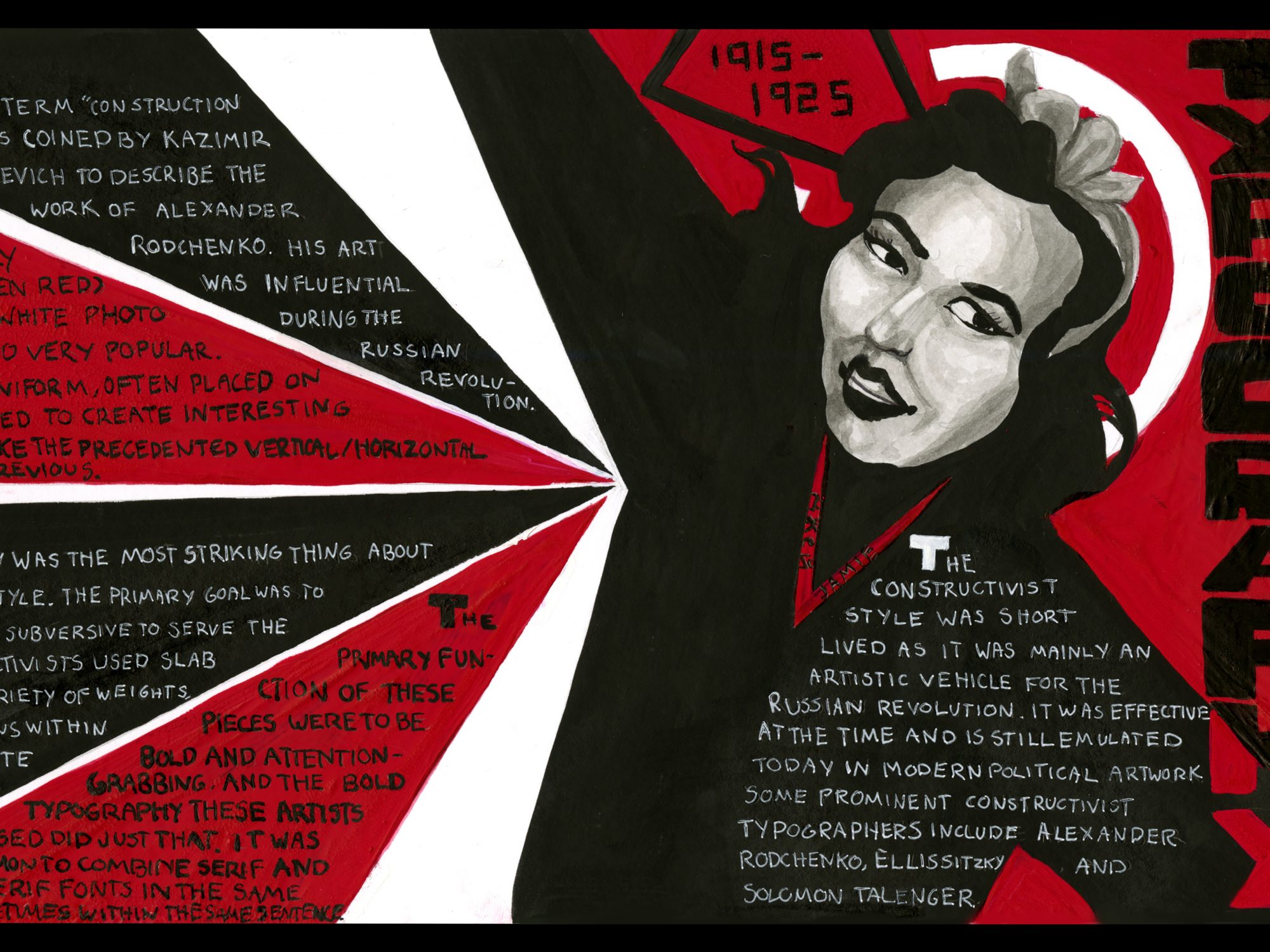

In 1917, the term “Construction Art” was coined by Kazimir Malevich to describe the work of Alexander Rodchenko. His work was very flat, and he wanted to eliminate any artistic brushstrokes within his work. Much of the artwork that came out of the constructivist era was as a direct result of the Russian Revolution following World War I.
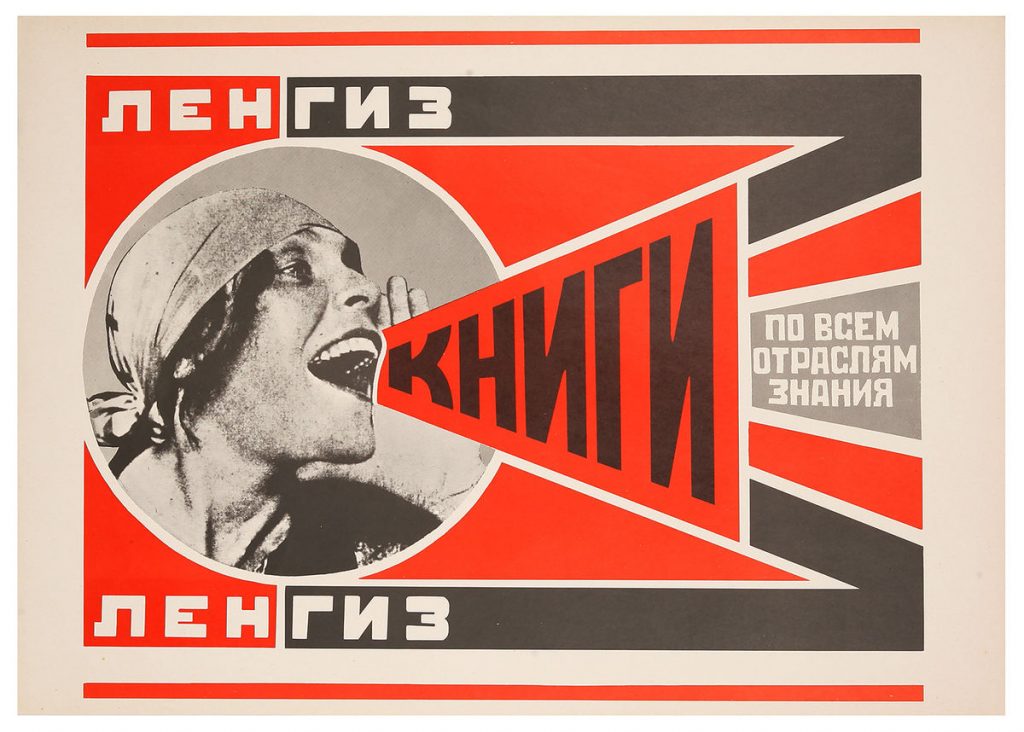
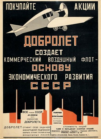
Characteristics of the Constructivist style include monochrome prints, usually using red, black and white, sometimes a bit of yellow, due to the expense of printing with more than one colour. They often featured photo collage, normally with the faces of smiling young people, who were meant to be the face of the future. Lines were no longer uniform, contrasting the squareness of the Bauhaus school in Germany and the works exuding from Europe, Russian Constructivism had bold, thick leading lines often at an angle, or creating sharp shapes that gave the eye a good sense of direction and created dynamic perspective.
The most striking thing about the Constructivist style was the typography. Due to much constructivist art being in service of the Russian Revolution, the Constructivist’s primary goal was to create something subversive in their typography to display that they were not victims of the previous institutions of the Tsar or the royal family.

In order to convey this, they used blocky sans serif lettering from a variety of typefaces in different sizes, sprawled in all directions. The posters were loud, yet still readable, with text across in a variety of directions capturing the attention of passers-by with text on diagonals instead of the precedented vertical or horizontal right-to-left tradition.
A variety of fonts could be used within one piece, and were taken from wherever artists could find them. It was common practice to combine serif and sans serif fonts within one poster, as well as combining them in one sentence. This can be seen within the work of prominent constructivist artists such as El Lissitzky, Solomon Talingater, and Alexander Rodchenko.
The Constructivist style was relatively short lived, as it was mainly an artistic vehicle of the Russian Revolution and was quickly overtaken by Socialist Realism, but was still effective in the time that it was relevant, and is commonly emulated today for political artwork.
In terms of rationale for my spread, I wanted to emulate the style of the Constructivist posters within the spread to really push the bold style and the influence these eye-catching posters must have had. I put the woman in as the centre point for the entire piece, as the part that stood out the most to me within the Constructivist style was the photo collage combined with the flat design to create a layered and dynamic image. I limited myself to the colours of red, black and white, as those seemed the most common within constructivism. I wanted the bold typography along the edge of the piece as a tribute to the purpose of the Constructivist style and where it was created in the first place: Russia. The text also plays with negative space, another characteristic commonly found within this style. I had fun with the composition of the piece, and after sketching out about 20 different thumbnails, I settled on this design. I wanted to pay tribute to the occurrence of perspective, while also acknowledging the effects and purpose of leading lines within design to bring the readers eye towards the centre of the piece. Paying homage to “The Red Wedge” (1919) by El Lissitzky, there is a white circle behind the woman’s head, interrupted by a red triangle. (Image of spread will be completed once it has been scanned and uploaded to the server).
This is my favourite spread I have created thus far in the term, and I give myself the mark 9/10 because there is always room for improvement.
References:
https://en.wikipedia.org/wiki/Alexander_Rodchenko
https://www.linotype.com/792/the-constructivists.html
https://en.wikipedia.org/wiki/Constructivism_(art)
https://www.royalacademy.org.uk/article/five-things-graphic-designers-owe-to-russia
http://www.designhistory.org/Avant_Garde_pages/Russia.html
http://www.designishistory.com/1920/constructivism/