Daniel Pelavin is a graphic designer and typographer who started work as an apprentice in Detroit and continues to work today in New York.
Pelavin’s work is very recognizable; his flat graphic and colourful style are signature of his artistic flair, and his use of line pays tribute to the Art Deco period via flourish and curve. His style fits best within the Retro and Vernacular category of the 70’s & 80’s.

The graphic and geometric nature of Pelavin’s work lends itself to a variety of materials such as product packaging, posters, layouts, and book covers. Its important to him to make his work both historically respectful, while also creating something fresh and timeless, as not to become dated.
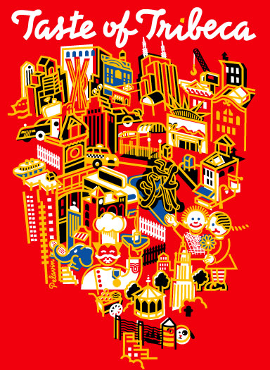
I personally love his work. He has a large body of it, and while it’s all completely different and original, he maintains a common thread that keeps it recognizable and authentic. He uses rich colours and strong line that makes his design pop, but never at the risk of them feeling too busy. He is a master of integrating typography into his designs, using more strong line and a sense of balance and movement to have everything looking cohesive and clean. I would love to purchase some prints of his work and hang them up on my walls.