Visual Research II: Gestalt Theory

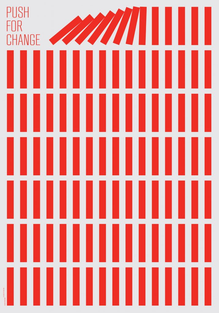
Similarity: This poster done by Kevin Finn is a great example of the principle of similarity. It is evident that all the red rectangles on the page are the same colour, size and shape, and are therefore interacting with each other as the first few rectangles have been knocked over. This suggests that as time goes on, all of the dominoes (or however you would like to perceive them) will eventually fall over.

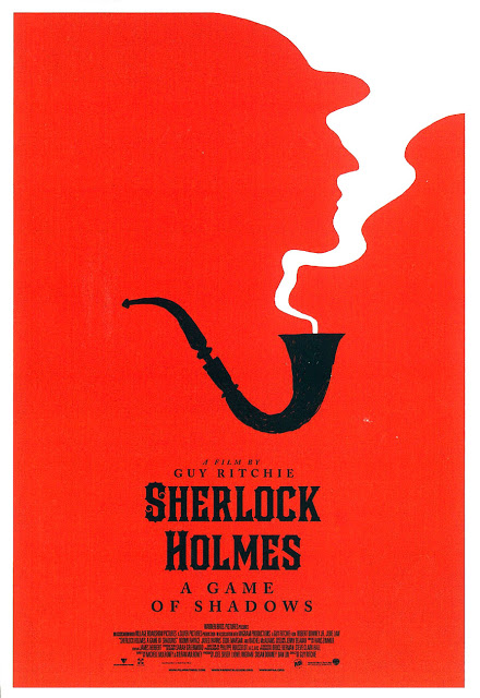
Figure/Ground: This poster for the film Sherlock Holmes was done by Olly Moss and perfectly demonstrates the optical illusion that can occur in a figure/ground piece. If you look closely, you will be able to flip between the white outline of smoke coming out of the pipe (which could also be an example of continuation) and the red figure on the left of a man in a hat.

Visual Research I: Design Elements

Size: This poster for Netflix’s Stranger Things displays certain characters much larger in size than others. The enlarged characters happen to be more prominent in this particular season of the show, while the smaller characters in the background seem to only appear occasionally. This poster was designed by Kyle Lambert.

Lines: The album cover art for Panic! at the Disco’s Death of a Bachelor demonstrates an interesting use of both squiggly and sharp lines rather than a simple image of a pool and a man passed out on the roof. The cover art was illustrated and designed by Nicole Guice.

Colour: The graphic novel, Through the Woods, written and illustrated by Emily Carroll, uses red as a pop of colour on top of the black and white on the rest of the cover. This pop of colour, as well as the small figure in blue, helps highlight particularly important aspects like the title and main character.