Bruce Mau was born on October 25, 1959 in Sudbury Ontario. Growing up, he admits that he never knew that a career in art and design was even an option. Mau studied at the Ontario College of Art & Design (OCAD) but left to work for the “Fifty Fingers” design group before graduating. Once he was exposed to the field, Bruce moved to England for two years to work at Pentagram in London. Although he started out as primarily a graphic designer, he later ventured into architecture and environmental design.
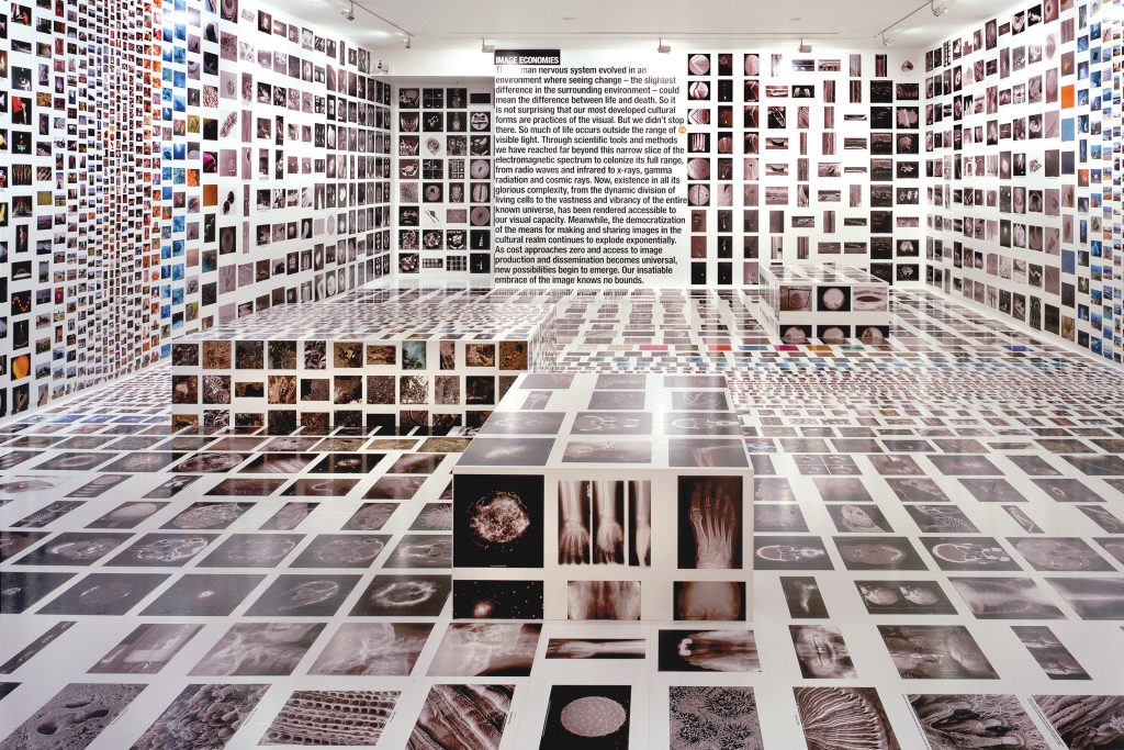
A “Massive Change” print exhibition displayed at the Vancouver Art Gallery.
In 1985, Bruce founded and worked as the creative director of Bruce Mau Design (BMD). While working here, he also founded the “Institute Without Boundaries” in collaboration with the School of Design at George Brown College, Toronto. After 25 years of work, Bruce left BMD in 2010. He then went on to establish Massive Change Network, a design consultancy in Chicago which he co-founded with his wife.
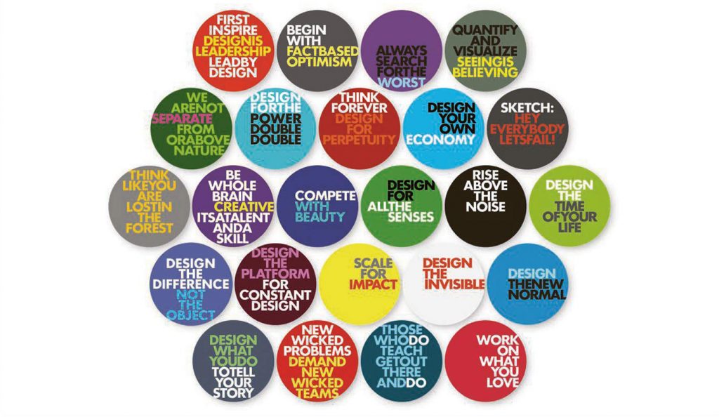
Sticker designs for Massive Change Network’s “MC24” campaign.
Although he never completed his own degree, Bruce has received multiple honorary art and design degrees from various schools. He also occasionally works as a professor in both Canada and the US. Mau most recently founded “Bruce Mau Studio” last year in 2020, which will bring forth a new era of BMD.
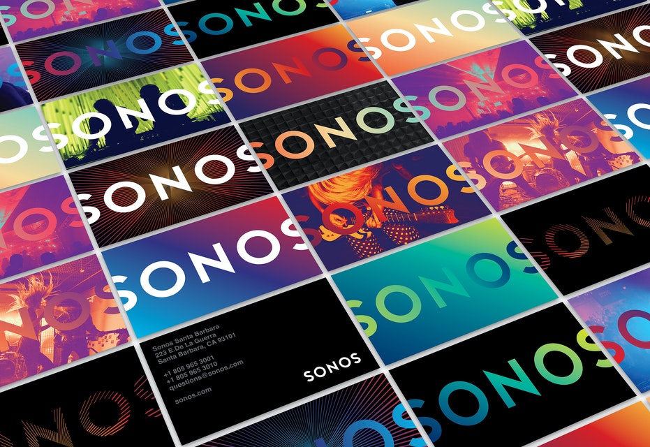
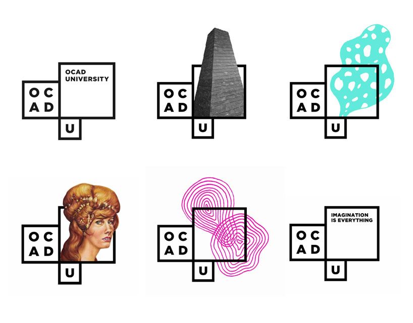
Some examples of design work he did for Sonos and OCAD University.
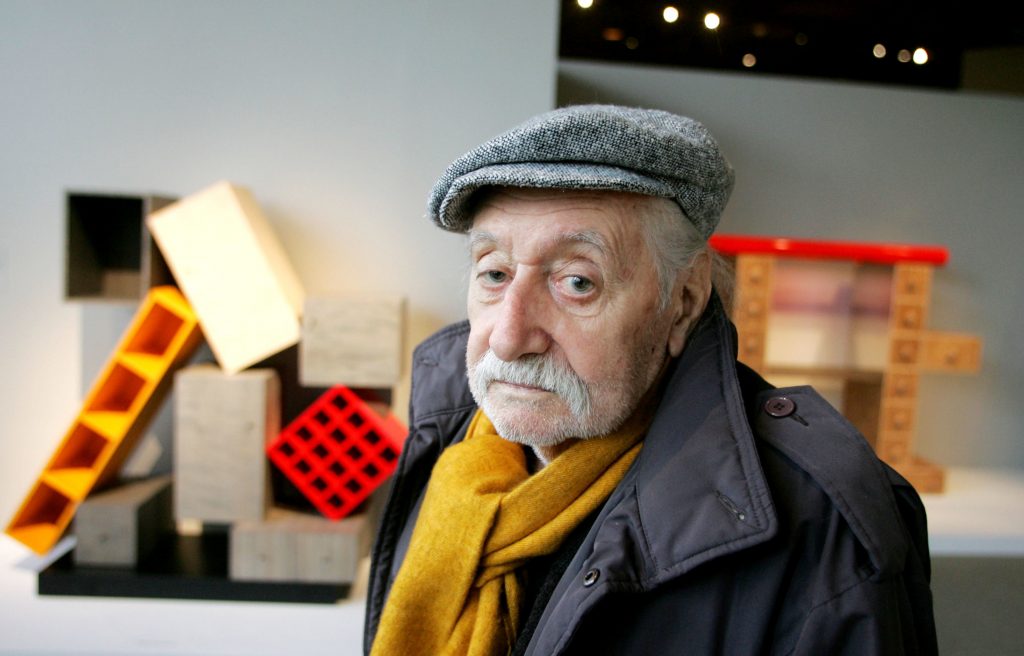
Ettore Sottsass was an Italian architect and designer born in September of 1917 in Austria. Sottsass studied architecture at the Politecnico di Torino, as his father also worked as an architect. However, shortly after graduating, he served in World War II as part of the Italian military. Once the war was over, he returned home and worked briefly as an architect with his father before opening his own architectural and industrial design studio in Milan. Here, he felt that he had the freedom to experiment with different media such as glass, ceramic, jewelry, lighting, and furniture.
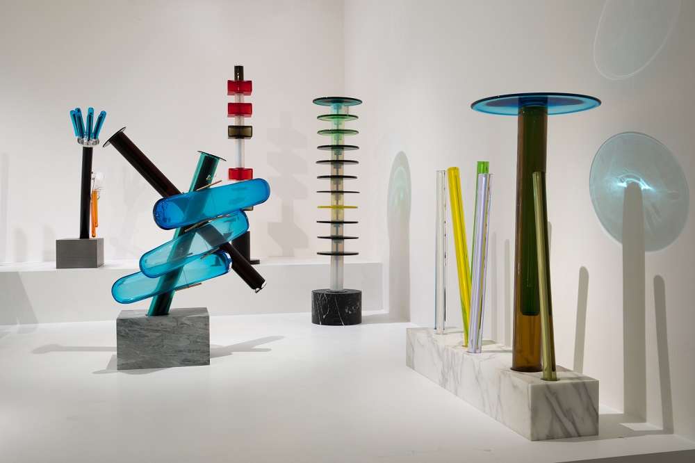
Some examples of Sottsass’ furniture design work on display.
In 1956, Ettore Sottsass was hired by Adriano Olivetti to work as a design consultant for “Olivetti”, a company that specializes in the design of electronic devices. Here, he learnt how to design things like typewriters and other office equipment.
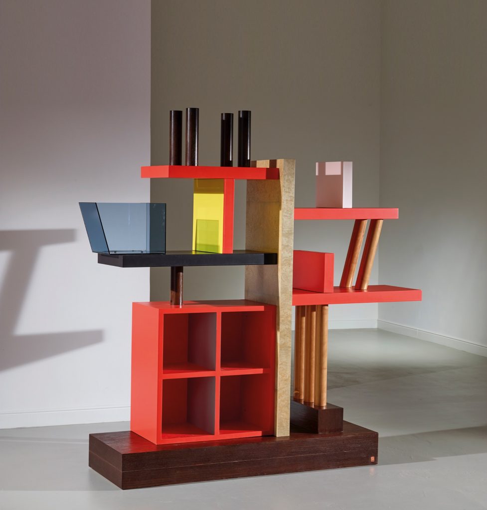
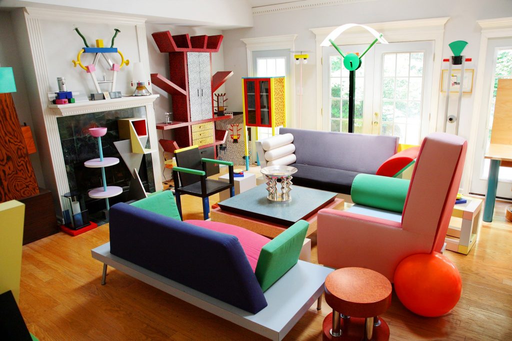
Various furniture and decorative pieces designed by the Memphis Group.
Ettore Sottsass founded the Memphis Group in Milan on December 11, 1980. The Memphis Group was a collaborative design group that emphasized experimentation with new design styles instead of following the classic trends. Most of their work was heavily inspired by pop art and the art deco style due to the use of bright, bold colours, textures, and patterns.
Unfortunately, Sottsass passed away in December of 2007 at the age of 90.
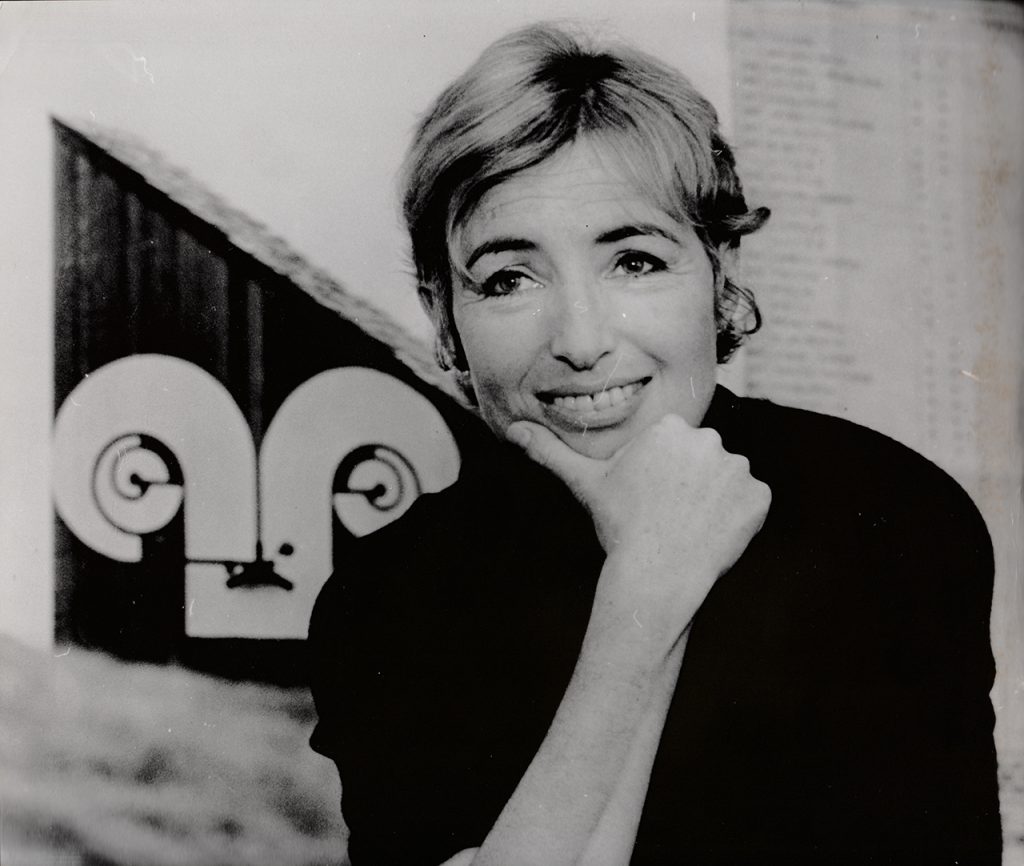
Born in 1928, Barbara “Bobbie” Stauffacher Solomon grew up on the West Coast of the USA in California. While she originally went to school to study painting and sculpture, she ultimately made the most significant contributions to the world of architecture, as she is most well known for her interior supergraphics. In 1956, Barbara moved to Switzerland to study graphic design under the widely popular designer Armin Hoffman. It wasn’t until 1981 when she finally decided to study architecture at the University of California, Berkley.
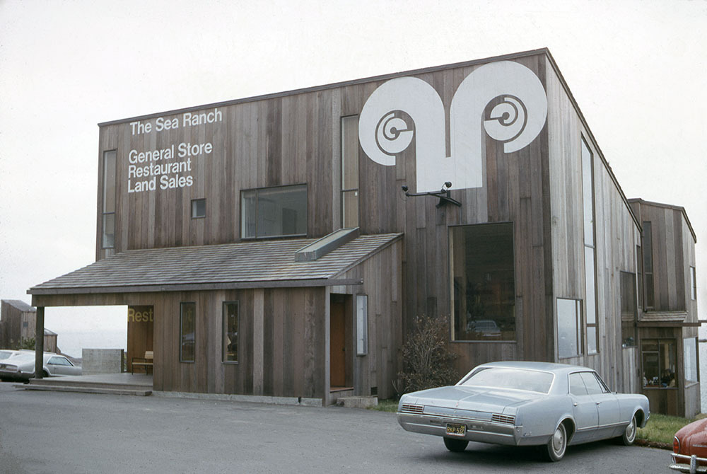
Sea Ranch brochure and building exterior, both featuring the iconic logo
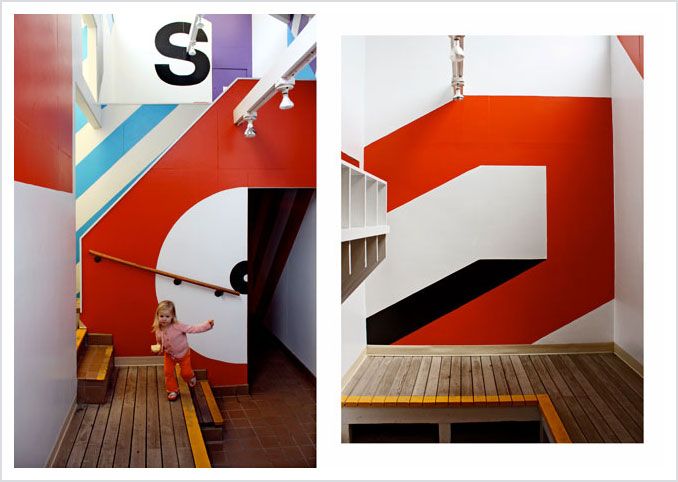
Various wall mural designs found inside Sea Ranch
Barbara is considerably most well known for the various design work she did for Sea Ranch in Sonoma County, California, a gig given to her beginning in 1962. She designed all sorts of things, most notably exterior signage, paintings for the building’s interiors, even the Sea Ranch logo itself (which depicts clear Swiss style influence, specifically as seen in the typography). Because of her great work at Sea Ranch, she went on to receive two American Institute of Architects (AIA) awards.
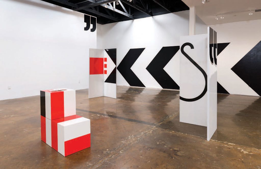
Today, Barbara’s work is displayed in various exhibitions, including the Berkley art Museum and the San Francisco Museum of Modern Art (SFMOMA).
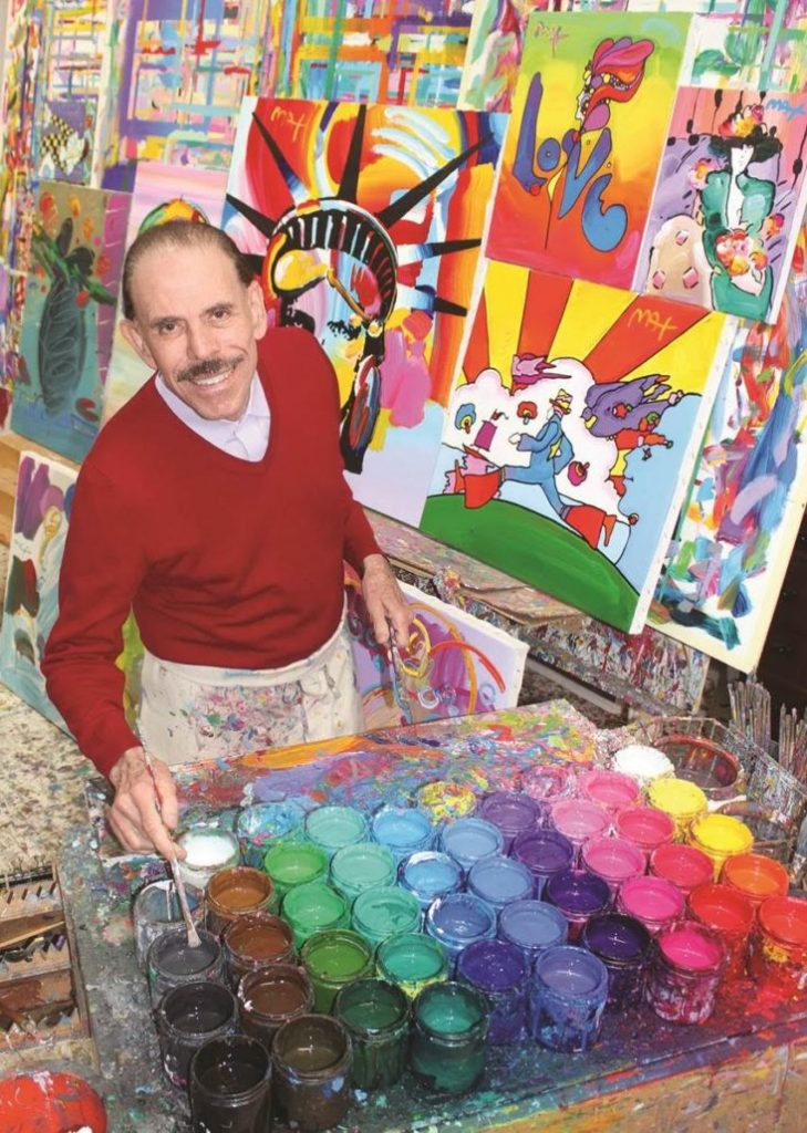
German-American artist Peter Max was born on October 19, 1937, in Berlin. Throughout his childhood, his family travelled and lived all over the world, from China to Israel, to Paris, eventually settling in New York City. There, Max began studying and training at the Art Students League of New York in 1956. He was mentored by Frank Reilly, a man who attended the League himself, but who also happened to study alongside Norman Rockwell. After completing his studies, Max opened a small art studio with the help of his school friend Tom Daly. The Daly & Max Studio won many numerous awards, particularly for their illustrations and designs displayed on book covers.
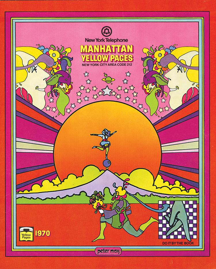
Max’s work on the cover of New York City Yellow Pages (1970), as well as his “Be In” poster (1967)
It is evident that Peter Max had a distinct psychedelic style in his work, featuring the use of bright colours and interesting shapes. What many people don’t realize is that Max had multiple synesthesia experiences throughout his lifetime. His personal artistic style helped him describe the way that he “heard” colour and “saw” things like music in particular. This phenomenon must have been the reason why his work was so popular among the hippies of the ’60s, especially considering how inspirational and widely-known his “Be In” poster came to be.
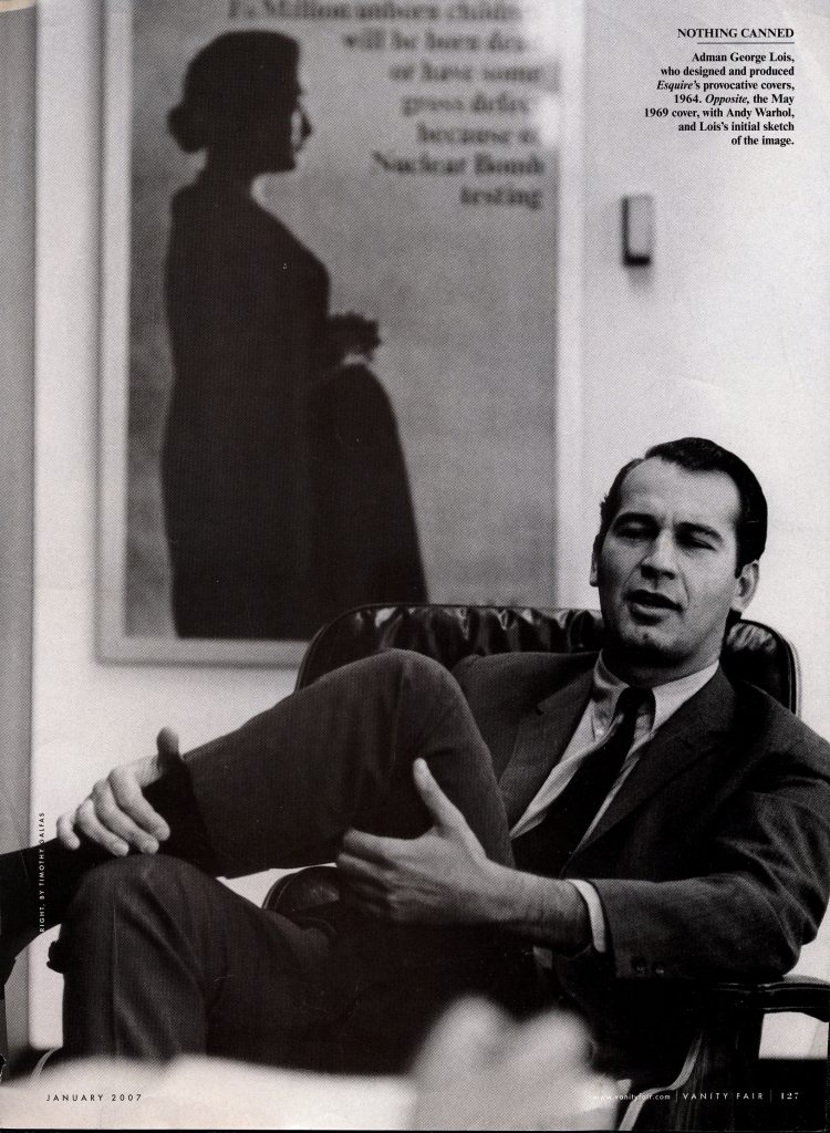
Photo of George Lois, featured in the January 2007 issue of Vanity Fair
American graphic designer, art director, and author George Lois was born on June 26, 1931, in New York, New York. Although he initially received a scholarship to play basketball, he ended up attending Pratt Institute where he only studied for a year before being drafted to fight in the Korean War. After the war, Lois finally started his career in design, where he worked at CBS in the advertising and promotional department.
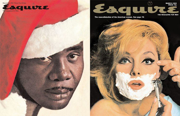
George Lois’ Esquire Covers from the 1960s
George Lois is best known for the total of 92 covers he designed for Esquire magazine over the course of ten years, from 1962-1972. However, other notable developments in his career include being recruited by Fred Papert and Julian Koenig to form the Papert Koenig Lois ad agency in 1960. Also known as PKL, this agency was known to be the first ad agency to ever go public.
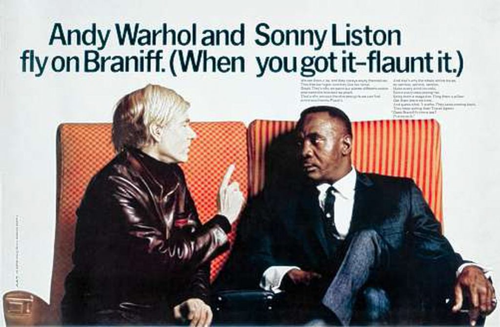
“When You Got It, Flaunt It” campaign for Braniff International Airways
Later, in 1968, Lois worked on a project for Braniff International Airways, where he created the famous “When You Got It, Flaunt It” campaign, resulting in a great increase in business. Over the course of his career, Lois also worked on various marketing and advertising projects for companies like MTV, Jiffy Lube, Tommy Hilfiger, Xerox, Aunt Jemima, USA Today, and ESPN.
On October 27, 1923, Roy Lichtenstein was born in New York City and is now known to be one of the most influential members of the pop art movement (while also sharing a birthday with me!). Lichtenstein first became interested in art and design at a young age, as he was a huge fan of jazz and would often attend concerts to draw portraits of the musicians playing their instruments. After high school, he attended Ohio State University but did not receive his Master of Fine Arts degree until 1949, after serving in WWII.
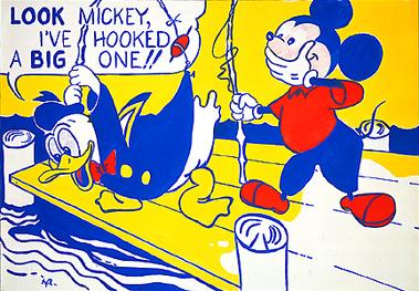
“Look Mickey” (1961)
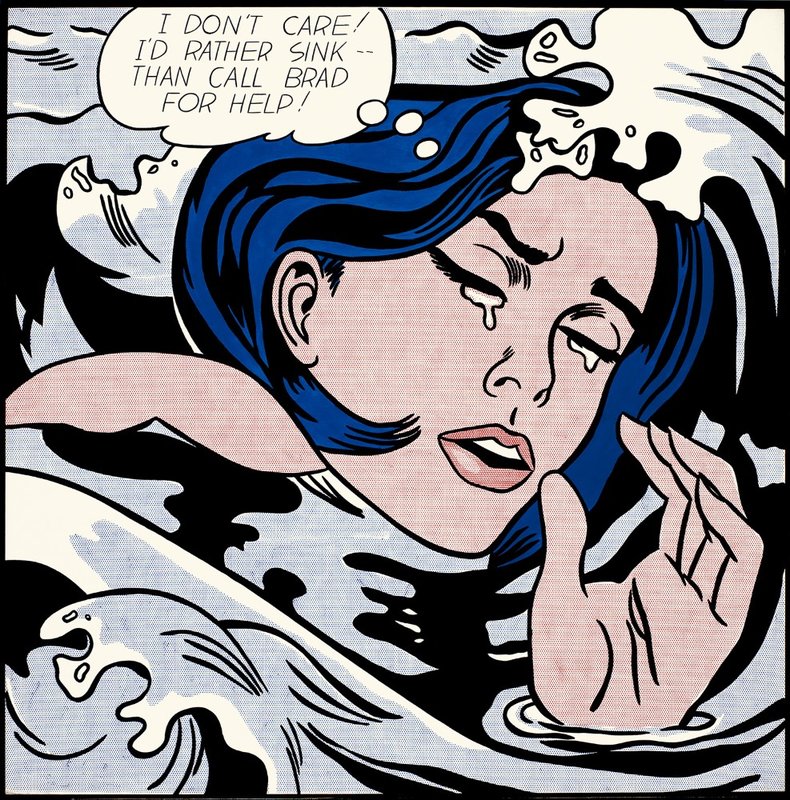
“Drowning Girl” (1963)
Lichtenstein worked on various exhibitions for a number of years and then began teaching at Rutgers University in 1960, which is where he first gained interest in pop art. At this time, Lichtenstein was known to incorporate hidden cartoon characters into his work, which later turned into direct adaptations of various comic book strips.
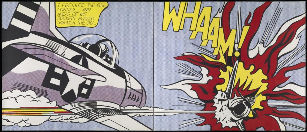
“Whaam!” (1963), adapted from DC Comics’ 1962 issue of “All-American Men of War”
Throughout his life, he was often accused of copying the work of other artists, to which he argues that the use of different textures and techniques makes his art different enough, even if others still consider it “copying”. Liechtenstein had a particular interest in the printed element of cartoon and commercial art, as he often resembled a style similar to photographic reproduction.
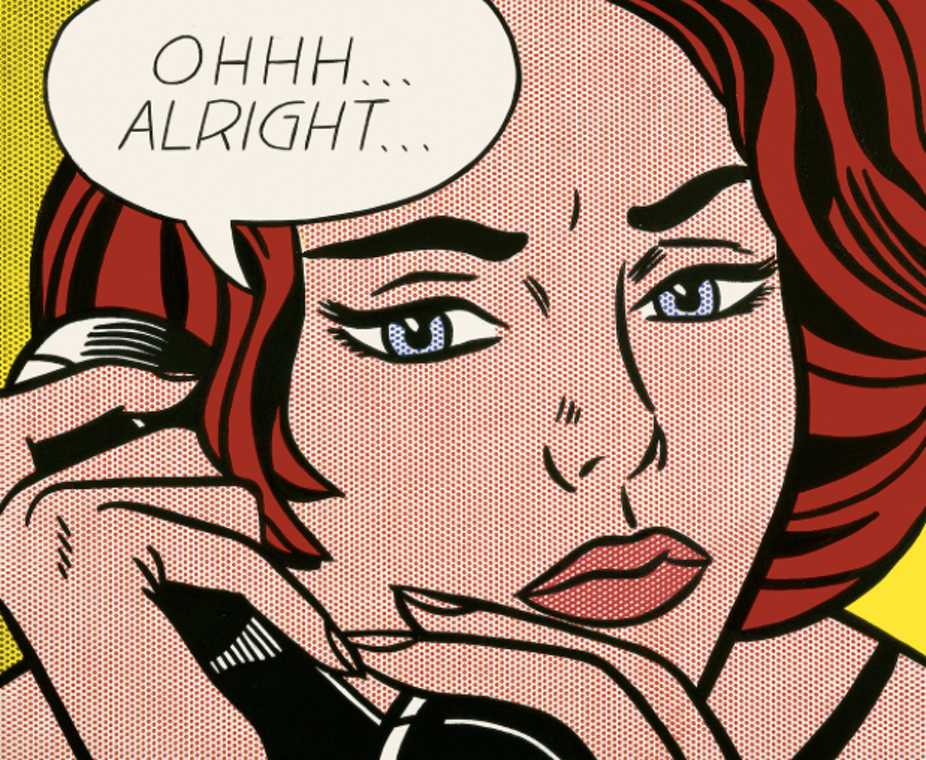
“Ohhh… Alright…” (1964)
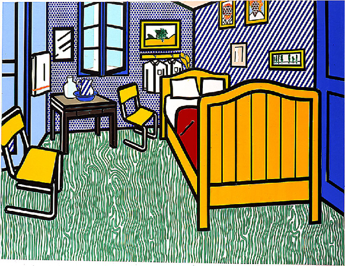
Reproduction of Van Gogh’s “Bedroom at Arles” (1992)
On September 29, 1997, Roy Lichtenstein died at the age of 73. Through his use of bold lines, striking colours, and various cartoon-like elements, Lichtenstein is now considered one of the best leading pop artists of his time.
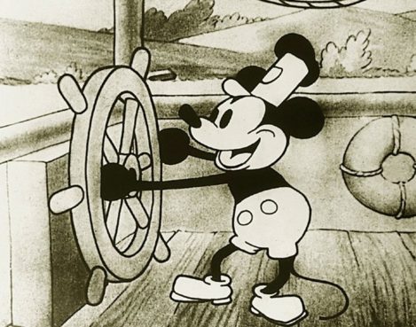
The iconic opening image, Mickey Mouse in “Steamboat Willie”.
On November 18, 1928, Walt Disney Studio’s short film Steamboat Willie hit the screens for the first time at Universal’s Colony Theater in New York City. Directed by Walt Disney and American animator Ub Iwerks, the film features the debut of everyone’s favourite cartoon characters, Mickey and Minnie Mouse.
Although Mickey and Minnie were not anything new in the eyes of Disney or Iwerks, Steamboat Willie truly changed the game for cartoons at the time. This film is now known to be the first-ever cartoon to successfully integrate synchronized sound. The film features two songs: “Steamboat Bill” which was popular in the 1910s, and “Turkey in the Straw” which dates back to the 19th century. In order to truly synchronize the sound to the film, the trick was for musicians behind the screen to use a “click-track” (metronome) to keep in time. On top of this, Walt Disney himself also provided the (minimal, yet important) sound effects for various characters in the film.
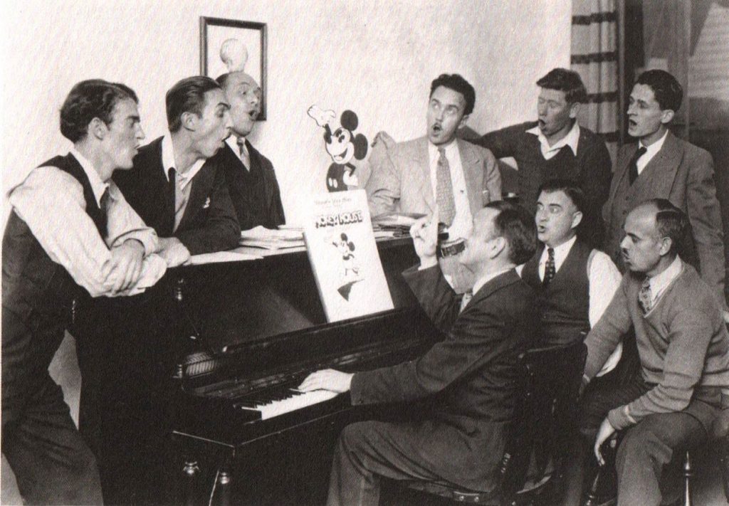
A group of men sat around a piano, Mickey Mouse songbook in hand.
In the end, Disney knew that ultimately, adding synchronized sound would be prominent in the future of filmmaking. While Steamboat Willie has always been praised for introducing one of the world’s most popular cartoon characters, it is important to thank Disney for the introduction of new sound technology in film.
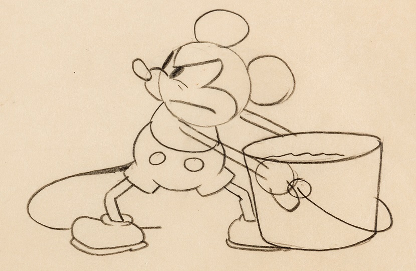
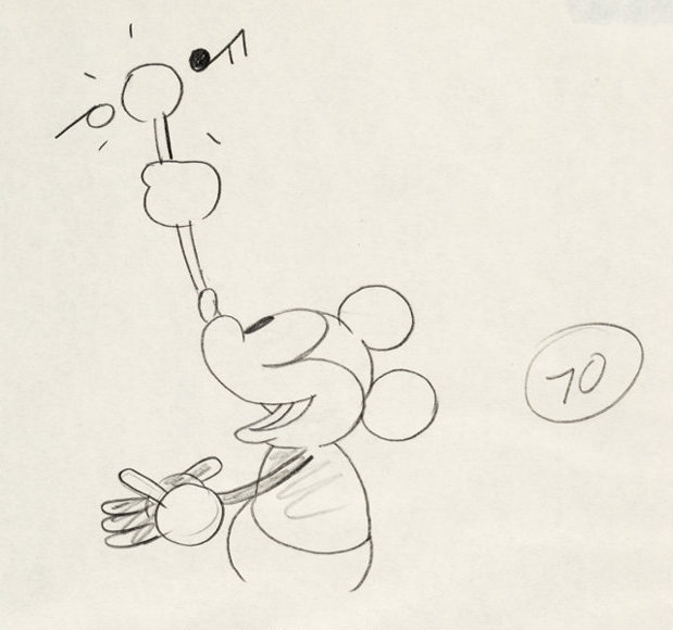
Mickey’s Character Design
Illustrative examples of Mickey’s character design, done for the production of “Steamboat Willie”.
Mickey’s early character design was done by Ub Iwerks and heavily resembled that of another popular cartoon character at the time, Oswald the rabbit. Iwerks focussed primarily on making Mickey’s overall design simple by using circular shapes for his ears, head, and body. Supposedly, Mickey’s hands only consisting of three fingers and a thumb was mostly a financial decision, as the addition of an extra finger in each of the thousands of frames would cost millions of dollars. Finally, white gloves were given to the mouse mainly to give contrast from the rest of his dark body. In fact, because of Mickey Mouse, gloves are now a very popular character design choice among many other cartoon characters.
The final poster execution, done with gouache, ink, and printed elements.
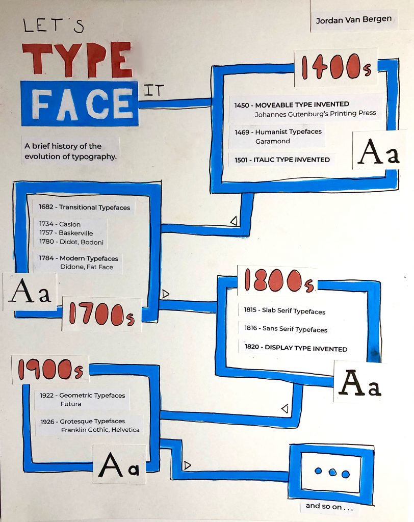
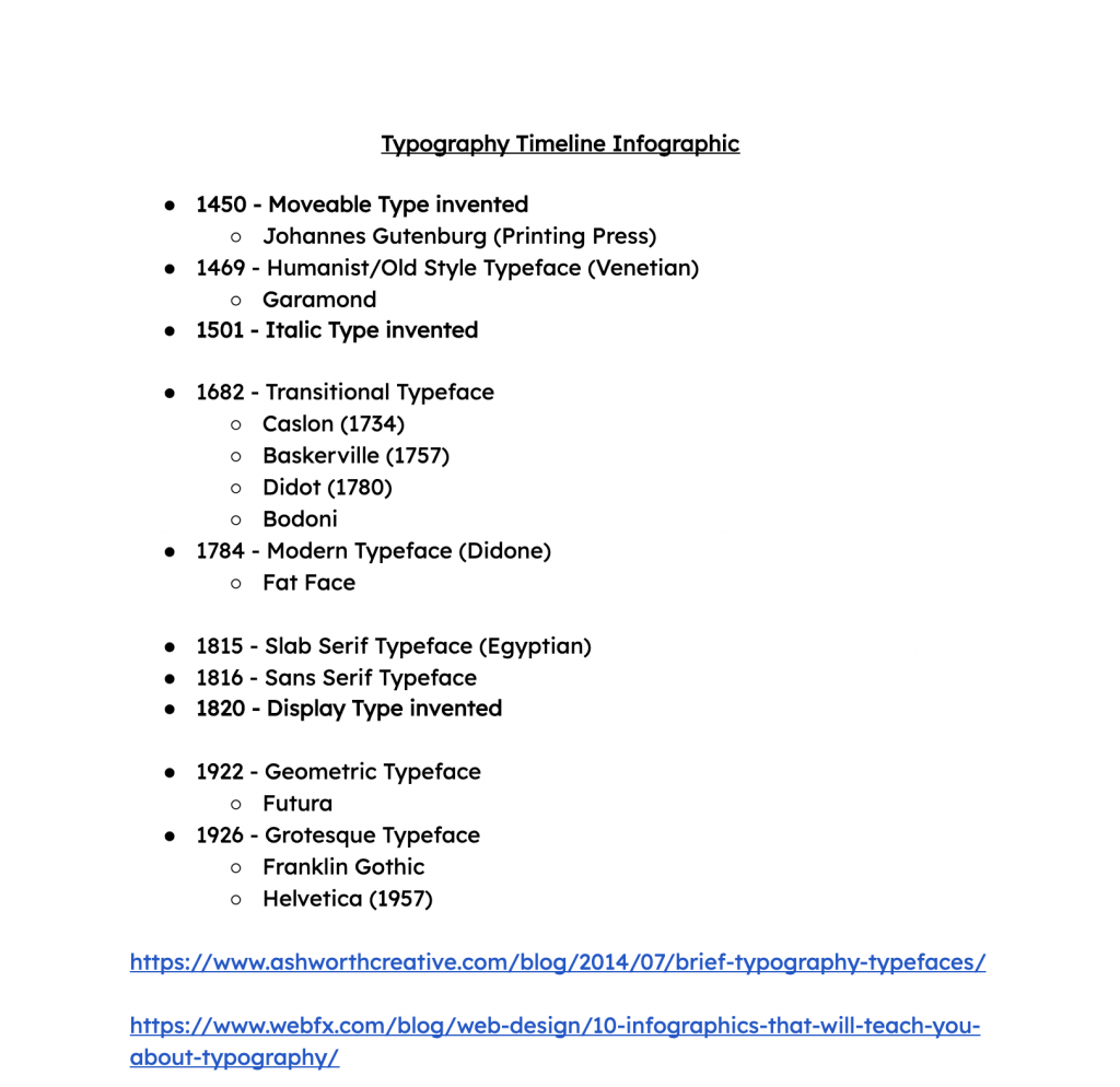
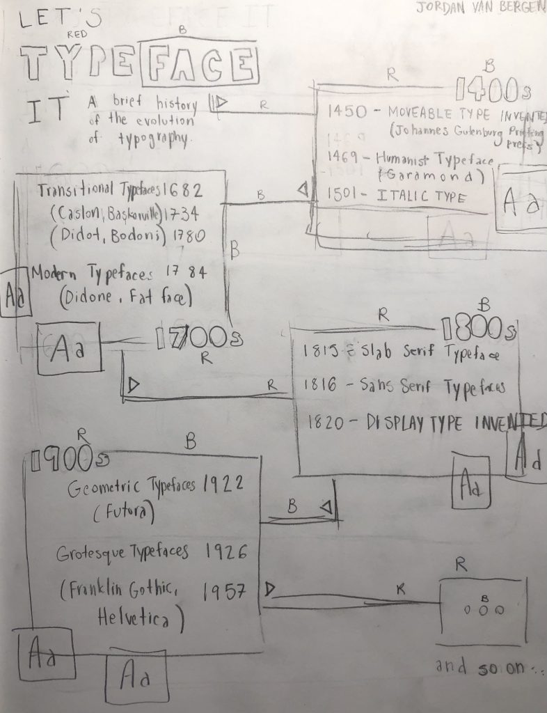
When drafting ideas for this infographic on the history typography, I wasn’t really sure where to go. Sure, I had found numerous timeline compositions that I felt very inspired by, however, I had trouble executing them.
In the end, I decided to go with the title “Let’s TypeFACE It”, which I honestly thought was very clever as I went with a pretty general approach to the history of typography. One of the examples that I came across featured very geometric shapes with lines and squares, as well as vibrant colours. I was heavily inspired by this particular infographic mainly because of how much of a fan I am of modern approaches, especially ones that are done in a very unique way. I think I went with a overall doodle-ish, crafty style (with my line work and cut and paste elements) because I felt it accurately described the versatility of all the different typefaces, especially typefaces in our modern world. The world of design has truly come a far way in terms of typography, and I really wanted to make sure I captured that in my poster.
A brainstormed list of the timeline contents
A rough sketch of the poster
Early process work for this assignment.
As for my mark, I think I would give myself 7/10. I don’t think I’m a huge fan of how my piece turned out for this assignment. I really wanted to create something similar to the unique compositions I came across while doing research, but I think that what I created might be a bit too simple or messy. I think that if I were to do a project like this again, I would lean towards creating a digital infographic, mainly because I would have the ability to make cleaner, more geometric lines and shapes, as well as adding pictorial elements with a lighter opacity. That way, I could create a hierarchy of sorts, rather than struggling to execute a poster in a traditional form. Nevertheless, I think it’s important to see a project through, even if you don’t like where it’s going. In the end, I’m glad I learnt a lot.
On June 3, 1877, Raoul Dufy was born in Le Havre, France. At a very young age, Dufy left school to begin working at a coffee importing company. However, it wasn’t until the age of 18 where he discovered his true passion for art. In 1895, he started taking evening art classes at École des Beaux-Arts and painted mostly watercolour landscapes. Eventually, he won a scholarship to study at the École Nationale Supérieure des Beaux-Arts in Paris. There, he was greatly influenced by Impressionist painter Claude Monet and soon developed his own unique colourful style.
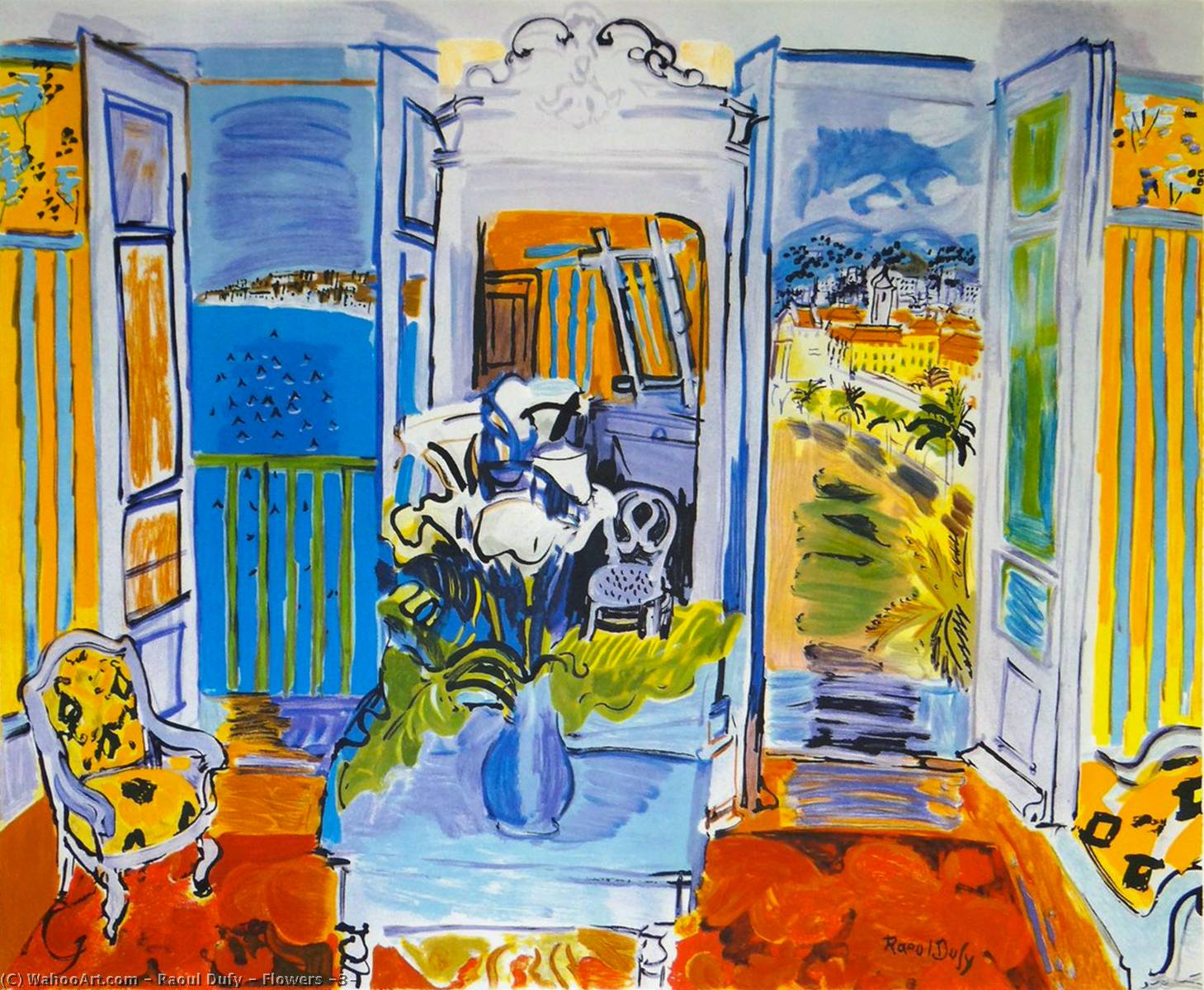
“Intérieur à la Fenêtre Ouverte” (1928)
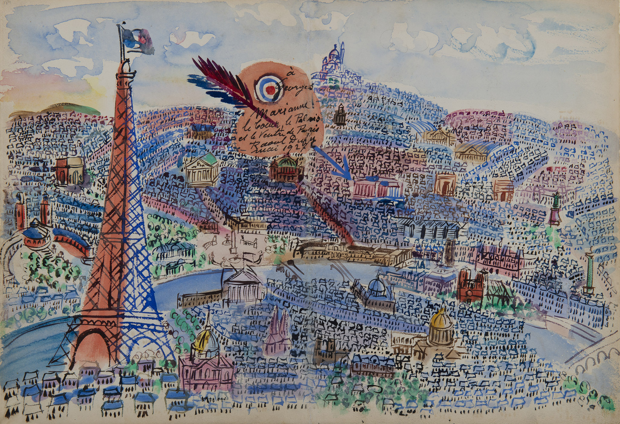
“Paris, Livre d’or de Marianne” (1927)
In 1901, Dufy entered his first exhibition at the Exhibition of French Artists and was lucky enough to gain attention and support from various fellow artists at the time. Soon enough, he expressed interest in Fauvism, particularly when he visited the Salon Des Indépendants in 1905. There, he found inspiration in Henri Matisse’s “Luxe, Calme et Volupté”. Until about 1909, he followed the artist group Les Fauves bright and vivid colour palette, until he realized that he could create his own subtle, yet still Fauvist style.
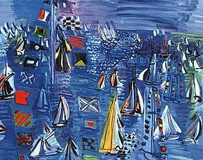
“Regatta at Cowes” (1934)
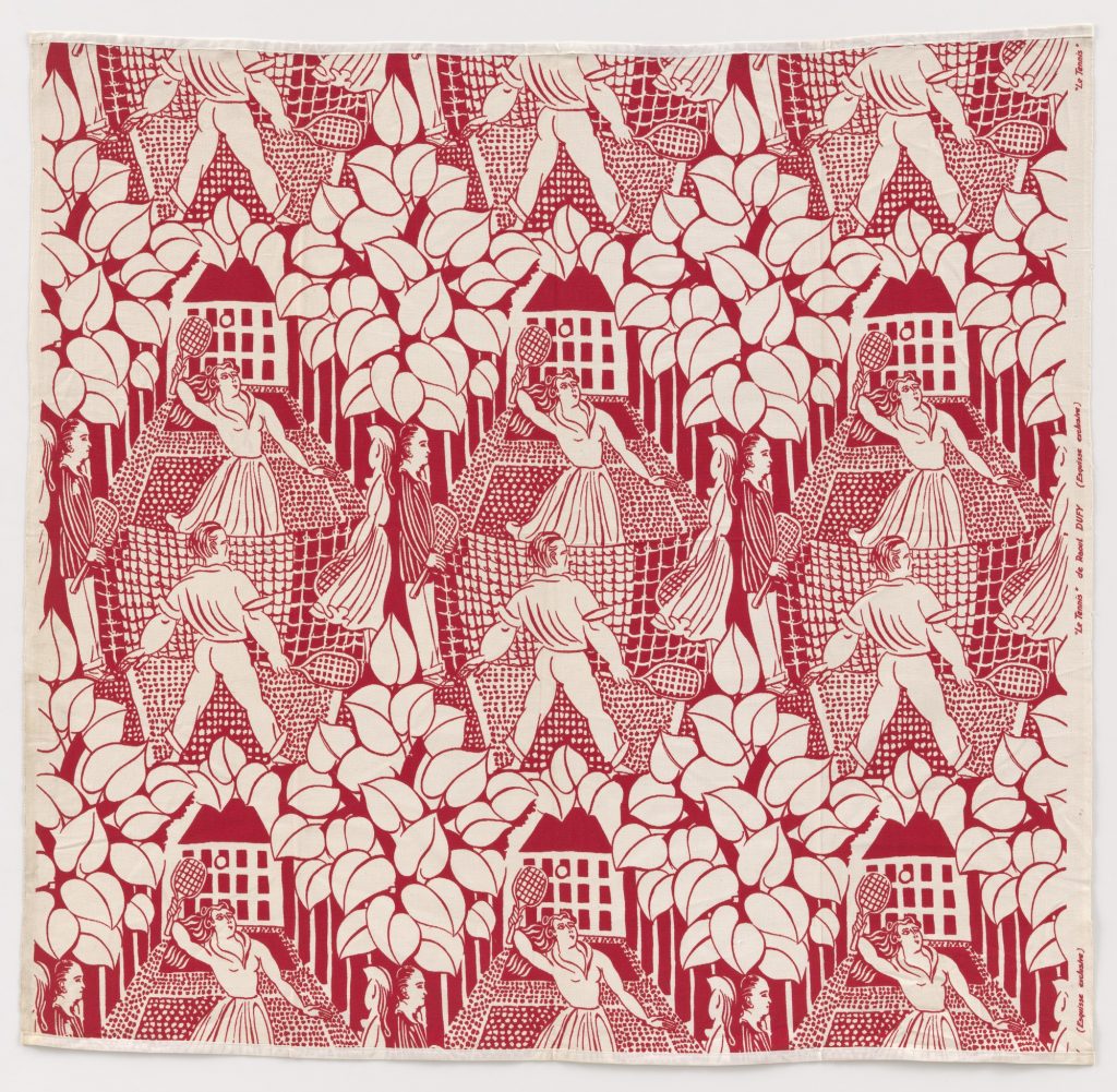
“Le Tennis” (1919) textile
Throughout the late 1920s, he painted many different yacht scenes in France using bright oils and watercolours. However, he also experimented with many other different mediums including murals, ceramics, textiles, tapestries, and even stationary. Unfortunately, in 1950, he developed severe arthritis in his hand which greatly impacted his ability to paint. Only three years later, Raoul Dufy passed away on March 23, 1953 at the age of 75.
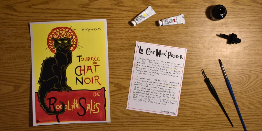
My rendition of the ‘Le Chat Noir’ poster, along with a brief historical description.
This week, my task was to recreate a historical artifact that I believe has greatly influenced the world of art and design today. As seen in my previous blog post, I was very inspired by the Le Chat Noir poster design by Theophile Steinlin.
As pictured above, I think I did a pretty good job of recreating the poster, despite the fact that it is not 100% spot-on. I decided to use a brighter shade of yellow in the background to emphasize the pop of vibrant colour. I also exaggerated the red halo detail behind the cat’s head, as this is an interesting detail referencing another late 19th-century artist named Alfonse Mucha. It is evident that there is not much going on in the photo itself, so I opted to simply display the materials I used, as it is quite likely that Steinlin practiced illustration with painting and ink as well. Nevertheless, the description page on the left was an attempt at complementing the poster using a red and yellow accent, as well as a noticeably hand-painted display font.
I think I would give myself a solid 8/10 on this project. I think that the artifact itself is beautifully done, and the description is quite informative, however, the photo maybe could have been a bit more creative. It was definitely difficult to portray a historically accurate scene including the artifact and description.