Summary: “The Importance of Urban Forests” by Amy Fleming

Source: https://treecanada.ca/engagement-research/canadian-urban-forest-network/

The following paragraph is a summary I wrote on Amy Fleming’s article, “The Importance of Urban Forests”. In English 100, we discussed and applied our summary writing strategies to the article itself, making sure to note the most important points as well as a few quotations. Here it is:

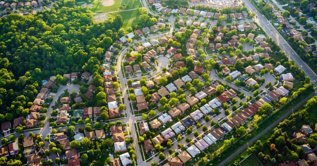
In the article, “The Importance of Urban Forests,” Amy Fleming emphasizes the various economic, physical, and mental health influences that trees have on us in our modern world. With a focus on the American elm trees living in New York City, historian Jill Jones talks about how “city officials saw trees as ‘expensive ornaments’,” that act as useless decorations and cost too much to take care of (qtd. in Fleming 2). Jones’ point is that nowadays, people often forget that as humans, we largely benefit from the existence of nature, especially trees. For example, in New York City alone, Fleming reports that there was $28 million worth of energy savings in a given year due to the number of trees living alongside the city’s buildings (3). This is because trees with large canopies provide a great deal of shade, therefore limiting the need for things like air conditioning in both workspaces and residential apartments (Fleming 2). On top of saving money, public health expert William Bird explains that “our brains view cities as hostile environments,” and therefore, people who take the time to connect with nature are generally less stressed (qtd. in Fleming 4). In making this comment, Bird urges individuals who struggle with their mental health to get outside, go for a walk and clear their minds, as nature plays a huge part in our physical and mental wellbeing.

About Me

Hello! Nice to meet you. : )

My name is Jordan Van Bergen and I am a first-year student at Capilano University’s IDEA School of Design program, where I major in illustration and graphic design.

Throughout high school, I was always involved in artsy courses such as choir and theatre, however, I found my true passion for art and design when I took yearbook in grades 11 and 12. Upon getting selected two times in a row as the designer for the yearbook’s cover, I knew that graphic design was something that I wanted to pursue as an area of study for post-secondary school. Aside from art and design, I thoroughly enjoy music, whether that be listening to or performing myself. I have played the piano and ukulele for a number of years and I have recently brought it upon myself to learn guitar.

Impressionism and Post-Impressionism: Pierre Bonnard

“Self-Portrait” (1889), oil on canvas

Born on October 3, 1867, Pierre Bonnard grew up in Fontenay-aux-Roses, France. He started showing talent for drawing and watercolour at a very young age, and grew up painting scenes in the garden of his parents’ country home. Later, he went to school to study law, as per his father’s request, however, he began taking art classes on the side. After selling his first work of art later that year, his parents let him study art full-time at “Academie Julian” in Paris.

“Twilight” (1892), oil on canvas, inspired by the Japanese print style

Soon after the start of his artistic career, Bonnard formed an art group with his friends from school called “Les Nabis”. While most of his peers created paintings with more religious themes, he kept his overall style playful and un-ideological. In 1892, he gained interest in decorative art and design and started creating posters and lithographs, as he was particularly inspired by the Japanese print style. Because of this, he also started including geometric patterns in his portrait paintings.

In 1894, Bonnard created a series of paintings of life in Paris and continued to focus on similar subjects until he married a woman named Marthe de Meligny in 1925. Marthe is known to be the subject of many of his portraits, particularly that of the nude style, as his most famous portraits include Marthe lying nude in a bathtub. 

“Nude in the Bath” (1936), Marthe as the model

The last painting he did was titled “The Almond Tree in Blossom”, (1947) and was completed a week before he died at age 79 in Le Cannet, France on January 23, 1947. Pierre Bonnard is widely considered ‘one of the greatest colourists of modern art’ due to his bold use of colours, which were heavily influenced by Paul Gaugin. His striking, distinct style is what truly led his remarkable life as an artist.

Sources:

Metmuseum.org, www.metmuseum.org/toah/hd/bonn/hd_bonn.htm.
“Pierre Bonnard.” Encyclopædia Britannica, Encyclopædia Britannica, Inc., 29 Sept. 2020, www.britannica.com/biography/Pierre-Bonnard.
“Pierre Bonnard.” Wikipedia, Wikimedia Foundation, 28 Oct. 2020, en.wikipedia.org/wiki/Pierre_Bonnard.

Images:

https://en.wikipedia.org/wiki/File:Pierre_Bonnard,_Self-portrait._c._1889,_oil_on_canvas,_21.5_x_15.8_cm.jpg 
How the Japanese transformed French painting
https://www.newstatesman.com/Pierre-Bonnard-Colour-Memory-Tate-Modern-review https://frenchculture.org/performing-arts/3843-pierre-bonnard-dining-room-country https://commons.wikimedia.org/wiki/File:%27Morning_in_Paris%27_by_Pierre_Bonnard,_1911.JPG

Survey 6: The Cat Cabaret, ‘Le Chat Noir’

Cabaret Culture

An image of the original cabaret venue, located in a small apartment.

In 1881, a man by the name of Rodolphe Stalis opened up an entertainment establishment in a bohemian district called Montmartre, just outside of Paris, France. Little did he know that this seemingly minuscule theatre would eventually become one of the most popular and recognizable establishments.

Upon founding his business, Stalis decided to call the nightclub Le Chat Noir or ‘The Black Cat’ in English. Apparently, the reason behind this is because he simply came across a black cat while the nightclub was under construction, however, I like to think that there is much more to the story. Maybe he associated the black cat with evil, dark magic, foreshadowing the emergence of the nightclub as the first ever provocative cabaret in Paris. 

An illustration of the larger, much fancier venue.

In Le Chat Noir, guests would sit at tables drinking alcoholic beverages and watching various artists perform on stage as a form of entertainment. Anyone from actors, singers, musicians, and even poets could perform. The cabaret was a loud and sometimes rowdy setting, however, it gained more and more popularity, and was eventually deemed the heart of artistic life in Paris. Le Chat Noir stayed open until 1897, making it the centre of nightlife for just over 15 years.


The Mind Behind the Design

The official ‘Le Chat Noir’ poster design by Theophile Steinlin.

The Cabaret wasn’t popularized all on its own, though. Like all establishments, advertisements were needed in order to spread the word. Lucky for Stalis, Le Chat Noir’s poster design done by Theophile Steinlin became one of the most recognizable posters in Paris and is still very well known to this day. 

Steinlin designed the poster with emphasis on the entertainment aspect of the cabaret. The text translates to: ‘Coming Soon, Rodolphe Stalis’ Le Chat Noir on Tour”. Steinlin printed the poster using colour lithography, and features, of course, a black cat, which was a popular subject in a number of his works. This cat in particular, however, has a bit of a mischievous look on its face, which adds to my theory about black cats and dark magic. Steinlin also decided to use the colour red to emphasize certain areas of the poster, like the text, for example. The intricate halo design behind the cat’s head, however, is a subtle nod towards a fellow poster designer by the name of Alphone Mucha, who featured images of women with circular halos behind their heads. 

Sources:

“Le Chat Noir.” Wikipedia, Wikimedia Foundation, 3 Nov. 2020, en.wikipedia.org/wiki/Le_Chat_Noir.
Ugc. “Le Chat Noir Collection.” Atlas Obscura, Atlas Obscura, 13 Feb. 2018, www.atlasobscura.com/places/le-chat-noir-collection.
Westologist, The. “The Black French Cat.” The Westologist, www.thewestologist.com/ideas/the-black-french-cat.

Images:

https://en.wikipedia.org/wiki/Le_Chat_Noir
https://pariswonders.com/page/3/ 

Braille: A Typeface for the Blind

The full zine, unfolded

About two weeks ago, my class was prompted to construct a “zine” (short for magazine, or little booklet) about something of our choice related to typography. As a result, I started to research the history of Braille and how the “language for the blind” came to be. Although Braille isn’t necessarily considered a font, I think it is especially interesting to learn more about a “font” that isn’t universally used every day.

Looking closer at the zine, it is noticeable that the three dominant colours are dark blue, bright red, grey, and of course, black and white. I chose the colours blue and red because Louis Braille, the creator of Braille, grew up in France, where he attended The National Institute for the Blind (located in Paris) thus, inventing Braille. Many of the shapes that I have used are geometric, hinting at a playful theme which I think is fitting as he invented Braille when he was still in school at the young age of 15. It is evident that the font used is pretty simple, and that there is not a lot of writing. I aimed to keep the zine quite minimalistic, as I feel as though that would make it easier to follow. It was also important to me that I tried to fit in as much of the Braille language as possible, so leaving room for small dot patterns was essential.

In conclusion, I think that I would give myself a 9/10. I think that my zine has a well-developed, organized flow to it, and I think that I subconsciously took into consideration that the origins of Braille can be taught to people of any age, especially since it was developed in a children’s school. I really like that I used both printed media, as well as various inks and colours. My only concern is that some may argue that the overall concept of Braille doesn’t really fit into the category of typography. I personally think that that is not the case, as Braille can be found on public signs almost everywhere.

Neoclassicism, Romanticism, & Rococo: Thomas Gainsborough

Self-Portrait (1759)

Born on May 14, 1727, Thomas Gainsborough grew up in Sudbury, Suffolk and later became one of the greatest English portrait and landscape painters of the 18th century. Gainsborough discovered his love for painting at the age of ten, and practiced constantly while living in what is now known as “Gainsborough’s House”, a popular museum dedicated to the life and works of Thomas. After discovering his great talent, Thomas’ father let him leave home in 1740 (at the age of thirteen) to study in London under Hubert Gravelot.

Mr. and Mrs. Andrews (1750)

After marrying a woman named Margaret Burr, Gainsborough temporarily moved back to Sudbury in 1748 to practice his portraits. Margaret and Thomas later had two daughters and decided to move into a bigger house in Ipswich in 1752, but they later settled more permanently in Bath in 1759. This is where Gainsborough finally gained traction and sold various commissions while studying the works of van Dyck. 

Soon enough, Gainsborough discovered that displaying his works in exhibitions would help him gain even more attention. He eventually began sending paintings to the Royal Academy every year, and was actually invited to attend the exhibit as a founding member in 1769. Although he had to temporarily stop displaying his paintings while his family moved to London in 1774, he finally made it big in 1777, where he painted and displayed portraits of celebrities like the Duke and Duchess of Cumberland. 

The Blue Boy (1770), oil on canvas.

Throughout the later years of his life, he resorted to painting simple landscapes, as this was his true passion. On August 2, 1788, Gainsborough died of cancer at the age of 61. In The Story of Art, Gombrich states that compared to his rival at the time, Joshua Reynolds, who emphasized the “importance of tradition,” Gainsborough was “a self-made man,” who decided to make his own rules (362). Ultimately, the mindset that Gainsborough had throughout his life is what led to his great success as a painter. 

Sources:

Gombrich, Ernst Hans. The Story of Art. Phaidon Press, 2016.
“Thomas Gainsborough.” Encyclopædia Britannica, Encyclopædia Britannica, Inc., 10 Sept. 2020, www.britannica.com/biography/Thomas-Gainsborough.
“Thomas Gainsborough.” Thomas Gainsborough - The Complete Works, www.thomas-gainsborough.org/.

Images:

https://en.wikipedia.org/wiki/Thomas_Gainsborough
Mr and Mrs Andrews by Thomas Gainsborough
https://www.rct.uk/collection/400675/henry-duke-of-cumberland-with-anne-duchess-of-cumberland-and-lady-elizabeth
https://www.wikiart.org/en/thomas-gainsborough/king-george-iii-1781
https://en.wikipedia.org/wiki/The_Blue_Boy

Survey 4: The Tale of the Telegraph

The Origins of the Telegraph

A man working inside a telegraph office, https://www.theregister.com/2019/09/19/geeks_guide_to_the_central_telegraph_office_and_bt_centre/

During the late 1830s, it seemed as though people were struggling to communicate with one another at large distances. However, Sir William Cooke and Sir Charles Wheatstone soon realized that it may be beneficial to invent a brand new communication device. That very device was called the telegraph and is still very well known today.

The first telegraph that was ever created was called a “needle telegraph” (1837), which featured several needle pointers that used electromagnetic principles to point at various letters on a triangular grid and spell out a message. These messages would be sent from one telegraph office (or telegraph station) to another through the electrical signals running through the connecting wires on utility poles.


Morse Code: The New Language

A telegraph key, used to tap “dots and dashes,” https://www.kaspersky.com.au/blog/telegraph-grandpa-of-internet/9034/

The morse telegraph (1838) was invented soon afterwards and deemed much more efficient. This telegraph is activated by tapping a “telegraph key” using a combination of dots (short taps) and dashes (long taps), which then sends out an electric pulse that makes a clicking sound at the receiving telegraph office.

The famous “dots and dashes” language was invented by a man named Samuel Morse, who assigned each letter of the alphabet a specific morse code combination. Samuel Morse created the code in such a way that made it easier for people to remember. Generally, commonly used letters were assigned a simple combination of dots and dashes, while letters that were used less commonly were assigned slightly more complex combinations. A great example of this is the internationally recognizable “SOS” distress symbol that originated because “S” in morse code is three dots, while “O” in morse code is three dashes.

A morse code guide chart, https://science.howstuffworks.com/innovation/inventions/morse-code.htm

Originally, the morse telegraph recorded each dot and dash mark on a piece of paper for the designated telegraph operator to translate. Later, it became evident that simply listening and recording the codes manually was much easier and more efficient, especially as the telegraph operator became more and more familiar with how to read the code.

Sources:

“Electrical Telegraph.” Wikipedia, Wikimedia Foundation, 18 Oct. 2020, en.wikipedia.org/wiki/Electrical_telegraph.


History.com Editors. “Morse Code & the Telegraph.” History.com, A&E Television Networks, 9 Nov. 2009, www.history.com/topics/inventions/telegraph.


“Telegraph.” Encyclopædia Britannica, Encyclopædia Britannica, Inc., www.britannica.com/technology/telegraph.

Invision Sucks: An Honest Attempt at a Research Mood Board

For the last couple of weeks, I have been working on researching three specific events that occurred during the same time period as our IDES 141 class’ Survey 4 lesson on “Steam and the Speed of Light” (1750-1850). My three chosen events were: 1) The First Passenger Railway in Britain (1825), 2) The First Illustrated Newspaper in Britain (1832), and 3) Samuel Morse and the Invention of the Telegraph (1838).

Overall, I have to say that I definitely struggled with this project. I found that researching specific topics within the chosen events was quite challenging, especially because there is only so much accessible information that can be found on each event. When it came to organizing the information and working with Invision, I seemed to have gotten even more frustrated, as I struggled with saving my preferred layout and making my board look appealing. I think that I would prefer to use Invision in a collaborative way (similar to Padlet), where I can work with classmates or colleagues to brainstorm an idea and form colour palettes (as that is actually a feature!).

In the end, I would give myself a 7/10 for this project. I think that I spent enough time diving deep into research on each topic, however, I struggled to make connections between events. To solve the earlier problem, I had to make a compromise and develop personalized topics that I felt were more suited toward the specific event. For example, the fashion topic ended up not fitting in with any of my events. As for my layout, I think that I chose strong images and used eye-catching headlines and keywords. My choice to separate all three events ended up working quite nicely so that I could have more fun with image sizing and hierarchy. If I had more time, I think I would’ve emphasized certain colour palettes within each event, as these old, historic events oftentimes feel the need to be in black and white.

The link to my Invision Mood Board can be found here: https://jordanvanbergen83051.invisionapp.com/board/IDES-141-Mood-Board-ckg8jjych0o5717vk9fl9fnql

Survey 3: It’s Tea Time!

The Origin of English Tea

“Seventeenth Century Tea-Time” by Pieter Gerritsz Van Roestraten

Ah, tea. The delicious warm leaf drink that everyone seems to enjoy drinking while snuggling up with a good book (or Netflix, in my case) after a long day. Generally, when people think about tea, they either think about traditional chai or green tea from certain parts of Asia, or they think about classic earl grey mixed with milk and sugar from England. The fact of the matter is that, well, both are fairly accurate, and neither version is wrong.

The creation of green tea in China actually dates all the way back to 2737 BC, however, the tea didn’t get exported to England until 1660, where it was introduced to a coffeehouse in London. As this was a new drink in England at the time, it quickly became very expensive, costing almost six times as much as coffee cost. In fact, tea was only popular amongst the upper class for a while, as King Charles II’s wife (Queen Catherine of Braganza) introduced it as a “custom drink” that was enjoyed amongst her friends at afternoon parties. 

Twinings Tea Shop in London, England

It wasn’t until much later that a man by the name of Thomas Twining opened the first tea shop in London in 1717. This is when tea became more affordable, and therefore, more widely enjoyed by people of all classes. The most common English tea at the time was, of course, the English Breakfast Tea, which was mixed with milk and sugar and sometimes served with biscuits, scones, or crumpets.


Made in China

Example of an antique porcelain teacup with a saucer

Traditionally, in China, tea was served in porcelain cups without handles, however, the popularization of tea in Britain made for large growth in the pottery industry. Tea sets were typically sold with a saucer (small plate) and, of course, the teacup. The common etiquette at the time was to hold the saucer in one hand, and the teacup in the other (dominant) hand so that the teacup could be placed back down in between sips. 

As for teapots, the earliest versions were in small vessels that could only hold up to two or three cups of tea (due to the expense of tea at the time). In England, metal teapots were quite common, as they were able to keep the tea as hot as possible, however, porcelain teapots that are used in China are believed to keep the tea a better flavour. 

Sources:

Davis, Melissa. “The Continuing Tempest Over Teapots.” The Washington Post, WP Company, 15 Feb. 1979, 
www.washingtonpost.com/archive/lifestyle/1979/02/15/the-continuing-tempest-over-teapots/4dd9230f-522a-4b02-a3ff-b4eaee4f5d2b/.

Lemm, Elaine. “The Different Types of Tea in Britain - There Are Many.” The Spruce Eats, 
www.thespruceeats.com/history-and-types-of-british-tea-435180.

“Tea in the United Kingdom.” Wikipedia, Wikimedia Foundation, 20 Sept. 2020, 
en.wikipedia.org/wiki/Tea_in_the_United_Kingdom.

TopicTea. “The History of Tea in Britain - Who Brought Tea to England?” TopicTea, 
topictea.com/blogs/tea-blog/history-of-tea-in-britain.

Images:

Elizabeth Pepys’s Potticary Tea
https://www.atlasobscura.com/places/twinings-tea-shop 
https://www.etsy.com/uk/listing/862499433/roslyn-primula-tea-set-stunning-early?ga_order=most_relevant&ga_search_type=all&ga_view_type=gallery&ga_search_query=english+tea+set&ref=sr_gallery-1-3&cns=1

High Renaissance and Mannerism: Raphael

Raphael, “Self-Portrait” (1504-1506), oil on board

Raphael Sanzio (better known as simply Raphael) was born on April 6, 1483, in Urbino, Italy. As a child, his father, Giovanni Santi, taught him how to paint, as he was also a painter. Soon after his father died, he began his apprenticeship in Perugia at a young age. Upon arriving in Perugia, he found inspiration through his mentor, Perugino, who heavily influenced one of his first notable paintings, “The Marriage of the Virgin” (1504).

Raphael, “Marriage of the Virgin” (1504), oil on panel

Later in 1504, Raphael moved to Florence, where he studied the works of Leonardo Da Vinci, Michelangelo, and Fra Bartolommeo. He was particularly captivated by Da Vinci’s chiaroscuro (light and dark contrast) and sfumato (soft shading) techniques, where he notably “avoid[ed] giving his figures a harsh and rigid appearance,” (Gombrich 345). Throughout his four years in Florence, he gained a bit of popularity and recognition as a talented young artist.

In 1508, Raphael was called to Rome by Pope Julius II to paint the inside of the Vatican Palace, where his paintings the “Disputation of the Holy Sacrament” (1510) and the “School of Athens” (1511) were displayed. Raphael also completed a series of Madonna paintings from 1508 to 1513, which were heavily influenced by Da Vinci’s “Madonna Litta” (1490). In 1517, Raphael was commissioned to paint an altarpiece depicting Christ’s Transfiguration, however, the painting was left unfinished as he unexpectedly died at age 37 on his birthday (April 6, 1520). The unfinished painting was displayed above his body at the funeral mass in the Vatican, however, the painting was later completed by Giulio Romano.

Raphael, “Transfiguration” (1516-1520), tempera on wood
Sources:

Gombrich, Ernst Hans. The Story of Art. Phaidon Press, 2016.
The Editors of Encyclopaedia Britannica. “Raphael.” Encyclopædia Britannica, Encyclopædia Britannica, Inc., 2 Apr. 2020, www.britannica.com/biography/Raphael-Italian-painter-and-architect.
“Raphael.” Biography.com, A&E Networks Television, 17 Oct. 2019, www.biography.com/artist/raphael.

Images:

http://www.raphael-sanzio.com/quotes/
http://totallyhistory.com/the-marriage-of-the-virgin/
https://en.wikipedia.org/wiki/Disputation_of_the_Holy_Sacrament
https://www.nga.gov/collection/art-object-page.26.html 
https://www.wga.hu/html_m/r/raphael/5roma/5/10trans.html