Survey 1: Ancient Greece

Function, Not Fashion

Ancient Greek Lady, dressed in a full-length “peplos” https://stephenliddell.co.uk/2015/03/24/beauty-the-beast-double-standards-in-ancient-greece/

In general, ancient Greece has been known to dwell on the functionality and simplicity of a given concept, rather than any minor intricacies. For example, things like ancient Greek architecture were fairly simple, but that didn’t make great structures (like the Parthenon) any less magnificent. This is especially evident when it comes to ancient Greek fashion and the style of clothing that was worn at the time.

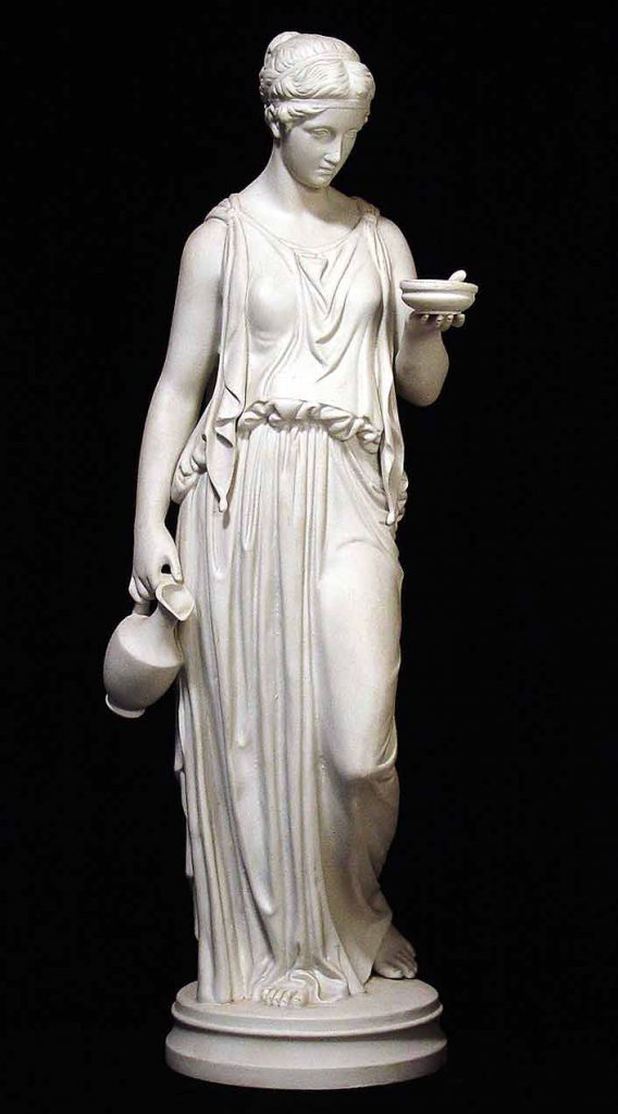
The Greeks wore simple, light garments, as most of the year brought tremendously hot weather, especially during the summer. Typically, Greek clothing consisted of a single piece of rectangular linen that was pinned and fastened around the body, commonly known as the chiton. Since men were outdoors more often and required comfier clothing, they wore the chiton down to their knees. On the other hand, women either wore the chiton or a tunic called a peplos (Greek for “peplum”) at full length, which was made out of slightly heavier wool material. When working or exercising, a type of chiton garment called an exomie was worn and draped over only one shoulder. During the winter, however, ancient Greeks wore a woollen cloak called a himation over top of their usual garments.

Various examples of clothing worn in Ancient Greece http://diiomnymi.blogspot.com/2014/01/ancient-greek-clothes_7.html

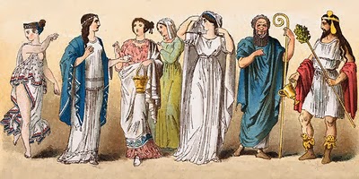
Most ancient Greek people could go a lifetime walking barefoot without any sort of footwear, as shoes and sandals were not very common. Sometimes, sandals or boots were worn if needed for things like special occasions. During the summer, Greek men wore wide-brimmed hats called petasos to protect themselves from the hot sun. Women also wore hats with crowns on occasion.


The Greek “Alpha-Bet(a)”

The ancient Greek writing system is one of the first classical alphabets to exist, therefore making it the basis and foundation for the Western script that is used today. As the Greek alphabet used letters to spell out words, no ideograms or pictographs were considered necessary. In around 800 BCE, the Greeks developed certain characters from the Phoenician system into their own alphabet.

Dipylon Oinochoe Inscription on Pottery, one of the oldest examples of the Greek alphabet (740 BCE) https://www.ancient.eu/image/3425/dipylon-oinochoe-inscription/

The Greek alphabet was the first script to use both vowels and consonants. This is because the Phoenician system used predominantly consonant sounds, making some of their alphabet symbols represent only consonants. Greece took these consonant symbols and turned them into what we now know as the vowels a, e, i, o, and u. The writing style in ancient Greece, however, went through various changes throughout this period. The earliest Greek alphabet was written from right to left, with the letters facing the left direction (which seems backwards to us). As time went on, Greeks wrote in a bidirectional manner, meaning that each line of text alternated between right-facing and left-facing. Finally, after 500 BCE, they settled on writing from left to right.


Bibliography

Ancient Greek Clothing

writer873 – https://www.ancient.eu/article/20/ancient-greek-clothing/

Ancient Greek Clothing – What Did the Ancient Greeks Wear?

http://www.historyofclothing.com/clothing-history/ancient-greek-clothing/

Greek Alphabet

The Editors of Encyclopaedia Britannica –https://www.britannica.com/topic/Greek-alphabet

Greek Alphabet

Cristian Violatti – https://www.ancient.eu/Greek_Alphabet/

Visual Research II: Gestalt Theory

Similarity: This poster done by Kevin Finn is a great example of the principle of similarity. It is evident that all the red rectangles on the page are the same colour, size and shape, and are therefore interacting with each other as the first few rectangles have been knocked over. This suggests that as time goes on, all of the dominoes (or however you would like to perceive them) will eventually fall over.

Figure/Ground: This poster for the film Sherlock Holmes was done by Olly Moss and perfectly demonstrates the optical illusion that can occur in a figure/ground piece. If you look closely, you will be able to flip between the white outline of smoke coming out of the pipe (which could also be an example of continuation) and the red figure on the left of a man in a hat.

Yearbook Spread

This week, I created a spread that measures 17 x 8.5″ and displays various facts about me in an imaginary yearbook format. Overall, I like that my spread takes on a rather rustic, scrapbook-like aesthetic, as I am a big fan of the organized collage-style when it comes to design. I think that the three main colours on the sticky notes (yellow, pink, and blue) provide a strong contrast from the neutral brown tones in the background. This is notable because I am generally a quiet and somewhat timid person, however, when you get to know me a little more, (much like how you get to know me on the sticky notes), I become more outgoing and enthusiastic. 

In conclusion, I think that I would give this piece a 9/10. I believe that I communicated all my information in a clear and creative way. If I had a little more time, I would probably add more to the background and possibly expand even more on the collage theme by cutting and pasting more photographic clippings.

Visual Research I: Design Elements

Size: This poster for Netflix’s Stranger Things displays certain characters much larger in size than others. The enlarged characters happen to be more prominent in this particular season of the show, while the smaller characters in the background seem to only appear occasionally. This poster was designed by Kyle Lambert.

Lines: The album cover art for Panic! at the Disco’s Death of a Bachelor demonstrates an interesting use of both squiggly and sharp lines rather than a simple image of a pool and a man passed out on the roof. The cover art was illustrated and designed by Nicole Guice.

Colour: The graphic novel, Through the Woods, written and illustrated by Emily Carroll, uses red as a pop of colour on top of the black and white on the rest of the cover. This pop of colour, as well as the small figure in blue, helps highlight particularly important aspects like the title and main character.