Survey 9: The Origin of the Mischievous Mickey Mouse

The Beginning of Sound in Film
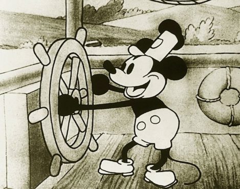
The iconic opening image, Mickey Mouse in “Steamboat Willie”.

On November 18, 1928, Walt Disney Studio’s short film Steamboat Willie hit the screens for the first time at Universal’s Colony Theater in New York City. Directed by Walt Disney and American animator Ub Iwerks, the film features the debut of everyone’s favourite cartoon characters, Mickey and Minnie Mouse.

Although Mickey and Minnie were not anything new in the eyes of Disney or Iwerks, Steamboat Willie truly changed the game for cartoons at the time. This film is now known to be the first-ever cartoon to successfully integrate synchronized sound. The film features two songs: “Steamboat Bill” which was popular in the 1910s, and “Turkey in the Straw” which dates back to the 19th century. In order to truly synchronize the sound to the film, the trick was for musicians behind the screen to use a “click-track” (metronome) to keep in time. On top of this, Walt Disney himself also provided the (minimal, yet important) sound effects for various characters in the film.
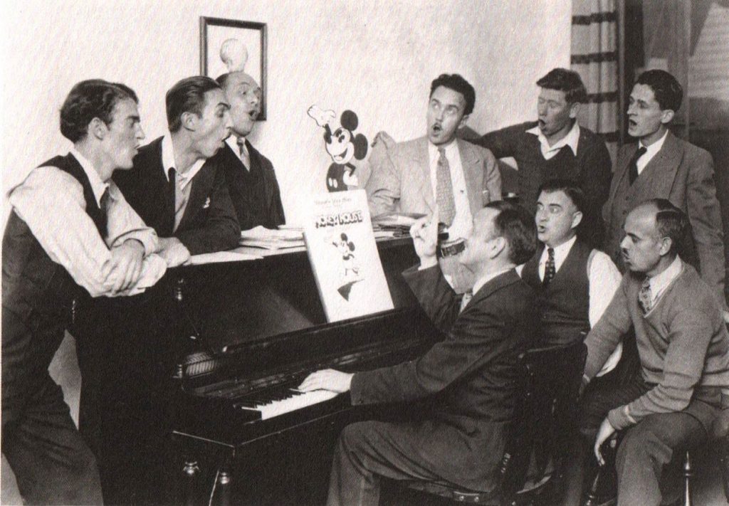
A group of men sat around a piano, Mickey Mouse songbook in hand.

In the end, Disney knew that ultimately, adding synchronized sound would be prominent in the future of filmmaking. While Steamboat Willie has always been praised for introducing one of the world’s most popular cartoon characters, it is important to thank Disney for the introduction of new sound technology in film.


Mickey’s Character Design

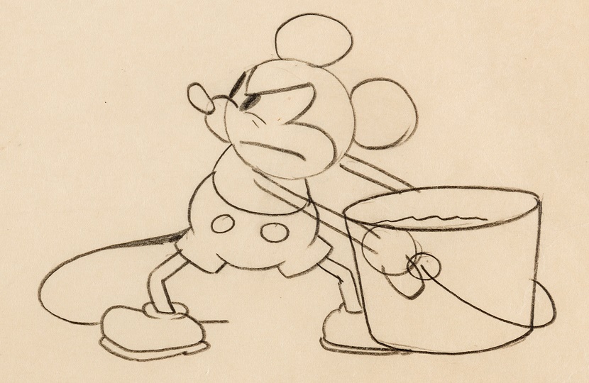
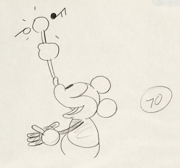
Mickey’s early character design was done by Ub Iwerks and heavily resembled that of another popular cartoon character at the time, Oswald the rabbit. Iwerks focussed primarily on making Mickey’s overall design simple by using circular shapes for his ears, head, and body. Supposedly, Mickey’s hands only consisting of three fingers and a thumb was mostly a financial decision, as the addition of an extra finger in each of the thousands of frames would cost millions of dollars. Finally, white gloves were given to the mouse mainly to give contrast from the rest of his dark body. In fact, because of Mickey Mouse, gloves are now a very popular character design choice among many other cartoon characters.

Sources:

“Mickey Mouse.” Wikipedia, Wikimedia Foundation, 6 Dec. 2020, en.wikipedia.org/wiki/Mickey_Mouse.
“Steamboat Willie.” Wikipedia, Wikimedia Foundation, 5 Dec. 2020, en.wikipedia.org/wiki/Steamboat_Willie.

Images:

https://www.moma.org/learn/moma_learning/walt-disney-ub-iwerks-steamboat-willie-1928/
https://medium.com/@martidg/from-sound-to-music-5bdf62c16dba
Important Mickey Mouse production drawings for sale at Heritage Auctions
https://comics.ha.com/itm/animation-art/production-drawing/steamboat-willie-mickey-mouse-animation-drawing-walt-disney-1928-/a/7196-95012.s
Let’s (Type)FACE It!

A Timeline on the History of Typography

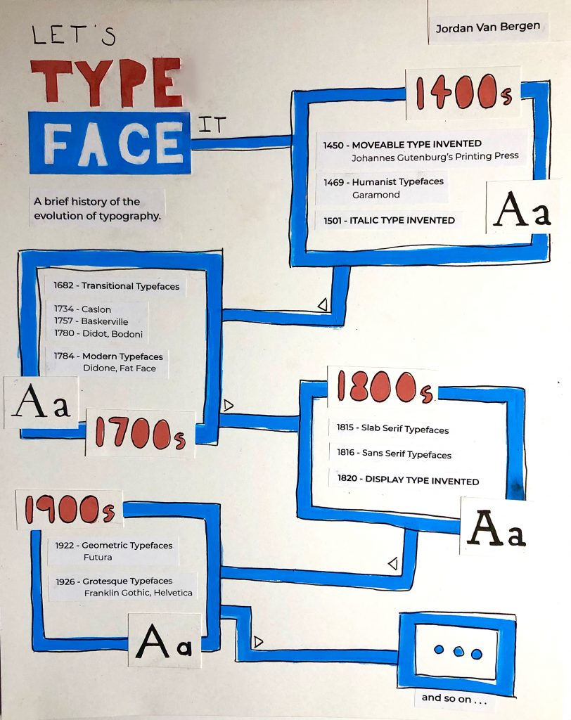
The final poster execution, done with gouache, ink, and printed elements.

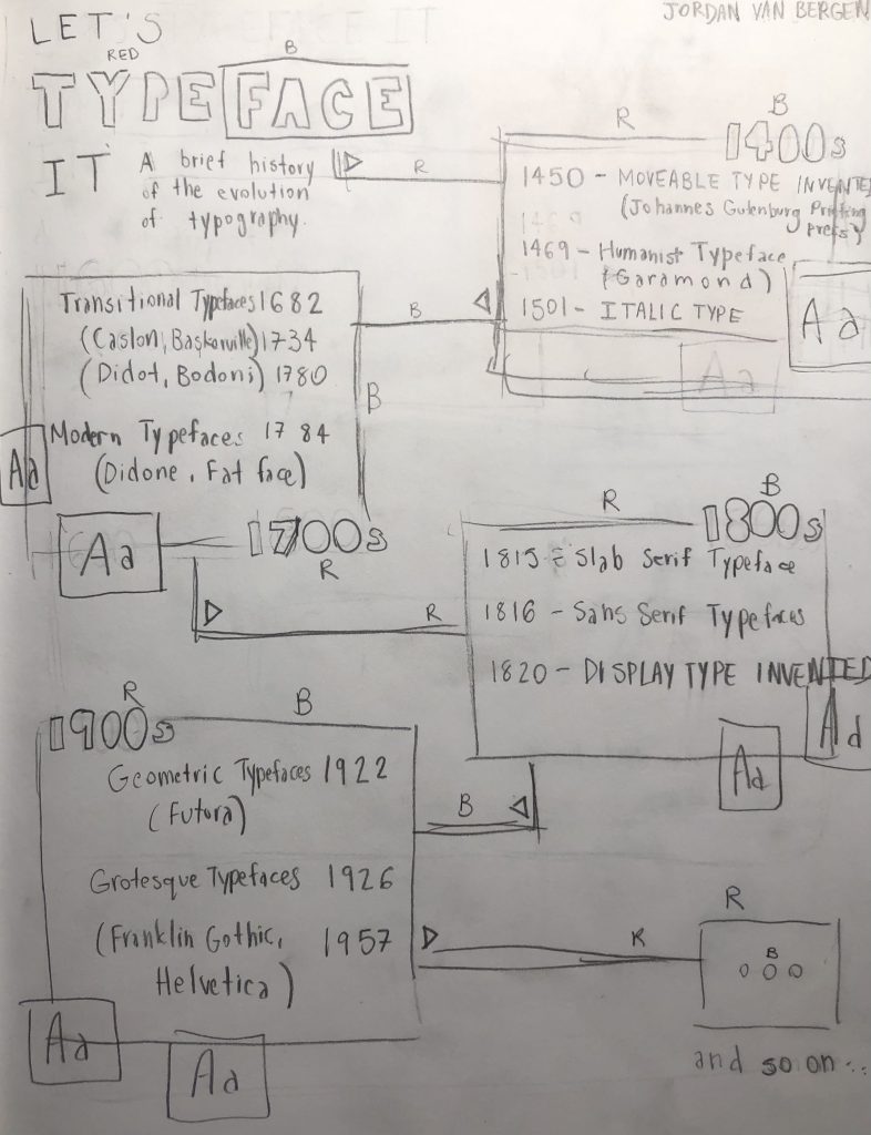
When drafting ideas for this infographic on the history typography, I wasn’t really sure where to go. Sure, I had found numerous timeline compositions that I felt very inspired by, however, I had trouble executing them.

In the end, I decided to go with the title “Let’s TypeFACE It”, which I honestly thought was very clever as I went with a pretty general approach to the history of typography. One of the examples that I came across featured very geometric shapes with lines and squares, as well as vibrant colours. I was heavily inspired by this particular infographic mainly because of how much of a fan I am of modern approaches, especially ones that are done in a very unique way. I think I went with a overall doodle-ish, crafty style (with my line work and cut and paste elements) because I felt it accurately described the versatility of all the different typefaces, especially typefaces in our modern world. The world of design has truly come a far way in terms of typography, and I really wanted to make sure I captured that in my poster.

As for my mark, I think I would give myself 7/10. I don’t think I’m a huge fan of how my piece turned out for this assignment. I really wanted to create something similar to the unique compositions I came across while doing research, but I think that what I created might be a bit too simple or messy. I think that if I were to do a project like this again, I would lean towards creating a digital infographic, mainly because I would have the ability to make cleaner, more geometric lines and shapes, as well as adding pictorial elements with a lighter opacity. That way, I could create a hierarchy of sorts, rather than struggling to execute a poster in a traditional form. Nevertheless, I think it’s important to see a project through, even if you don’t like where it’s going. In the end, I’m glad I learnt a lot.

Research Sources: 

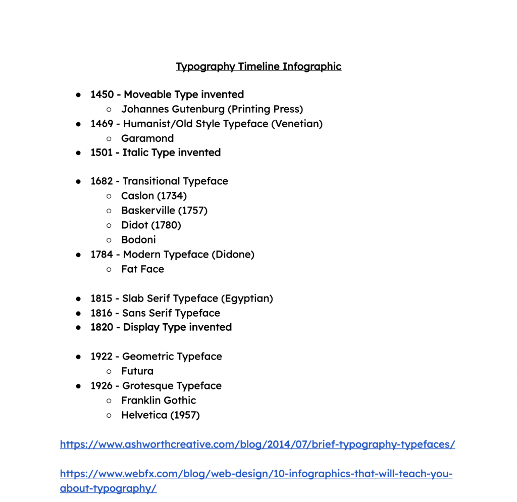
https://www.ashworthcreative.com/blog/2014/07/brief-typography-typefaces/
https://www.webfx.com/blog/web-design/10-infographics-that-will-teach-you-about-typography/

Historical Artifact: ‘Le Chat Noir’ Poster

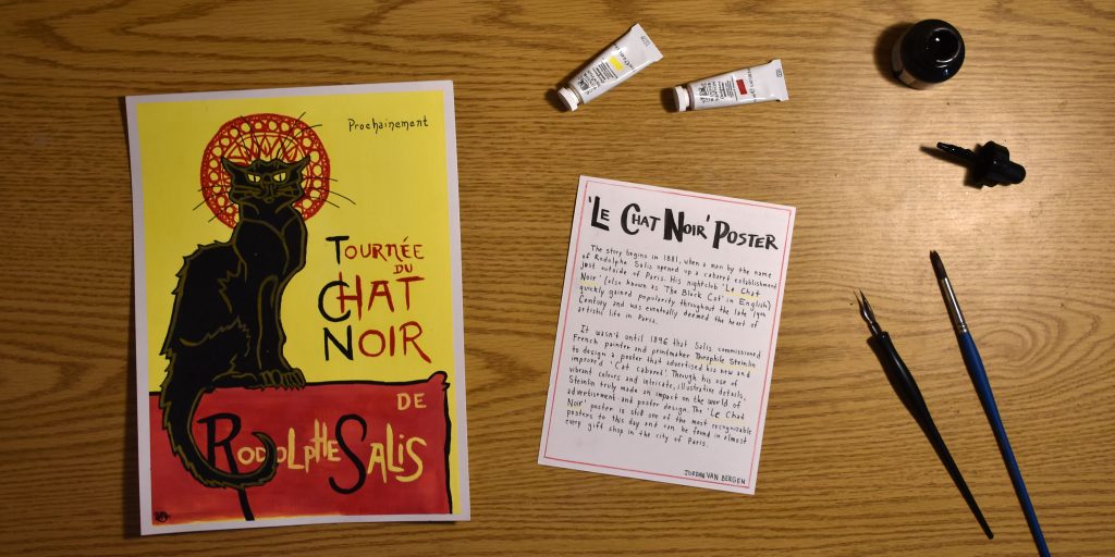
My rendition of the ‘Le Chat Noir’ poster, along with a brief historical description.

This week, my task was to recreate a historical artifact that I believe has greatly influenced the world of art and design today. As seen in my previous blog post, I was very inspired by the Le Chat Noir poster design by Theophile Steinlin.

As pictured above, I think I did a pretty good job of recreating the poster, despite the fact that it is not 100% spot-on. I decided to use a brighter shade of yellow in the background to emphasize the pop of vibrant colour. I also exaggerated the red halo detail behind the cat’s head, as this is an interesting detail referencing another late 19th-century artist named Alfonse Mucha. It is evident that there is not much going on in the photo itself, so I opted to simply display the materials I used, as it is quite likely that Steinlin practiced illustration with painting and ink as well. Nevertheless, the description page on the left was an attempt at complementing the poster using a red and yellow accent, as well as a noticeably hand-painted display font.

I think I would give myself a solid 8/10 on this project. I think that the artifact itself is beautifully done, and the description is quite informative, however, the photo maybe could have been a bit more creative. It was definitely difficult to portray a historically accurate scene including the artifact and description.

Survey 6: The Cat Cabaret, ‘Le Chat Noir’

Cabaret Culture

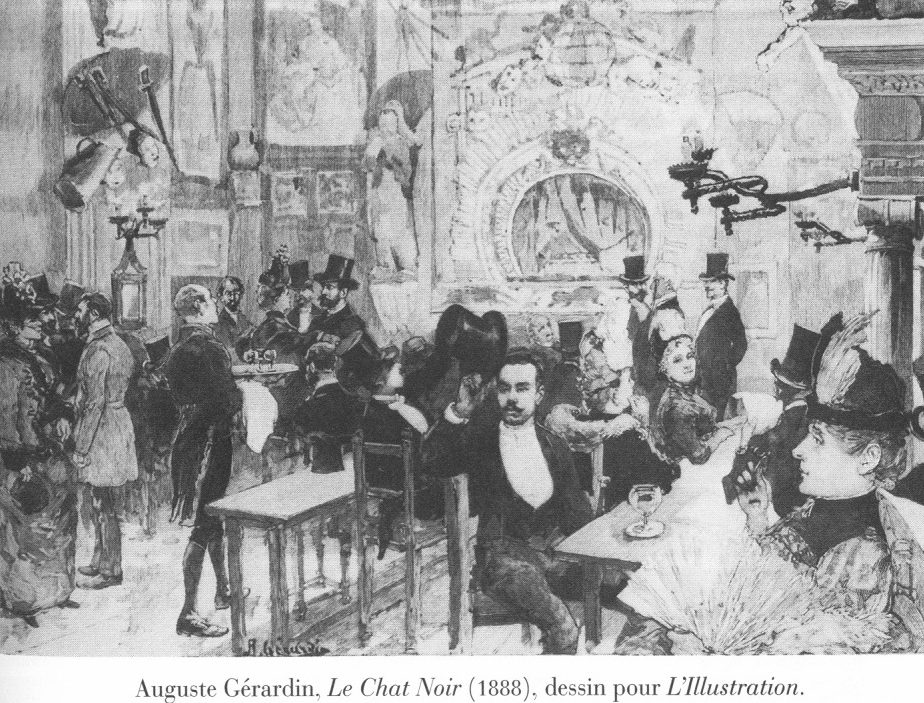
An image of the original cabaret venue, located in a small apartment.

In 1881, a man by the name of Rodolphe Stalis opened up an entertainment establishment in a bohemian district called Montmartre, just outside of Paris, France. Little did he know that this seemingly minuscule theatre would eventually become one of the most popular and recognizable establishments.

Upon founding his business, Stalis decided to call the nightclub Le Chat Noir or ‘The Black Cat’ in English. Apparently, the reason behind this is because he simply came across a black cat while the nightclub was under construction, however, I like to think that there is much more to the story. Maybe he associated the black cat with evil, dark magic, foreshadowing the emergence of the nightclub as the first ever provocative cabaret in Paris. 

An illustration of the larger, much fancier venue.

In Le Chat Noir, guests would sit at tables drinking alcoholic beverages and watching various artists perform on stage as a form of entertainment. Anyone from actors, singers, musicians, and even poets could perform. The cabaret was a loud and sometimes rowdy setting, however, it gained more and more popularity, and was eventually deemed the heart of artistic life in Paris. Le Chat Noir stayed open until 1897, making it the centre of nightlife for just over 15 years.


The Mind Behind the Design

The official ‘Le Chat Noir’ poster design by Theophile Steinlin.

The Cabaret wasn’t popularized all on its own, though. Like all establishments, advertisements were needed in order to spread the word. Lucky for Stalis, Le Chat Noir’s poster design done by Theophile Steinlin became one of the most recognizable posters in Paris and is still very well known to this day. 

Steinlin designed the poster with emphasis on the entertainment aspect of the cabaret. The text translates to: ‘Coming Soon, Rodolphe Stalis’ Le Chat Noir on Tour”. Steinlin printed the poster using colour lithography, and features, of course, a black cat, which was a popular subject in a number of his works. This cat in particular, however, has a bit of a mischievous look on its face, which adds to my theory about black cats and dark magic. Steinlin also decided to use the colour red to emphasize certain areas of the poster, like the text, for example. The intricate halo design behind the cat’s head, however, is a subtle nod towards a fellow poster designer by the name of Alphone Mucha, who featured images of women with circular halos behind their heads. 

Sources:

“Le Chat Noir.” Wikipedia, Wikimedia Foundation, 3 Nov. 2020, en.wikipedia.org/wiki/Le_Chat_Noir.
Ugc. “Le Chat Noir Collection.” Atlas Obscura, Atlas Obscura, 13 Feb. 2018, www.atlasobscura.com/places/le-chat-noir-collection.
Westologist, The. “The Black French Cat.” The Westologist, www.thewestologist.com/ideas/the-black-french-cat.

Images:

https://en.wikipedia.org/wiki/Le_Chat_Noir
https://pariswonders.com/page/3/ 

Braille: A Typeface for the Blind

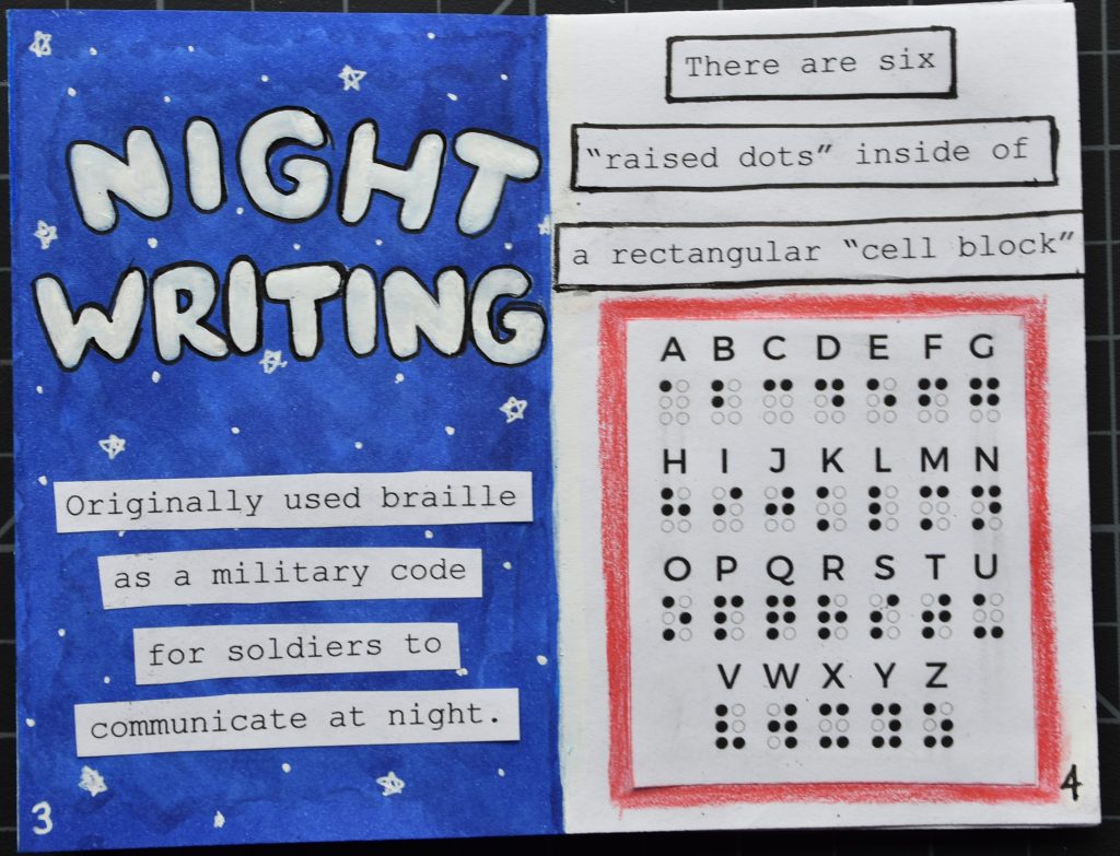
The full zine, unfolded

About two weeks ago, my class was prompted to construct a “zine” (short for magazine, or little booklet) about something of our choice related to typography. As a result, I started to research the history of Braille and how the “language for the blind” came to be. Although Braille isn’t necessarily considered a font, I think it is especially interesting to learn more about a “font” that isn’t universally used every day.

Looking closer at the zine, it is noticeable that the three dominant colours are dark blue, bright red, grey, and of course, black and white. I chose the colours blue and red because Louis Braille, the creator of Braille, grew up in France, where he attended The National Institute for the Blind (located in Paris) thus, inventing Braille. Many of the shapes that I have used are geometric, hinting at a playful theme which I think is fitting as he invented Braille when he was still in school at the young age of 15. It is evident that the font used is pretty simple, and that there is not a lot of writing. I aimed to keep the zine quite minimalistic, as I feel as though that would make it easier to follow. It was also important to me that I tried to fit in as much of the Braille language as possible, so leaving room for small dot patterns was essential.

In conclusion, I think that I would give myself a 9/10. I think that my zine has a well-developed, organized flow to it, and I think that I subconsciously took into consideration that the origins of Braille can be taught to people of any age, especially since it was developed in a children’s school. I really like that I used both printed media, as well as various inks and colours. My only concern is that some may argue that the overall concept of Braille doesn’t really fit into the category of typography. I personally think that that is not the case, as Braille can be found on public signs almost everywhere.

Survey 4: The Tale of the Telegraph

The Origins of the Telegraph

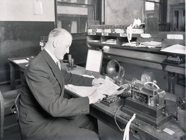
A man working inside a telegraph office, https://www.theregister.com/2019/09/19/geeks_guide_to_the_central_telegraph_office_and_bt_centre/

During the late 1830s, it seemed as though people were struggling to communicate with one another at large distances. However, Sir William Cooke and Sir Charles Wheatstone soon realized that it may be beneficial to invent a brand new communication device. That very device was called the telegraph and is still very well known today.

The first telegraph that was ever created was called a “needle telegraph” (1837), which featured several needle pointers that used electromagnetic principles to point at various letters on a triangular grid and spell out a message. These messages would be sent from one telegraph office (or telegraph station) to another through the electrical signals running through the connecting wires on utility poles.


Morse Code: The New Language

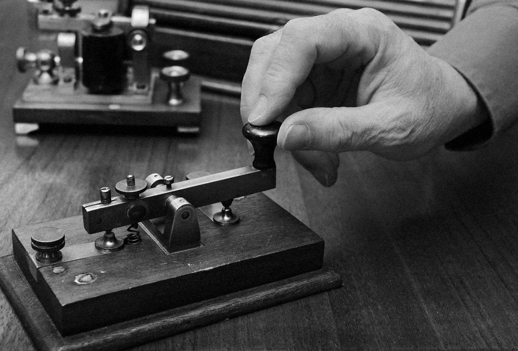
A telegraph key, used to tap “dots and dashes,” https://www.kaspersky.com.au/blog/telegraph-grandpa-of-internet/9034/

The morse telegraph (1838) was invented soon afterwards and deemed much more efficient. This telegraph is activated by tapping a “telegraph key” using a combination of dots (short taps) and dashes (long taps), which then sends out an electric pulse that makes a clicking sound at the receiving telegraph office.

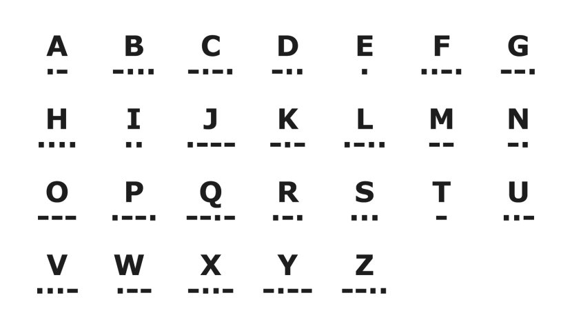
The famous “dots and dashes” language was invented by a man named Samuel Morse, who assigned each letter of the alphabet a specific morse code combination. Samuel Morse created the code in such a way that made it easier for people to remember. Generally, commonly used letters were assigned a simple combination of dots and dashes, while letters that were used less commonly were assigned slightly more complex combinations. A great example of this is the internationally recognizable “SOS” distress symbol that originated because “S” in morse code is three dots, while “O” in morse code is three dashes.

A morse code guide chart, https://science.howstuffworks.com/innovation/inventions/morse-code.htm

Originally, the morse telegraph recorded each dot and dash mark on a piece of paper for the designated telegraph operator to translate. Later, it became evident that simply listening and recording the codes manually was much easier and more efficient, especially as the telegraph operator became more and more familiar with how to read the code.

Sources:

“Electrical Telegraph.” Wikipedia, Wikimedia Foundation, 18 Oct. 2020, en.wikipedia.org/wiki/Electrical_telegraph.


History.com Editors. “Morse Code & the Telegraph.” History.com, A&E Television Networks, 9 Nov. 2009, www.history.com/topics/inventions/telegraph.


“Telegraph.” Encyclopædia Britannica, Encyclopædia Britannica, Inc., www.britannica.com/technology/telegraph.

Invision Sucks: An Honest Attempt at a Research Mood Board

For the last couple of weeks, I have been working on researching three specific events that occurred during the same time period as our IDES 141 class’ Survey 4 lesson on “Steam and the Speed of Light” (1750-1850). My three chosen events were: 1) The First Passenger Railway in Britain (1825), 2) The First Illustrated Newspaper in Britain (1832), and 3) Samuel Morse and the Invention of the Telegraph (1838).

Overall, I have to say that I definitely struggled with this project. I found that researching specific topics within the chosen events was quite challenging, especially because there is only so much accessible information that can be found on each event. When it came to organizing the information and working with Invision, I seemed to have gotten even more frustrated, as I struggled with saving my preferred layout and making my board look appealing. I think that I would prefer to use Invision in a collaborative way (similar to Padlet), where I can work with classmates or colleagues to brainstorm an idea and form colour palettes (as that is actually a feature!).

In the end, I would give myself a 7/10 for this project. I think that I spent enough time diving deep into research on each topic, however, I struggled to make connections between events. To solve the earlier problem, I had to make a compromise and develop personalized topics that I felt were more suited toward the specific event. For example, the fashion topic ended up not fitting in with any of my events. As for my layout, I think that I chose strong images and used eye-catching headlines and keywords. My choice to separate all three events ended up working quite nicely so that I could have more fun with image sizing and hierarchy. If I had more time, I think I would’ve emphasized certain colour palettes within each event, as these old, historic events oftentimes feel the need to be in black and white.

The link to my Invision Mood Board can be found here: https://jordanvanbergen83051.invisionapp.com/board/IDES-141-Mood-Board-ckg8jjych0o5717vk9fl9fnql

Survey 3: It’s Tea Time!

The Origin of English Tea

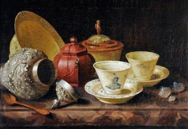
“Seventeenth Century Tea-Time” by Pieter Gerritsz Van Roestraten

Ah, tea. The delicious warm leaf drink that everyone seems to enjoy drinking while snuggling up with a good book (or Netflix, in my case) after a long day. Generally, when people think about tea, they either think about traditional chai or green tea from certain parts of Asia, or they think about classic earl grey mixed with milk and sugar from England. The fact of the matter is that, well, both are fairly accurate, and neither version is wrong.

The creation of green tea in China actually dates all the way back to 2737 BC, however, the tea didn’t get exported to England until 1660, where it was introduced to a coffeehouse in London. As this was a new drink in England at the time, it quickly became very expensive, costing almost six times as much as coffee cost. In fact, tea was only popular amongst the upper class for a while, as King Charles II’s wife (Queen Catherine of Braganza) introduced it as a “custom drink” that was enjoyed amongst her friends at afternoon parties. 

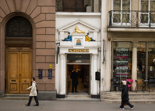
Twinings Tea Shop in London, England

It wasn’t until much later that a man by the name of Thomas Twining opened the first tea shop in London in 1717. This is when tea became more affordable, and therefore, more widely enjoyed by people of all classes. The most common English tea at the time was, of course, the English Breakfast Tea, which was mixed with milk and sugar and sometimes served with biscuits, scones, or crumpets.


Made in China

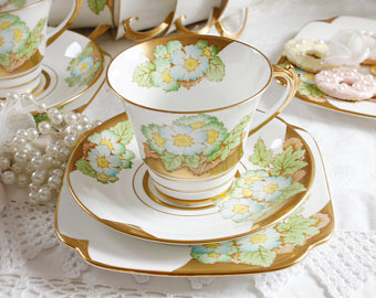
Example of an antique porcelain teacup with a saucer

Traditionally, in China, tea was served in porcelain cups without handles, however, the popularization of tea in Britain made for large growth in the pottery industry. Tea sets were typically sold with a saucer (small plate) and, of course, the teacup. The common etiquette at the time was to hold the saucer in one hand, and the teacup in the other (dominant) hand so that the teacup could be placed back down in between sips. 

As for teapots, the earliest versions were in small vessels that could only hold up to two or three cups of tea (due to the expense of tea at the time). In England, metal teapots were quite common, as they were able to keep the tea as hot as possible, however, porcelain teapots that are used in China are believed to keep the tea a better flavour. 

Sources:

Davis, Melissa. “The Continuing Tempest Over Teapots.” The Washington Post, WP Company, 15 Feb. 1979, 
www.washingtonpost.com/archive/lifestyle/1979/02/15/the-continuing-tempest-over-teapots/4dd9230f-522a-4b02-a3ff-b4eaee4f5d2b/.

Lemm, Elaine. “The Different Types of Tea in Britain - There Are Many.” The Spruce Eats, 
www.thespruceeats.com/history-and-types-of-british-tea-435180.

“Tea in the United Kingdom.” Wikipedia, Wikimedia Foundation, 20 Sept. 2020, 
en.wikipedia.org/wiki/Tea_in_the_United_Kingdom.

TopicTea. “The History of Tea in Britain - Who Brought Tea to England?” TopicTea, 
topictea.com/blogs/tea-blog/history-of-tea-in-britain.

Images:

Elizabeth Pepys’s Potticary Tea
https://www.atlasobscura.com/places/twinings-tea-shop 
https://www.etsy.com/uk/listing/862499433/roslyn-primula-tea-set-stunning-early?ga_order=most_relevant&ga_search_type=all&ga_view_type=gallery&ga_search_query=english+tea+set&ref=sr_gallery-1-3&cns=1

Survey 1: Ancient Greece

Function, Not Fashion

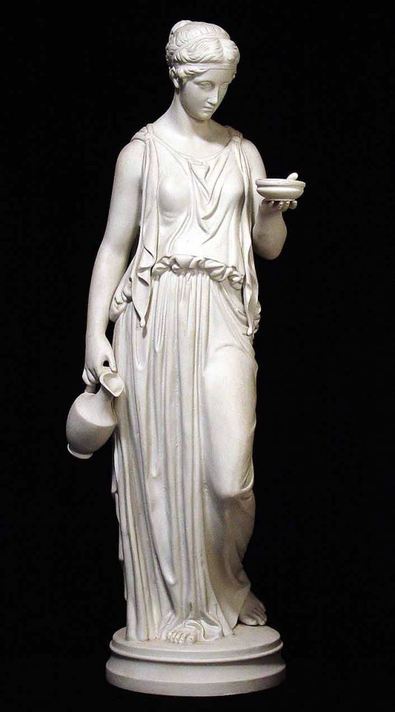
Ancient Greek Lady, dressed in a full-length “peplos” https://stephenliddell.co.uk/2015/03/24/beauty-the-beast-double-standards-in-ancient-greece/

In general, ancient Greece has been known to dwell on the functionality and simplicity of a given concept, rather than any minor intricacies. For example, things like ancient Greek architecture were fairly simple, but that didn’t make great structures (like the Parthenon) any less magnificent. This is especially evident when it comes to ancient Greek fashion and the style of clothing that was worn at the time.

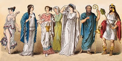
The Greeks wore simple, light garments, as most of the year brought tremendously hot weather, especially during the summer. Typically, Greek clothing consisted of a single piece of rectangular linen that was pinned and fastened around the body, commonly known as the chiton. Since men were outdoors more often and required comfier clothing, they wore the chiton down to their knees. On the other hand, women either wore the chiton or a tunic called a peplos (Greek for “peplum”) at full length, which was made out of slightly heavier wool material. When working or exercising, a type of chiton garment called an exomie was worn and draped over only one shoulder. During the winter, however, ancient Greeks wore a woollen cloak called a himation over top of their usual garments.

Various examples of clothing worn in Ancient Greece http://diiomnymi.blogspot.com/2014/01/ancient-greek-clothes_7.html

Most ancient Greek people could go a lifetime walking barefoot without any sort of footwear, as shoes and sandals were not very common. Sometimes, sandals or boots were worn if needed for things like special occasions. During the summer, Greek men wore wide-brimmed hats called petasos to protect themselves from the hot sun. Women also wore hats with crowns on occasion.


The Greek “Alpha-Bet(a)”

The ancient Greek writing system is one of the first classical alphabets to exist, therefore making it the basis and foundation for the Western script that is used today. As the Greek alphabet used letters to spell out words, no ideograms or pictographs were considered necessary. In around 800 BCE, the Greeks developed certain characters from the Phoenician system into their own alphabet.

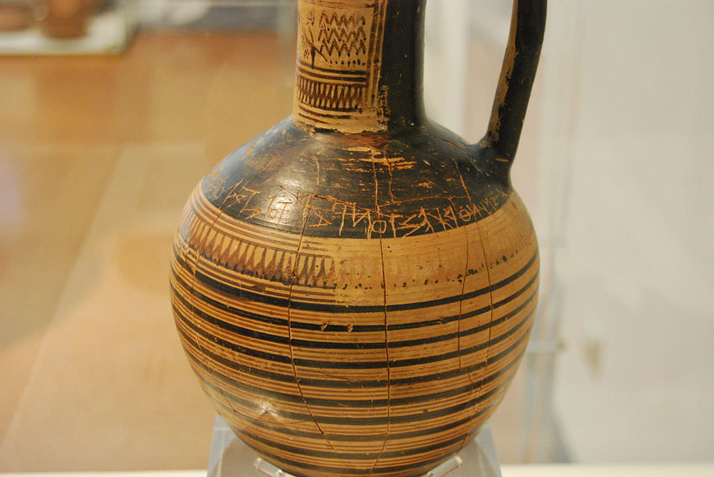
Dipylon Oinochoe Inscription on Pottery, one of the oldest examples of the Greek alphabet (740 BCE) https://www.ancient.eu/image/3425/dipylon-oinochoe-inscription/

The Greek alphabet was the first script to use both vowels and consonants. This is because the Phoenician system used predominantly consonant sounds, making some of their alphabet symbols represent only consonants. Greece took these consonant symbols and turned them into what we now know as the vowels a, e, i, o, and u. The writing style in ancient Greece, however, went through various changes throughout this period. The earliest Greek alphabet was written from right to left, with the letters facing the left direction (which seems backwards to us). As time went on, Greeks wrote in a bidirectional manner, meaning that each line of text alternated between right-facing and left-facing. Finally, after 500 BCE, they settled on writing from left to right.


Bibliography

Ancient Greek Clothing

writer873 – https://www.ancient.eu/article/20/ancient-greek-clothing/

Ancient Greek Clothing – What Did the Ancient Greeks Wear?

http://www.historyofclothing.com/clothing-history/ancient-greek-clothing/

Greek Alphabet

The Editors of Encyclopaedia Britannica –https://www.britannica.com/topic/Greek-alphabet

Greek Alphabet

Cristian Violatti – https://www.ancient.eu/Greek_Alphabet/

Yearbook Spread

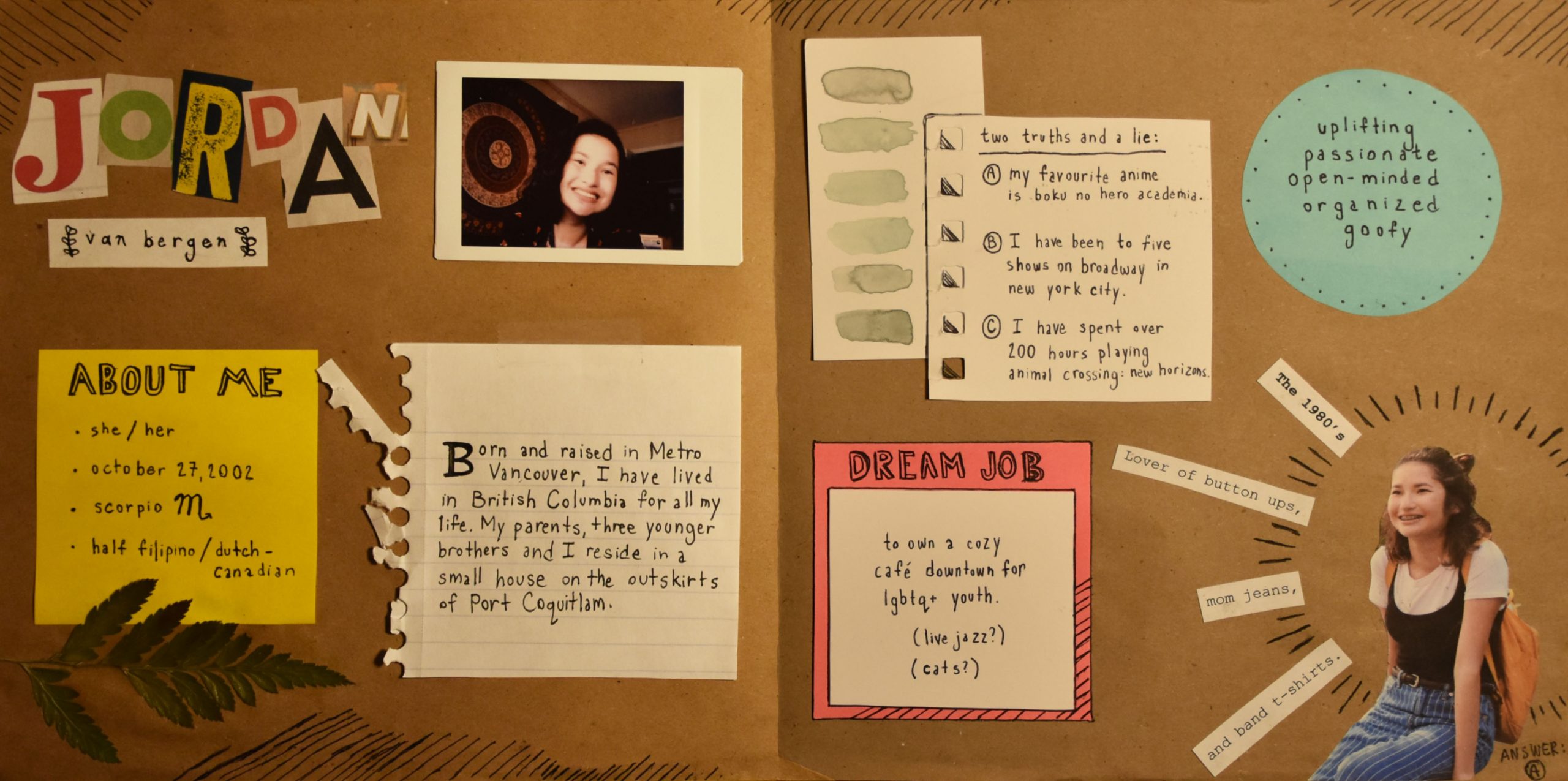
This week, I created a spread that measures 17 x 8.5″ and displays various facts about me in an imaginary yearbook format. Overall, I like that my spread takes on a rather rustic, scrapbook-like aesthetic, as I am a big fan of the organized collage-style when it comes to design. I think that the three main colours on the sticky notes (yellow, pink, and blue) provide a strong contrast from the neutral brown tones in the background. This is notable because I am generally a quiet and somewhat timid person, however, when you get to know me a little more, (much like how you get to know me on the sticky notes), I become more outgoing and enthusiastic. 

In conclusion, I think that I would give this piece a 9/10. I believe that I communicated all my information in a clear and creative way. If I had a little more time, I would probably add more to the background and possibly expand even more on the collage theme by cutting and pasting more photographic clippings.