Categories
141

Survey I: Han Dynasty Architecture and Burial Culture (200 BCE.)

Everyday in my Filipino household, you can hear the echoes of asian dramas coming from the living room. Most of the time they are Chinese dramas that my mom loves to watch, some of them being based on the Han Dynasty which is around 200 BCE. I personally do not watch them, but when I glance over at the television, I can not help but notice the sets of architecture.

(Ban Shu Legend 2015)

You can imagine my disappointment when I found out that there are not many pieces of architecture from the Han Dynasty that survived to this day. However, there are historical writings and poems known as fu, these poems are composed with lots of descriptions and are relatively long which contains information about Han architecture. This literature often referenced tall towers in capital cities mainly used for watchtowers, astronomical observatories, and religious structures to appeal to immortal beings, sometimes these tall towers surround multi-story buildings along with courtyards. Since these structures did not survive to this day due to them being mainly built out of timber, which fell victim to rapid decay and an unfortunate case of wood not being fireproof, luckily there are multiple ceramic model replicas that exist such as this one. 

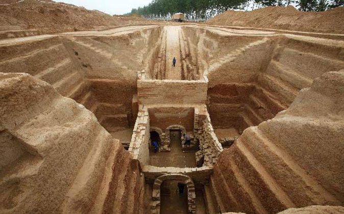
The Han dynasty is also well known for their great palace buildings such as the Efang Gong (also known as Ebang Gong), the main hall alone was made to fit 10,000 guests, and it stretched more than 11km along the Wei River. What might be equally as iconic as the palace, would be the tombs as they are incredibly elaborate. Instead of them being built out of timber like the other main buildings, they were made from stone or brick. 

More Than 100 Han Dynasty Tombs Discovered in China
Immortality of the Spirit: Chinese Funerary Art from the Han and Tang  Dynasties Exhibition Catalogue

During this era, they held a great value in the afterlife and believed that it is just as important as existence on earth, that is why their tombs were elaborate, they were seen as a gateway to the afterlife. Individuals were to be buried with figures called “mingqi”. These figures are essentially objects like instruments or weapons and even statue spiritual representations made with pottery, bronze, gold, silver, lacquer, and jade which is believed to have spiritual qualities. The purpose of “mingqi” is essentially to supply an individual in the afterlife with necessities and comfort items since everything in life is needed in death. In addition to this, the more objects one would have in their tomb displayed one’s wealth and status.

Links:

https://courses.lumenlearning.com/boundless-arthistory/chapter/the-han-dynasty/#:~:text=Surviving%20architecture%20from%20the%20Han%20Dynasty%20includes%20ruins%20of%20brick,that%20once%20adorned%20timber%20halls.

https://digitalcommons.fairfield.edu/cgi/viewcontent.cgi?referer=https://www.google.com/&httpsredir=1&article=1000&context=immortality_ephemera

https://ezproxy.capilanou.ca/login?url=https://search.ebscohost.com/login.aspx?direct=true&db=edb&AN=90134489&site=eds-live&scope=site

https://www.dur.ac.uk/whatson/event/?eventno=10004#:~:text=During%20the%20Han%20dynasty%20(206,granaries%20and%20even%20farm%20animals.

https://www.britannica.com/art/Chinese-architecture/Stylistic-and-historical-development-to-220-ce#ref283450

Categories
121

Visual Research II

– Figure/Ground –

This music poster relies on the figure/ground gestalt principle. Unfortunately, I was not able to find the designer for this poster, regardless they used this design principle to separate a foreground, midground, and background between people and the focus of the “88”.

– Continuation –

This poster was designed by Kyle Baker who uses continuation to propel his design. This is demonstrated by using the hair as lines to create a continuous line for the eye to follow, bringing it to the information at the front of the page.

Categories
141

Yearbook Spread

I like to consider myself a rather playful and optimistic person so I wanted to portray that in my spread. Personally I have always loved the aesthetic of peachy/pink tones with brown shades since it gives me a sense of warmth, happiness and energy, which I believe matches my personality. I decided to draw myself in my own simplistic cartoon style because I wanted to implement my own art style since it is very personal to me and I wanted to keep the overall mood of the spread light and simple. I wanted to make the polaroid and phone prominent because I love the aesthetics of technology so I wanted to implement that somehow. The second page was kind of a happy accident, I accidentally spilled brown watercolour paint on the paper so I decided to cover the whole page with that colour and placed white papers on top which in my opinion made them pop out of the page better. I believe that I was able to successfully portray who I am through this spread.

I would give myself an 8/10 because I feel as though I rushed through it and I would have been able to do a better job if I just took my time and gathered better materials to use. However considering the materials I have at home, I think I was able to do this assignment well.

Categories
121

Visual Research I

– Line –

This logo belongs to the ESports team Cloud 9 designed by Cory Heimbecker. This logo heavily relies on lines as it only requires two simple lines in order to create the image of a cloud out of what appears to be the number nine.

– Shape –

TSM also known as Team SoloMid is another ESports team that is well known in North America. The designer of the logo is unfortunately unknown. This logo is heavily reliant on the design element of shape as the letters “TSM” form a circle with S and M creating semicircles to fit inside.

– Colour –

Jared Mirabile is the designer of this logo for the ESports team 100Thieves, also well known in North America since they originate from Los Angeles. This logo depends on colour the most with red being the most prominent contrasting white drawing the eye towards the letter T and the circle.

Categories
100

About Me

Kathleen Manuel is an 18 year old student fresh out of high school and is ready to pursue her ambitions of working in artistic creatives through the IDEA program at Capilano University. She has always been absorbed in illustrating from a young age starting by drawing pieces related to other interests she had such as certain shows, online influencers and video games. Eventually she was able to start selling her art online through the help of Instagram and RedBubble which opened her eyes to the fact that she is capable of doing something she is passionate about as a career. In her grade eleven and twelve years she participated in yearbook which heightened her interest in design as well as illustration. This led her to choose Capilano University’s Bachelor’s of Design and Illustration as it was well known to be one of the best choices for creatives. Apart from illustrating, Kathleen enjoys singing, playing the ukulele, dancing, and playing video games.