I personally enjoyed working on this zine assignment. I was able to research a typeface that I found interesting and learned a lot in the process. In addition to this, I believe that this assignment helped my creative thinking process by forcing my mind to think creatively in finding ways to present information in an interesting and artistic manner. I decided to do my zine on Bodoni as I knew it was used in the posters of “Mamma Mia!” which is one of my mom’s favourite musical films. What I did not realize was that it was created in the early 1700s but was popularized in the early 1900s due to a renewal of this font. The word timeless immediately came to mind since it was used in a couple of centuries and is still used today and I followed the word timeless with typeface for a small bit of alliteration. Another thing I wanted to point out on my zine is the revitalization page, I wanted to represent this idea a little less literally and use the metaphor of the 15 growing seedlings as a “new life” for the Bodoni font with Morris Fuller being the individual tending to these seedlings represented by the rain. I would give myself an 8/10 for this assignment because although I feel like I was able to present my information well, I could have made it flow better and try to implement more colour to make it more engaging.
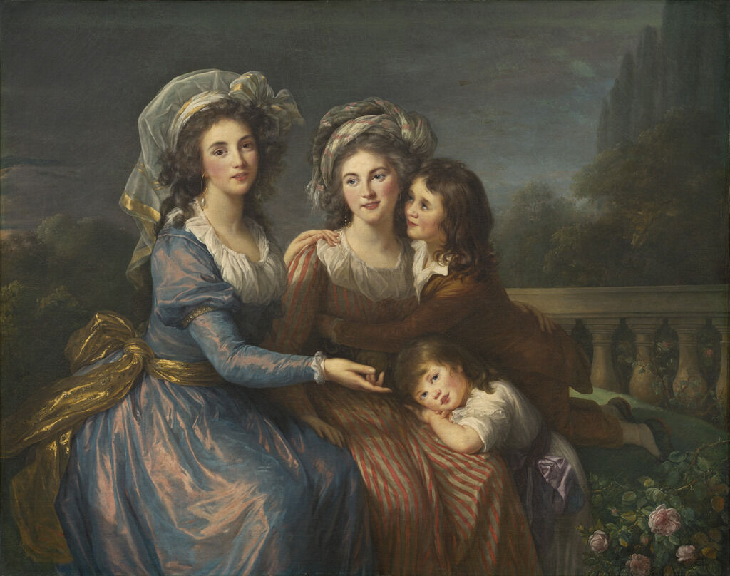
The Marquise de Pezay, and the Marquise de Rougé with Her Sons Alexis and Adrien
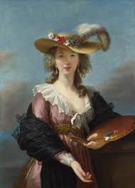
Self Portrait in a Straw Hat
Being a woman pursuing art, I gain inspiration from individuals such as French artist Marie-Louise-Élisabeth Vigée-Lebrun. She was able to make a mark in the Rococo period with her portraits, specifically ones of women, and her use of bright colours and loose brushwork. Her father, Louis Vigée, worked with pastel art which naturally put her in an artistic environment to grow, painting on any surface that was available to her. He was also able to educate her on the basics of art before he passed away when she was 12. All her hard work and dedication granted her a membership in a masters guild of painters and sculptors which led to her being brought to Versailles in order to paint a portrait of Queen Marie-Antoinette in 1779. As time went by, she painted multiple portraits of the queen and ended up developing a friendship with her. Due to this relationship, she was permitted into the Royal Academy of Painting and Sculpture which caused some controversy. Since she was a woman tied to the social status of her husband’s profession of an art dealer. This proved her to be a very powerful artist of her time.
Notice how your attention was first drawn to the title of this blog? One reason is it being at the top of the page, however, it enhances the effect by the boldness of the text contrasting from the text you are reading right now. Bold text also known as fat faces and slab serifs were heavily used during the industrial revolution.
Communication with Typeface
Industries were growing at a rapid pace, hence the name “the industrial revolution” due to this, communication through design was vital to promote their products against the competition. To enhance communication in typography people started experimenting with bold fonts. Robert Thorne responded to this growth of industrialization by founding the bold, fat roman typeface, which affected the development of advertisement for the revolution. Vincent Higgins was another individual who brought a new view of typography by introducing a 3D aspect to these bold typefaces in 1815. This then inspired designers to implement and essentially normalize the usage of these typefaces.
Robert Thorne’s typeface
Technology and Design Hand in Hand
Technology and design seemed to grow hand in hand during the revolution. As I mentioned, design was needed to create advertisements in magazines or newspapers for products and machines factories produced, some of these machines being made supposedly to assist designers and typography in general.
Inventions such as the steam-powered printing press by Friedrich Koening and metal or wood hand presses used for important words with typically the largest typeset being used in print shops sped up the production of newspapers and advertisements making it cheaper and efficient. However, this did take away jobs from individuals who worked in typesetting, only one person was needed to work a machine that would normally take multiple people to do.
Friedrich Koenig’s steam powered printing press
Another huge invention that benefits designers from the industrial revolution was photography. Joseph Nicéphore Niépce took the first-ever permanent photo using a camera obscura. This allowed designers to take their designs even further by now being able to reprint photos.
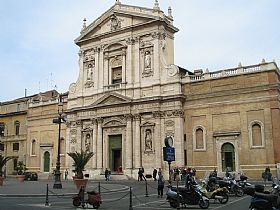
As someone who grew up in a Catholic family and Catholic schools for almost my entire life, I’ve been to a cathedral or two when travelling on school trips or just vacations with my family. One of the many cathedrals I’ve visited during my high school’s music trip is the Notre Dame De Quebec which had aspects of baroque architecture and decor as well as the Marie-Reine-du-Monde Cathedral.
Now what makes baroque architecture unique? It was essentially made to be overly decorated, heavily detailed and dramatic. To enhance this “dramatic” feel, they would use strong light and shade contrasts creating a chiaroscuro effect, or an even light using windows. In churches they made naves broader and circular, external walls often characterized by a dramatic central projection and the interior a canvas for more decoration and quite a few more attributes.
While there are cathedrals in Quebec that portray the techniques of baroque architecture, it actually originated in Rome, Italy in the 16th century. Carlo Maderno was one of the first architects to assist in the solidification of the baroque style of architecture as he designed the Santa Susanna church which contained aspects of the baroque architectural style like column patterns which gave it a central mass along with condensed central decoration. However still containing aspects of renaissance architecture. This then inspired other architects to design with the baroque style like Pietro da Cortana with the Santa Maria della Pace.
During this time, the scientific revolution was happening as well. Greek views of nature were overtaken by abandoning assumptions about nature and observing with an open mind. This period brought forth many developments towards biology, math, astronomy etc. which were essentially building blocks for knowledge we know today and continue to build upon. An architect by the name of Robert Hooke worked alongside Newton to develop proof of the elliptical forms of orbiting planets.
Personally, this project was difficult to understand and execute and if I’m being completely honest, I don’t think I did it right. However, as I have never made a mood-board before, I found that InVision was relatively easy to understand. I decided to research the events of The Great Exhibition in London, the American Civil War, and the concept of gendered colour coding in the mid to late 1800s.
I found myself having to reverse research in order to find events to look into further. Although the period of time I had to research had a variety of events to choose from, I felt extremely limited due to an event having to be associated with very specific topics in each group, then having the options be cut down every time I solidify topics for an event.
I would give myself a 5/10 for this assignment because I was working in confusion and doubt majority of the time, which makes me unsure about the final result of this mood-board.
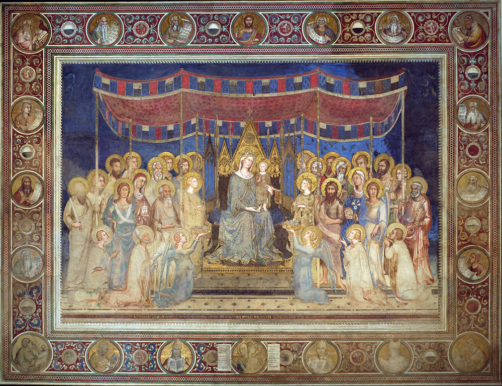
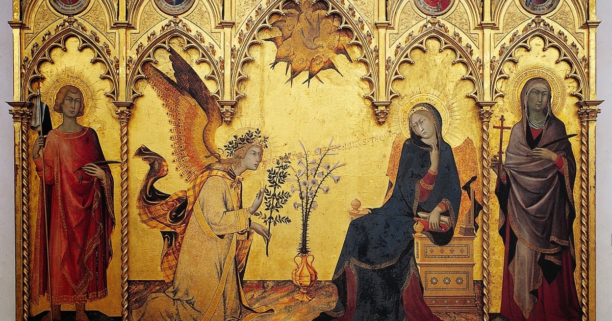
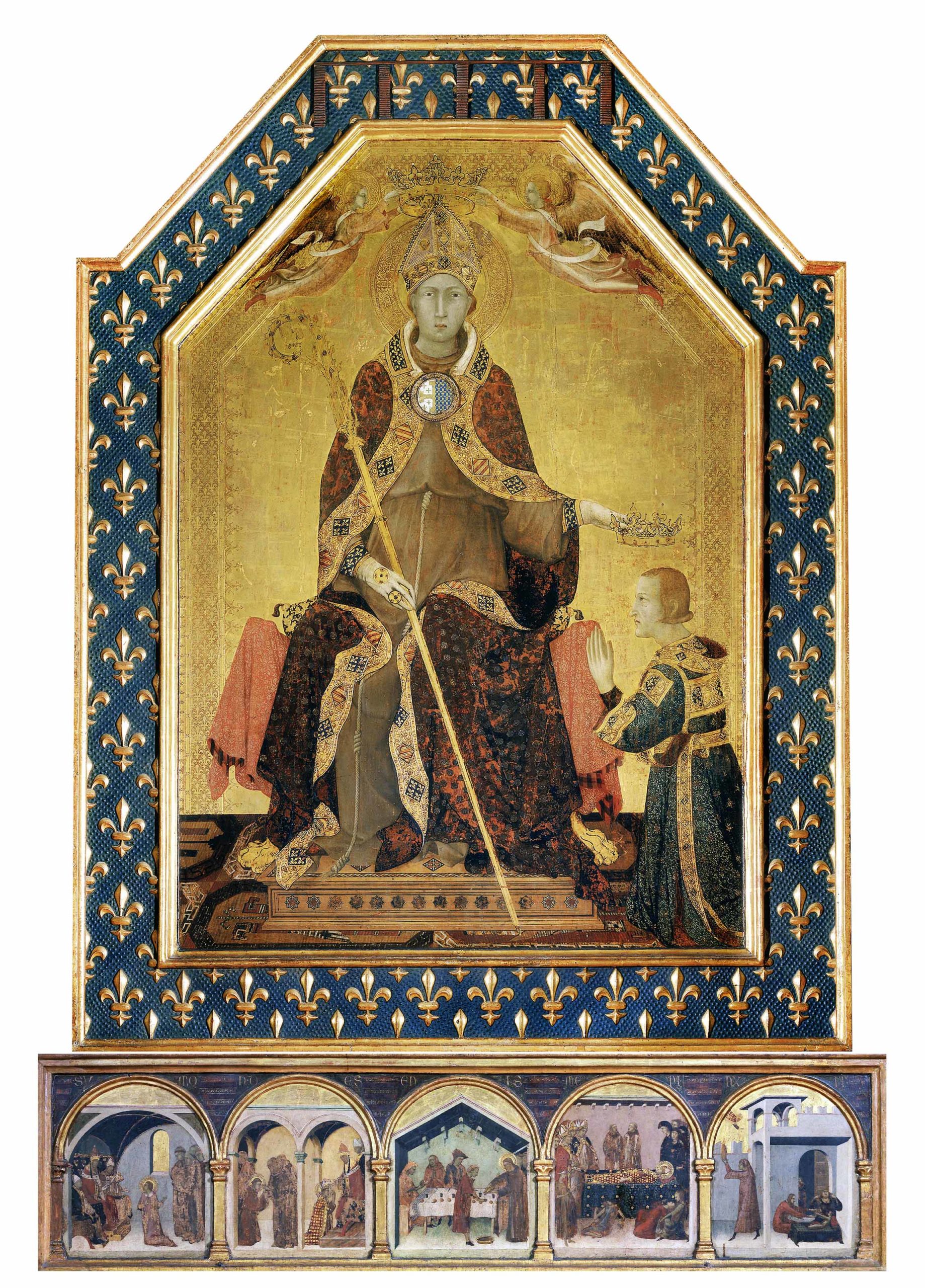
Simone Martini was an artist based in Siena after the generation of Duccio di Buoninsegna that helped to further develop a full Gothic style of painting. It is rumoured that he was taught by Duccio or at least by someone in his ring since it is evident in his work through the use of pure, harmonious colours that Duccio was known for. However, he was also able to implement the graceful lines that were influenced by French Gothic paintings at the time giving figures more depth. His earliest documented painting is the fresco of the Maestà, and his finest example of this linear style is the Annunciation. He spent the rest of his life in the papal court and got acquainted with a great Italian poet named Francesco Petrarch, who painted him a portrait of the subject from Petrarch’s love-sonnets.
Everyday in my Filipino household, you can hear the echoes of asian dramas coming from the living room. Most of the time they are Chinese dramas that my mom loves to watch, some of them being based on the Han Dynasty which is around 200 BCE. I personally do not watch them, but when I glance over at the television, I can not help but notice the sets of architecture.
(Ban Shu Legend 2015)
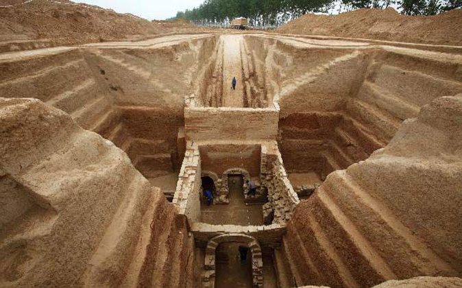
You can imagine my disappointment when I found out that there are not many pieces of architecture from the Han Dynasty that survived to this day. However, there are historical writings and poems known as fu, these poems are composed with lots of descriptions and are relatively long which contains information about Han architecture. This literature often referenced tall towers in capital cities mainly used for watchtowers, astronomical observatories, and religious structures to appeal to immortal beings, sometimes these tall towers surround multi-story buildings along with courtyards. Since these structures did not survive to this day due to them being mainly built out of timber, which fell victim to rapid decay and an unfortunate case of wood not being fireproof, luckily there are multiple ceramic model replicas that exist such as this one.
The Han dynasty is also well known for their great palace buildings such as the Efang Gong (also known as Ebang Gong), the main hall alone was made to fit 10,000 guests, and it stretched more than 11km along the Wei River. What might be equally as iconic as the palace, would be the tombs as they are incredibly elaborate. Instead of them being built out of timber like the other main buildings, they were made from stone or brick.
During this era, they held a great value in the afterlife and believed that it is just as important as existence on earth, that is why their tombs were elaborate, they were seen as a gateway to the afterlife. Individuals were to be buried with figures called “mingqi”. These figures are essentially objects like instruments or weapons and even statue spiritual representations made with pottery, bronze, gold, silver, lacquer, and jade which is believed to have spiritual qualities. The purpose of “mingqi” is essentially to supply an individual in the afterlife with necessities and comfort items since everything in life is needed in death. In addition to this, the more objects one would have in their tomb displayed one’s wealth and status.
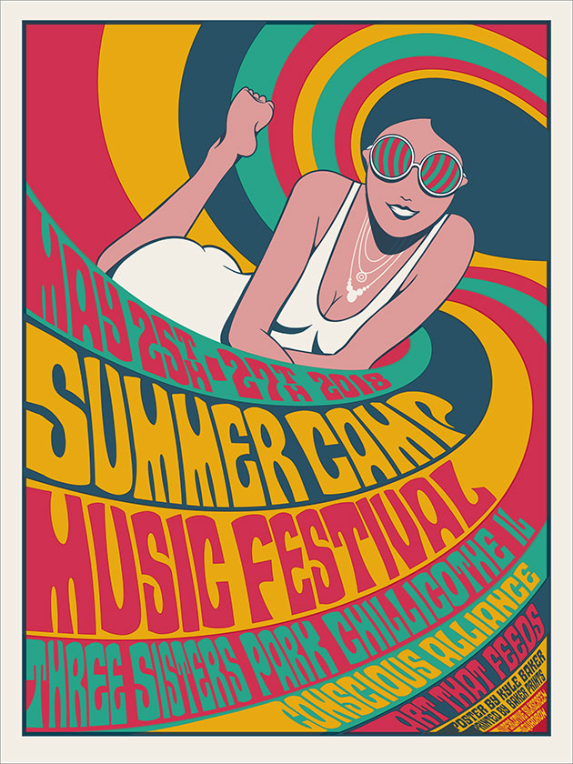
This music poster relies on the figure/ground gestalt principle. Unfortunately, I was not able to find the designer for this poster, regardless they used this design principle to separate a foreground, midground, and background between people and the focus of the “88”.
– Continuation –
This poster was designed by Kyle Baker who uses continuation to propel his design. This is demonstrated by using the hair as lines to create a continuous line for the eye to follow, bringing it to the information at the front of the page.
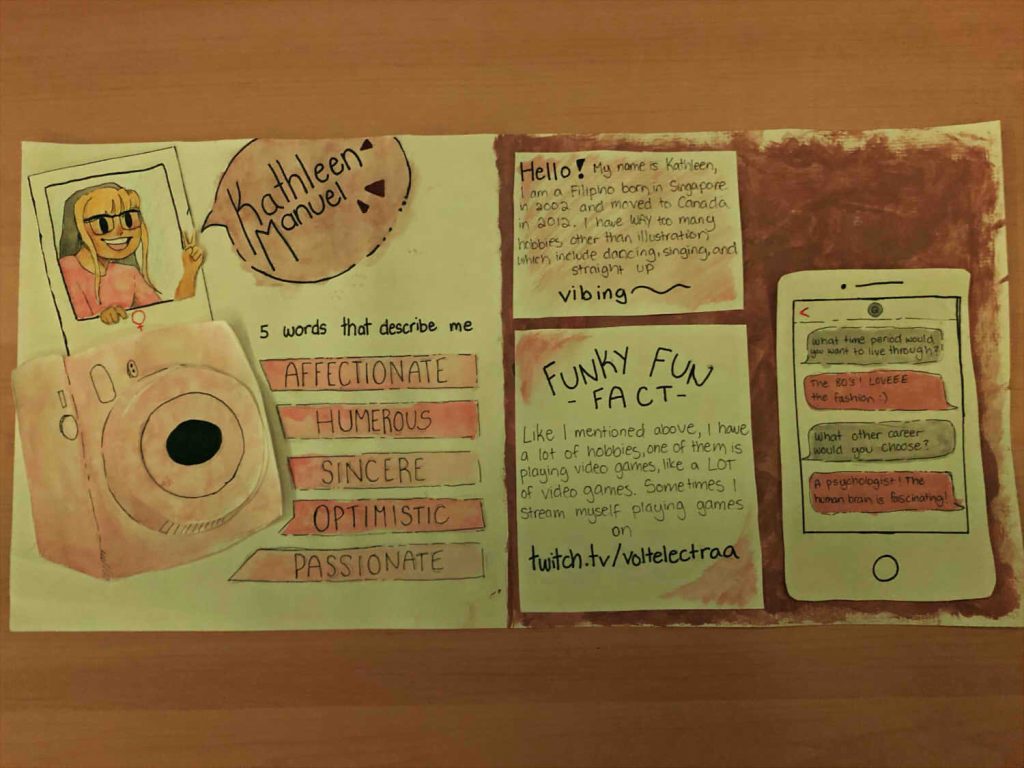
I like to consider myself a rather playful and optimistic person so I wanted to portray that in my spread. Personally I have always loved the aesthetic of peachy/pink tones with brown shades since it gives me a sense of warmth, happiness and energy, which I believe matches my personality. I decided to draw myself in my own simplistic cartoon style because I wanted to implement my own art style since it is very personal to me and I wanted to keep the overall mood of the spread light and simple. I wanted to make the polaroid and phone prominent because I love the aesthetics of technology so I wanted to implement that somehow. The second page was kind of a happy accident, I accidentally spilled brown watercolour paint on the paper so I decided to cover the whole page with that colour and placed white papers on top which in my opinion made them pop out of the page better. I believe that I was able to successfully portray who I am through this spread.
I would give myself an 8/10 because I feel as though I rushed through it and I would have been able to do a better job if I just took my time and gathered better materials to use. However considering the materials I have at home, I think I was able to do this assignment well.
This logo belongs to the ESports team Cloud 9 designed by Cory Heimbecker. This logo heavily relies on lines as it only requires two simple lines in order to create the image of a cloud out of what appears to be the number nine.
– Shape –
TSM also known as Team SoloMid is another ESports team that is well known in North America. The designer of the logo is unfortunately unknown. This logo is heavily reliant on the design element of shape as the letters “TSM” form a circle with S and M creating semicircles to fit inside.
– Colour –
Jared Mirabile is the designer of this logo for the ESports team 100Thieves, also well known in North America since they originate from Los Angeles. This logo depends on colour the most with red being the most prominent contrasting white drawing the eye towards the letter T and the circle.