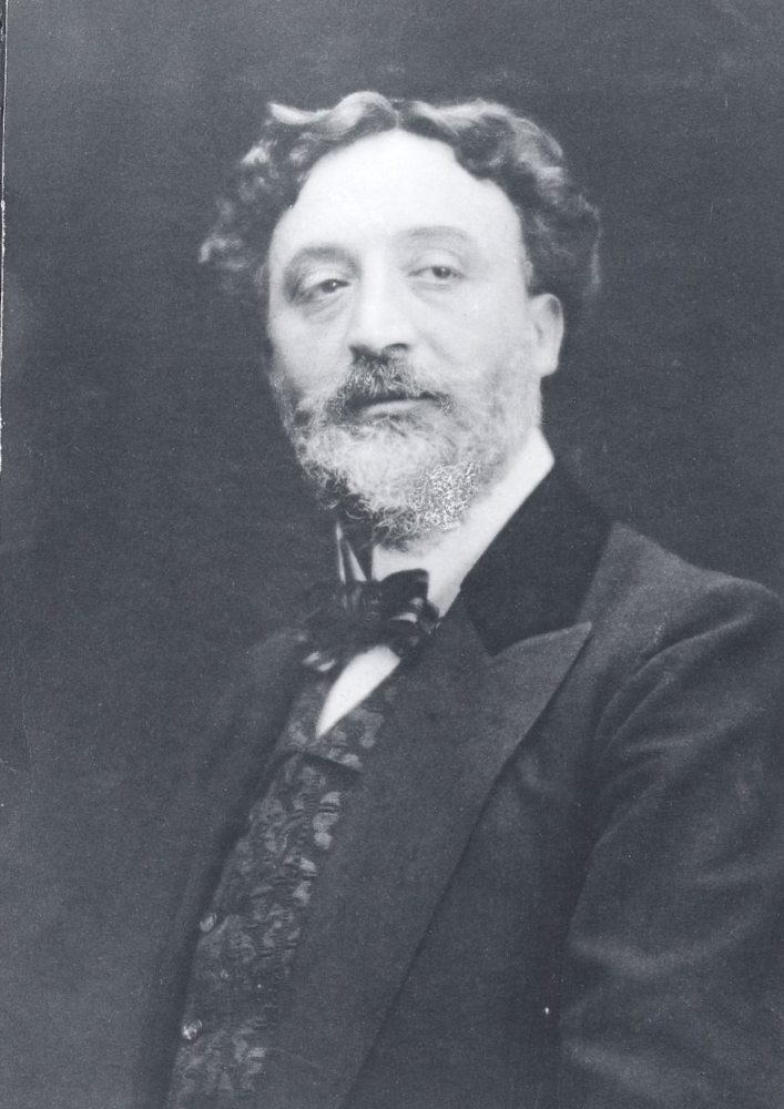
Who was Hector Guimard?
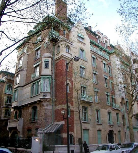
Hector Guimard was a prominent architect, furniture designer, and decorator during the Art Nouveau movement. Guimard studied and taught at the School of Decorative Arts and at the Ecole des Beaux-Arts in Paris. He has designed many famous apartment buildings such as Castel Beranger in 1899 and an Art Nouveau synagogue but he is most well known for designing the 86 beautiful archways framing the Paris metro station entrances, established in 1900. This made him stand out as one of the pivotal architectural designers during the movement.

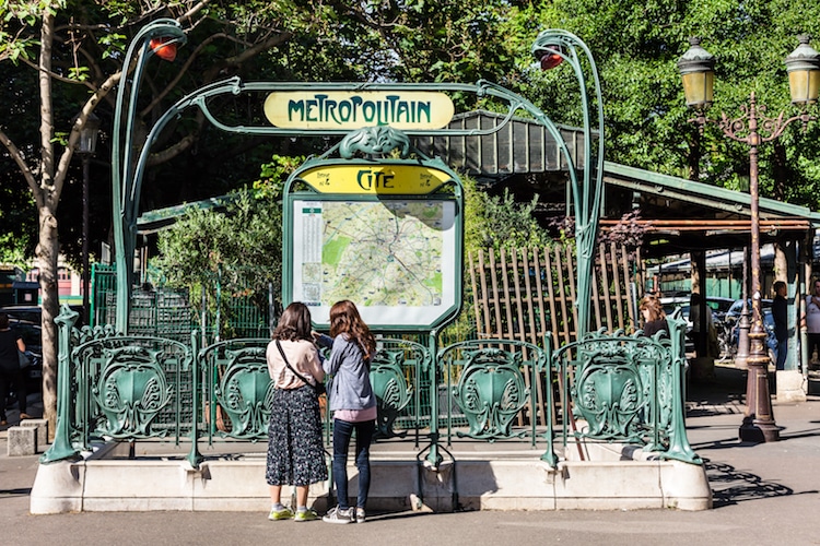
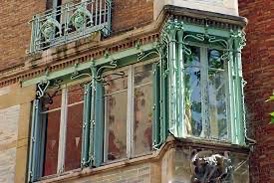
The Paris metro entrances by Guimard were inspired by the excentric Art Nouveau style thriving in France in the early 20th century. Typical Art Nouveau illustrations incorporated several organic and botanical elements with small intricate details, as well as decorative curvy borders and type. So in his designs for the metro, Guimard implemented iconic sinuous art nouveau motifs into the decorative architecture. He also added them into his other work like for the Castel Beranger apartment buildings and the Hotel Villa de la Reunion. Much like the metro, they had intricate decorative vine-like ironwork framing the windows, terraces, and gateways.
Creating the Metropolitan Typeface
Another famous outcome of the avant-garde metro design was the font that Hector created for the labeling/signage on the metro station entrances known as “Metropolitaines”/ metropolitan type. To make the font he pulled from other typefaces such as Auriol and other art nouveau advertising which often included fluid curvy type.


The metropolitan font is a san serif typeface with a wide variety of line thicknesses, almost entirely made of curves. This reflected the designs well with their asymmetrical yet balanced appearance. The type was originally all over the stations on station names, directions, and maps but since then Paris has updated their signage in the metros and used a more modern/ contemporary typeface, called “Metro Alphabet”. However, the original type by Guimard is still on several of the station entrances to this day with the original decorative metal archways.
Sources:
“Guimard Metropolitain: Digitizing the Original Font of the Paris Métro.” UC Honors Learning Portfolio, wilkinsonlp.weebly.com/guimard-metropolitain-digitizing-the-original-font-of-the-paris-meacutetro.html. Accessed 4 Nov. 2021.
“Hector Guimard.” Encyclopedia Britannica, www.britannica.com/biography/Hector-Guimard. Accessed 4 Nov. 2021.
“The Story Behind Paris’ Iconic Art Nouveau Metro Entrances.” My Modern Met, 1 May 2019, mymodernmet.com/paris-metro-entrances/. Accessed 4 Nov. 2021.
Typefaces. “Hector Guimard.” Luc Devroye’s, luc.devroye.org/fonts-43924.html. Accessed 4 Nov. 2021.
Leave a Reply