Kiyoshi Awazu: The Traditional Becomes the Modern – Blog 4#

Maren Brophy, Nov 25, 2022

Beginnings in Design 

Kiyoshi Awazu is a Japanese graphic designer born in 1929 and died in 2009. I was drawn to him as his use of traditional themes with modern design elements was inspiring to me. Awazu is said to be self-taught, and unlike most artists, he learned from practice and experience. His career launched in 1954 when he joined the advertising department for a film company known as Nikkatsu. His role in the company was small as he was only part-time and he was involved in just a few minor theatre design projects. In 1955, his poster “Give back our Sea” (海を返せ) became a sensation in the graphic design world. The poster represents the restrictions placed on fishermen due to military conflict and Awazu’s own experience growing up in post-World War 2 Japan. The award-winning poster was recognized by the Japan Advertising Artists Club and represented a turning point in Awazu’s career. 

Give our Sea Back (1955) Kiyoshi Awazu. https://www.nonaka-hill.com/artists/121-kiyoshi-awazu/works/567-kiyoshi-awazu-give-our-sea-back-1955/. This award-winning poster put Kiyoshi Awazu on the map as a designer. The poster is also an example of how Awazu incorporated social commentary into his designs which would become a staple of his work throughout his career.

His Design Work: Many Important Messages, Mediums, and Motifs 

Awazu was a versatile artist who worked in a wide variety of media such as editing, essay writing, photography, filmography, and graphic design. He incorporated his interest in film into his graphic design work by creating movie posters. Along with his involvement in the graphic design world, he also collaborated with architects and urban designers and aimed to address social issues in his work. In the post-war modernism era, design was becoming a vehicle for economic growth.  Awazu remained traditional in the sense that he wanted to create art with a deeper meaning. The rapid change at this time meant that folklore values were rapidly disappearing. One of Awazu’s goals was to resurrect these traditional art forms using ancient printing methods to represent modern symbolism. Awazu believed that a designer’s mission was “to extend the rural into the city, foreground the folklore, reawaken the past, summon back the outdated.” 

Most of his design work resembles elements of pop or psychedelic art, but what really makes his work stand out is his use of colour and symbols which create a unique visual aesthetic. What I adore about Awazu’s work is although it is classified as modernist, it is still incredibly complex and rich. 

The Japan Council Against Atomic and Hydrogen Bombs (1957) Kiyoshi Awazu. This poster was done by Kiyoshi to speak up against atomic and hydrogen bombs. This piece shows his use of social messages in his designs along with post-World War 2 themes. https://pen-online.com/arts/kiyoshi-awazus-psychedelic-prints/?scrolled=2

An example of Awazu’s ability to take the traditional and represent it in a modern context is the “New Spirit in Japan” (1984) poster. On the left, there is a topographic pattern made up of traditional Japanese symbols. Through using modern, thin lines in the wave patterns on the right, vivid colours and bold shapes, Awazu brings a fresh perspective to traditional Japanese ideas. 

New Spirt in Japan (1984) Kiyoshi Awazu, https://visualmelt.com/Kiyoshi-Awazu. This piece is a great example of Awazu’s ability to use modern design elements (simplified shapes, bright colours) with traditional Japanese imagery as seen on the left.

His Impact on Design as We Know it Today

Awazu continued to create up until his death in 2009. His legacy in design continues many years after his death. Between developing graphic design culture in Japan, challenging the status quo of design at the time and advocating for art with social messages, Awazu’s ideologies continue to be inspiration for designers. Kiyoshi Awazu’s work is a reminder that traditions and change can co-exist, and by utilizing elements of both, we can create some truly impactful and important designs. 

Sources: 

https://www-oxfordartonline-com.ezproxy.capilanou.ca/groveart/view/10.1093/gao/9781884446054.001.0001/oao-9781884446054-e-7000005376#oao-9781884446054-e-7000005376

https://www-tandfonline-com.ezproxy.capilanou.ca/doi/pdf/10.1080/17547075.2017.1315222

https://hyperallergic.com/466604/graphic-designer-awazu-kiyoshi-fantastical-world/

https://npo-plat.org/awazu-kiyoshi-en.html

https://sabukaru.online/articles/kiyoshi-awazu-reawaking-the-outdated
The Great Exhibition – Blog Post 3

Maren Brophy, Nov 11, 2022

A Monumental Showcase

In 1851, Henry Cole and Prince Albert (husband to Queen Victoria), organized the famous Great Exhibition otherwise known as the Crystal Palace Exhibition, which came from the name of the palace in which it was held. The exhibition was monumental for many reasons. Most notably, it was the first of the World’s Fairs, a series of exhibitions that were popular around the 19th century and showcased technology and culture. A grand total of around 6 million visitors attended the event. As the Crystal Palace was part of the exhibition itself, visitors marvelled at the impressive glasswork and the scale. Throughout the exhibition, there were displays of cutting-edge technology including microscopes and electric telegraphs. The event was a tremendous success and made £186,000 (which is equivalent to tens of millions today). In addition to the financial success, the Great Exhibition helped bring other global and cultural influences to Britain and helped further the development of design, technology, and science. 

The Crystal Palace for the Great Exhibition of 1851. Dedicated to the Royal Commissioners., London: Read & Co. Engravers & Printers, 1851.

The Wondrous Displays of the Exhibition 

The Exhibition showcased nearly everything one could imagine, from machinery to fine arts, to industrial design and textiles. There are many notable pieces from the exhibition, including a 27-foot-high fountain at the center of the building, a howdah displayed on a stuffed elephant, and the world’s largest known diamond. Exhibitions came from all over the world exposing the British to the art and technology from different cultures. For example, the Indian section of the exhibition introduced attendees to colourful and high-quality Indian textiles. 

A telescope at the exhibition. image is taken from: “The Half Hour Library of Travel, Nature and Science for young readers” Volume: 03 Page: 237, 1896

Scholarships for Science

While the exposure to other international technologies and advances diversified Britain’s design and technology industry, it also demonstrated how other cultures were upstaging the British in this area. Some of the British exhibits lacked in comparison to the aesthetic appeal that the French had, or the engineering that the Germans had. Prince Albert took action to change this and created a series of scholarships. The scholarships were realized in 1891 with the foundation of the Commission’s Science Scholarships. The goal of these scholarships was to help developing inventors and scientists further their research. These scholarships demonstrate how the Great Exhibition still influences our world today. The scholarships (now known as Research Fellowships), are still being awarded over a century later.

The Legacy

The Great Exhibition was incredibly influential for Britain’s culture and technology and was one of the defining points of the nineteenth century. From the profits made, education and culture were further spread throughout Britain. A new cultural quarter was established in South Kensington using the money from the event. This quarter is now home to the Victoria and Albert Museum, Science Museum, Royal Albert Hall and many others. The technology on display at the Great Exhibition influenced our world for years to come such as steam locomotives and the printing press. The Great Exhibition shows us the importance of funding and showcasing technology and design to develop and improve our society. 

Frieze detail in the internal courtyard. The frieze is a commemoration of the 1851 Great Exhibition. Here, Queen Victoria is shown in front of the Crystal Palace in Hyde Park and is surrounded by figures who represent the countries that were a part of the exhibition. Pres Panayotov/Shutterstock

References: 

https://www.theguardian.com/science/blog/2015/aug/28/how-the-great-exhibition-of-1851-still-influences-science-today

https://www.historic-uk.com/HistoryUK/HistoryofEngland/Great-Exhibition-of-1851/

https://www.cityoflondon.gov.uk/things-to-do/history-and-heritage/london-metropolitan-archives/collections/the-great-exhibition-of-1851

​​https://www-jstor-org.ezproxy.capilanou.ca/stable/j.ctvnb7rvd 

Survey 2: The Book of Kells

Oct 20th, 2022, by Maren Brophy

The Book of Kells: The beginning of text and image becoming one 

The Book of Kells (c. 800 CE), is one of the most famous examples of medieval illuminated manuscripts. Illuminated manuscripts were hand-made books based most often on Christan texts and stories. The book is made up of four gospels. On each of the 340 pages of the manuscript, there are 16 to 18 lines of writing in a style known as “insular majuscule. However, the text is not the star of the show in the Book of Kells, the illuminations are. In comparison, many other illuminated manuscripts were created with the text written first and then the illumination added afterwards; in contrast, the Book of Kells focused more on the visual side making the art the centrepiece of the manuscript.  

The History of the Book of Kells 

While it is not fully known who created the book, many believe that it was Columbian monks off the coast of Scotland in Lona, one of the oldest Christian centres of western Europe. The monks were believed to have been raised in the monastery founded by the Irish Monk St. Columba. According to this telling of the story, the book was brought to Kells in Ireland when the Vikings raided Lona. Presently, the book is on display at the library of Trinity College, Dublin. 

Iona (/aɪˈoʊnə/; Scottish Gaelic: Ì Chaluim Chille (IPA:[ˈiːˈxaɫ̪ɯimˈçiʎə]), sometimes simply Ì; Scots: Iona) is a small island off the west coast of Scotland. It is one of the oldest Christian centers of western Europe and it is where many believe the book was created initially. 

Illuminated Manuscripts in the Book of Kells 

As for the craft behind the book of Kells, the pages were made from vellum, a material created from calfskin. Along with the high-quality paper, The Book of Kells also features rich colours and Indigo, chalk and gypsum were used to make a handful of these wonderful colours. When looking closer at the manuscript, we can see that one square inch of a design in the Book of Kells revealed 158 ribbonlike interlacings. The pages are filled with tightly interlocking spirals and other geometric patterns along with depictions of humans, animals and mythical creatures all of which are placed together to create mind-blowing scenes and pages. This is why the book of Kells is recognized universally as the most magnificent example of medieval illuminations.

An incredibly detailed page from the Book of Kells demonstrating the detailed shapes and patterns used. 

The Symbolism Behind The Book of Kells

Depictions of Christian stories and significant figures can be seen throughout the book and give us insight into the symbolism of the illuminations. For example, on Fol. 7v, is the earliest surviving image of the Virgin Mary and baby Jesus. Contrary to the biblical descriptions of Mary coming from humble origins, the Book of Kells shows her as royal seated upon a jewel-encrusted throne and wearing purple (the colour of royalty). The section in the book covering the Gospel of Matthew is introduced with a Portrait of Jesus. At the top of Folio 32v there is a miniature of Christ surrounded by peacocks; peacocks are repeatedly seen throughout the book and are symbols of Christ.

Virgin and child in the Book of Kells Fol. 7v. The earliest known depiction of the Virgin Mary and Christ. 

Conclusion

The Book of Kells remains one of the most beautifully illuminated manuscripts in history providing us insight into the past of illuminated manuscripts and Christianity. A large part of my family is of Celtic or Irish heritage, which has sparked an interest in Celtic history and art in me, which is why I chose to research this artifact. As an artist, the incredible paintings in the Book of Kells serve as a huge source of inspiration and awe for me and many others. 

References

Mark, J. J. (2022, October 19). Book of Kells. World History Encyclopedia. Retrieved October 21, 2022, from https://www.worldhistory.org/Book_of_Kells/

Brief History – Book of Kells. (n.d.). Retrieved October 21, 2022, from https://www.people.vcu.edu/%7Edjbromle/color-theory/color04/laura/bookofkells.htm

Medievalists.net. (2022, March 13). Book of Kells: Ireland’s Medieval Treasure. Retrieved October 21, 2022, from https://www.medievalists.net/2022/03/book-of-kells-irelands-medieval-treasure/

Claddagh Design. (2014, July 8). Irish Treasures: The Book of Kells. Retrieved October 21, 2022, from https://www.claddaghdesign.com/blogs/irish-interest/irish-treasures-the-book-of-kells

Ruud, J. (2014). Book of Kells. In J. Ruud, Encyclopedia of medieval literature (2nd ed.). Facts On File. Credo Reference: https://ezproxy.capilanou.ca/login?url=https://search.credoreference.com/content/entry/fofmedieval/book_of_kells/0?institutionId=6884

Flinn, F. K. (2016). Book of Kells. In F. K. Flinn, Encyclopedia of world religions: Encyclopedia of Catholicism (2nd ed.). Facts On File. Credo Reference: https://ezproxy.capilanou.ca/login?url=https://search.credoreference.com/content/entry/fofc/book_of_kells/0?institutionId=6884

Museum Artifact Exhibit

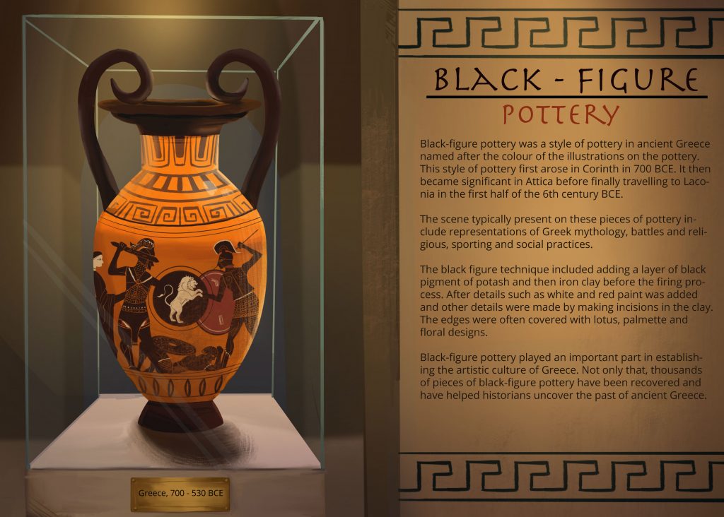
I went through a few different iterations for the museum artifact exhibit project before landing on a final cohesive design. At first, I wanted to do something inspired by The Book of Kells/Illuminated manuscripts but decided against it as it was too challenging to re-create the incredibly detailed designs. In a change of direction, I decided to do Greek Pottery instead, specifically black-figure pottery. Greek pottery has always been of interest to me so I felt inspired to research more about the subject. Rather than re-creating an existing piece of pottery, I decided to design my own piece of artwork as a way to better retain and understand what I had researched. Before designing, I did a deep dive into the design behind the pottery. For example, I discovered that white was used for female flesh while black was used for the males portrayed on the vessels. Understanding the mythology of Greece at the time was important for creating an authentic scene. Scenes often depicted on these pieces of pottery included war stories and Greek Mythology. As I decided to portray a war scene, I took time to research the appropriate dress and style for this era. The lion in ancient Greek culture symbolized power which I thought would be a suitable motif for the scene.

As for my design process, I started by researching different items of pottery and designs. Once I finally landed on an idea, I created concept sketches for the layout in Procreate. Then, I went in and drew the greek vase first and then put it into the background I created after. Finally, I used Illustrator for the text. 

Overall, the project went smoothly, but I think I would have benefited from planning out more in advance to save time. I also would have spent more time on the background to come up with a more creative composition. 

In total, this project took around 6 hours to complete. 

The process: 

First, I designed the vase using flat colours. Then I used a sharp pencil drawing too and a painterly brush to do the shading.
This is the composition of the exhibit without any of the lighting, but with all the appropriate values.
Finally, I brought everything together by adding lighting and texture.

The final image with text and details, along with adjusted lighting.

Below are the reference images I used for this project:  

This vase was the primary inspiration behind the shape and patterns of my design. 

The piece that was one of the biggest inspirations to me was Heracles and Geryon c. 540 BCE. 

References: 

https://www.brown.edu/Departments/Joukowsky_Institute/courses/greekpast/4887.html

https://www.worldhistory.org/Black_Figure_Pottery/

https://www.joshobrouwers.com/articles/making-ancient-greek-vases-look-red-figure-black-figure-pottery/

https://www.hellenic-art.com/black-figure-pottery.html

Survey 1: Wandjina and the Beginning of Visual Communication and Storytelling 

 By Maren Brophy, 9/30/022


History and Design 

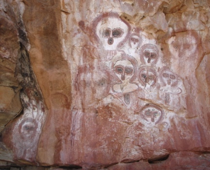
 Dating back as far as when humans began to walk this earth, we have been inventing different ways to communicate and share ideas. From cave paintings to hieroglyphics, our desire to communicate has led to some of the most valuable pieces of history. Not only that, these artifacts are the basis for what design is today. I have been fascinated with paleolithic and neolithic history. Cave paintings are particularly interesting to me as they combine my love of prehistory with my interest in the evolution of communication. When I learnt about Wandjina I was instantly intrigued. The striking imagery of the paintings and the rich story behind the art instantly drew me to the topic. Images of Wanjina spirts are the oldest sacred paintings found on the planet to date. Found in the Kimberley region in Australia, these incredible pieces of art give us insight into the fundamental nature of humans and our desire to communicate. 

Wandjina cave art in Kimberly WA, Australia. https://japingkaaboriginalart.com/articles/wandjina/

The History of Wandjina paintings 

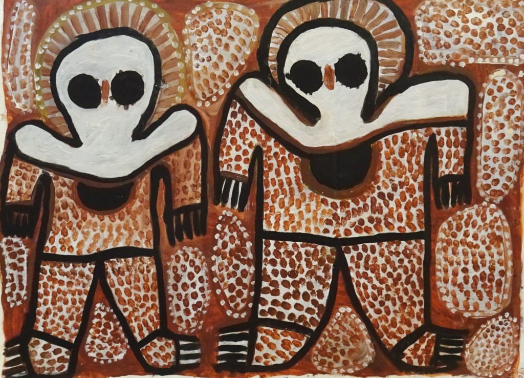
 It is theorized that the rock paintings of the Wandjina located in Kimberley are roughly 4,000 years old. Stylistically, these rock paintings emerged due to a millennium-long drought which resulted in a wetter environment. Wandjina paintings are done in a variety of white, black, yellow, and red. The paintings are arranged either horizontally or vertically depending on the size of the rock and the spirits have been depicted in either groups or solo. Occasionally, they are portrayed with objects such as a Rainbow Serpent ( a deity seen as a creator god). The figures appear with huge eyes and a long nose and body, but no mouth. 

The dots that are drawn on many Wandjina represent rainfall. https://aboriginalartshop.com/wandjina-rock-aboriginal-art/

Wandjina and Aboriginal Beliefs 

Something that drew me to Wandjina as a topic for this post was how it is one of the first sacred images. It also has a rich story and mythology behind it. In the aboriginal Australian’s beliefs, the Wandjina is a shape-changing being which is associated with rain and fertility. Dreamtime legends (the term to describe the stories and beliefs of the Aboriginal Australians) state the Wandjina are the ones who created the landscape and inhabitants and still have power over these elements. As for the cave paintings, is told that when spirits find a place to die, they put their images on the rocks and would leave the physical world through a nearby waterhole. 

The Power of Design on Story and Symbolism 

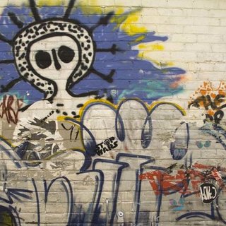
Design can be an impactful thing, and if done right, it can be truly timeless. Wandjina is a prime example of this. Something that surprised me about Wandijnas is that they are still revered by the Aboriginal tribes of the Worora, Ngarinyin and Wunumbul. This shows us the impact that these cave paintings had as the imagery and stories that they represented are still an important part of Australian Aboriginal culture today. These incredible images which provide insight into human history also demonstrate the power that the history of design has on art today. For example, the palettes used in Wandjina paintings are used today and their imagery even was said to inspire modern-day depictions of aliens. Wandjina cave paintings are an early example of the use of symbolism as many different aspects of their design communicate the stories behind these spirits. Diving into the art of the Wandjina cave paintings inspired me to think about using symbols and stories behind my design to give them another level of interest. Researching this topic showed me how powerful a design with meaning and a story can be and I am excited to keep learning about the history of visual communication.

Modern day street art of a Wandjina in Perth showing how the legend of the Wandjina has lived on and is still an important part of Australian culture. https://www.researchgate.net/figure/A-Wandjina-style-figure-amid-graffiti-in-Perth_fig3_242558094

References 

Aldridge, R. (n.d.). Wandjina. aboriginal-bark-paintings.com.       https://www.aboriginal-bark-paintings.com/wandjina/

Gillan, J. (2021, November 27). The Mysterious Aboriginal Rock Art of the Wandjina Sky Beings. Ancient Origins. Retrieved October 3, 2022, from https://www.ancient-origins.net/human-origins-folklore/wandjina-rock-art-00701

Korff, J. C. S. (2020, July 16). What are Wandjinas? Creative Spirits. Retrieved October 3, 2022, from https://www.creativespirits.info/aboriginalculture/arts/what-are-wandjinas

Plunkett, J. (2022, February 1). Wandjina Dreamtime Story. Japingka Aboriginal Art Gallery. Retrieved October 3, 2022, from https://japingkaaboriginalart.com/articles/wandjina/

Wroth, D. (2017). Aboriginal Rock Art of the Kimberley – An Overview

japingkaaboriginalart.com. https://japingkaaboriginalart.com/articles/kimberley-rock-art-overview/

Yearbook Spread, September 19, 2022

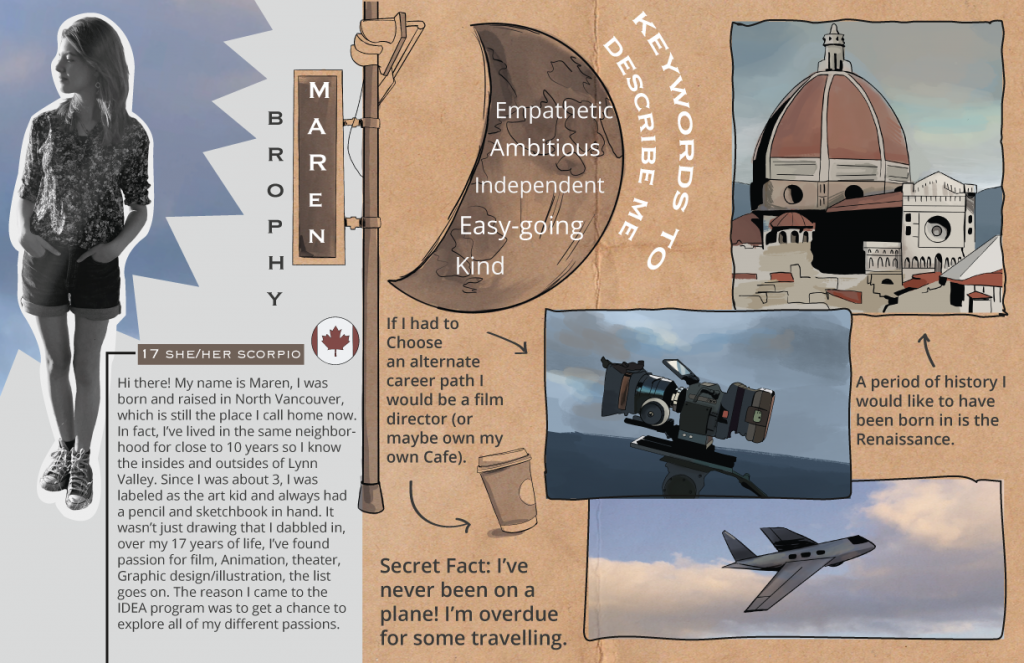
My first project for IDES 141 was to create a page like a yearbook spread that encompassed who I am. 

To begin, I started with brainstorming different design palettes and layouts. I was drawn towards blue and earth tones aesthetic wise, but these colours also represent my own personality. Blue is associated with calm, freedom, intuition, imagination, and sensitivity which are all prominent traits of mine. The complementing earth tones display my love of the natural world. I then bounced around many different layout ideas such as a magazine or a character sheet, however; none of those concepts suited me.  Eventually I landed on the idea of a scrapbook/sketchbook look which felt a lot more like Maren. 

Visuals are my language, I learn through visuals and I think in visuals. So naturally, my spread needed to be image heavy with less emphasis on text. I illustrated scenes that would match what was in the text to create an engaging layout. One noticeable design aspect I employed was my use of celestial and sky imagery. I’ve always had my head clouds (literally and metaphorically), therefore; I felt using an image of some dreamy, watercolour looking clouds would be the perfect thing to tie everything together. Finally, you will notice that I incorporated sketches around the layout to organize the design in a creative way and add an extra visual novelty. 

On the topic of layout, to ensure my composition was pleasing I used a variety of organization methods. These methods include using the pen tool in Illustrator to create a natural outline around my photos and using arrows to help connect the text with their corresponding images. 

Overall, I had a ton of fun with this project even if developing the concept took a while. Because of the effort I took in creating this project and the thought I put into it, I’d give myself an A. I’d estimate I spent about 48 hours in total working on this project.