My first project for IDES 141 was to create a page like a yearbook spread that encompassed who I am.
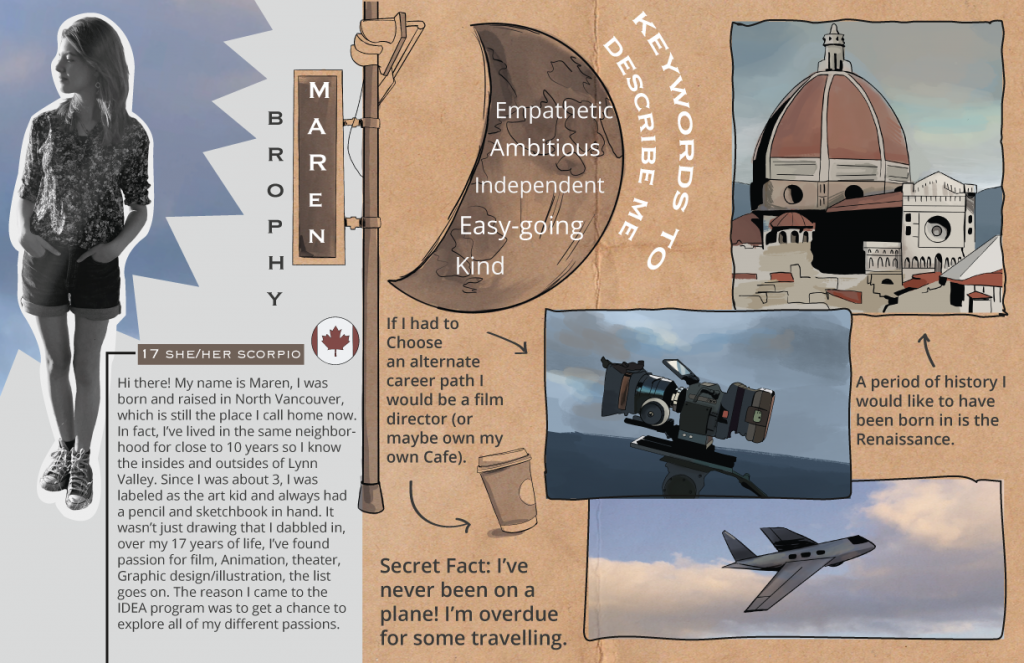
To begin, I started with brainstorming different design palettes and layouts. I was drawn towards blue and earth tones aesthetic wise, but these colours also represent my own personality. Blue is associated with calm, freedom, intuition, imagination, and sensitivity which are all prominent traits of mine. The complementing earth tones display my love of the natural world. I then bounced around many different layout ideas such as a magazine or a character sheet, however; none of those concepts suited me. Eventually I landed on the idea of a scrapbook/sketchbook look which felt a lot more like Maren.
Visuals are my language, I learn through visuals and I think in visuals. So naturally, my spread needed to be image heavy with less emphasis on text. I illustrated scenes that would match what was in the text to create an engaging layout. One noticeable design aspect I employed was my use of celestial and sky imagery. I’ve always had my head clouds (literally and metaphorically), therefore; I felt using an image of some dreamy, watercolour looking clouds would be the perfect thing to tie everything together. Finally, you will notice that I incorporated sketches around the layout to organize the design in a creative way and add an extra visual novelty.
On the topic of layout, to ensure my composition was pleasing I used a variety of organization methods. These methods include using the pen tool in Illustrator to create a natural outline around my photos and using arrows to help connect the text with their corresponding images.
Overall, I had a ton of fun with this project even if developing the concept took a while. Because of the effort I took in creating this project and the thought I put into it, I’d give myself an A. I’d estimate I spent about 48 hours in total working on this project.