
Craig and Karl
When it comes to writing blog posts, I enjoy challenging myself to research and write about someone or something obscure and equally powerful. Not only do I find it more interesting but it widens my knowledge on the topic assigned. Usually, the information available is scarce and more investigating is required but for today’s topic, I decided to be more accomodating towards more ‘mainstream’ choices. With that being said, I present to you Craig & Karl.
A team of two, Craig Redman and Karl Maier met at an art college in Australia and have been collaborating ever since. What is worth mentioning is that Craig resides in New York and Karl in London, making their partnership that much more interesting.
They have an extremely distinctive and cohesive style, using bright colors, bold outlines, and a mixture of shapes and patterns. Their art has so much going on, but you somehow never get lost and know exactly where to look. I would call it contemporary psychedelia. The palettes and the exploration of there art resemble immensely 60-70’s psychedelic posters but it doesn’t have the flow and organic shapes that marries both the image and type. It’s blunt and bold which has become a trend in contemporary design.
Each piece they have created, whether it is murals, packaging or set design, they all reference supergraphics. I usually like to analyze a favorite piece but with Craig and Karl, it is like choosing your favorite child, impossible (well from what I’ve heard). So instead I thought I would feature a couple and that showcase why I believe they are the supergraphic innovators of the 21st century.
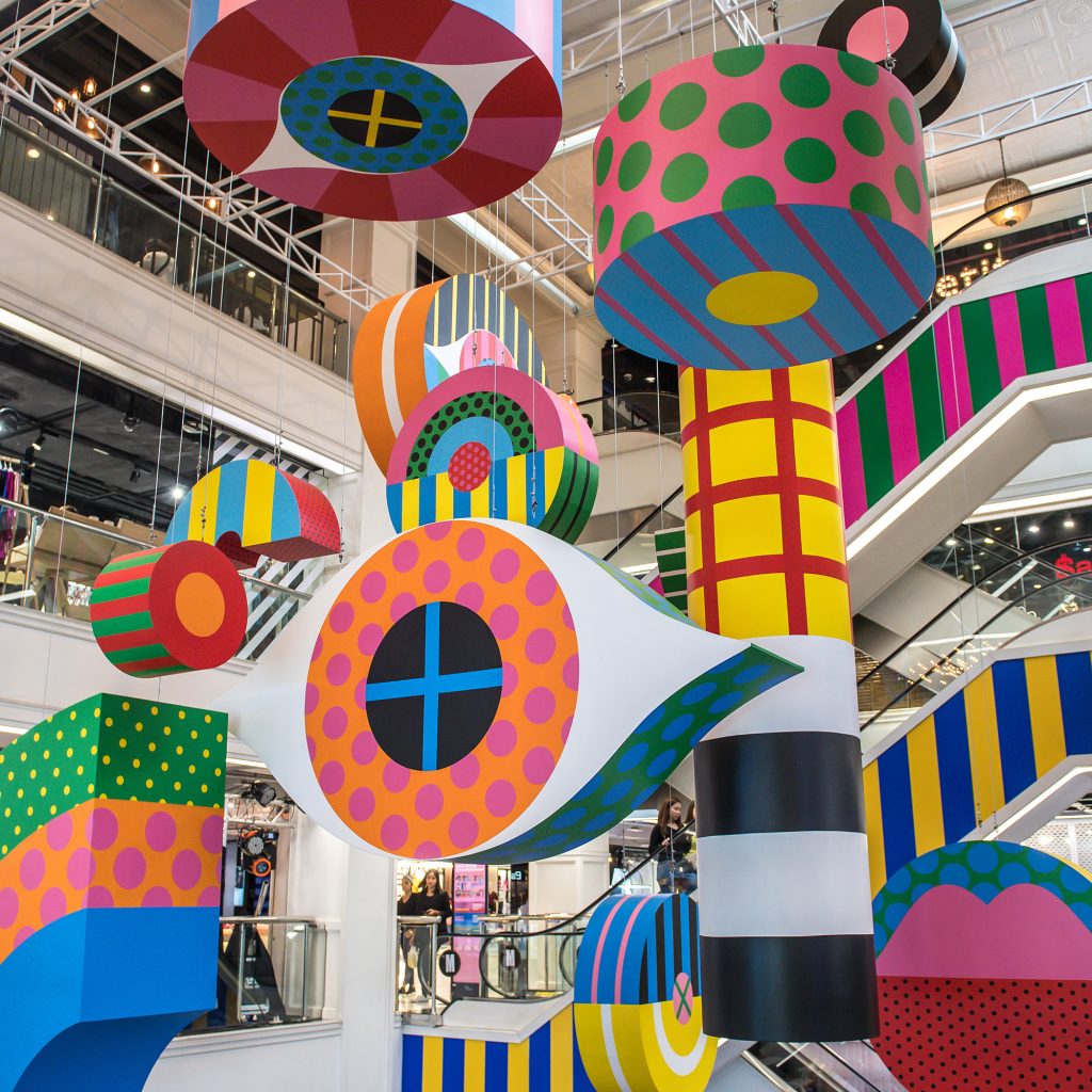
Chromagic is an installation suspended over 3 levels of the Siam Center in Bangkok 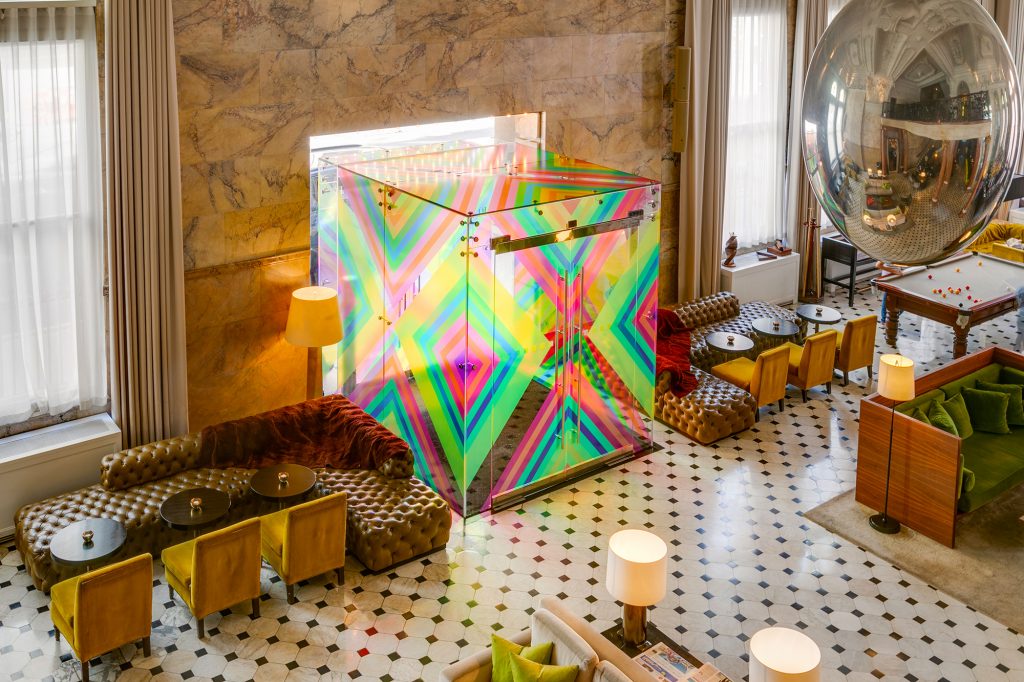
Entrance at The London EDITION hotel 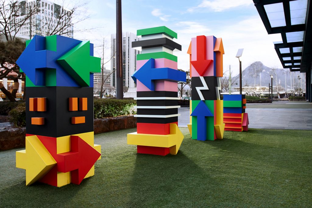
Installation in Seoul 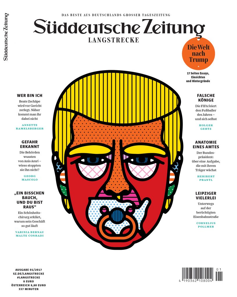
Cover for Süddeutshe Zeitung 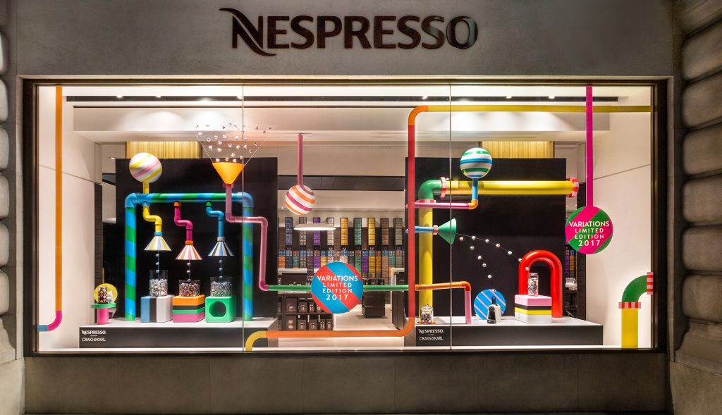
Limited Festive Collection