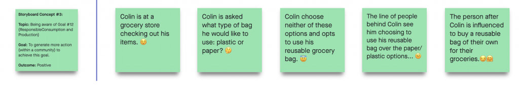
For the storyboard, we started off by brainstorming ideas as a group for a user story. We came up with three different concepts. The first one was focusing on the global goals in general, resulting in a story about becoming aware of them with a positive outcome. The second concept focuses on goal #6 (clean H20 and sanitation) with a negative outcome. The third concept focuses on goal #12 (responsible consumption and production) with a positive outcome.
We then added emoticons to each sticky note to decipher the mood and chose concept three as our desired storyboard.
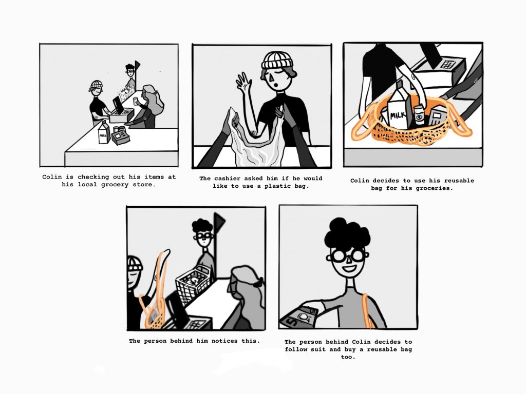
After that, our group split up and we illustrated our own versions of concept #3. This is my storyboard:
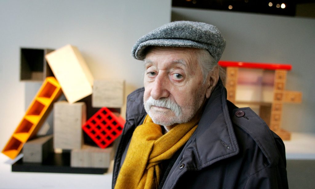
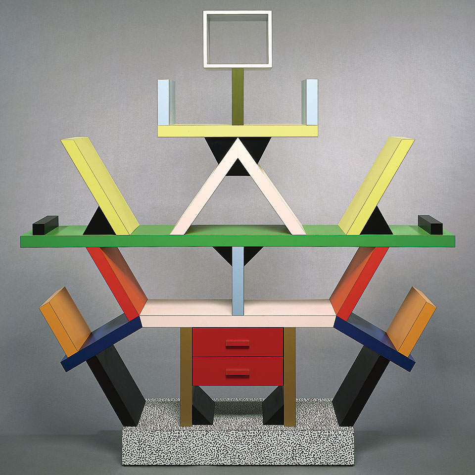
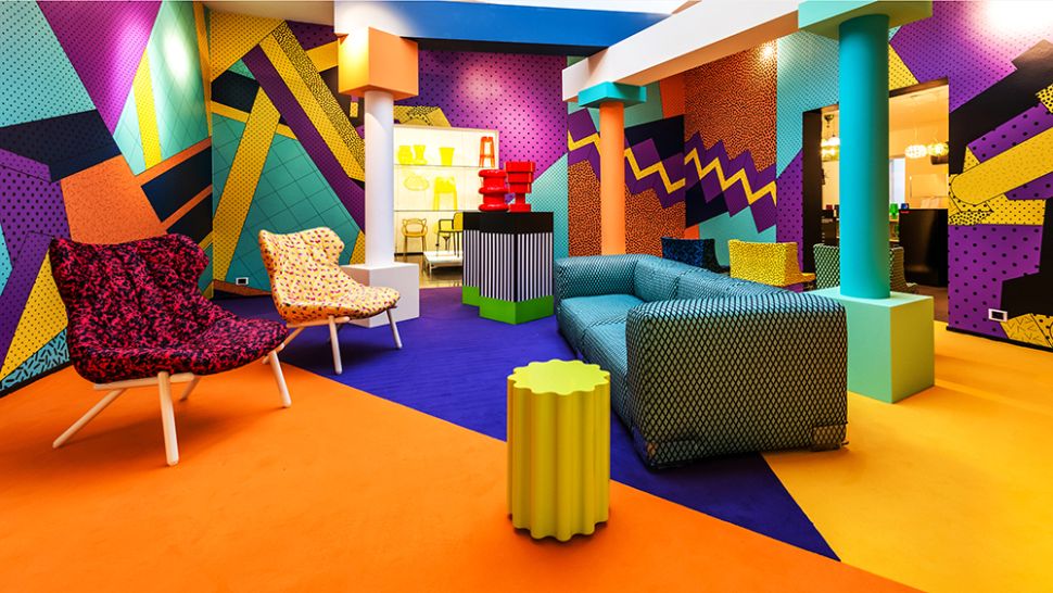
In 1980, Ettore Sottsass, an Italian designer and architect, decided that it was the time to create a new design style. To go against the grain and create something that many might initially perceive as ridiculous. Sottsass, however, did not do this alone. the whole idea of this was to collectively create something new, so he joined forces with other designers and architects to form the Memphis group. A name derived from the song they listened to on repeat during their first meeting: Stuck Inside of Mobile with the Memphis Blues Again, by Bob Dylan. Three months later, they presented each other with hundreds of ideas and settled on the groundbreaking style that became known as the Memphis Movement.
They combined colours that would have previously been unheard of together, mixed patterns and geometric shapes. They used brightly coloured plastic laminate and interesting materials, while creating objects and furniture to be decorative over functional. All these factors contributed to them making a name for themselves.
There was rejection and thoughts that this was merely a fad, but after a long time of being overlooked, this style inspires many including the fashion industry, and is beloved today by most. I personally appreciate the Memphis Movement because the group took a chance and did not follow the status quo. I think their work is vibrant and fun and I am surely inspired by its boldness and risk.
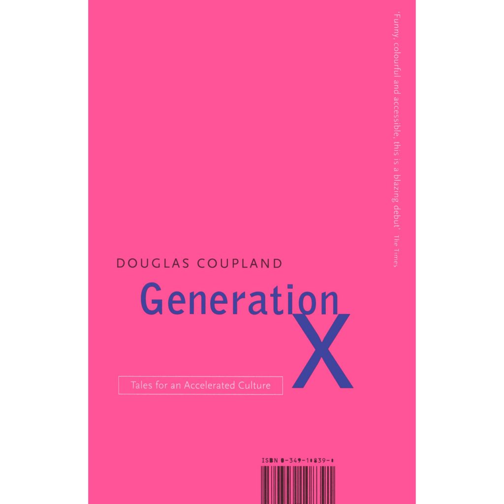
Douglas Coupland is a writer, graphic designer, and artist and is widely regarded as the most original observer on current American culture. He also popularized the term Generation X.
He was born on a Canadian military base in Germany but grew up in Vancouver. In 1984, he attended Emily Carr University of Art and design to become a sculptor, but then moved to Japan to do Japanese business sciences. After that, he returned to Canada and in 1991, published his first novel called Generation X: Tales for an Accelerated Culture. The novel became so popular that the Americans born during the 1960s and 70s became regarded as Generation X.
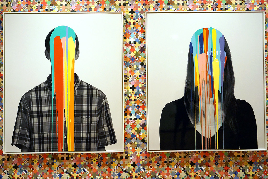
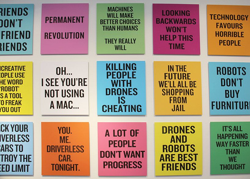
In addition to this book, he wrote many others that were successful. In regard to his art, he is exhibited across north America and Europe. He creates beautiful, colourful work that is often about popular culture and how the technological revolution effects our minds. He creates work from paintings, prints, and sculptures, to public interactive pieces.
I think his work is intriguing and wonderful to look at. I also love the meaning behind it, as the technological revolution is so relevant and it can resonate with many.
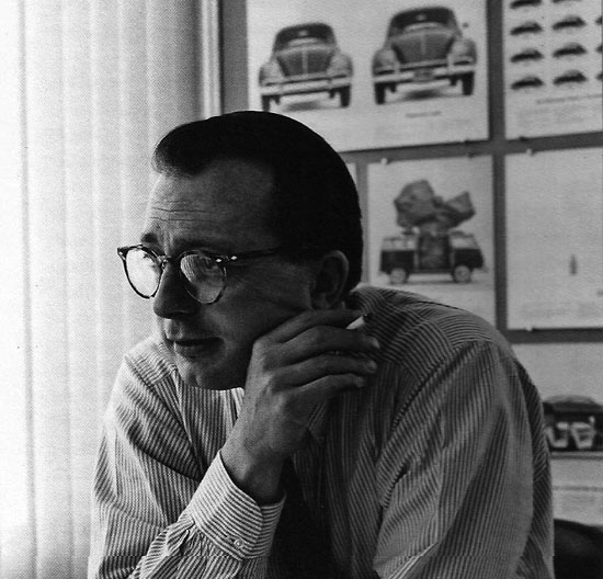
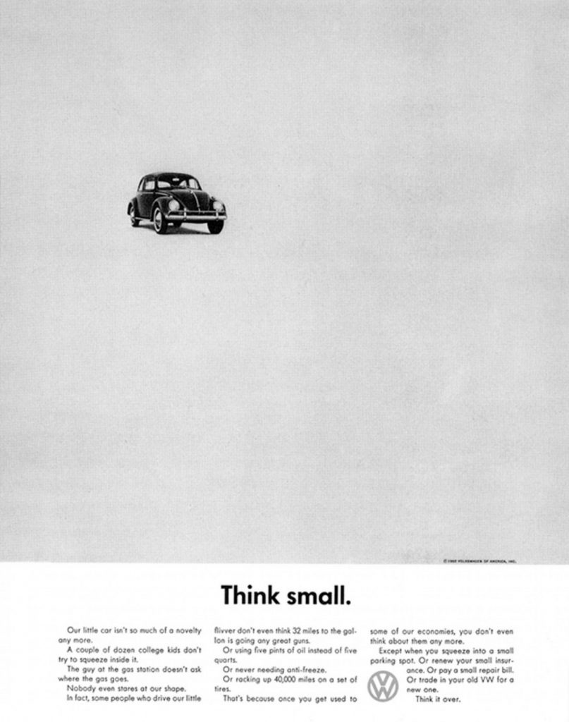
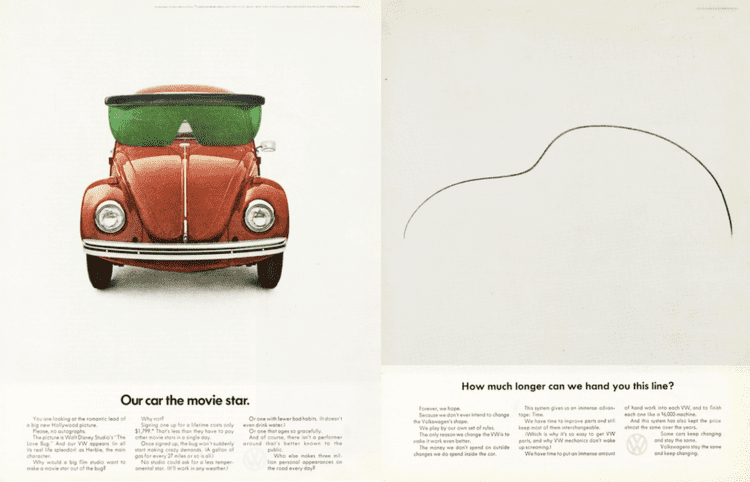
Helmut Krone was a respectable advertising art director born in New York, 1925. He was part of a campaign that changed advertising. Inspired by Paul Rand, he went into print advertising and later became an Art Director at the Doyle Dane Bernbach advertising agency. He worked there for over 30 years creating innovative campaigns and surprising sales pitches. He was a perfectionist and even though his work was relatively simple he spent many hours refining every detail; I can relate to this.
DDB was already promoting Volkswagen to a local car dealer and they had put Krone as the leader. Apparently, krone was very difficult to work with and was unhappy with many of the decisions, such as “think small”, however, he worked with others and settled on a composition that became one of the many successful Volkswagen advertisements. He also decided to put the logo in an unusual spot, which sets his work apart from others.
His goal was always to create something different than what his peers were creating. He received many awards during his career and was showcased in the One Club’s Creative Hall of Fame and the Art Directors Hall of Fame.
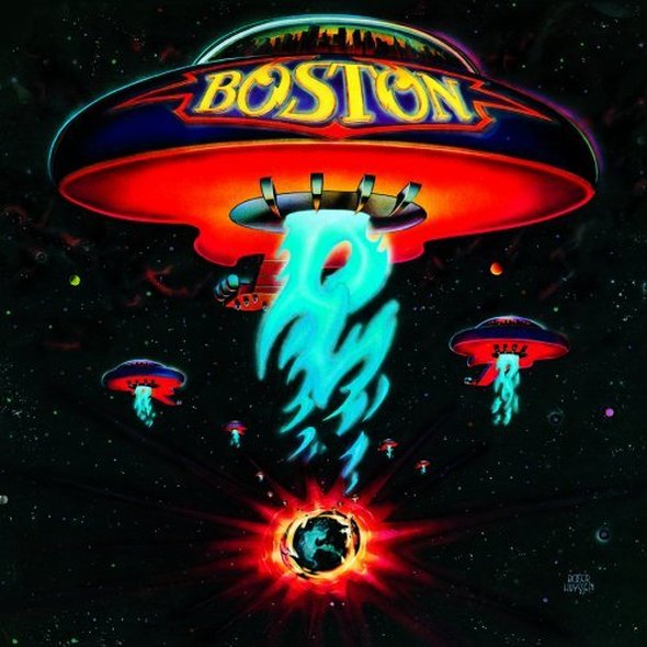
Paula Scher was an extremely influential graphic designer. Beginning in the 1970s her career took off by being an art director. She also worked in the promotion and advertisement department of CBS Records.
After working there for 8 years, she created over 150 album covers each year. She earned 4 Grammy nominations for her album covers including: Ginseng Woman by Eric Gale, H and One on One by Bob James and Boston by Boston.
In 1991 she became partners with the New York office of Pentagram. She eventually got a job as a teacher at the School of Visual Arts for over 20 years and taught occasionally at Yale University, Tyler School of Art and Cooper Union.
Her work has been represented all over the world, for example in the permanent collections of the MoMA, museums in London, Germany, and Paris. There is also a Netflix documentary which Scher is featured in called “Abstract: The Art of Design”.
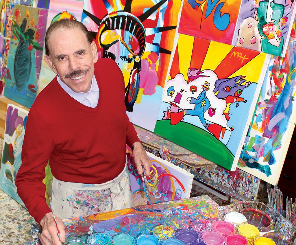
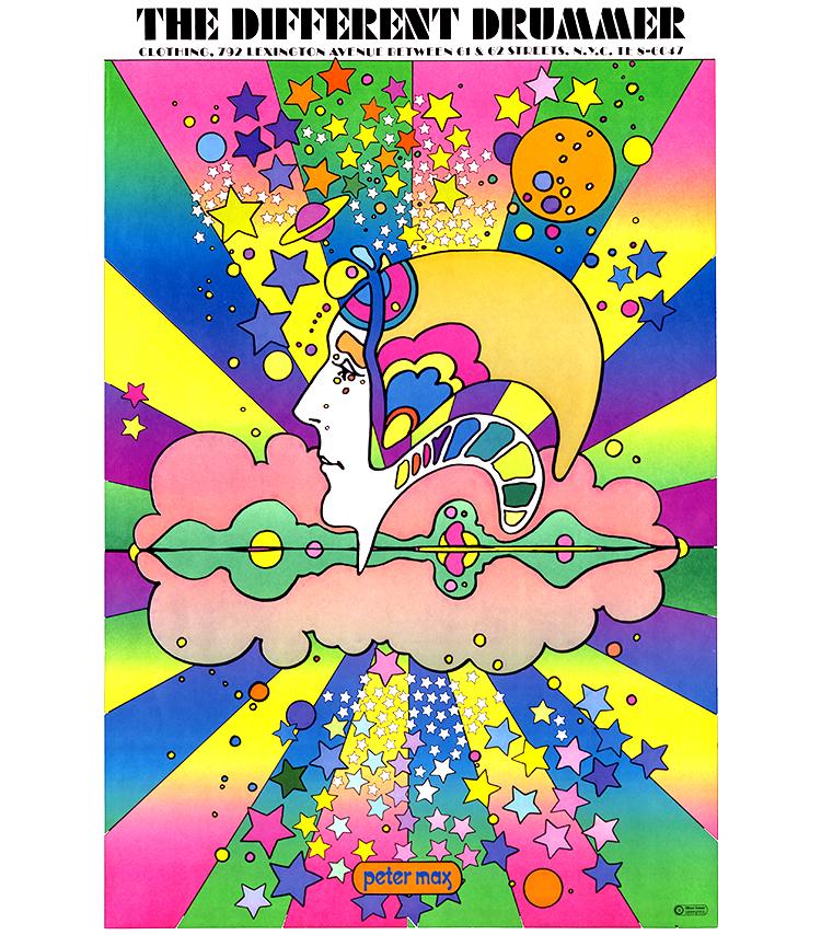
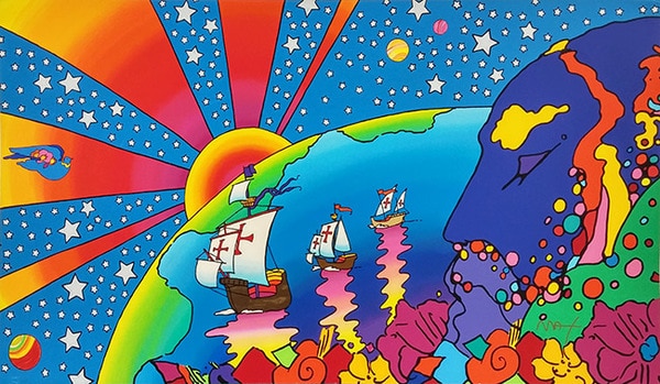
Peter Max is an illustrator and graphic artist who became well recognized during the 1960s. His work is known for an incredible use of colour, where one colour pallet is continuously used throughout his work. He often uses psychedelic shapes and generally specializes in Pop Art and Neo-Expressionism.
In 1937, Max was born in Germany, however, he and his family moved to China, Israel, and France, finally settling in New York in 1953. Max studied art at the Art Students League of New York and later started an art studio with his friend Tom Daly which they called “The Daly & Max Studio”.
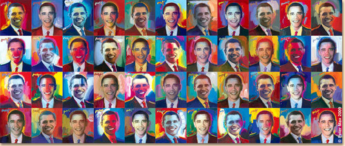
Max has designed ad campaigns for 7-Up and Chrysler, and he has also painted for six US presidents, for example his painting 44 Obamas debuted on The Early Show. He painted for celebrities, politicians, and athletes as well. Max was the official artist for the Grammy Awards, the World Cup in 1994, and the Super Bowl.
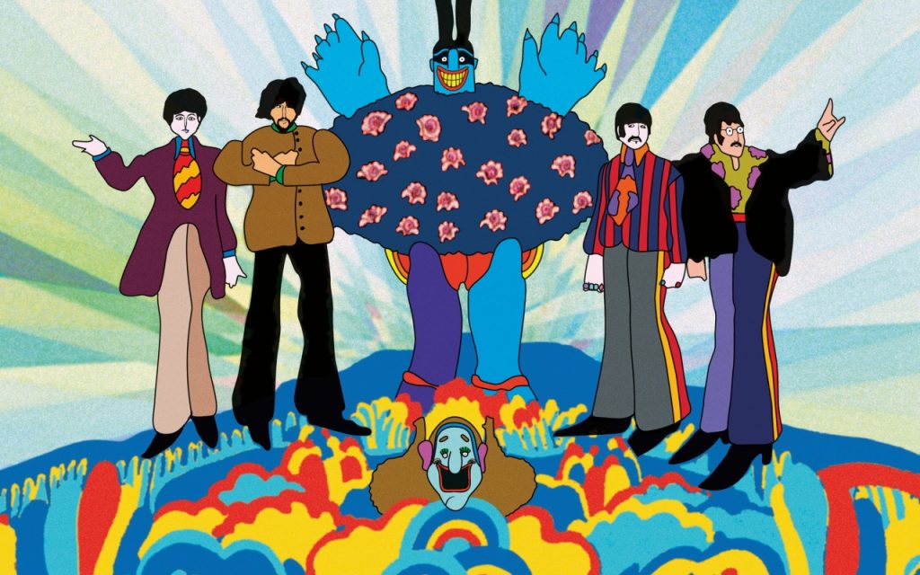
There have also been constant claims that Max worked on The Beatles’ “Yellow Submarine”, however, this was said to be false by the production team. I was initially drawn to Max’s work because of how closely his style resembles the Beatles illustrations, however, I love how playful his art is and I enjoy his colour pallet and creativity.
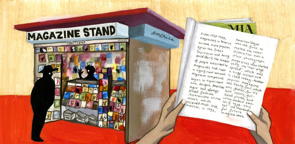
This is a design spread, in which I chose to focus on magazines in America from 1930-1945. I decided to create a magazine stand to symbolize the abundance of magazines being produced at the time and showcase the two most significant magazines which were Vogue and Vanity Fair. The style in which I painted the spread was inspired by a number of the illustrations seen on the front covers of the Vanity Fair magazines. The colour pallet I chose was meant to look similar to some of the bold choices magazine companies were making during this time, hence the bright red and yellow.
I give myself an 8/10 on this because perhaps I could have added something more to the background. I also believe that moving the magazine stand over to the left would have suited the page better. However I think the spread reflects the era well and i am happy with the colour choices and execution.
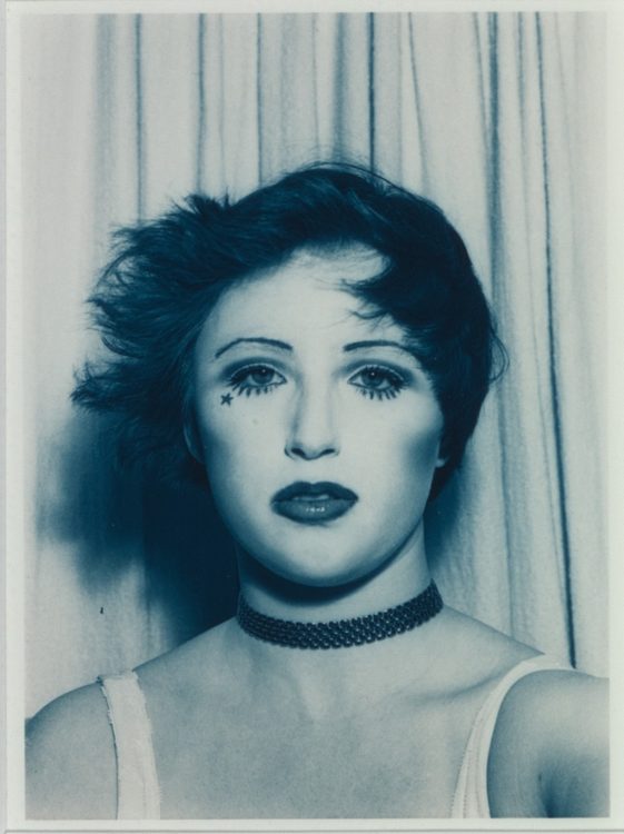
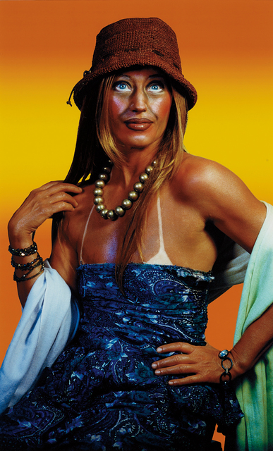
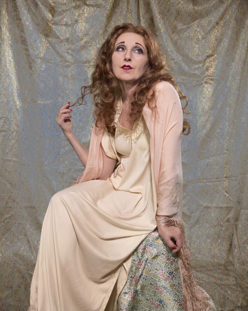
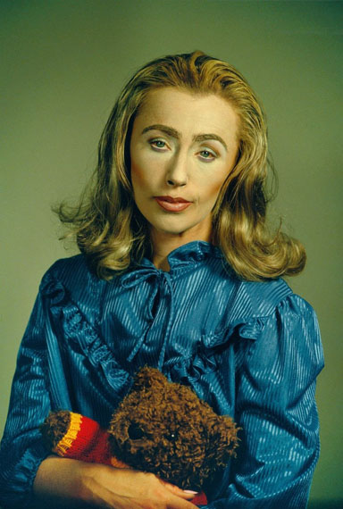
Cindy Sherman played an extremely important role in contemporary art. She is known as one of the most important artists in this movement. The 1980s was a period where mass media imagery was on the rise and Cindy Sherman was a key figure in socially critical photography.
After a time of American Feminism, she turned to photography in order to explore and depict different personas or social roles among women. She was so unique because for over 30 years, she used herself as her own model.
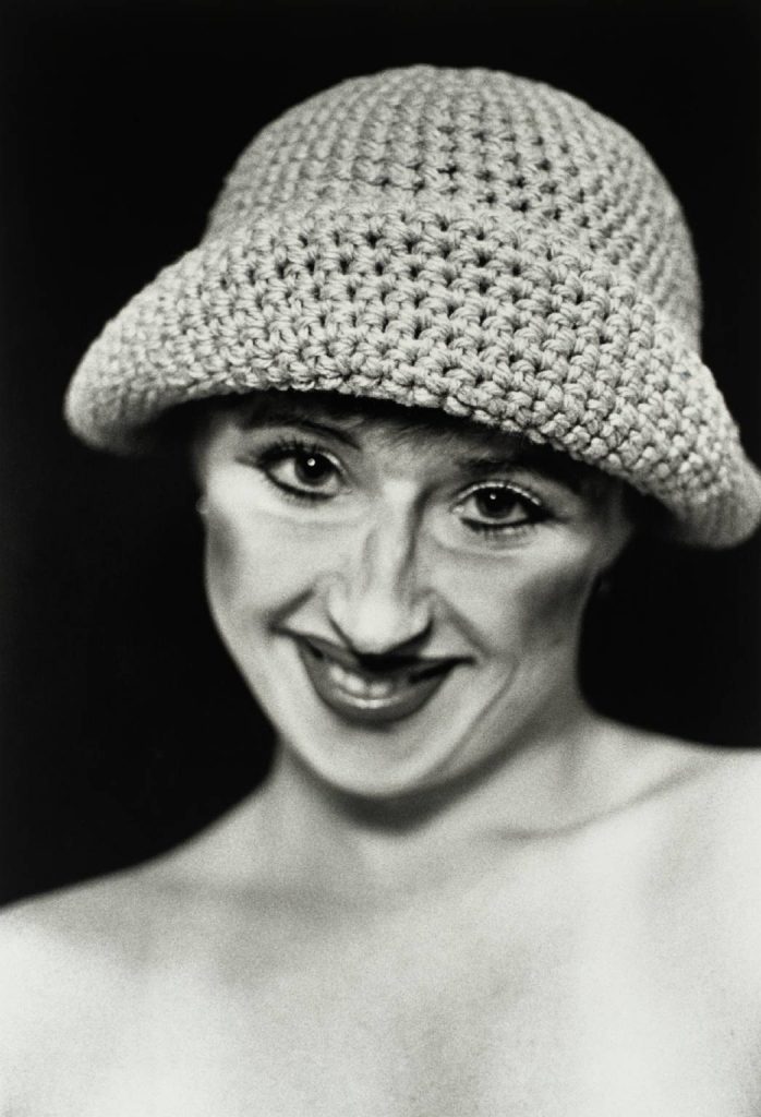
She would create her photographs by dressing herself up in different costumes. She would take on the role of not just the photographer, but the makeup artist, the costume designer, and the model. She created a series of headshots to depict film stars on there way to fame. She has created the most interesting series of work and has made it into the Moma Gallery in New York.
Her work has been called disturbing or distasteful, however, it has also been called amusing and intriguing. She tests the viewer to reconsider cultural assumptions. I really appreciate her work and think it is truly intriguing. It is unsettling and glorious at the same time. When you look at her pieces, it is absolutely remarkable how many people she can turn into and the way she captures their aura.
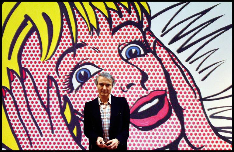
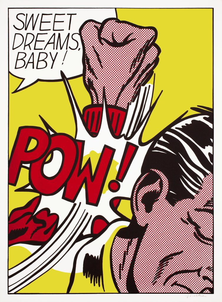
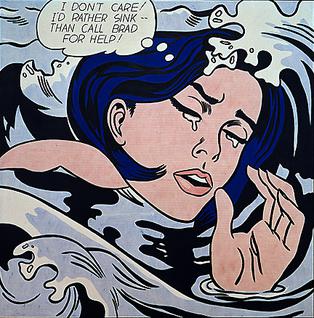
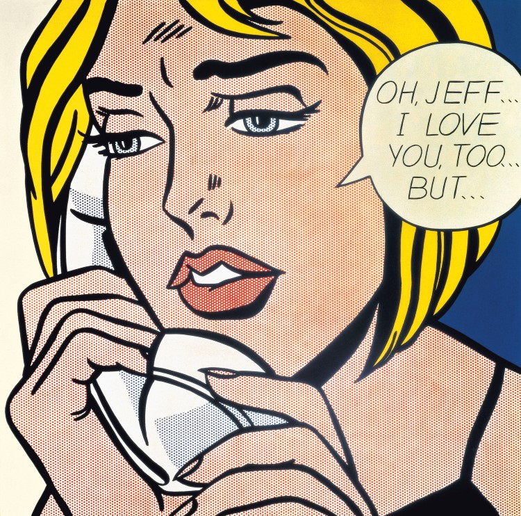
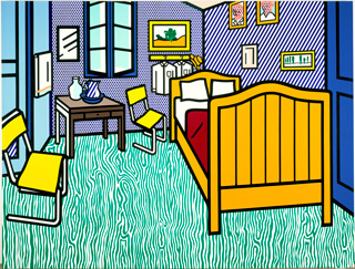
Roy Lichtenstein was an artist who helped originate the movement of Pop Art. He was one of the most influential artists during the 20th century. He became known for his bold use of colour and American pop culture, such as parodies for comic books and advertisements.
Growing up in New York culture, he loved the American Museum of Natural History and the MOMA, which he is now exhibited in. He was very successful in commercial art. It was not until the 1960s that Lichtenstein decided to paint by focusing on the painting process instead of the emotional aspect of art.
He would take images and subjects directly out of comic books and advertisements and use these as his art. He would then convert these subjects into his own style which is resembling the printing used for commercial art. His style consisted of a series of dots, black outlines and bold colours.
I personally enjoy his work. The colours and way in which he stylises his figures is very inventive and bold. I do, however, know that some people disagree with the fact that his art is copied. I like how he twists something already existing and makes it more interesting.
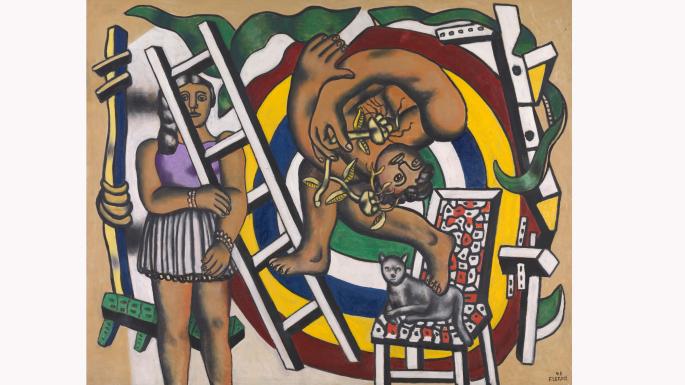
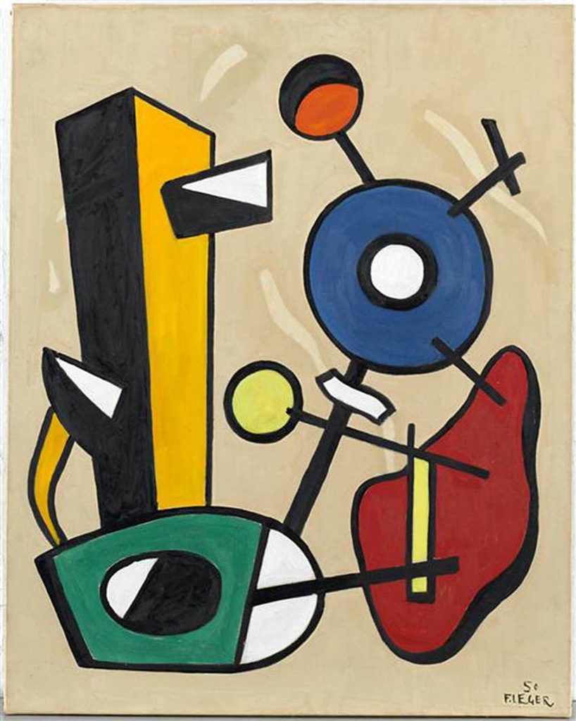
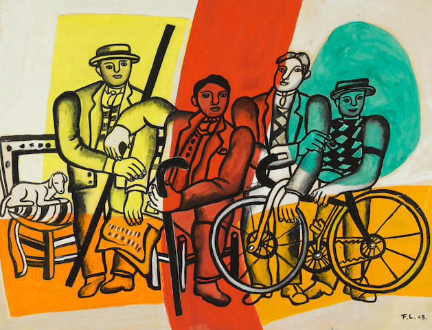
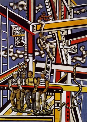
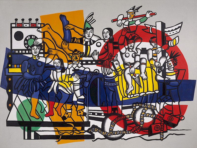
Fernand Leger was an artist who developed a style called “machine art” which uses tube-like forms, bold colours, and mechanical imagery. Despite painting, he had also done worked with ceramics, stained glass windows, print, and even film and theater. He began his career as an architectural draftsman, as well as a photo retoucher.
It was when he did schooling in Paris, however, that he was influenced by artists such as Cézanne, Picasso, and Braque. This is when he abandoned the fauvist and impressionistic style of painting, and started creating unique renditions of cubism. He used primary colours, curved and straight lines, and forms derived from mechanics to create his work.
He eventually created the avant-garde film Ballet Mécanique and designed murals. His main art pieces he created near the end of his life were The Constructors and The Great Parade. He wanted these pieces to appeal to the general public, but unfortunately didn’t get the popularity he wanted at the time.
Today he is greatly appreciated and has his work in many large galleries. I believe his work is bold, yet graceful. His take on the cubist style is very unique and adore his creativity and his bold use of shape, pattern and colour.
