Canadian Design Today

Allan Fleming

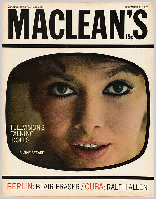
Allan Fleming was a Canadian graphic designer born in Toronto Ontario. His father Allen Steveson Fleming, was a clerk with Canadian National Railways, which may have helped him with his success. However Allan Fleming has always been a hard-working designer, he was only 16 when he apprenticed at various firms in the city, which is incredibly impressive for someone to be working in a professional field that young.  He is best known for creating the Canadian National railway logo which was launched in 1960, and it remains unchanged. He worked as a freelance designer and taught part-time at the Ontario College of Art, he subsequently landed a major position as an Art director for Maclean’s Magazine1962. Clients included General Electric, General Motors, Hockey Night in Canada, and Imperial Oil. More clients meant more opportunities. Throughout his career, Fleming’s work has won numerous awards, and he is far beyond remembered as the man who created the CN logo.

Eye Magazine | Feature | Allan Fleming: The man who branded a nation
Allan Fleming looking cheeky for the camera
Allan Fleming - Wikipedia
Fleming’s expressive typography.
Eye Magazine | Feature | Allan Fleming: The man who branded a nation
Eye Magazine ft. Allen Fleming
Shining the spotlight on Canadian design - 99designs
Allen posing in front of his most notable achievement the CN logo

Post Modernism in Europe

The Memphis Group!

The Memphis Group which also goes by the name Memphis Milano was founded in 1980 by a design and architecture group lead by Ettore Sottsass. The group specialized in postmodern furniture, lighting, fabrics, carpets, ceramics, glass, and metal. These designs were active from 1980 to 1987. Their work is characterized as colorful, vibrant, and flamboyant, a lot of their furniture took shape in asymmetrical forms. This style stemmed from the rejects of Modernism, they collectively wanted to change the concept of what design had been focused on. I am guessing the groups’ intentions for their designs could be referred to the famous quote by Louis Sullivan “form follows function”. I am marvled by the ambiguous and questionable furniture they created, although it could be described as “eye candy” furniture many of the pieces look very uncomfortable. I wonder if that was one of the factors that led to the downfall of 1987. Unfortunately, the group parted ways due to insufficient commercial success. Despite this short-lived fad Ettore Sottsass is still considered one of the most well-known Italian post-War designers!

Незабываемые 80-е и группа Memphis. Они собрались в декабре... •  Интерьер+Дизайн
The Memphis Group posing for a playful photo
10 iconic examples of Memphis design | Creative Bloq
Pin on xx_Memphis

These designs give me major flashbacks from a cartoon I used watch as a kid, it was called “Rolie Polie olie”. Crazy to say when I look at these designs they actually give me a strong sense of nostalgia!

Supergraphics Innovator!

Peter Saville

NPG x38121; Peter Saville - Portrait - National Portrait Gallery

Peter Saville is an English graphic designer and art director who graduated from Manchester Polytechnic in 1978  for graphic design. He is best known for his collaborative work with Factory Records where he designed many record sleeves for artists. Most notably for Joy Division and New Order. He was introduced to the music scene by Tony Wilson who was a journalist and broadcaster who commissioned Peter to design a music poster. Since then his career took off. Two of his biggest design influencers are Jan Tschihold and Herbert Spencer whom he was inspired by their typography. At age 57 he was awarded the prestigious London design medal which recognized him as UK’s most famous graphic designer.
Peter Saville on Joy Division's Unknown Pleasures stellar cover art |  TypeRoom
Peter Saville for Joy Division’s Unknown Pleasures
Dreams Never End: The Cover Artworks of Peter Saville | by Alexander Gyurov  | Fiction | Medium
More Cover artworks by Peter Saville
Peter Saville – city-mon-pmabdirahmanahmed

What I admire about Saville’s work is the versatility of his designs. He has a wide range of styles that makes him a multi-faceted designer. I noticed his different incorporations of typography, photography all of his designs look different and unique from one another which I love!

Sources:

https://www.theguardian.com/artanddesign/2013/sep/08/peter-saville-uks-famous-graphic-designer

https://en.wikipedia.org/wiki/Peter_Saville_(graphic_designer)

Psychedelic Design Hero

Lee Conklin

50 years of psychedelic art with Lee Conklin | KALW

Lee Conklin is an artist born in 1947 in New Jersey and grew up in the small town of Monsey, New York. He is prolific for his 1960’s psychedelic poster art and best known for his memorable cover for Santana’s debut album, formed by the Mexican American artist Carlos Santana. In 1965 he was recruited to the army and moved to San Francisco after being disbanded from the war. He was one of the many artists who revolved around the psychedelic movement and the growing music culture in San Francisco. His influences include Heinrich Kley a master of pen and ink, and the inspiration is evident in his poster design for “Santana”. Lee’s style is distinctive for his intricate graphics and calligraphy. He also tends to add discrete images within images or disguise lettering into formed figures. Conklin continues to make art posters and prints for venues such as Fillmore, and Maritime Hall.

Debut Concert Poster for “Santana”

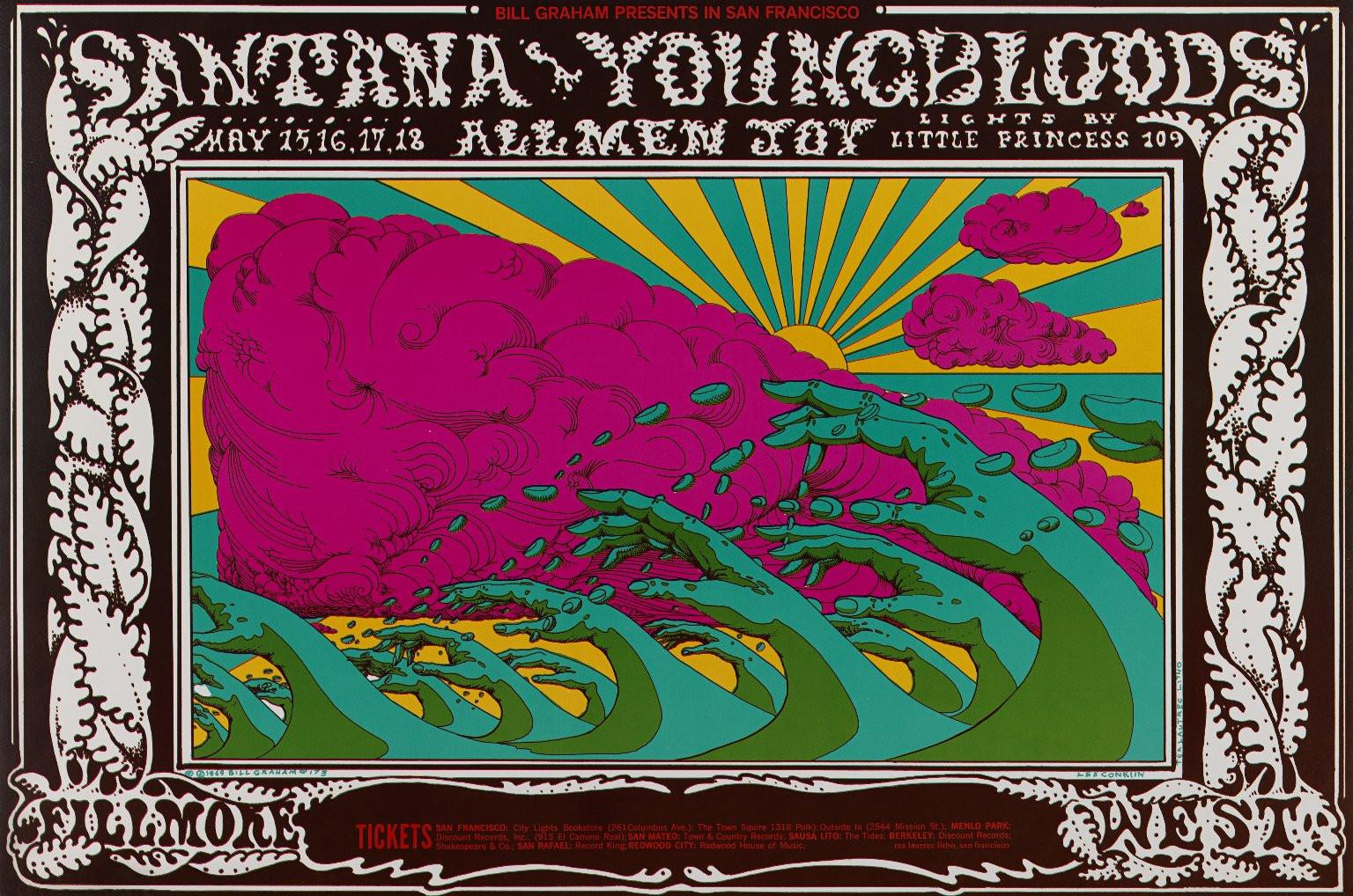
Another concert poster for “Santana”

Lee Conklin Painting The Sixties – retroculturati

Poster for Fleetwood Mac

sources:

https://www.bahrgallery.com/artist-master/lee-conklin#:~:text=Biography,easel%20in%20his%20later%20teens.

Advertising Art Director

Willy Flechaus

Willy Fleckhaus-Ausstellung: Die Welt als Raster und Regenbogen - Kultur -  Tagesspiegel

Willy Fleckhaus was born in post-war Velbert, Germany in 1925. He is known for his innovative, creative, and influential designs. His most prolific work was for “Twen” a lifestyle magazine, where he worked as an art director. It’s said that he invented the position of the “art director”, before the career description even existed.  “Twen”, which is short for twenty was established in 1959, and ironically only lasted 20 years until 1970. This magazine was created for young German adults who have grown older since the end of World War 2. The covers for Twen were captivating, he mastered visual montage with his choices of framing, reducing, and enlarging. His design techniques were influential because readers and viewers alike were emotionally compelled. Below are some examples of his work that demonstrate strong elements of photography in design. Although “Twen” lived a short life it is no doubt Willy’s advertising art direction revolutionized the design in magazines. Everything was selectively planned, his work can be described as organized chaos.

Design, Revolt, Rainbow: the pioneering work of graphic designer Willy  Fleckhaus
Above
twen 6, 1962, photography: Nicolas Tikhomiroff
twen 9,1964, photography: Willy Rizzo
twen 11, 1962, photography: Jeanloup Sieff
twen 4,1965, photography: Roger Fritz
twen 7, 1962, photography: Charlotte March
twen 5, 1961
Graphic Journey Blog: Schmalfette: Tall, dark and handsome
Past Print: twen issue 9 1962 / selected pages | Magazine cover layout,  Magazine layout, Page layout design

“Twen” issue 9 1962