I was assigned to do a spread on colour for survey 9: Colour and cool font. I specifically chose to discuss the Bauhaus School of art in my spread as their work with colour was quite revolutionary for the time.
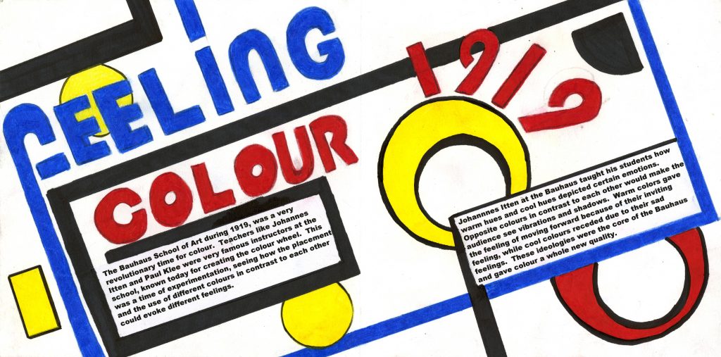
I wanted to illustrate my spread in a clear Bauhaus style. I attempted doing this by using lots of diagonal lines and bold shapes. My text is on a diagonal, and I used primary colours and lots of black which was commonly seen in Bauhaus posters. I wanted to create the feeling of movement throughout the spread which I think I executed well. I think overall I executed the Bauhaus style well through the spread, though looking back I do think though it is very busy looking, it is still a bit simplistic and if I were to do it again I’d maybe add some more Bauhaus like elements to it. For these reasons I give myself an eight out of ten.
Works Cited
“Bauhaus.” Wikipedia, Wikimedia Foundation, 20 Nov. 2019, en.wikipedia.org/wiki/Bauhaus.
“Bauhaus Color Theory.” Hunker, www.hunker.com/12000116/bauhaus-color-theory.
Leave a Reply