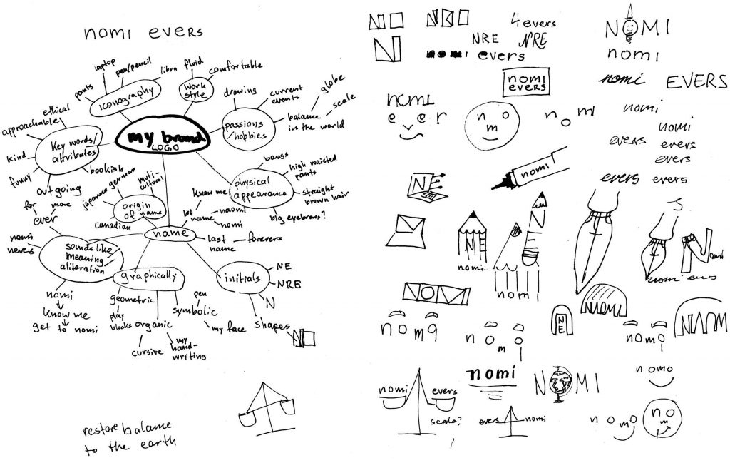
From my sketches in the previous post, I chose three distinctly different options for the final logo. All three options display a different side of myself as a designer. Ideally, my logo would have incorporated all three sides of myself but when I tried that the logo became convoluted. It was important to me that my logo has a simple legible message.
Option 1: Perspective
Problem-solving and changing perspectives go hand in hand. Opening yourself up to other’s point of views allows you to see solutions, not before thought of. This awareness helps you make better decisions to help people in the best way. This logo represents two perspectives: The eye as a personal perspective, and the earth and moon a global perspective.
Option 2: Friendly Lady
I strongly believe in the power of collaboration. Because two minds are better the sum of their parts. Being approachable and a good listener is vital in working with other people. I also value kindness.
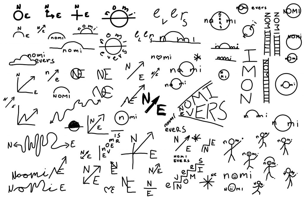
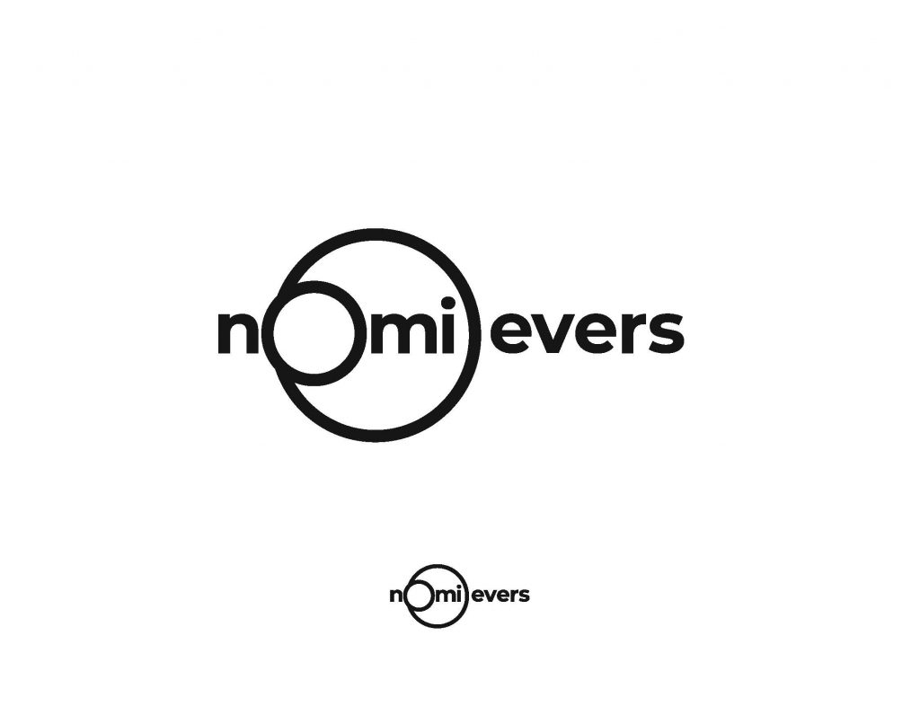
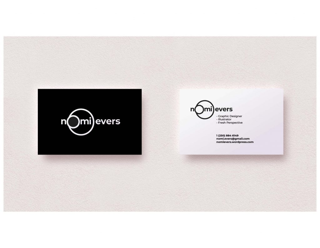
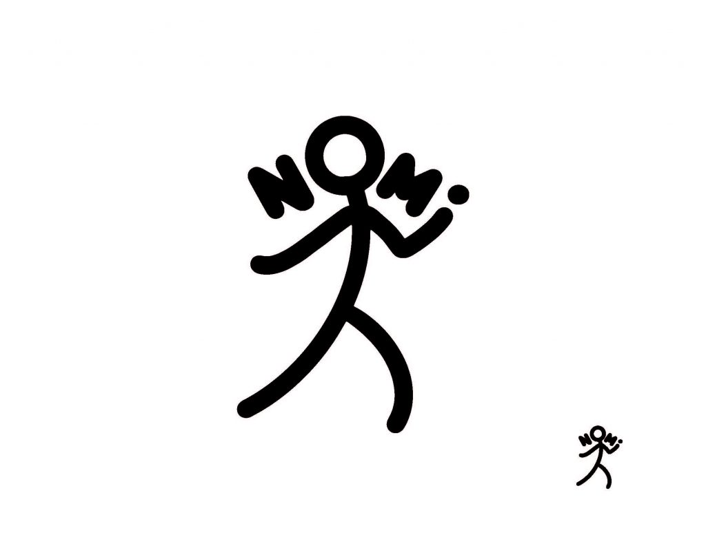
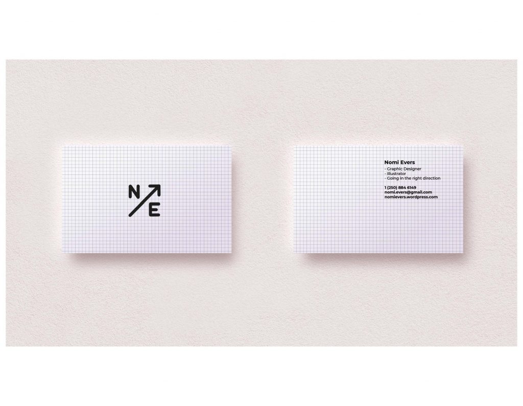
Option 3: Northeast
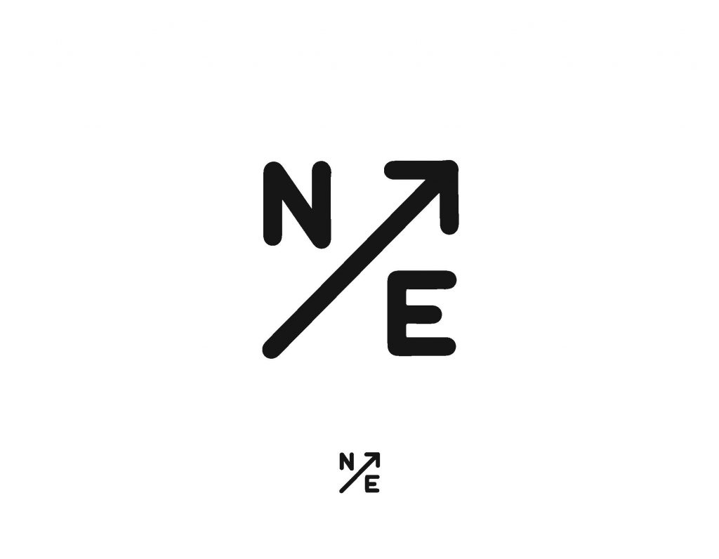
My initials are N E as in northeast. Northeast points in the direction of upwards and onwards. If a line on a graph is pointing northeast it means growth is happening. I aspire to continually grow and learn as I get older. No stagnation for me!
Thanks for reading!