GDC SCHOLARSHIP CAMPAIGN

Research:

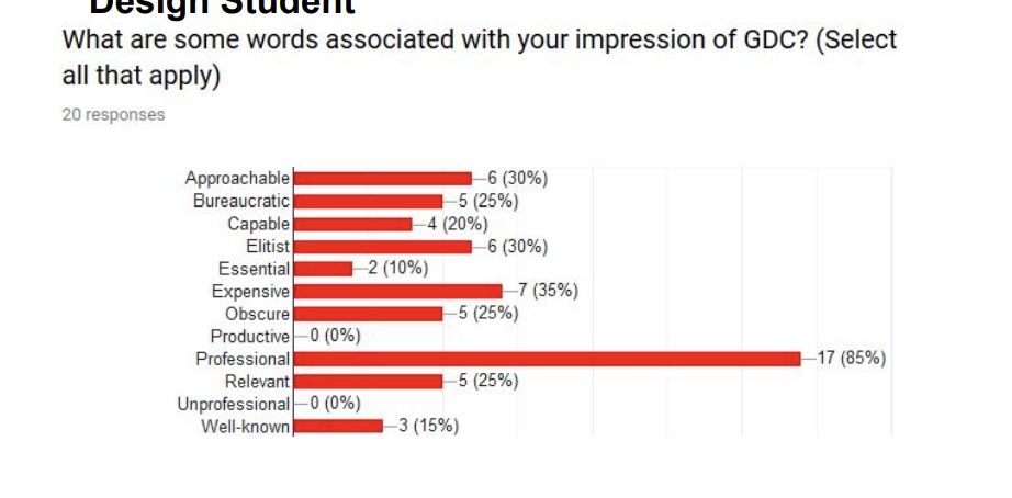
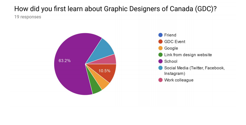
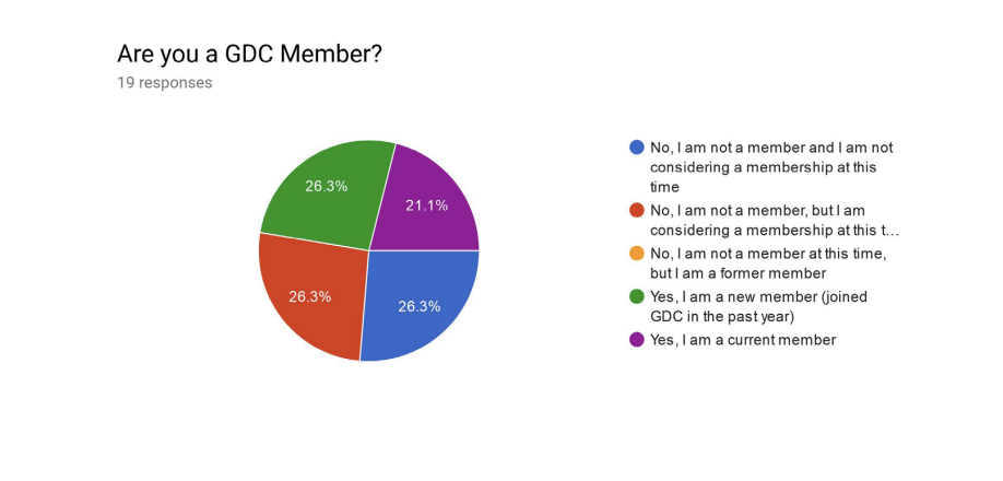
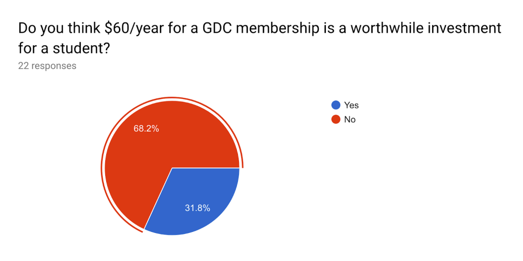
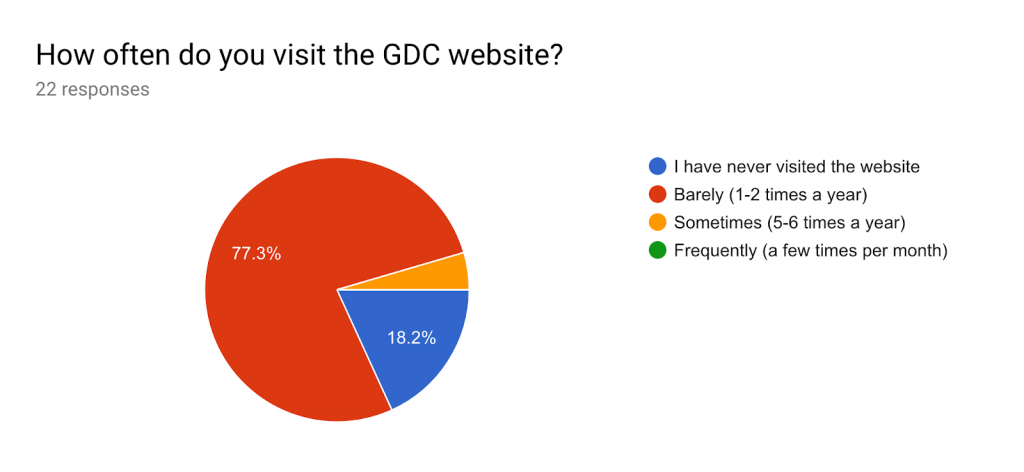
From the information gathered from surveying design students, we learned that there is low engagement and awareness among students about the GDC student membership. Research also showed that students felt that while the website appeared professional, it was not targeted at them but more so addressing certified working designers.

The Challange:

Canadian design students have a lack of awareness about the benefits of a GDC membership.

The Opportunity

A promotional campaign focused on the scholarships GDC offers.

Execution:

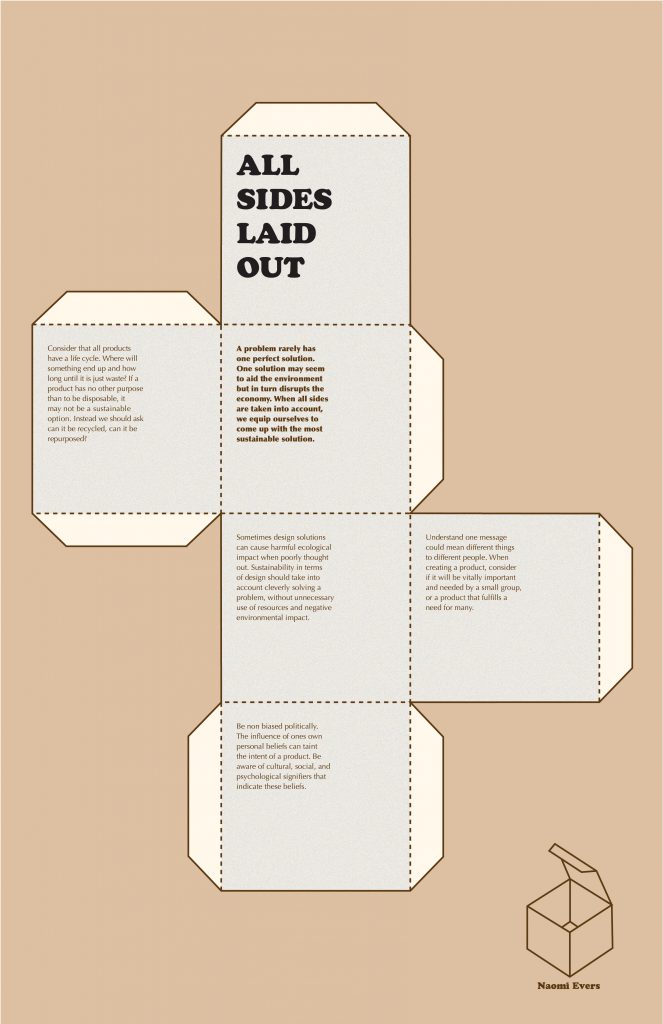
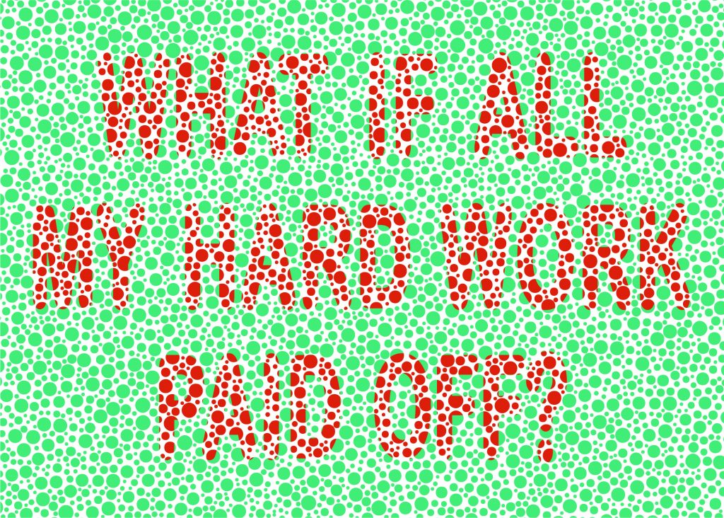
– Postcards with statement headlines directed towards students, with a tone of voice that offers a challenge, but encouragement as well.
– Front of card has an aesthetic type treatment that young people are drawn to and will want to keep.
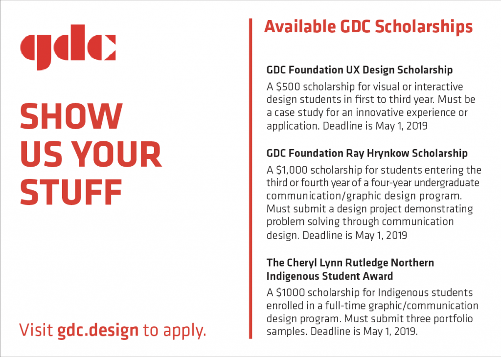
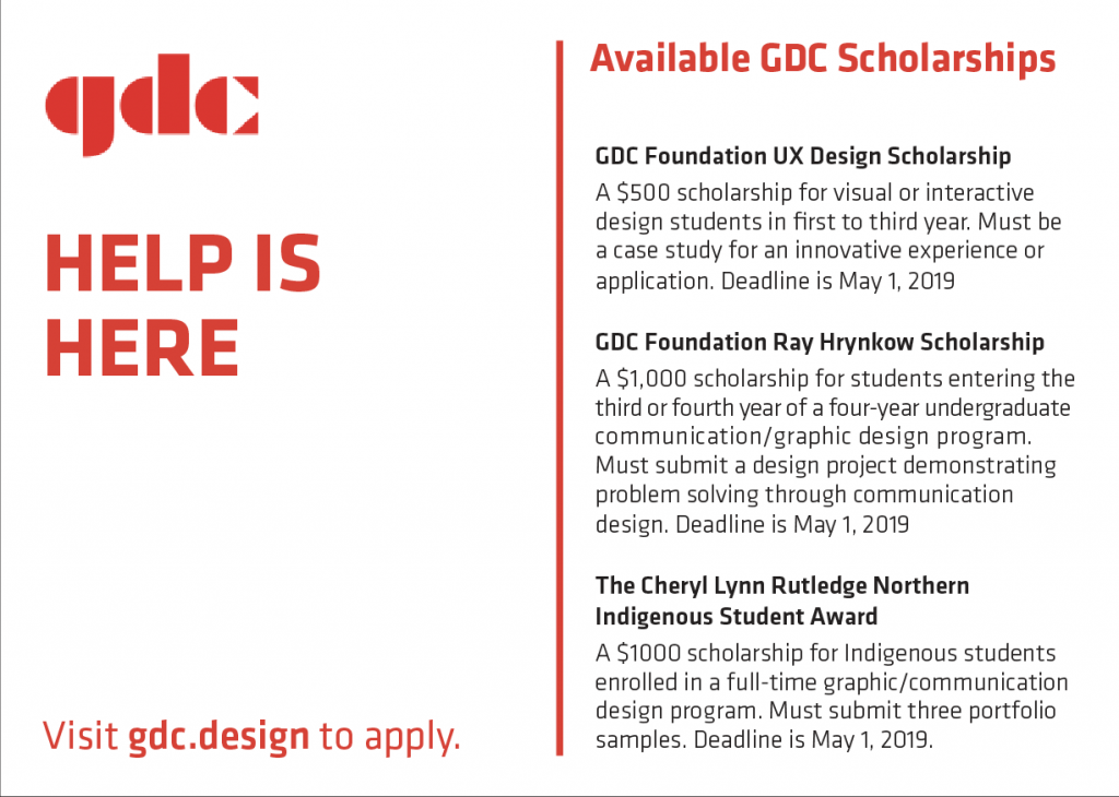
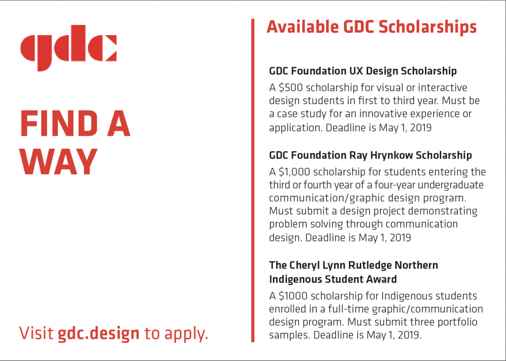
– Back of card has information about all three GDC scholarships and the website URL.
– A stack of cards would be mailed to universities, the GDC student ambassador would then distribute the cards to class
– Postcards are 5” X 7”.
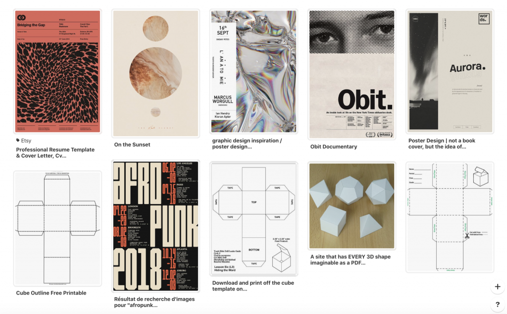
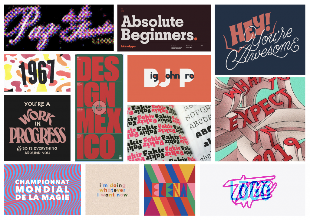
Moodboard

Postcard Examples

Rationale

– Students will find the cards relatable because of the trendy design and the empathetic language that speak to the struggles of being a student. This will increase the chance of students holding onto the cards, thus gaining awareness and interest in GDC.
– The cards are not just a promotion for the scholarship opportunities that GDC offers, but also a catalyst to show students that scholarships are a proactive way to get the most out of school.
– Students will see these cards and associate GDC with attractive design and that student memberships are a resource that is available to them.

Self-Evaluation

This idea answers the brief that GDC gave us. The postcard campaign is a cost-efficient, simple solution that works within the clients limited budget. I worked by myself on this project and give myself a 10/10.

DECOLONISING IDEA

Notes:

Posters:

Website:

https://invis.io/ANQSX31TBS9

Rationale:

By holding a gallery show containing art which is made up of work and performances by indigenous young artists, we are able to highlight the voices of Indigenous youth and through their art spread the perspective of a younger generations. The title “Unsettle” refers to decolonization in that Canadians must become unsettled and put themselves in a state of mind where they are capable of seeing, firsthand how colonialism has affected indigenous people to this day. “Unsettle” also refers to decolonization in that the art at this show is trying to acknowledge the impact of settlers. The show is a good step in reconciliation because the visibility and understanding of young indigenous artists in being promoted.

Self-evaluation:

9.5/10

Sara and I are giving ourselves a 9.5 out of 10 for our project. Our solution is successful at promoting young artist and successfully accomplishes the problems set out in the brief. Our solution to the brief contributes to the ongoing issue of decolonization in Canada.

RESUMÉ

Notes:

Execution:

Front of page
Page when held up to light

Rationale
After making my SWOT analysis I decided my unique selling point is my interest in presenting content in an innovative way. By present things in an unusual way, it gives the content a different perspective. I directed my resume towards Hangar18, a design collective that focuses heavily on the conceptual. Because of this, I wanted my resume to have an interesting concept. By having the viewer physically change their perspective to view my resume it lets them know I have the ability to think innovatively.

Self-evaluation
I give myself a 8/10 for my design. I think my concept is strong but the actually content of my resume could be more informative.

SUSTAINABILITY 101 DESIGN MANIFESTO

Step 1: Research

Step 2: Moodboard

Step 3: Create

Rationale
The concept of this poster is what ties in my personal style and beliefs. By having the option to cut out the shape and turn it into a box it not only shows my personality but also how all pillars of sustainability are closely connected and effect each other. The type font choices are personal favourites of mine. The choice of a slab serif for the title lets the viewer know that this is a ‘fun’ poster. On the other hand the colours are more muted to infer a seriousnesses to the poster. I think this poster is successful with its strong concept.

Self-evaluation
I give myself a 9 out of 10 for this project. I really like my concept and choice of colour and type but I think some of the writing could be a little tighter. I also wish the title could be bigger to stand out more.

Sources:

https://www.cbc.ca/documentaries/manufactured_landscapes

https://www.futurelearn.com/courses/sustainable-business/1/steps/157438

https://www.fastcompany.com/90202203/what-if-economic-growth-isnt-as-positive-as-you-think

https://www.canva.com/learn/the-ultimate-guide-to-font-pairing/