
Step 1: Research
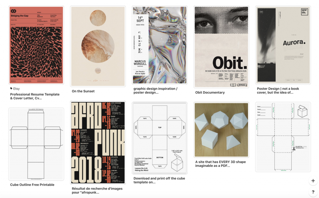
Step 2: Moodboard
Step 3: Create
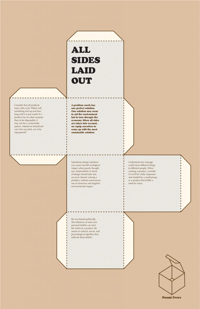
Rationale
The concept of this poster is what ties in my personal style and beliefs. By having the option to cut out the shape and turn it into a box it not only shows my personality but also how all pillars of sustainability are closely connected and effect each other. The type font choices are personal favourites of mine. The choice of a slab serif for the title lets the viewer know that this is a ‘fun’ poster. On the other hand the colours are more muted to infer a seriousnesses to the poster. I think this poster is successful with its strong concept.
Self-evaluation
I give myself a 9 out of 10 for this project. I really like my concept and choice of colour and type but I think some of the writing could be a little tighter. I also wish the title could be bigger to stand out more.
Sources:
https://www.cbc.ca/documentaries/manufactured_landscapes
https://www.futurelearn.com/courses/sustainable-business/1/steps/157438
https://www.fastcompany.com/90202203/what-if-economic-growth-isnt-as-positive-as-you-think
https://www.canva.com/learn/the-ultimate-guide-to-font-pairing/