141 Typography Zine

A.M Cassandre

(Left to Right- Page 2, 3, 4, 5)
(Left to right- Page 6, 7, 8, Title (1))

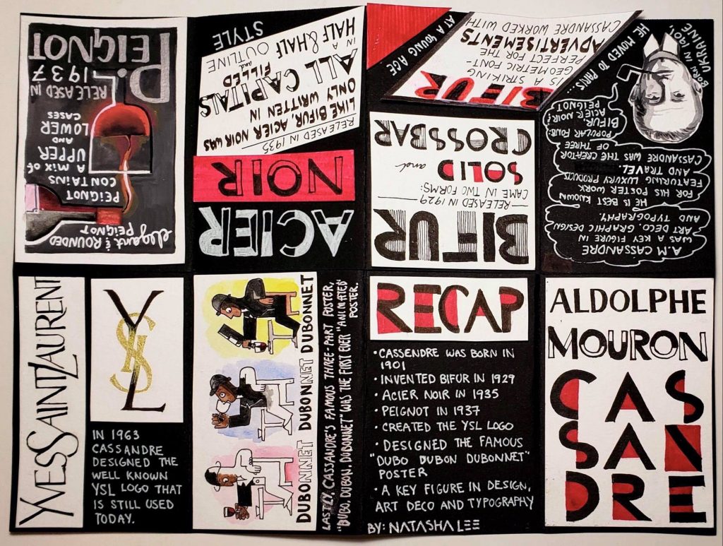
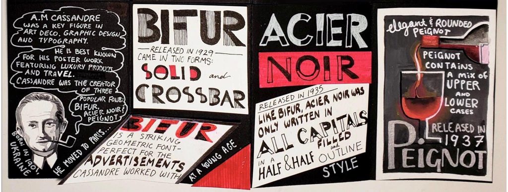
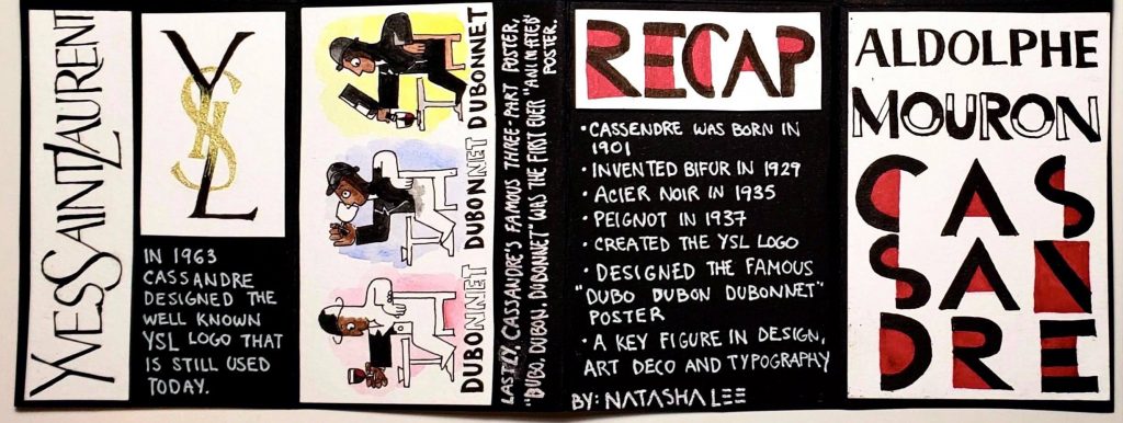
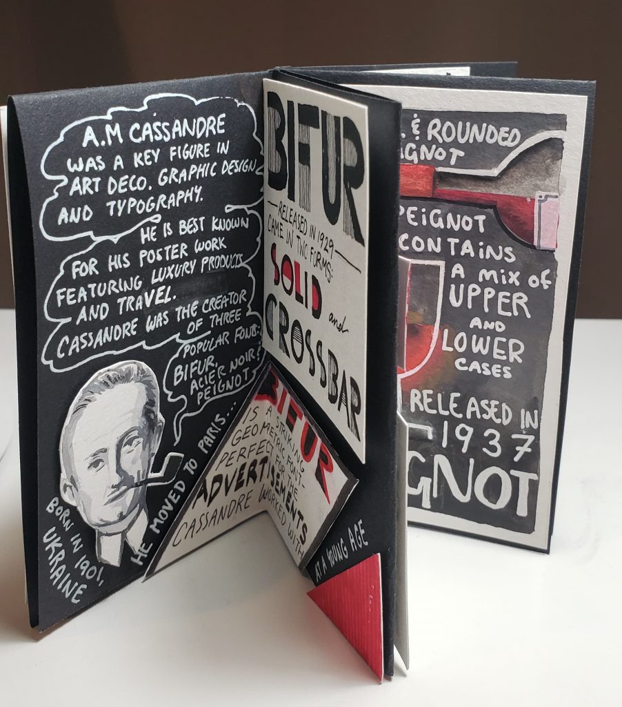
I found this zine project very fun and an exciting challenge to create. I chose to feature A.M Cassandre as the subject of my zine and got to learn a lot about his typography and poster work through my research. While I found much more information on his graphic design and poster work than on his typography, it was still interesting to learn about how he combined these two skills to create fantastic advertisements.
One difficulty I found when creating my zine was fitting all the information I wanted to include onto a small page! I was able to find many interesting facts and stories about Cassandre, but when it came time to transfer my research onto the zine, I realized that I had to pair down the information to the bare points. While I could have cut down on the illustrations and large lettering, I tried to prioritize readability and visual intrigue over bombarding my zine with text. I chose to create a cohesive theme for my zine by sticking to a limited colour palette of black, white, silver, and red for the majority of the text. These were colours used often in Cassandre’s typography work, so it seemed fitting to create my zine using such colours as well.

For this project, I would give myself an 8/10. I am quite pleased with the graphic and bold style of my zine that reflects Cassandre’s work and incorporates examples of his work outside of just typography. I spent a lot of time ensuring that the flow of the information made sense and that it was captivating and fun to read. In retrospect, I wish I was able to incorporate even more information on his work and typography by making the size of my zine bigger. This way, I could have added more facts and given the reader an even better idea and appreciation of Cassandre’s work.

Fun fact: Everything in my zine was hand drawn or written! Nothing against printers- I just wanted to torture myself and give everything a cohesive hand made quality.

Websites used for research:

https://www.cassandre-france.com/about-am-cassandre

https://www.printmag.com/post/bifur-cassandre-typeface

https://www.artyfactory.com/graphic_design/graphic_designers/cassandre.htm

http://luc.devroye.org/fonts-26316.htmlhttps://medium.com/fgd1-the-archive/yves-saint-laurent-logo-1963-a-m-cassandre-3cd069a83384

Adélaïde Labille-Guiard

The Female Feminist in Rococo Art

https://commons.wikimedia.org/wiki/File:Portrait_of_Madame_Adélaïde_by_Adélaïde_Labille-Guiard,_Speed_Art_Museum.jpg

Adélaïde Labille-Guiard was born in Paris, 1749 as the youngest out of eight children. While her family never possessed any connections to the arts, Labille-Guiard started her career at the age of 20 when she was admitted into the male-dominated Academie Royale after much determination and persistence. There she studied alongside the more famous Élisabeth Vigée-Le Brun, whose work would be compared to Labille-Guiard’s, even long after they finished school together. While Vigée-Le Brun was much more socially active and commissioned to do many portraits of Queen Marie Antoinette, Labille-Guiard made her mark as the painter for King Louis XVI’s aunts. Her work is most distinguishable by the matte and solid backgrounds she painted, in contrast to the popular trend of surrounding the subject with objects that flaunted their wealth. Her work is very detailed and has an almost photographic quality to them.

https://blog.nmwa.org/2017/04/11/happy-birthday-adelaide-labille-guiard/?shared=email&msg=fail

In her painting of the Marquise de Lafayette, Labille-Guiard’s use of a plain and natural background truly brings out the subject. This reminded me of the Mona Lisa by DaVinci and how the figure can work cohesively with the background but still appear as the focal point.

Labille-Guiard was also a prominent figure in supporting women’s rights and female artists. She was a devoted art teacher and supported her female pupils, and hoped of opening an all-girls art academy of her own. Unlike Vigée-Le Brun, she welcomed the French revolution and gave donations to the movement. This support allowed her to stay in Paris even after the French revolution to continue painting.

https://en.wikipedia.org/wiki/Self-Portrait_with_Two_Pupils Her most famous painting- “Self-Portrait with Two Pupils”

Here we can see Labille-Guiard’s devotion to her education of female artists. With a lack of extravagant props and her eager pupils in the back, Labille-Guiard appears most radiant and modest in her workspace.

Cites used:

https://theconversation.com/hidden-women-of-history-adela-de-labille-guiard-prodigiously-talented-painter-107801

https://nmwa.org/art/artists/adelaide-labille-guiard/ 

https://www.thevintagenews.com/2017/06/09/adelaide-labille-guiard-a-french-miniaturist-and-portraitist-of-remarkable-talent/

Survey 4- 141

Neoclassical Art and fashion

https://fashionhistory.fitnyc.edu/1800-1809/ Example of Neoclassical fashion

1800 was a revolutionary time in western fashion history. After the French revolution, the former stiff and cone styled dresses of the rococo era turned into more form-fitting outfits with very high waistlines. During this time, fashion, along with the arts, took on neoclassical inspirations. In their aim to reproduce looks from ancient Greece and Rome, women often mistakenly wore white, believing that classical fashion featured primarily white clothing. It was during this time that dresses became much looser with straight flowing skirts in contrast to their large and stiff forms from the previous era. Unlike the frivolous styles from before, natural beauty was heavily emphasized in fashion. Form-fitting clothes now outlined the natural body shape, and undergarments had to be altered to fit this drastic reduction of coverage.

https://en.wikipedia.org/wiki/Empire_silhouette Dress example

During this time, famous painters like Jaques-Louis David and Delacroix emerged to partake in the neoclassical trend. Just like fashion, art during this time drew inspiration from the Ancient Greek and Roman trends in aspects such as their scenes and costumes. This movement was based on the push against the previously frivolous traits of Rococo styles and held a more natural but still very impactful flare. Colour palettes noticeably reduced in paintings as the emphasis moved to the lines and forms of figures.

https://en.wikipedia.org/wiki/Liberty_Leading_the_People

Important events such as the French Revolution and the rise of Napoleon were great inspirations to painters like Delacroix, who painted the famous “28th of July: Liberty Leading the People” in 1830. Along with David, who painted many prominent pieces commissioned by Napoleon, such as “Napoleon Crossing the Alps,” and the “Coronation of Napoleon.”

https://vistapointe.net/coronation-of-napoleon.html

Sites used:

https://www.britannica.com/art/Neoclassicism

Gestalt Theory- Visual Research 121

Originally Posted September 29, 2020

Figure/Ground Example:

In this example of ground, the viewer’s eye first focuses on the man in the foreground but can also move to the background city scape, which plays a secondary role in this picture. This differentiation is a key component of the figure/ground rule. 

Proximity Example:

I chose this example of the African Beat logo (Originally a gif) as my example for proximity. While the lines and dots are separate, our minds can group them together to picture the outline of Africa. 

Similarity Example: 

I was not completely certain if this is a good example, but upon first glance, I categorized this image as an example of similarity. By using the rule of similarity, the patches of varying colours helps to differentiate the different sections of the hulk. Without these similar patches of colour, the set of triangles would tell much less of a story and could not convey the same message.

Design Elements- Visual Research 121

Originally Posted September 22, 2020

Colour Example:

This Art Deco themed poster by Mads Berg uses color very powerfully. In this poster, primary colors such as cyan, magenta, and yellow are paired to create a striking composition. Here, Berg uses an abundance of cyan in the dress and background, but which he contrasts with the orangy peach of the woman’s skin tone to create a striking yet visually appealing piece of artwork.

Shapes Example:

Shapes are skillfully used in this movie poster, designed by Sam Smith. Here, Smith has craftily created the contour of a bull out of many organic shapes, including the profiles of people and the repetition of wave-like forms. Paired with his powerful use of color, this design is very alluring and engages viewers.

Space Example:

In this cover for Linda Coggin’s Book “The Boy With The Tiger’s Heart”, designed by Levente Szabo, space plays a key role. Here, the use of negative space is cleverly used to cut out the form of the tiger while snaking through the form to also give the impression of stripes through the form of trees.

Blog Post 131

Originally Posted October 5, 2020

Late Gothic and Early Renaissance– Week 5

Giovani Bellini

Bellini’s Self Portrait- completed in 1500


Giovanni Bellini was born in 1430, Venice, Italy, and was an influential painter who brought the Renaissance style of painting to his hometown. The Bellinis were an artistic family; his father Jacopo, was a painter along with his brother-in-law, Andrea Mantenga, and his older brother, Gentile. This background helped to pave the way for Giovanni as he greatly surpassed his relatives in his artistic career. Bellini’s most notable artwork features masterful use of sensuous colors and his studies in perspective and landscapes. While at the start of his art-making practice, he drew inspiration from the bible and used tempera, he transitioned later in his life to natural scenes in oil paint.

The Agony In The Garden- completed in 1465

One of his most famous paintings, The Agony In The Garden, depicting Christ praying in the Garden of Gethsemane, clearly shows his mastery of perspective, foreshortening and an incredible sense of colour. 

Holy Allegory- completed in 1499

His painting, the Holy Allegory, caught my attention while I was researching this artist. The depth captured in this landscape is impressive, but even more, the precision of the geometric terrace in the foreground astounded me. The combination made for a piece of artwork that appears to be way before it’s time.

The Sacred Conversation- completed in 1505

Lastly, the altarpiece he painted in St Giobbe church, attests to his absolute skill in realism and perspective. From the architecture to the rendering of the figures, Bellini’s years of practice and perfection led up to this marvellous painting. 

Cites referenced:

https://www.britannica.com/biography/Giovanni-Bellini-Italian-painter
https://www.theartstory.org/artist/bellini-giovanni/artworks/
https://biography.yourdictionary.com/giovanni-bellini

Mood Board- 141

Originally Posted October 14, 2020

InVision Mood Board Screenshot

Survey 8 Project Link: https://natashal459625.invisionapp.com/board/Survey-8-1915-1925-ckfsldpc30k4l18sgt3hqtnbs

In this project, I chose a couple of events that interested me during this decade. I already started studied the first world war in high school, but during my research, I discovered patterns in the propaganda posters that were so common at that time. When I visited an art gallery downtown, I had first learned about the BC Chinese exclusion act and the tiny living quarters my relatives experienced when first coming to Canada. This research was the most personal part of the project to me as I learned a lot about the injustice and suffering Chinese people had to go through. My findings made me feel so fortunate that my ancestors made the difficult transition for me and how people’s attitude towards Asian peoples has changed in Canada.
During this project, I struggled a lot at first with how to use InVision! As most other text applications that I have used before do not move my pictures around so drastically, I found it hard to control the positioning of my images. Only after I separated them all into three groups did it become more manageable and enjoyable to use. I also found the color palettes created by InVision on the side of my pictures very neat! It helped to generate a cohesive set of colors that I could study and refer back to, especially in my “Colour” section of the project.

I would give myself a solid 7/10 on my mood board. While I learned a lot during my research for some of the topics, especially for W.A Dwiggins and the BC Chinese Exclusion act, I found it very hard to write in-depth on the limited information I could find online. I had to be creative on the links I made from the event to the prompt, and I fear that the reach may have made my points a bit weaker. On a positive note, I am happy with the result that was created on InVision and would reuse this platform for my future projects!

Survey 3- 141

Originally Posted October 14, 2020

From Gothic to Baskerville

In contrast to the Gothic and Venetian styles of typography created in the 1400s, the 1500s brought the “Old-style” font to fame. Fonts like Garamond and Goudy Old Style were prevalent during this century. The main difference of the time was that these fonts were created to be printed rather than handwritten. This change led to letters taking on a more upright appearance with high contrast between the thick and thin elements of typefaces.

https://greenwaycampus.weebly.com/blog/goudy-old-style-t-bold-download

Near the beginning of the 1700s, Caslon Font, created by Wiliam Caslon, was the most popular type in England and America. The style of typography had a hand-like quality and could be printed by presses easily. Caslon had an attractive appearance that was easy to read and suited long passages of text. This font could later be commonly found in newspapers, invented in 1752, where the font gained rapid exposure with the public.

https://www.prepressure.com/printing/history/1700-1749

The iconic Baskerville font was also invented during this time. This font featured very high contrast lettering that had elements of classical and modern typography. The creator, John Baskerville, went to great measures for his text and even redesigned the printing press to capture the intricacies of his type font. This font spread quickly from England to the rest of Europe, where countries eagerly took on adaptations of the text. Today, the elegant properties of Baskerville live on in our books and daily typography, as the font has remained a popular choice around the world.

https://jemmaeagleson.github.io/john-baskerville/Version-4.html

Sites used:https://blog.spoongraphics.co.uk/articles/a-history-of-typeface-styles-type-classification/embed#?secret=F29AoYGYbE

http://idsgn.org/posts/know-your-type-baskerville/

Survey 1- 141

Originally Posted September 30, 2020

Centuries-Old Chinese Calligraphy 


Born and raised in Vancouver, British Columbia from second-generation parents, I may be Chinese ethnically, but my knowledge of this country is slim. While I have never learned very much about China in Western-oriented schools, I have always jumped on the opportunity to learn more about my ancestor’s homeland. Therefore, when we learned about the history of art in Asia in my Survey Design class, I immediately knew that I would love to look more into this area. 

As touched upon in the Survey 1 lessons, The Chinese were the first to develop written characters in ancient Asia between 1400-1200 B.C, not too long after the very first invention of writing by the Sumerians in 3500-3200 B.C. Similar to hieroglyphs, Chinese characters were inspired by nature and originally formed to resemble pictures of their representative objects. We can still see the origins of these words today in the modern Chinese language through characters like the sun, moon, and mountains. 

https://www.reddit.com/r/etymology/comments/da2cs3/evolution_of_chinese_characters/ (Chat showing the evolution of pictures to characters)

During this time, Chinese calligraphy was regarded as the highest form of art. Similar to painting, calligraphy was performed with a brush and had a heavy emphasis on the precision of characters and motion in the strokes. Today, traditional calligraphy is considered to be a form of fine art in China and is practiced widely around the country. While the first records of Chinese calligraphy were found around 1400 B.C, the writing was not introduced to the masses until the Han Dynasty (206 B.C. to 220 A.D). This was only possible thanks to the invention of paper in China around 105 A.D. Paper helped to make literature and written works much easier to transport and to spread among the common folk. 

https://www.comuseum.com/painting/ (Artwork featuring a woman writing or painting)

Today, Chinese is spoken by over 1.6 billion people in the world, about 16% of the total population, and this number shows no sign of stopping. While the written language has gone through numerous transformations over the years, it is quite amazing to learn that most symbols and characters have stayed very close to the original.

https://www.ancient.eu/Chinese_Calligraphy/ (Calligraphy art by Cai Xiang)

Cites used:

https://search-credoreference-com.ezproxy.capilanou.ca/content/entry/move/chinese_art_and_architecture/0

https://search-credoreference-com.ezproxy.capilanou.ca/content/entry/columency/chinese_art/0

https://asiasociety.org/education/chinese-calligraphy

https://www.ancient.eu/Chinese_Calligraphy/–https://www.ancient.eu/article/1120/paper-in-ancient-china/

Yearbook Spread Assignment 141

Originally posted September 23, 2020

In this first assignment, I focused on a fun and interactive breakfast spread to feature different elements that I enjoy eating and which can visually enhance the text.
I have composed this spread using gouache to achieve a clean and colorful background for my text while having the freedom to draw illustrative components as well. In terms of layout, all the items are at an angle down towards the right to create movement. I also incorporated a variety of text styles and fonts to fit the size of the items I was covering and the message I wanted to convey.

Self Assessment: 9.5/10- I gave myself this mark because I spent a lot of time planning and executing this painting. My main concern is the busyness of the layout, but this spread shows who I am, and I am proud of what I have accomplished.