For this last blog post, I found Bruce Mau’s work very beautiful and clean. Born in Ontario, Mau is a designer, innovator, and educator who won an AIGA Gold medal in 2007 and co-founded the Massive Change Network with his wife Bisi Williams in Chicago. I was drawn to the minimalistic compositions he creates, often using typography as the main attraction of his work. As a student with a background in illustration, I always think that more is better and have been trying to learn how to scale back to what is only necessary to convey the idea. For Mau’s work, I admire how there is nothing unnecessary at all in his designs. The bold type paired with the use of colour, lines, or slight gradients reads very nicely and is so appealing to the eyes without feeling bare.
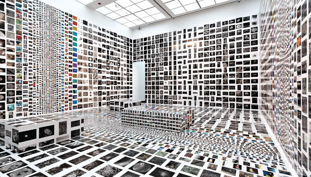
I was also amazed to see Mau’s other work in installations and architecture! His work continues in the same cleanliness as his graphic design work. In some installations, he plays with repetition and covers every plane in the room to create an incredibly immersive effect.
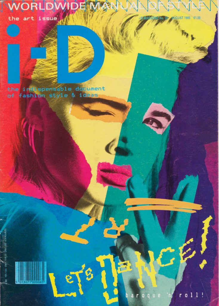
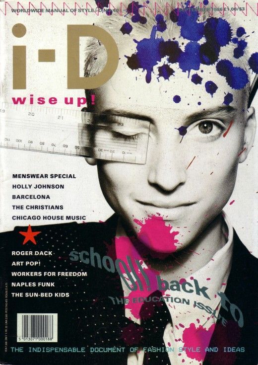
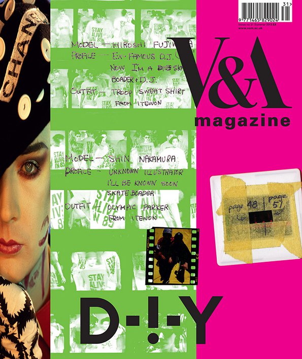
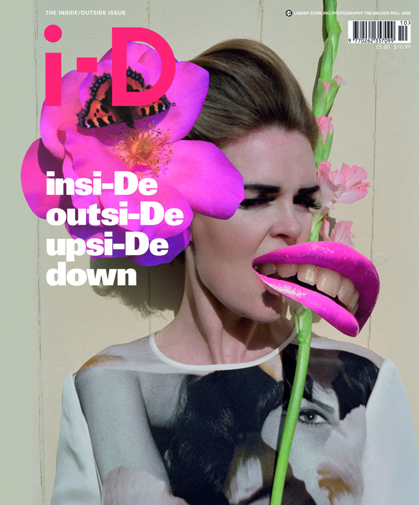
The postmodernist designer I chose for this blog post is Terry Jones. Born in Northampton, England, he is the Creative Director, Editor-in-Chief, and publisher of the fashion magazine i-D. Much of his work features collages of photography and exciting colours, introduced in the form of different mediums such as paint splats. Jones refers to his approach to art direction as “controlled chaos,” and it is easy to see what he means. His final compositions are very packed with varying materials and textures but done to a limit that it does not feel sloppy or overwhelming.
When I first saw these magazine covers, it appeared to me like an artist had been working on mixed media projects over top of a photograph, and whatever mess spilled onto that photo became the composition! As I looked at it longer, the placement of each object is far from random and beckon viewers in with what looks like a piece of art in progress. In the end, we have a stunning design that feels natural and free but still holds the professionalism and precision of a magazine cover.
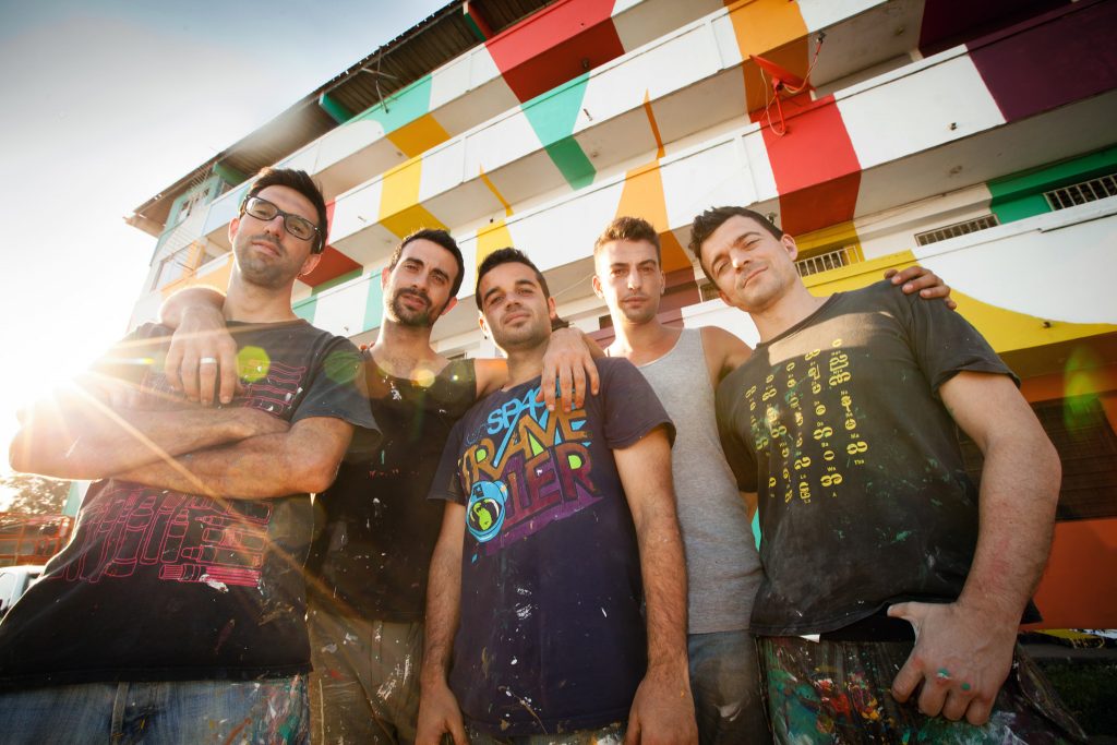
Picture of the members: Oscar Hudson, Danny Cohen, Roger Guardia, Allie Avital, and Yoonha Park
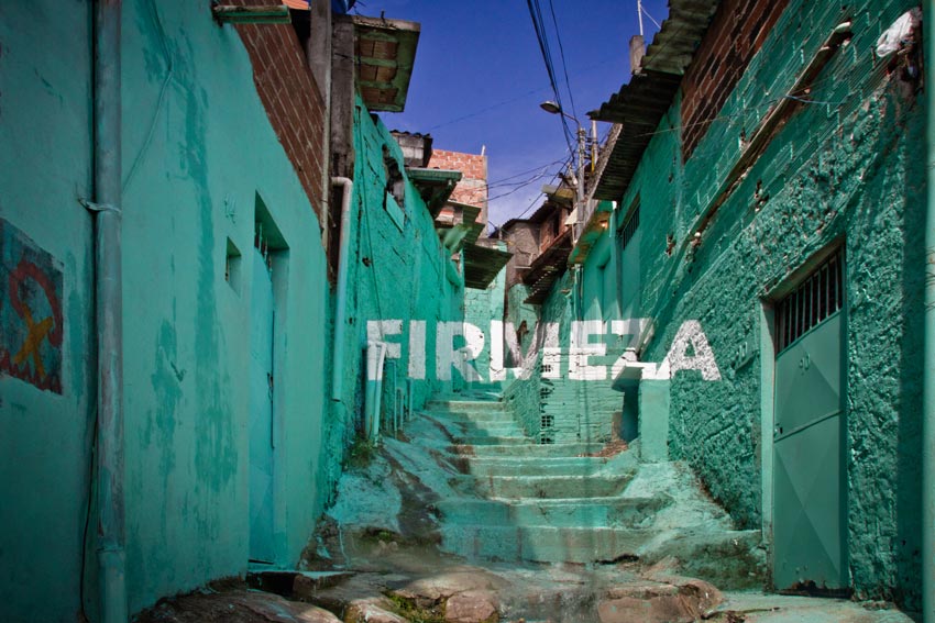
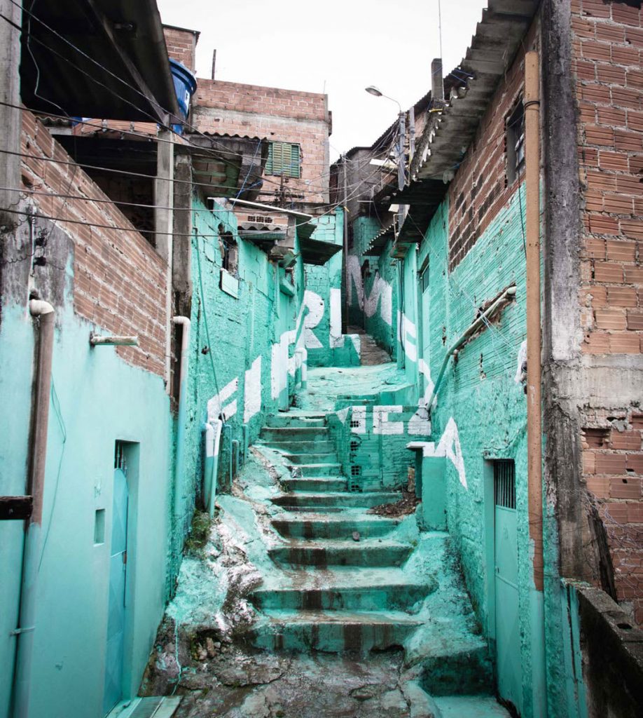
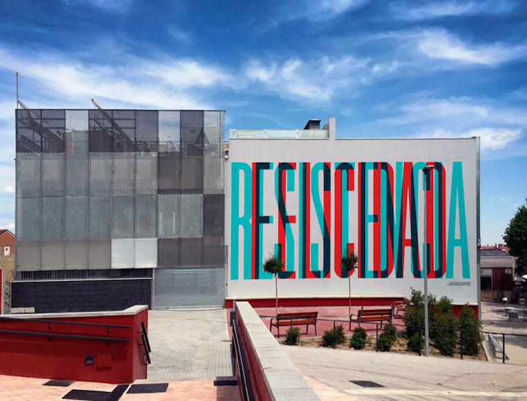
I was not sure this exactly fit the blog post brief as this is a group of very modern street artists instead of one singular designer but after seeing pictures of their supergraphic mural work, it was too amazing to pass up! Boa Mistura is a team of graffiti-based artists in Madrid, composed of Oscar Hudson, Danny Cohen, Roger Guardia, Allie Avital, and Yoonha Park. They are famous for their incredible typography murals that trick the eye into reading words if you stand at the perfect location. These works of art can transform winding streets with bursts of colour or span so large that they encompass a whole square.
Boa Mistura’s work in Guadalajara, Mexico.
I really admired the impact of their bold use of type and bright colours. Even though I have only seen photos of their work, I believe the experience of seeing their supergraphics in person would be incredible as the sheer scale would play a significant effect. What is even more impressive is that most examples of supergraphics I have seen as typically done on smooth surfaces with sharp corners. Boa Mistura has taken it to the next level through their ability to work with rough stones and uneven walls to create something that looks so modern and clean!
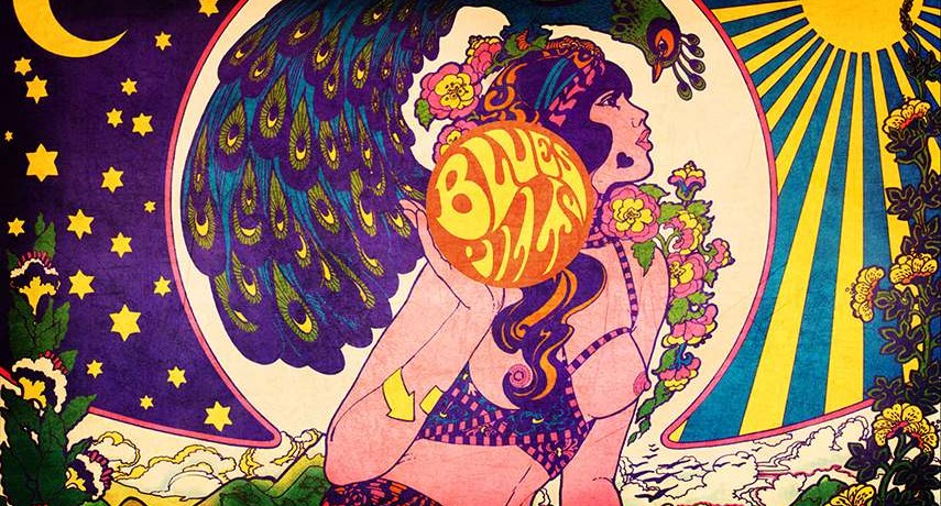
Despite the lack of information on this artist online, I chose Marijke Koger as my psychedelic art hero. A multi-talented artist from Holland, Koger’s beautiful mural work, album covers, and painted instruments all hold a special delicateness in balance with its psychedelic flair. Her complex compositions are always well balanced with an abundance of colours and textures that somehow work harmoniously. I was drawn to how she portrayed women in her paintings, beautiful but with a certain strength in their pose and eyes. There is a calming sense from the figures that help balance out the complex backgrounds and settings in these pieces of artwork.
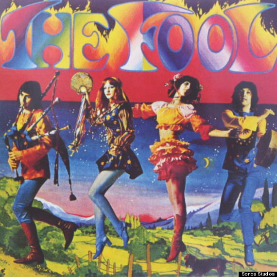
The Fool Album Cover by Marijke Koger
Another aspect of Koger’s work I enjoy is the natural backgrounds and flora she paints. The psychedelic style typically has a very loose and nature-based feel- so the use of flowers and greenery in her work plays off the theme beautifully. Even her design work for The Fool’s album cover features a calming and serene landscape to balance out the psychedelic text and photography used in the foreground.
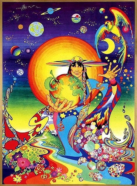
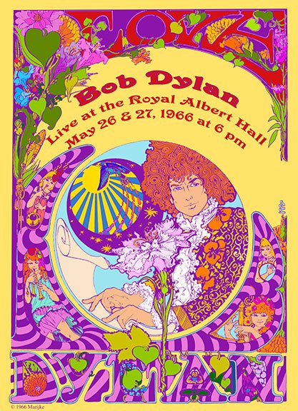
A is for Apple Promotional Poster by Marijke KogerA Bob Dylan Poster by Marijke Koger
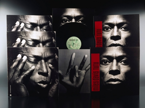
While researching this blog post, the stunning and bold work of Eiko Ishioka jumped out at me. She was once known as Japan’s best Art director, and after seeing some images of her accomplishments- it is easy to see why. Ishioka is most famous for her costume design work, but she had started in the advertising industry with graphic design.
Miles Davis’s Tutu album covers by Eiko Ishioka
A true master of the arts, Ishioka won a Grammy award for the “best recording package” for Miles Davis’s album Tutu in 1987, and an Academy Award and two Tony awards for her costume design work in varying films and plays. Her costume and design work is bold and startling, sometimes featuring hints of her heritage but always with a modern spin.
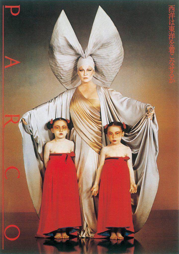
Can West Wear East Poster -Eiko Ishioka
Ishioka’s varying skills create a powerful combination as she pairs her elaborate costume work with photography and typography to produce posters like the “Can West Wear East?” poster from 1979. As an internationally recognized designer, she was still designing costumes up to 2012 when she died of pancreatic cancer.
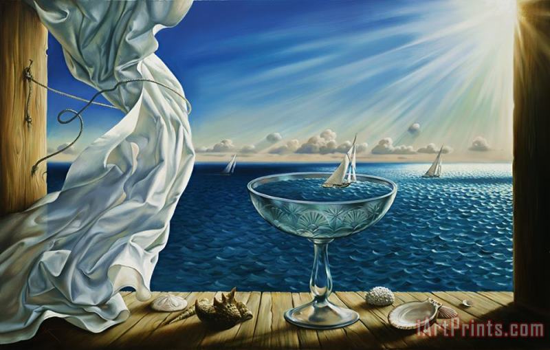
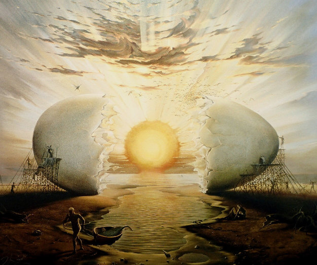
While I am not certain if I am allowed to do my blog post on this Artist, Vladimir Kush is an extremely witty and talented surrealism artist of our time. Born in Moscow, Russia 1965, at the near end of the Surrealism movement, Kush studied at the Surikov Moscow Art Institute and later immigrated to the United States where he made a name for himself. His work is most known today for their playful and creative juxtapositions of nature and man made items, calming scenes and elegant compositions. I particularly admire his work for the smooth and flawless application of paint and excellent rendering of natural elements such as water, smoke and clouds.
One of the pieces that caught my eye when doing research on this fantastical artist was his painting “Sunrise by the ocean” shown above. Many of Kush’s paintings feature beautiful renderings of sunshine or sunsets, more spectacular than found in any photographs. At first glance, it is easy to decipher a cracked egg with a shining egg yolk and the egg whites pooling out, but upon further inspection this is not an egg but the makings on a man made building and the setting sun. Not only is the painting nice to look at, but also leave the interpretation up to the viewer as to what Kush wanted to say. Is this a picture of mankind building up to cage the sun? Or has the sun broken free? Perhaps the link between the egg yolk and the sun speak to rebirth and life?
Kush draws on inspiration from the great surrealist master, Dali, in his paintings. Like Dali, the subject of the butterfly is often used in his works as a representation of transformation or metamorphosis. In comparison to Dali’s work, Kush’s pieces are much more representational and focus on recognizable objects as the subject of his paintings. This lighthearted and purely aesthetic qualities to his work help to make it that much more accessible to the public, allowing him to open up a studio in Hawaii later in his career.
Although Vladimir Kush is not as old as many of the other surrealist artists we studied, his work takes a mind blowing modern twist on the work of the past. I am very excited to have found an artist such as him and think his work is a great example of learning from the past masters and bringing them to the present by using different techniques or with different presentation. This blog post is much too short to display all of his spectacular works but I hope to share my discovery of this artist with others in the future.
(If this is not a suitable example of a surrealist artist, please let me know Jeff and I can redo/ make a new blog post to fit the requirements better. I just really, really enjoyed his work and wanted to share!)
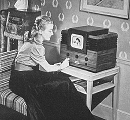
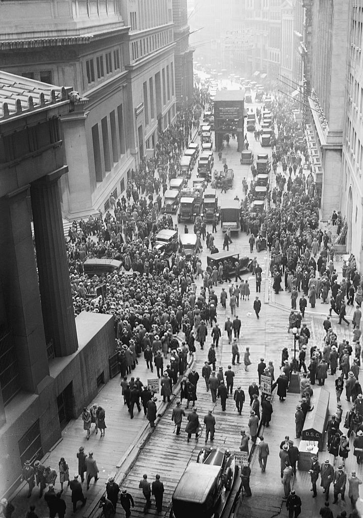
Before the coming of World War II, multiple new inventions such as the television were being created. In 1927, Philo Taylor Farnsworth invented the first electronic tv at the age of 21. While the television was invented so early on, it was very expensive and hard to acquire in most households. The tv boomed in the 1950s after the war was over and electricity was more common in every household. So what form of communication was used during WWII? Radios were the most common form for entertainment and news broadcasting before and during the war. Propaganda was spread even faster than with posters like in the previous war and citizens from all around the globe could tune in to the news.
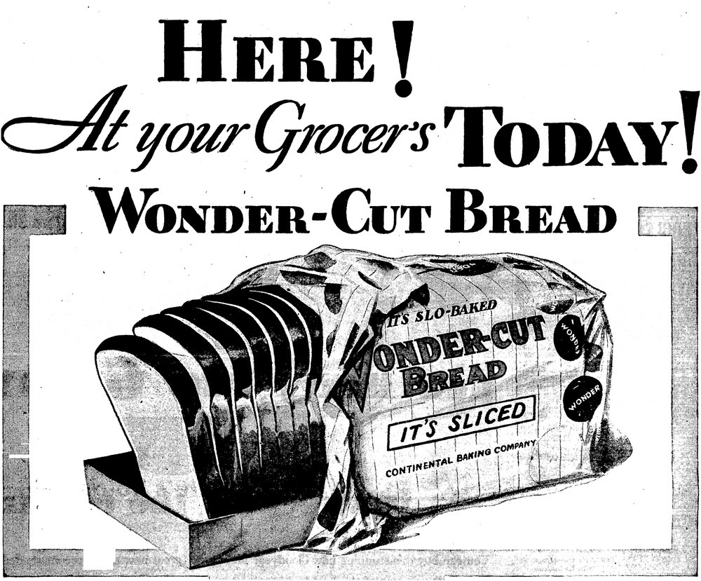
Sliced bread was another one of the ground breaking inventions of the 1930s! (Well not really) Otto Fredrick Rohwedder is credited with the invention of the first ever bread slicing machine. Before that, bread was always sold as a solid loaf and customers would simply cut the bread by hand themselves. This invention led to the future popularity of “Wonder Bread” in the United States. As for the famous saying, quoted by the comedian Red Skelton “do not worry about television. It’s the greatest thing since sliced bread,” we still use this saying today to describe great inventions. You might wonder, was sliced bread really such a big deal then? And the answer is yes! It is not the invention of the product so much but what it signifies. The first commercial sliced bread, Wonder Bread grew to such large scale and mass popularity due to the mechanical invention of the bread slicer and the industrialization and convenience it represented.
Geo-Politics of the time- Why was this era called the Dirty Thirties?
The 1930s were not a great time everywhere in the world. With the Great Depression having just hit the United States after the Wall Street Crash of 1929, and places like Germany riling up for the Second World War, it was a tense time to say the least. For countries in dire situations with lots to gain, a Great War was a strategic move but a large gamble to see who will come out on top. During this time, Mao Zedong was also testing his political footing in China. While he would not come to power until closer to the 1960s, he would lead to the Chinese Cultural Revolution and many other revolutionary events.
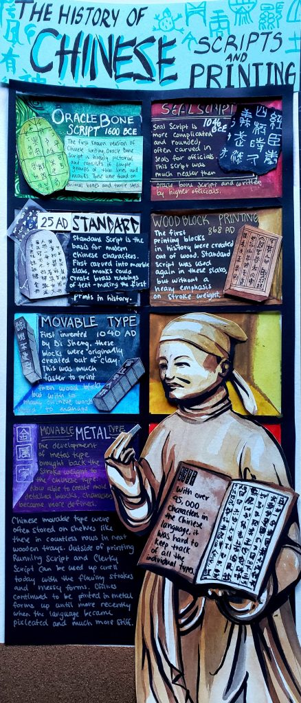
Project Rationale: For this project, I dove into the history of typography in China and their evolution in printing. I wanted to display the different materials Chinese was written on or printed with as a texture on each shelf. One of the most prominent things to me when I did my research on Bi Sheng and his invention of movable type was the countless shelves of little printing blocks printing shops had to own. I chose to depict the different artifacts in a shelf like format here to mimic this and have the reader’s eye follow from top to bottom. An illustration of Bi Sheng holds a printed book as the result of this evolution of typography in one hand and one of his printing blocks in the other.
I would give myself an 8/10 for this project. While in a poster format like this, I may have crammed too much information into the piece, I am very happy with the combination of material and information on typography I conveyed through the piece. Even at a quick glance, the infographic is interesting to look at and should draw a viewer in for a better look.
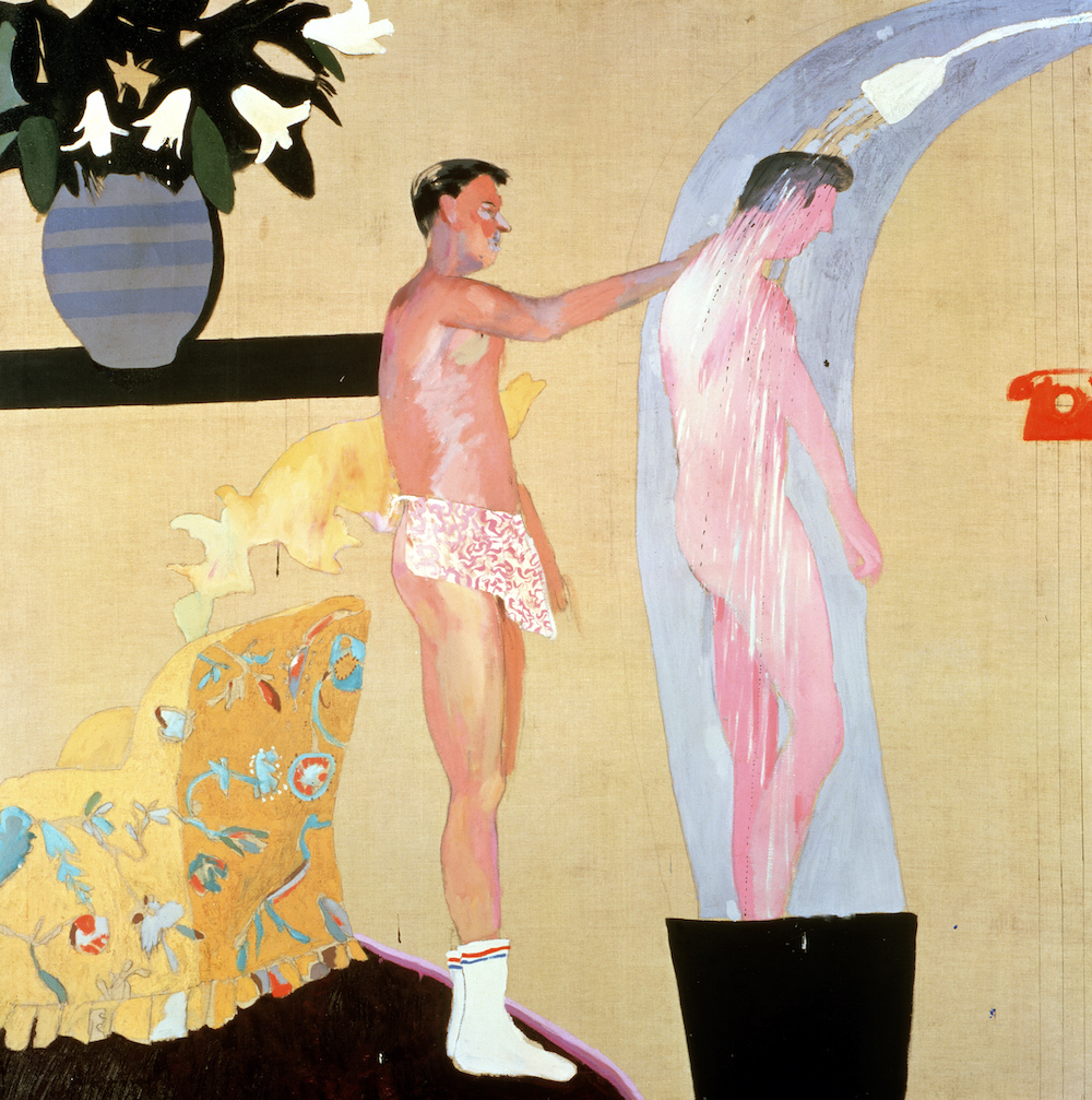
This bright and fun pop artist was born in 1937, Bradford. Well known for his colourful depictions of California life, poolsides, and poping landscapes, Hockney’s work conjures feelings of warmth and happiness through his paintings. Early in his career, he was influenced by Picasso, Matisse, and Fragonard and created his version of cubism using photographs and a collage-like technique.
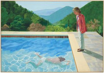
His most famous and memorable work typically features pool scenes like the painting “Pool with Two figures” shown below. His use of bright, vibrant colours and stylization of the water creates a calming and serene piece, also sold for a whopping $80.3 million dollars in 2018, which was at the time the highest price paid for a work by a living artist. While his painting is far from the most photorealistic, or skilfully complicated, Hockney’s skills lie in his ability to simplify a scene and bring out the raw emotion he wants to convey.
https://en.wikipedia.org/wiki/David_Hockney
In a time when homosexuality was less accepted in the minds of Europeans, the liberty of America helped to nurture Hockney’s work in the previously taboo. He created many paintings like the Pool with Two Figures that touched on scenes of two men partaking in normal activities. Rarely seen in art before, his work portrayed the male figure as more sensual and embraced the relationships of queer couples.
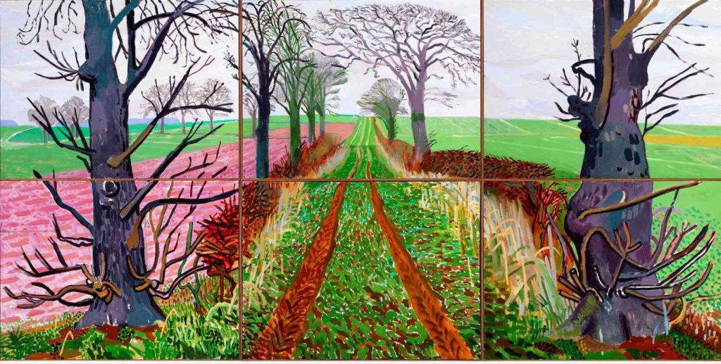
Moving with the times, Hockney has taken his skill in landscape painting into digital painting. He uses a mixture of oil paints, film, charcoal, and the iPad to create natural scenes using the same vivid and punchy colours he is so well known for. These bright paintings look more like fantasy candy land with pink fields and purple trees but always conveying a sense of liveliness and beauty.
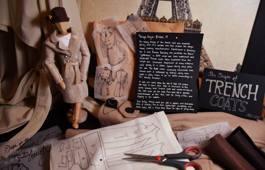
For this project, I chose to conduct my research on the origins of trench coats as this is one of my favourite genres of clothing. For my historical artifact, I sewed together a miniature version of a trench coat completed with a cloche hat and handbag out of felt. In my photoshoot, I continued the theme of clothing design by creating miniature trench coat pattern pieces and sketches on transfer paper to imitate the coat creation process. I struggled a bit with making my text legible on the transfer paper, so in this shoot my text is on black paper and the title font is in the style of the fashion magazine “Everyday” that ran in the 1920s. Here I worked with different shades of cream, brown and black to create a cohesive theme within the picture and give it a warm tone. In my research I chose to focus more on the history of the trench coat and what role it played in women’s fashion during the time on the side. While I was a bit concerned that the hat and handbag would be too much, I still enjoy the mood they help to create and set the scene back in time.
As a project, I would give myself a 7/10. I am very happy with the result of my miniature coat and I learned a lot while doing my research for the paragraph, but I also feel that this is not the best work I could have produced. The text did not correspond as well with the rest of scene as I would have liked and my work almost gets lost in all the brown tones I set in the background! While there are many things I would like to change looking back, I found this a fun project nonetheless and it has been quite a while since I have hand sewn anything so crafty in a long time.