Important Notice:
Recent projects/ posts for this class will now be found under the category 141 in the side bar.
I shall leave these past projects up on this page in case I would like to revert to posting like this. Terribly sorry about this inconvenience.
Mood Board
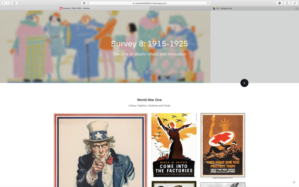
Survey 8 Project Link: https://natashal459625.invisionapp.com/board/Survey-8-1915-1925-ckfsldpc30k4l18sgt3hqtnbs
In this project, I chose a couple of events that interested me during this decade. I already started studied the first world war in high school, but during my research, I discovered patterns in the propaganda posters that were so common at that time. When I visited an art gallery downtown, I had first learned about the BC Chinese exclusion act and the tiny living quarters my relatives experienced when first coming to Canada. This research was the most personal part of the project to me as I learned a lot about the injustice and suffering Chinese people had to go through. My findings made me feel so fortunate that my ancestors made the difficult transition for me and how people’s attitude towards Asian peoples has changed in Canada.
During this project, I struggled a lot at first with how to use InVision! As most other text applications that I have used before do not move my pictures around so drastically, I found it hard to control the positioning of my images. Only after I separated them all into three groups did it become more manageable and enjoyable to use. I also found the color palettes created by InVision on the side of my pictures very neat! It helped to generate a cohesive set of colors that I could study and refer back to, especially in my “Colour” section of the project.
I would give myself a solid 7/10 on my mood board. While I learned a lot during my research for some of the topics, especially for W.A Dwiggins and the BC Chinese Exclusion act, I found it very hard to write in-depth on the limited information I could find online. I had to be creative on the links I made from the event to the prompt, and I fear that the reach may have made my points a bit weaker. On a positive note, I am happy with the result that was created on InVision and would reuse this platform for my future projects!
Survey 3
October 14, 2020
In contrast to the Gothic and Venetian styles of typography created in the 1400s, the 1500s brought the “Old-style” font to fame. Fonts like Garamond and Goudy Old Style were prevalent during this century. The main difference of the time was that these fonts were created to be printed rather than handwritten. This change led to letters taking on a more upright appearance with high contrast between the thick and thin elements of typefaces.
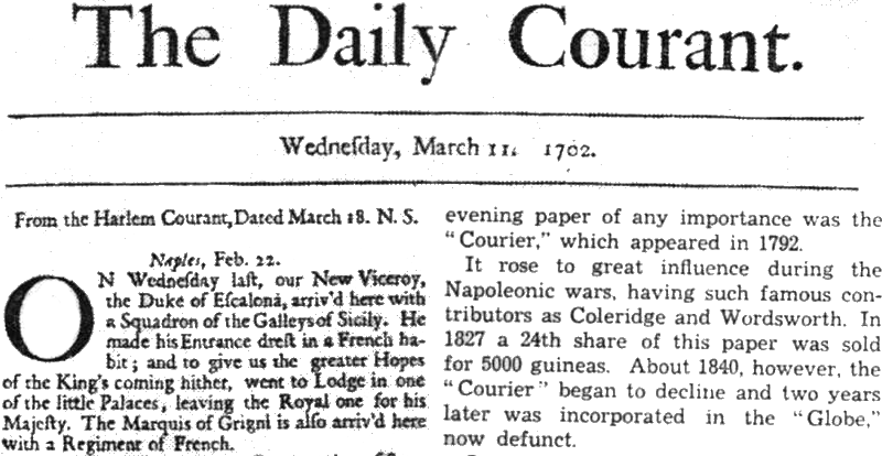
Near the beginning of the 1700s, Caslon Font, created by Wiliam Caslon, was the most popular type in England and America. The style of typography had a hand-like quality and could be printed by presses easily. Caslon had an attractive appearance that was easy to read and suited long passages of text. This font could later be commonly found in newspapers, invented in 1752, where the font gained rapid exposure with the public.
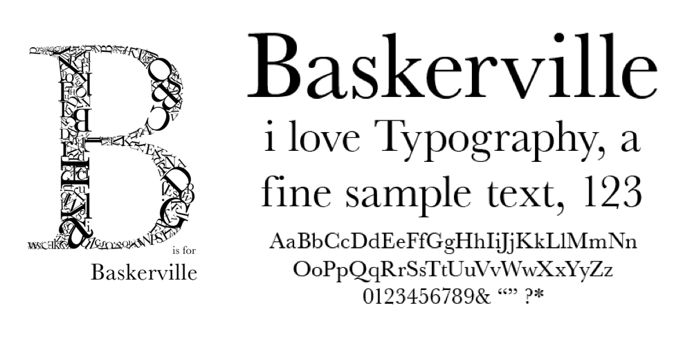
The iconic Baskerville font was also invented during this time. This font featured very high contrast lettering that had elements of classical and modern typography. The creator, John Baskerville, went to great measures for his text and even redesigned the printing press to capture the intricacies of his type font. This font spread quickly from England to the rest of Europe, where countries eagerly took on adaptations of the text. Today, the elegant properties of Baskerville live on in our books and daily typography, as the font has remained a popular choice around the world.
Sites used:
http://idsgn.org/posts/know-your-type-baskerville/
Survey 1
Centuries-Old Chinese Calligraphy
September 30, 2020
Born and raised in Vancouver, British Columbia from second-generation parents, I may be Chinese ethnically, but my knowledge of this country is slim. While I have never learned very much about China in Western-oriented schools, I have always jumped on the opportunity to learn more about my ancestor’s homeland. Therefore, when we learned about the history of art in Asia in my Survey Design class, I immediately knew that I would love to look more into this area.
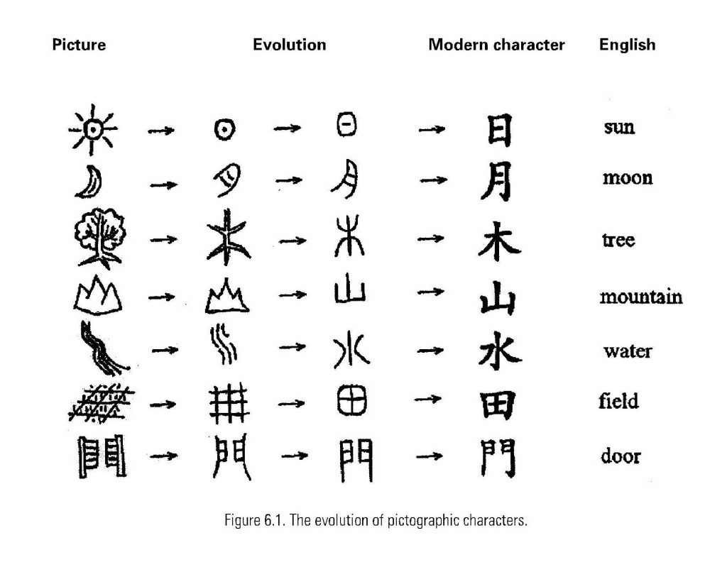
As touched upon in the Survey 1 lessons, The Chinese were the first to develop written characters in ancient Asia between 1400-1200 B.C, not too long after the very first invention of writing by the Sumerians in 3500-3200 B.C. Similar to hieroglyphs, Chinese characters were inspired by nature and originally formed to resemble pictures of their representative objects. We can still see the origins of these words today in the modern Chinese language through characters like the sun, moon, and mountains.
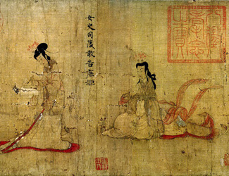
During this time, Chinese calligraphy was regarded as the highest form of art. Similar to painting, calligraphy was performed with a brush and had a heavy emphasis on the precision of characters and motion in the strokes. Today, traditional calligraphy is considered to be a form of fine art in China and is practiced widely around the country. While the first records of Chinese calligraphy were found around 1400 B.C, the writing was not introduced to the masses until the Han Dynasty (206 B.C. to 220 A.D). This was only possible thanks to the invention of paper in China around 105 A.D. Paper helped to make literature and written works much easier to transport and to spread among the common folk.
Today, Chinese is spoken by over 1.6 billion people in the world, about 16% of the total population, and this number shows no sign of stopping. While the written language has gone through numerous transformations over the years, it is quite amazing to learn that most symbols and characters have stayed very close to the original.

Sites used:
https://search-credoreference-com.ezproxy.capilanou.ca/content/entry/columency/chinese_art/0
https://asiasociety.org/education/chinese-calligraphy
https://www.ancient.eu/Chinese_Calligraphy/–https://www.ancient.eu/article/1120/paper-in-ancient-china/
Yearbook Spread Assignment
September 23, 2020

In this first assignment, I focused on a fun and interactive breakfast spread to feature different elements that I enjoy eating and which can visually enhance the text.
I have composed this spread using gouache to achieve a clean and colorful background for my text while having the freedom to draw illustrative components as well. In terms of layout, all the items are at an angle down towards the right to create movement. I also incorporated a variety of text styles and fonts to fit the size of the items I was covering and the message I wanted to convey.
Self Assessment: 9.5/10- I gave myself this mark because I spent a lot of time planning and executing this painting. My main concern is the busyness of the layout, but this spread shows who I am, and I am proud of what I have accomplished.