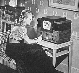
Survey 9- 141

The Dirty Thirties

https://www.pinterest.ca/pin/571323902706187663/

Invention of the TV

Before the coming of World War II, multiple new inventions such as the television were being created. In 1927, Philo Taylor Farnsworth invented the first electronic tv at the age of 21. While the television was invented so early on, it was very expensive and hard to acquire in most households. The tv boomed in the 1950s after the war was over and electricity was more common in every household. So what form of communication was used during WWII? Radios were the most common form for entertainment and news broadcasting before and during the war. Propaganda was spread even faster than with posters like in the previous war and citizens from all around the globe could tune in to the news.
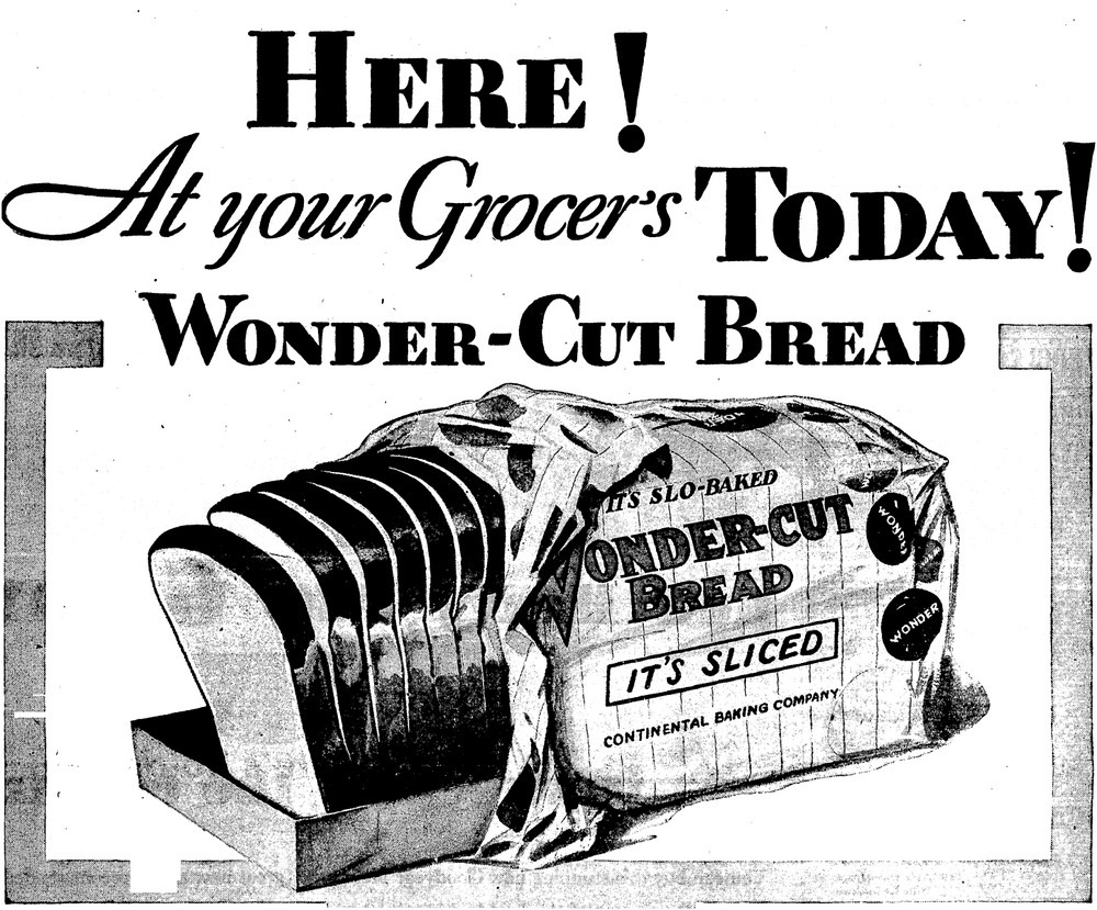
https://www.amusingplanet.com/2018/04/that-time-when-america-banned-sliced.html

The greatest thing since sliced bread

Sliced bread was another one of the ground breaking inventions of the 1930s! (Well not really) Otto Fredrick Rohwedder is credited with the invention of the first ever bread slicing machine. Before that, bread was always sold as a solid loaf and customers would simply cut the bread by hand themselves. This invention led to the future popularity of “Wonder Bread” in the United States. As for the famous saying, quoted by the comedian Red Skelton “do not worry about television. It’s the greatest thing since sliced bread,” we still use this saying today to describe great inventions. You might wonder, was sliced bread really such a big deal then? And the answer is yes! It is not the invention of the product so much but what it signifies. The first commercial sliced bread, Wonder Bread grew to such large scale and mass popularity due to the mechanical invention of the bread slicer and the industrialization and convenience it represented.

https://en.wikipedia.org/wiki/Wall_Street_Crash_of_1929

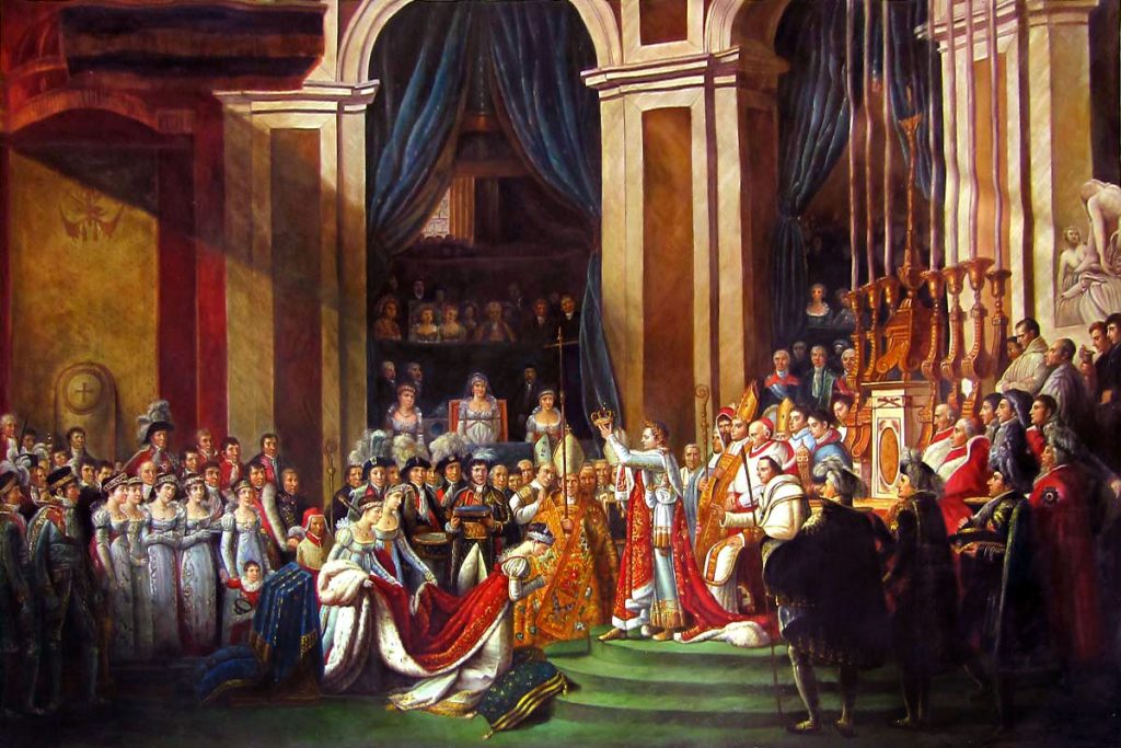
Geo-Politics of the time- Why was this era called the Dirty Thirties?

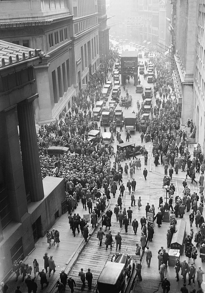
The 1930s were not a great time everywhere in the world. With the Great Depression having just hit the United States after the Wall Street Crash of 1929, and places like Germany riling up for the Second World War, it was a tense time to say the least. For countries in dire situations with lots to gain, a Great War was a strategic move but a large gamble to see who will come out on top. During this time, Mao Zedong was also testing his political footing in China. While he would not come to power until closer to the 1960s, he would lead to the Chinese Cultural Revolution and many other revolutionary events.

Cites Used:

https://www.knowitall.org/document/television-invention-kids-work

Typographic Infographic

The History of Chinese Scripts and Printing

Project Rationale: For this project, I dove into the history of typography in China and their evolution in printing. I wanted to display the different materials Chinese was written on or printed with as a texture on each shelf. One of the most prominent things to me when I did my research on Bi Sheng and his invention of movable type was the countless shelves of little printing blocks printing shops had to own. I chose to depict the different artifacts in a shelf like format here to mimic this and have the reader’s eye follow from top to bottom. An illustration of Bi Sheng holds a printed book as the result of this evolution of typography in one hand and one of his printing blocks in the other.

I would give myself an 8/10 for this project. While in a poster format like this, I may have crammed too much information into the piece, I am very happy with the combination of material and information on typography I conveyed through the piece. Even at a quick glance, the infographic is interesting to look at and should draw a viewer in for a better look.

The Origin of Trench Coats

Photo of my set up

For this project, I chose to conduct my research on the origins of trench coats as this is one of my favourite genres of clothing. For my historical artifact, I sewed together a miniature version of a trench coat completed with a cloche hat and handbag out of felt. In my photoshoot, I continued the theme of clothing design by creating miniature trench coat pattern pieces and sketches on transfer paper to imitate the coat creation process. I struggled a bit with making my text legible on the transfer paper, so in this shoot my text is on black paper and the title font is in the style of the fashion magazine “Everyday” that ran in the 1920s. Here I worked with different shades of cream, brown and black to create a cohesive theme within the picture and give it a warm tone. In my research I chose to focus more on the history of the trench coat and what role it played in women’s fashion during the time on the side. While I was a bit concerned that the hat and handbag would be too much, I still enjoy the mood they help to create and set the scene back in time.

As a project, I would give myself a 7/10. I am very happy with the result of my miniature coat and I learned a lot while doing my research for the paragraph, but I also feel that this is not the best work I could have produced. The text did not correspond as well with the rest of scene as I would have liked and my work almost gets lost in all the brown tones I set in the background! While there are many things I would like to change looking back, I found this a fun project nonetheless and it has been quite a while since I have hand sewn anything so crafty in a long time.

Survey 6- 141

Iron Buildings and Mustard Yellows– Art Nouveau Architecture and Colours

https://traveladdicts.net/art-nouveau-riga/ Riga Lativa Building

A continuation of the Arts and Crafts branch, Art Nouveau brought the beauty and asymmetrical rhythm of nature into buildings all over the world. Architects were very creative during this era as ironwork, glass, ceramic, and brickwork were combined to create curvy and colourful structures. From art museums, whole blocks of buildings, skyscrapers to iconic landmarks, art nouveau inspired a global beautification of previously ordinary cities.

Examples of this work include Barcelona’s famous Casa Batlló, designed by Antoni Gaudí. This building gained its international fame for the colourful broken ceramics that adorn the exterior, paired with the bubbling effect created using iron and wood. Today it is a popular tourist attraction in Barcelona and also serves as an art museum, therefore, featuring stunning artwork both inside and out.

https://www.casabatllo.es/en/news/the-five-corners-of-casa-batllo-that-people-cannot-stop-shooting/ Pictures of Casa Batllo inside and out

The use of ironwork truly led the way for the creation of many Art Nouveau buildings. From the Crystal Palace in London to the Eiffel tower, iron made it possible for architects to create durable skeletons while shaping it to whatever their minds pleased. Iron also was used as decorations on buildings, shown in the Secession Building found in Vienna, with its striking golden dome covered with gilt wrought-iron laurel leaves. (Below is a picture of the Crystal Palace before it was burned down in a fire in 1936)

Asides from the colourful and natural buildings, Art Nouveau artwork developed a specific colour scheme that included many muted and pastel colours. Continuing with the all-natural theme, earthy tones like mustard, brown, and olive green were commonly paired with bright and floral colours such as lilac, violets, and peacock blues. These colours were prominent in posters, artwork, and even interior decorations, all featuring greenery and flora. (Below is an example of a common Art Nouveau colour palette. Soft peaches and yellows were also common in skin tone depictions. Link for the photo is found at the bottom.)

Ornate gold and metalwork also made up for a good part of the Art Nouveau colour palette. In jewelry, furniture, gates, and frames, the dark colour of metals and iron contrasted the lively colours and mimicked the style of line work popular in art nouveau posters. Iron buildings previously mentioned of also used a great deal of dark greys but were often contrasted with blue glass and very colourful ceramics as part of their facades.

https://blog.sampleboard.com/art-nouveau-style-how-to-create-the-art-nouveau-look/ Examples of the muted pastels in pieces of furniture and interior decoration.

Cites Used:

https://weheartit.com/entry/3445093

https://www.reddit.com/r/ArchitecturalRevival/comments/i7vu5b/the_crystal_palace_in_hyde_park_london_in_1851/

https://www.britannica.com/art/Art-Nouveau 

https://www.theartstory.org/movement/art-nouveau/history-and-concepts/

141 Typography Zine

A.M Cassandre

(Left to Right- Page 2, 3, 4, 5)
(Left to right- Page 6, 7, 8, Title (1))

I found this zine project very fun and an exciting challenge to create. I chose to feature A.M Cassandre as the subject of my zine and got to learn a lot about his typography and poster work through my research. While I found much more information on his graphic design and poster work than on his typography, it was still interesting to learn about how he combined these two skills to create fantastic advertisements.
One difficulty I found when creating my zine was fitting all the information I wanted to include onto a small page! I was able to find many interesting facts and stories about Cassandre, but when it came time to transfer my research onto the zine, I realized that I had to pair down the information to the bare points. While I could have cut down on the illustrations and large lettering, I tried to prioritize readability and visual intrigue over bombarding my zine with text. I chose to create a cohesive theme for my zine by sticking to a limited colour palette of black, white, silver, and red for the majority of the text. These were colours used often in Cassandre’s typography work, so it seemed fitting to create my zine using such colours as well.

For this project, I would give myself an 8/10. I am quite pleased with the graphic and bold style of my zine that reflects Cassandre’s work and incorporates examples of his work outside of just typography. I spent a lot of time ensuring that the flow of the information made sense and that it was captivating and fun to read. In retrospect, I wish I was able to incorporate even more information on his work and typography by making the size of my zine bigger. This way, I could have added more facts and given the reader an even better idea and appreciation of Cassandre’s work.

Fun fact: Everything in my zine was hand drawn or written! Nothing against printers- I just wanted to torture myself and give everything a cohesive hand made quality.

Websites used for research:

https://www.cassandre-france.com/about-am-cassandre

https://www.printmag.com/post/bifur-cassandre-typeface

https://www.artyfactory.com/graphic_design/graphic_designers/cassandre.htm

http://luc.devroye.org/fonts-26316.htmlhttps://medium.com/fgd1-the-archive/yves-saint-laurent-logo-1963-a-m-cassandre-3cd069a83384

Survey 4- 141

Neoclassical Art and fashion

https://fashionhistory.fitnyc.edu/1800-1809/ Example of Neoclassical fashion

1800 was a revolutionary time in western fashion history. After the French revolution, the former stiff and cone styled dresses of the rococo era turned into more form-fitting outfits with very high waistlines. During this time, fashion, along with the arts, took on neoclassical inspirations. In their aim to reproduce looks from ancient Greece and Rome, women often mistakenly wore white, believing that classical fashion featured primarily white clothing. It was during this time that dresses became much looser with straight flowing skirts in contrast to their large and stiff forms from the previous era. Unlike the frivolous styles from before, natural beauty was heavily emphasized in fashion. Form-fitting clothes now outlined the natural body shape, and undergarments had to be altered to fit this drastic reduction of coverage.

https://en.wikipedia.org/wiki/Empire_silhouette Dress example

During this time, famous painters like Jaques-Louis David and Delacroix emerged to partake in the neoclassical trend. Just like fashion, art during this time drew inspiration from the Ancient Greek and Roman trends in aspects such as their scenes and costumes. This movement was based on the push against the previously frivolous traits of Rococo styles and held a more natural but still very impactful flare. Colour palettes noticeably reduced in paintings as the emphasis moved to the lines and forms of figures.

https://en.wikipedia.org/wiki/Liberty_Leading_the_People

Important events such as the French Revolution and the rise of Napoleon were great inspirations to painters like Delacroix, who painted the famous “28th of July: Liberty Leading the People” in 1830. Along with David, who painted many prominent pieces commissioned by Napoleon, such as “Napoleon Crossing the Alps,” and the “Coronation of Napoleon.”

https://vistapointe.net/coronation-of-napoleon.html

Sites used:

https://www.britannica.com/art/Neoclassicism

Mood Board- 141

Originally Posted October 14, 2020

InVision Mood Board Screenshot

Survey 8 Project Link: https://natashal459625.invisionapp.com/board/Survey-8-1915-1925-ckfsldpc30k4l18sgt3hqtnbs

In this project, I chose a couple of events that interested me during this decade. I already started studied the first world war in high school, but during my research, I discovered patterns in the propaganda posters that were so common at that time. When I visited an art gallery downtown, I had first learned about the BC Chinese exclusion act and the tiny living quarters my relatives experienced when first coming to Canada. This research was the most personal part of the project to me as I learned a lot about the injustice and suffering Chinese people had to go through. My findings made me feel so fortunate that my ancestors made the difficult transition for me and how people’s attitude towards Asian peoples has changed in Canada.
During this project, I struggled a lot at first with how to use InVision! As most other text applications that I have used before do not move my pictures around so drastically, I found it hard to control the positioning of my images. Only after I separated them all into three groups did it become more manageable and enjoyable to use. I also found the color palettes created by InVision on the side of my pictures very neat! It helped to generate a cohesive set of colors that I could study and refer back to, especially in my “Colour” section of the project.

I would give myself a solid 7/10 on my mood board. While I learned a lot during my research for some of the topics, especially for W.A Dwiggins and the BC Chinese Exclusion act, I found it very hard to write in-depth on the limited information I could find online. I had to be creative on the links I made from the event to the prompt, and I fear that the reach may have made my points a bit weaker. On a positive note, I am happy with the result that was created on InVision and would reuse this platform for my future projects!

Survey 3- 141

Originally Posted October 14, 2020

From Gothic to Baskerville

In contrast to the Gothic and Venetian styles of typography created in the 1400s, the 1500s brought the “Old-style” font to fame. Fonts like Garamond and Goudy Old Style were prevalent during this century. The main difference of the time was that these fonts were created to be printed rather than handwritten. This change led to letters taking on a more upright appearance with high contrast between the thick and thin elements of typefaces.

https://greenwaycampus.weebly.com/blog/goudy-old-style-t-bold-download

Near the beginning of the 1700s, Caslon Font, created by Wiliam Caslon, was the most popular type in England and America. The style of typography had a hand-like quality and could be printed by presses easily. Caslon had an attractive appearance that was easy to read and suited long passages of text. This font could later be commonly found in newspapers, invented in 1752, where the font gained rapid exposure with the public.

https://www.prepressure.com/printing/history/1700-1749

The iconic Baskerville font was also invented during this time. This font featured very high contrast lettering that had elements of classical and modern typography. The creator, John Baskerville, went to great measures for his text and even redesigned the printing press to capture the intricacies of his type font. This font spread quickly from England to the rest of Europe, where countries eagerly took on adaptations of the text. Today, the elegant properties of Baskerville live on in our books and daily typography, as the font has remained a popular choice around the world.

https://jemmaeagleson.github.io/john-baskerville/Version-4.html

Sites used:https://blog.spoongraphics.co.uk/articles/a-history-of-typeface-styles-type-classification/embed#?secret=F29AoYGYbE

http://idsgn.org/posts/know-your-type-baskerville/

Survey 1- 141

Originally Posted September 30, 2020

Centuries-Old Chinese Calligraphy 


Born and raised in Vancouver, British Columbia from second-generation parents, I may be Chinese ethnically, but my knowledge of this country is slim. While I have never learned very much about China in Western-oriented schools, I have always jumped on the opportunity to learn more about my ancestor’s homeland. Therefore, when we learned about the history of art in Asia in my Survey Design class, I immediately knew that I would love to look more into this area. 

As touched upon in the Survey 1 lessons, The Chinese were the first to develop written characters in ancient Asia between 1400-1200 B.C, not too long after the very first invention of writing by the Sumerians in 3500-3200 B.C. Similar to hieroglyphs, Chinese characters were inspired by nature and originally formed to resemble pictures of their representative objects. We can still see the origins of these words today in the modern Chinese language through characters like the sun, moon, and mountains. 

https://www.reddit.com/r/etymology/comments/da2cs3/evolution_of_chinese_characters/ (Chat showing the evolution of pictures to characters)

During this time, Chinese calligraphy was regarded as the highest form of art. Similar to painting, calligraphy was performed with a brush and had a heavy emphasis on the precision of characters and motion in the strokes. Today, traditional calligraphy is considered to be a form of fine art in China and is practiced widely around the country. While the first records of Chinese calligraphy were found around 1400 B.C, the writing was not introduced to the masses until the Han Dynasty (206 B.C. to 220 A.D). This was only possible thanks to the invention of paper in China around 105 A.D. Paper helped to make literature and written works much easier to transport and to spread among the common folk. 

https://www.comuseum.com/painting/ (Artwork featuring a woman writing or painting)

Today, Chinese is spoken by over 1.6 billion people in the world, about 16% of the total population, and this number shows no sign of stopping. While the written language has gone through numerous transformations over the years, it is quite amazing to learn that most symbols and characters have stayed very close to the original.

https://www.ancient.eu/Chinese_Calligraphy/ (Calligraphy art by Cai Xiang)

Cites used:

https://search-credoreference-com.ezproxy.capilanou.ca/content/entry/move/chinese_art_and_architecture/0

https://search-credoreference-com.ezproxy.capilanou.ca/content/entry/columency/chinese_art/0

https://asiasociety.org/education/chinese-calligraphy

https://www.ancient.eu/Chinese_Calligraphy/–https://www.ancient.eu/article/1120/paper-in-ancient-china/

Yearbook Spread Assignment 141

Originally posted September 23, 2020

In this first assignment, I focused on a fun and interactive breakfast spread to feature different elements that I enjoy eating and which can visually enhance the text.
I have composed this spread using gouache to achieve a clean and colorful background for my text while having the freedom to draw illustrative components as well. In terms of layout, all the items are at an angle down towards the right to create movement. I also incorporated a variety of text styles and fonts to fit the size of the items I was covering and the message I wanted to convey.

Self Assessment: 9.5/10- I gave myself this mark because I spent a lot of time planning and executing this painting. My main concern is the busyness of the layout, but this spread shows who I am, and I am proud of what I have accomplished.