David Hockney- Pop Art/ Cubism

Blog Post #5

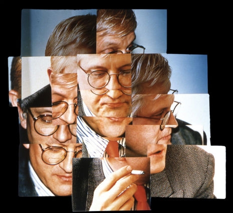
This bright and fun pop artist was born in 1937, Bradford. Well known for his colourful depictions of California life, poolsides, and poping landscapes, Hockney’s work conjures feelings of warmth and happiness through his paintings. Early in his career, he was influenced by Picasso, Matisse, and Fragonard and created his version of cubism using photographs and a collage-like technique.

https://dangerousminds.net/comments/david_hockneys_cubist_photography

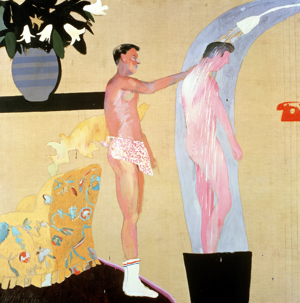
His most famous and memorable work typically features pool scenes like the painting “Pool with Two figures” shown below. His use of bright, vibrant colours and stylization of the water creates a calming and serene piece, also sold for a whopping $80.3 million dollars in 2018, which was at the time the highest price paid for a work by a living artist. While his painting is far from the most photorealistic, or skilfully complicated, Hockney’s skills lie in his ability to simplify a scene and bring out the raw emotion he wants to convey.

https://en.wikipedia.org/wiki/David_Hockney

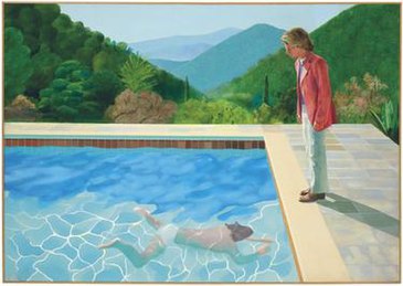
In a time when homosexuality was less accepted in the minds of Europeans, the liberty of America helped to nurture Hockney’s work in the previously taboo. He created many paintings like the Pool with Two Figures that touched on scenes of two men partaking in normal activities. Rarely seen in art before, his work portrayed the male figure as more sensual and embraced the relationships of queer couples.

“DOMESTIC SCENE LOS ANGELES” 1963 OIL ON CANVAS 60 X 60″ © DAVID HOCKNEY

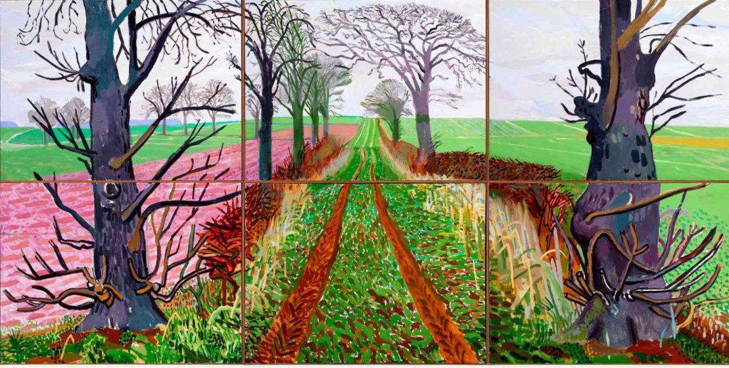
Moving with the times, Hockney has taken his skill in landscape painting into digital painting. He uses a mixture of oil paints, film, charcoal, and the iPad to create natural scenes using the same vivid and punchy colours he is so well known for. These bright paintings look more like fantasy candy land with pink fields and purple trees but always conveying a sense of liveliness and beauty.

https://www.treehugger.com/stunning-english-landscape-paintings-made-with-ipad-photos-4858507

Cites used:

https://www.biography.com/artist/david-hockney

https://www.treehugger.com/stunning-english-landscape-paintings-made-with-ipad-photos-4858507

The Origin of Trench Coats

Photo of my set up

For this project, I chose to conduct my research on the origins of trench coats as this is one of my favourite genres of clothing. For my historical artifact, I sewed together a miniature version of a trench coat completed with a cloche hat and handbag out of felt. In my photoshoot, I continued the theme of clothing design by creating miniature trench coat pattern pieces and sketches on transfer paper to imitate the coat creation process. I struggled a bit with making my text legible on the transfer paper, so in this shoot my text is on black paper and the title font is in the style of the fashion magazine “Everyday” that ran in the 1920s. Here I worked with different shades of cream, brown and black to create a cohesive theme within the picture and give it a warm tone. In my research I chose to focus more on the history of the trench coat and what role it played in women’s fashion during the time on the side. While I was a bit concerned that the hat and handbag would be too much, I still enjoy the mood they help to create and set the scene back in time.

As a project, I would give myself a 7/10. I am very happy with the result of my miniature coat and I learned a lot while doing my research for the paragraph, but I also feel that this is not the best work I could have produced. The text did not correspond as well with the rest of scene as I would have liked and my work almost gets lost in all the brown tones I set in the background! While there are many things I would like to change looking back, I found this a fun project nonetheless and it has been quite a while since I have hand sewn anything so crafty in a long time.

The Importance of Urban Forests- Amy Fleming

As a part of my English 100 course, I wrote a summary of this informative article, “The Importance of Urban Forests” by Amy Fleming. This article uncovers the hidden benefits of greenery in cities, and stresses why we should all be incorporating trees in our neighbourhoods. Please find the link to the article here:

https://elearn.capu.ca/pluginfile.php/1827023/mod_resource/content/0/Fleming_The%20Importance%20of%20Urban%20Forests.pdf

In her article, “The Importance of Urban Forests,” Amy Fleming stresses the value of trees in urban life. She introduces the vast financial and medical benefits that come with growing these green giants in cities and how their dwindling numbers are affecting us negatively. While these “expensive ornaments” do not appear to make money, she reports that $120 million are saved each year in New York City, thanks to trees growing in their urban landscapes (qt pg 2). Cities that choose to neglect greenery face higher bills in air conditioning and heating; they have no natural way of filtering polluted air and can encounter more damages due to storms or flooding (pg 3). Fleming also argues that trees hold a significant impact on one’s mental health. She reports that exposure to trees helps lower stress, violence, and mental fatigue, all common symptoms in city dwellers (pg 4). She goes as far as to point out the number of deaths related to circulatory diseases is lower in neighborhoods with more trees, linking the lives of humans directly to the number of plants they encounter (pg 5). Through these facts, Fleming enforces why trees are so important to the financial and physical well being of city dwellers.

English 100- About Me


Hello! My name is Natasha Lee, and I am starting my first year in the IDEA program at Capilano University. Recently, I graduated from Lord Byng Secondary School, specifically the Byng Arts Mini program, and it is because of my experiences in high school that I chose to attend Capilano University to study visual arts. I had never once considered pursuing the arts as anything more than a hobby as I grew up. I had always been under the impression that all artists would be “starving” and for the vast majority, unsuccessful and jobless. My views only changed when I encountered many professionals at school assemblies who adored their careers in the arts and witnessed many of my seniors graduating from my program and continuing their studies in visual arts. Capilano University proved to be the best choice for me as its program offers work experience opportunities besides a promising education in desirable skills I could apply in the art industry and beyond. I am very excited that I have chosen to be part of this community and am looking forward to my next four years here.

Eliseu Visconti

Impressionism and Art Nouveau

https://en.wikipedia.org/wiki/Eliseu_Visconti

A Brazilian born in Italy, Eliseu Visconti was an impressionist painter, cartoonist, and teacher and is credited with bringing the style of impressionism and art deco to Brazil. In 1884, Visconti was allowed to study the arts in Paris after winning a prize for his work, there he went on to win different medals and awards as a Brazilian representative and honed his skills at the École des Beaux-Arts. His work draws inspiration from impressionism, pointillism, realism, and art nouveau, seen in his artwork over the years.

One of his most notable achievements is his painting for the Rio Opera House, Theatro Municipal, measuring 6500 square feet and spanned over the wall, ceiling, and curtains. This grand painting shows an elaborate scene with many figures seeming to move throughout the scene.

VISCONTI CONCLUI O PANO DE BOCA EM SEU ATELIÊ – PARIS

His more impressionistic work typically features soft colours and depicts natural scenes or women and children as the subjects. Visconti had a masterful technique for capturing the likeness of light, which brought his pieces of art to life. Using the over exposing technique like in cameras, he would wash out facial features in some of his works, creating an illusion of bright light.

https://commons.wikimedia.org/wiki/File:EliseuVisconti-P613-Na_alameda.jpg
https://eliseuvisconti.com.br/obra/p415/

Out of all Brazilian Artists, Visconti painted the most number of self portraits in his life, a total of 42. According to his grandson, he was an “energetic and anxious” person who could always rely on himself to be a model for his artwork. In his self portrait below, we can see again his use of soft colours and impressionist brush strokes in the serene and calming painting.

https://pt.wikipedia.org/wiki/Ficheiro:EliseuVisconti-P021-Ilusões_perdidas.jpg

Cites Used:

https://www.newcitybrazil.com/2016/11/07/modern-artist/

Survey 6- 141

Iron Buildings and Mustard Yellows– Art Nouveau Architecture and Colours

https://traveladdicts.net/art-nouveau-riga/ Riga Lativa Building

A continuation of the Arts and Crafts branch, Art Nouveau brought the beauty and asymmetrical rhythm of nature into buildings all over the world. Architects were very creative during this era as ironwork, glass, ceramic, and brickwork were combined to create curvy and colourful structures. From art museums, whole blocks of buildings, skyscrapers to iconic landmarks, art nouveau inspired a global beautification of previously ordinary cities.

Examples of this work include Barcelona’s famous Casa Batlló, designed by Antoni Gaudí. This building gained its international fame for the colourful broken ceramics that adorn the exterior, paired with the bubbling effect created using iron and wood. Today it is a popular tourist attraction in Barcelona and also serves as an art museum, therefore, featuring stunning artwork both inside and out.

https://www.casabatllo.es/en/news/the-five-corners-of-casa-batllo-that-people-cannot-stop-shooting/ Pictures of Casa Batllo inside and out

The use of ironwork truly led the way for the creation of many Art Nouveau buildings. From the Crystal Palace in London to the Eiffel tower, iron made it possible for architects to create durable skeletons while shaping it to whatever their minds pleased. Iron also was used as decorations on buildings, shown in the Secession Building found in Vienna, with its striking golden dome covered with gilt wrought-iron laurel leaves. (Below is a picture of the Crystal Palace before it was burned down in a fire in 1936)

Asides from the colourful and natural buildings, Art Nouveau artwork developed a specific colour scheme that included many muted and pastel colours. Continuing with the all-natural theme, earthy tones like mustard, brown, and olive green were commonly paired with bright and floral colours such as lilac, violets, and peacock blues. These colours were prominent in posters, artwork, and even interior decorations, all featuring greenery and flora. (Below is an example of a common Art Nouveau colour palette. Soft peaches and yellows were also common in skin tone depictions. Link for the photo is found at the bottom.)

Ornate gold and metalwork also made up for a good part of the Art Nouveau colour palette. In jewelry, furniture, gates, and frames, the dark colour of metals and iron contrasted the lively colours and mimicked the style of line work popular in art nouveau posters. Iron buildings previously mentioned of also used a great deal of dark greys but were often contrasted with blue glass and very colourful ceramics as part of their facades.

https://blog.sampleboard.com/art-nouveau-style-how-to-create-the-art-nouveau-look/ Examples of the muted pastels in pieces of furniture and interior decoration.

Cites Used:

https://weheartit.com/entry/3445093

https://www.reddit.com/r/ArchitecturalRevival/comments/i7vu5b/the_crystal_palace_in_hyde_park_london_in_1851/

https://www.britannica.com/art/Art-Nouveau 

https://www.theartstory.org/movement/art-nouveau/history-and-concepts/