Terry Jones

Postmodernism in Europe Blog Post: Terry Jones

The postmodernist designer I chose for this blog post is Terry Jones.
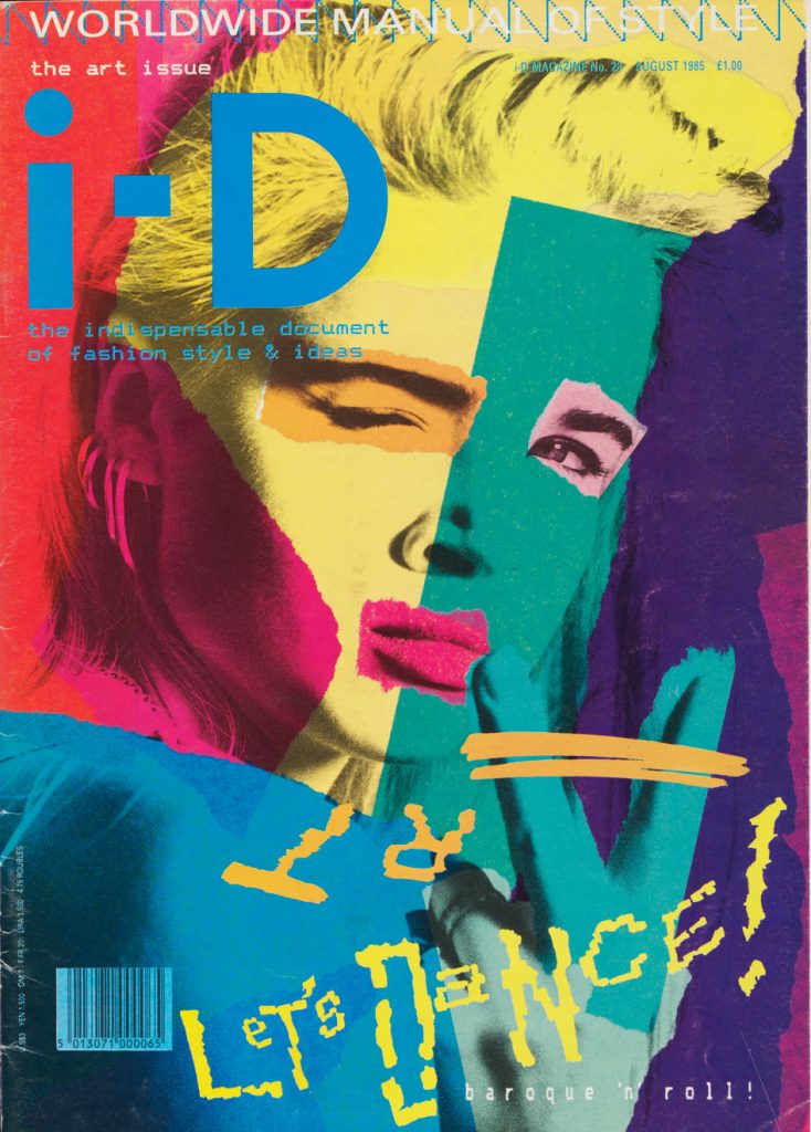
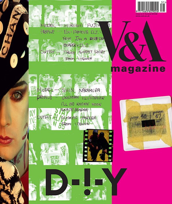
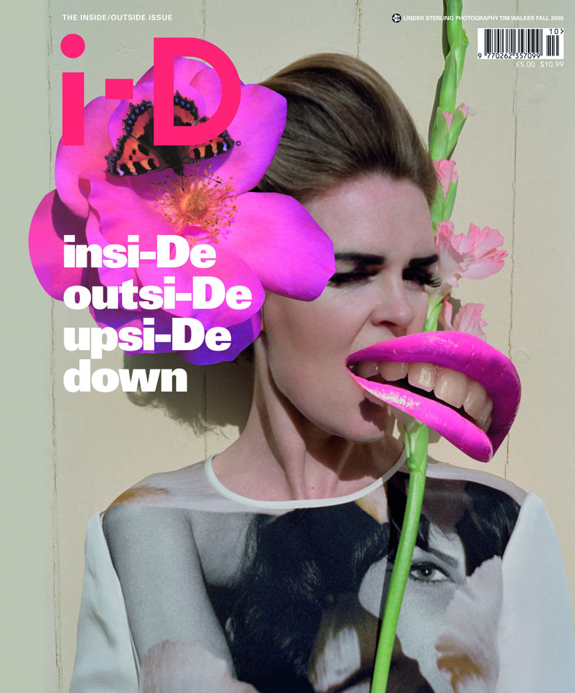
Born in Northampton, England, he is the Creative Director, Editor-in-Chief, and publisher of the fashion magazine i-D. Much of his work features collages of photography and exciting colours, introduced in the form of different mediums such as paint splats. Jones refers to his approach to art direction as “controlled chaos,” and it is easy to see what he means. His final compositions are very packed with varying materials and textures but done to a limit that it does not feel sloppy or overwhelming.

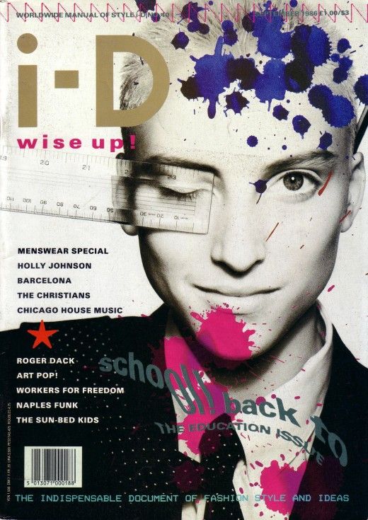
When I first saw these magazine covers, it appeared to me like an artist had been working on mixed media projects over top of a photograph, and whatever mess spilled onto that photo became the composition! As I looked at it longer, the placement of each object is far from random and beckon viewers in with what looks like a piece of art in progress. In the end, we have a stunning design that feels natural and free but still holds the professionalism and precision of a magazine cover.

Works Cited:

https://www.itsnicethat.com/articles/terry-jones-v-and-a-magazine-cover

http://ideasondesign.net/speakers/speakers/terry-jones/ https://en.wikipedia.org/wiki/Terry_Jones_(i-D)

Boa Mistura

Supergraphics Innovator Blog Post: Boa Mistura

Picture of the members: Oscar Hudson, Danny Cohen, Roger Guardia, Allie Avital, and Yoonha Park

I was not sure this exactly fit the blog post brief as this is a group of very modern street artists instead of one singular designer but after seeing pictures of their supergraphic mural work, it was too amazing to pass up! Boa Mistura is a team of graffiti-based artists in Madrid, composed of Oscar Hudson, Danny Cohen, Roger Guardia, Allie Avital, and Yoonha Park. They are famous for their incredible typography murals that trick the eye into reading words if you stand at the perfect location. These works of art can transform winding streets with bursts of colour or span so large that they encompass a whole square.

Boa Mistura’s work in Guadalajara, Mexico.

I really admired the impact of their bold use of type and bright colours. Even though I have only seen photos of their work, I believe the experience of seeing their supergraphics in person would be incredible as the sheer scale would play a significant effect. What is even more impressive is that most examples of supergraphics I have seen as typically done on smooth surfaces with sharp corners. Boa Mistura has taken it to the next level through their ability to work with rough stones and uneven walls to create something that looks so modern and clean!

Works Cited:

https://artelaguna.world/artist/mistura-boa/

https://www.canal180.pt/article/oscar-hudson/

https://www.fastcompany.com/90162145/a-tour-of-the-worlds-coolest-supergraphics

Welcome to my ePortfolio!

“Yearbook Spread” About me from IDES 141 class

My name is Natasha Lee, and welcome to my blog! I am a first year student straight out of high school, studying in Visual Communication and Design at Capilano University.

To find homework specific to each of my classes, please visit the designated page linked in the menu at the top of this page.

First semester:

100: English

121: Design Fundamentals

131: Survey Illustration

133: Visual Studio

141: Survey Design