Bruce Mau

Canadian Design Today Blog Post: Bruce Mau

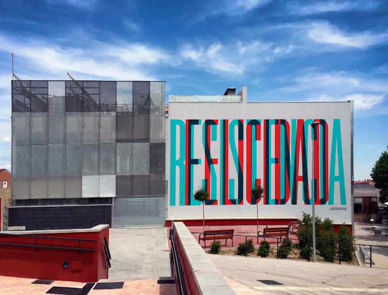
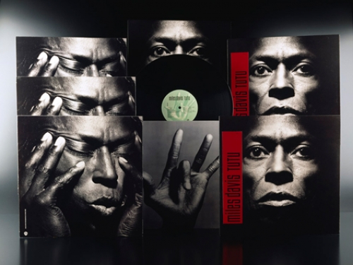
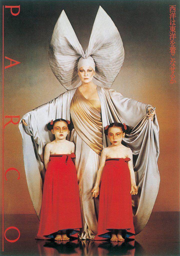
For this last blog post, I found Bruce Mau’s work very beautiful and clean. Born in Ontario, Mau is a designer, innovator, and educator who won an AIGA Gold medal in 2007 and co-founded the Massive Change Network with his wife Bisi Williams in Chicago. I was drawn to the minimalistic compositions he creates, often using typography as the main attraction of his work. As a student with a background in illustration, I always think that more is better and have been trying to learn how to scale back to what is only necessary to convey the idea. For Mau’s work, I admire how there is nothing unnecessary at all in his designs. The bold type paired with the use of colour, lines, or slight gradients reads very nicely and is so appealing to the eyes without feeling bare.

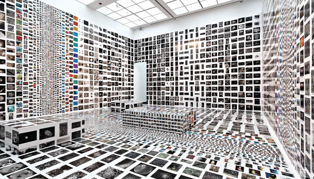
I was also amazed to see Mau’s other work in installations and architecture! His work continues in the same cleanliness as his graphic design work. In some installations, he plays with repetition and covers every plane in the room to create an incredibly immersive effect.

Works Cited:

https://en.wikipedia.org/wiki/Bruce_Mau

https://www.brucemaudesign.com/work

 https://brucemaustudio.com

Terry Jones

Postmodernism in Europe Blog Post: Terry Jones

The postmodernist designer I chose for this blog post is Terry Jones.
Born in Northampton, England, he is the Creative Director, Editor-in-Chief, and publisher of the fashion magazine i-D. Much of his work features collages of photography and exciting colours, introduced in the form of different mediums such as paint splats. Jones refers to his approach to art direction as “controlled chaos,” and it is easy to see what he means. His final compositions are very packed with varying materials and textures but done to a limit that it does not feel sloppy or overwhelming.

When I first saw these magazine covers, it appeared to me like an artist had been working on mixed media projects over top of a photograph, and whatever mess spilled onto that photo became the composition! As I looked at it longer, the placement of each object is far from random and beckon viewers in with what looks like a piece of art in progress. In the end, we have a stunning design that feels natural and free but still holds the professionalism and precision of a magazine cover.

Works Cited:

https://www.itsnicethat.com/articles/terry-jones-v-and-a-magazine-cover

http://ideasondesign.net/speakers/speakers/terry-jones/ https://en.wikipedia.org/wiki/Terry_Jones_(i-D)

Boa Mistura

Supergraphics Innovator Blog Post: Boa Mistura

Picture of the members: Oscar Hudson, Danny Cohen, Roger Guardia, Allie Avital, and Yoonha Park

I was not sure this exactly fit the blog post brief as this is a group of very modern street artists instead of one singular designer but after seeing pictures of their supergraphic mural work, it was too amazing to pass up! Boa Mistura is a team of graffiti-based artists in Madrid, composed of Oscar Hudson, Danny Cohen, Roger Guardia, Allie Avital, and Yoonha Park. They are famous for their incredible typography murals that trick the eye into reading words if you stand at the perfect location. These works of art can transform winding streets with bursts of colour or span so large that they encompass a whole square.

Boa Mistura’s work in Guadalajara, Mexico.

I really admired the impact of their bold use of type and bright colours. Even though I have only seen photos of their work, I believe the experience of seeing their supergraphics in person would be incredible as the sheer scale would play a significant effect. What is even more impressive is that most examples of supergraphics I have seen as typically done on smooth surfaces with sharp corners. Boa Mistura has taken it to the next level through their ability to work with rough stones and uneven walls to create something that looks so modern and clean!

Works Cited:

https://artelaguna.world/artist/mistura-boa/

https://www.canal180.pt/article/oscar-hudson/

https://www.fastcompany.com/90162145/a-tour-of-the-worlds-coolest-supergraphics

Marijke Koger

Psychedelic Design Hero Blog Post: Marijke Koger

Blues Pills Album Cover by Marijke Koger

Despite the lack of information on this artist online, I chose Marijke Koger as my psychedelic art hero. A multi-talented artist from Holland, Koger’s beautiful mural work, album covers, and painted instruments all hold a special delicateness in balance with its psychedelic flair. Her complex compositions are always well balanced with an abundance of colours and textures that somehow work harmoniously. I was drawn to how she portrayed women in her paintings, beautiful but with a certain strength in their pose and eyes. There is a calming sense from the figures that help balance out the complex backgrounds and settings in these pieces of artwork.

The Fool Album Cover by Marijke Koger

Another aspect of Koger’s work I enjoy is the natural backgrounds and flora she paints. The psychedelic style typically has a very loose and nature-based feel- so the use of flowers and greenery in her work plays off the theme beautifully. Even her design work for The Fool’s album cover features a calming and serene landscape to balance out the psychedelic text and photography used in the foreground.

A is for Apple Promotional Poster by Marijke Koger
A Bob Dylan Poster by Marijke Koger

Works Cited

https://marijkekogerart.com/marijkeKoger/psychedlic-Paintings-about.php

https://www.huffpost.com/entry/marijke-koger-dunhams-psy_n_1671660

https://www.widewalls.ch/magazine/psychedelic-art

Eiko Ishioka

Advertising Art Director Blog Post: Eiko Ishioka

Picture of Eiko Ishioka

While researching this blog post, the stunning and bold work of Eiko Ishioka jumped out at me. She was once known as Japan’s best Art director, and after seeing some images of her accomplishments- it is easy to see why. Ishioka is most famous for her costume design work, but she had started in the advertising industry with graphic design.

Miles Davis’s Tutu album covers by Eiko Ishioka

A true master of the arts, Ishioka won a Grammy award for the “best recording package” for Miles Davis’s album Tutu in 1987, and an Academy Award and two Tony awards for her costume design work in varying films and plays. Her costume and design work is bold and startling, sometimes featuring hints of her heritage but always with a modern spin.

Can West Wear East Poster -Eiko Ishioka

Ishioka’s varying skills create a powerful combination as she pairs her elaborate costume work with photography and typography to produce posters like the “Can West Wear East?” poster from 1979. As an internationally recognized designer, she was still designing costumes up to 2012 when she died of pancreatic cancer.

Eiko Ishioka’s work for “The Fall” movie poster

Works Cited:

https://www.aljazeera.com/features/2017/7/12/eiko-ishioka-japans-rebel-artist-and-art-director

https://en.wikipedia.org/wiki/Eiko_Ishioka