As a part of my English 100 course, I wrote a summary of this informative article, “The Importance of Urban Forests” by Amy Fleming. This article uncovers the hidden benefits of greenery in cities, and stresses why we should all be incorporating trees in our neighbourhoods. Please find the link to the article here:
In her article, “The Importance of Urban Forests,” Amy Fleming stresses the value of trees in urban life. She introduces the vast financial and medical benefits that come with growing these green giants in cities and how their dwindling numbers are affecting us negatively. While these “expensive ornaments” do not appear to make money, she reports that $120 million are saved each year in New York City, thanks to trees growing in their urban landscapes (qt pg 2). Cities that choose to neglect greenery face higher bills in air conditioning and heating; they have no natural way of filtering polluted air and can encounter more damages due to storms or flooding (pg 3). Fleming also argues that trees hold a significant impact on one’s mental health. She reports that exposure to trees helps lower stress, violence, and mental fatigue, all common symptoms in city dwellers (pg 4). She goes as far as to point out the number of deaths related to circulatory diseases is lower in neighborhoods with more trees, linking the lives of humans directly to the number of plants they encounter (pg 5). Through these facts, Fleming enforces why trees are so important to the financial and physical well being of city dwellers.
Hello! My name is Natasha Lee, and I am starting my first year in the IDEA program at Capilano University. Recently, I graduated from Lord Byng Secondary School, specifically the Byng Arts Mini program, and it is because of my experiences in high school that I chose to attend Capilano University to study visual arts. I had never once considered pursuing the arts as anything more than a hobby as I grew up. I had always been under the impression that all artists would be “starving” and for the vast majority, unsuccessful and jobless. My views only changed when I encountered many professionals at school assemblies who adored their careers in the arts and witnessed many of my seniors graduating from my program and continuing their studies in visual arts. Capilano University proved to be the best choice for me as its program offers work experience opportunities besides a promising education in desirable skills I could apply in the art industry and beyond. I am very excited that I have chosen to be part of this community and am looking forward to my next four years here.
A Brazilian born in Italy, Eliseu Visconti was an impressionist painter, cartoonist, and teacher and is credited with bringing the style of impressionism and art deco to Brazil. In 1884, Visconti was allowed to study the arts in Paris after winning a prize for his work, there he went on to win different medals and awards as a Brazilian representative and honed his skills at the École des Beaux-Arts. His work draws inspiration from impressionism, pointillism, realism, and art nouveau, seen in his artwork over the years.
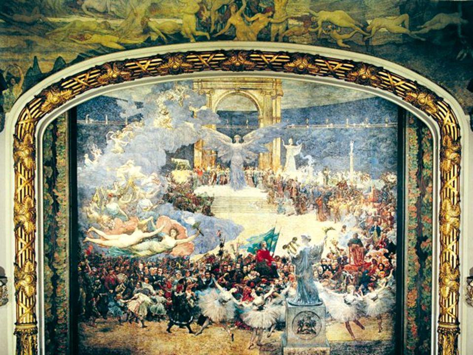
One of his most notable achievements is his painting for the Rio Opera House, Theatro Municipal, measuring 6500 square feet and spanned over the wall, ceiling, and curtains. This grand painting shows an elaborate scene with many figures seeming to move throughout the scene.
VISCONTI CONCLUI O PANO DE BOCA EM SEU ATELIÊ – PARIS
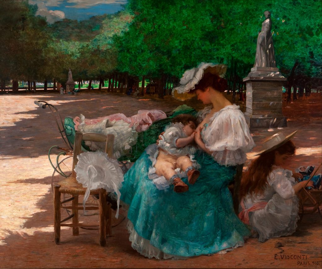
His more impressionistic work typically features soft colours and depicts natural scenes or women and children as the subjects. Visconti had a masterful technique for capturing the likeness of light, which brought his pieces of art to life. Using the over exposing technique like in cameras, he would wash out facial features in some of his works, creating an illusion of bright light.
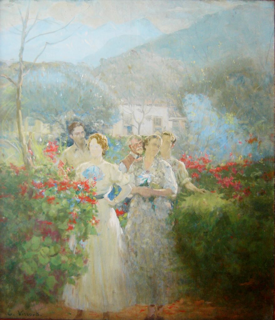
Out of all Brazilian Artists, Visconti painted the most number of self portraits in his life, a total of 42. According to his grandson, he was an “energetic and anxious” person who could always rely on himself to be a model for his artwork. In his self portrait below, we can see again his use of soft colours and impressionist brush strokes in the serene and calming painting.
Iron Buildings and Mustard Yellows– Art Nouveau Architecture and Colours
https://traveladdicts.net/art-nouveau-riga/ Riga Lativa Building
A continuation of the Arts and Crafts branch, Art Nouveau brought the beauty and asymmetrical rhythm of nature into buildings all over the world. Architects were very creative during this era as ironwork, glass, ceramic, and brickwork were combined to create curvy and colourful structures. From art museums, whole blocks of buildings, skyscrapers to iconic landmarks, art nouveau inspired a global beautification of previously ordinary cities.
Examples of this work include Barcelona’s famous Casa Batlló, designed by Antoni Gaudí. This building gained its international fame for the colourful broken ceramics that adorn the exterior, paired with the bubbling effect created using iron and wood. Today it is a popular tourist attraction in Barcelona and also serves as an art museum, therefore, featuring stunning artwork both inside and out.
https://www.casabatllo.es/en/news/the-five-corners-of-casa-batllo-that-people-cannot-stop-shooting/ Pictures of Casa Batllo inside and out
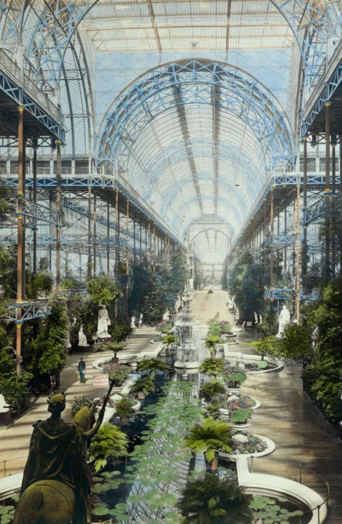
The use of ironwork truly led the way for the creation of many Art Nouveau buildings. From the Crystal Palace in London to the Eiffel tower, iron made it possible for architects to create durable skeletons while shaping it to whatever their minds pleased. Iron also was used as decorations on buildings, shown in the Secession Building found in Vienna, with its striking golden dome covered with gilt wrought-iron laurel leaves. (Below is a picture of the Crystal Palace before it was burned down in a fire in 1936)
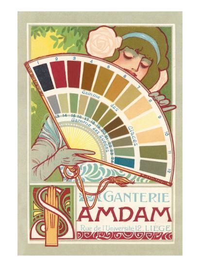
Asides from the colourful and natural buildings, Art Nouveau artwork developed a specific colour scheme that included many muted and pastel colours. Continuing with the all-natural theme, earthy tones like mustard, brown, and olive green were commonly paired with bright and floral colours such as lilac, violets, and peacock blues. These colours were prominent in posters, artwork, and even interior decorations, all featuring greenery and flora. (Below is an example of a common Art Nouveau colour palette. Soft peaches and yellows were also common in skin tone depictions. Link for the photo is found at the bottom.)
Ornate gold and metalwork also made up for a good part of the Art Nouveau colour palette. In jewelry, furniture, gates, and frames, the dark colour of metals and iron contrasted the lively colours and mimicked the style of line work popular in art nouveau posters. Iron buildings previously mentioned of also used a great deal of dark greys but were often contrasted with blue glass and very colourful ceramics as part of their facades.
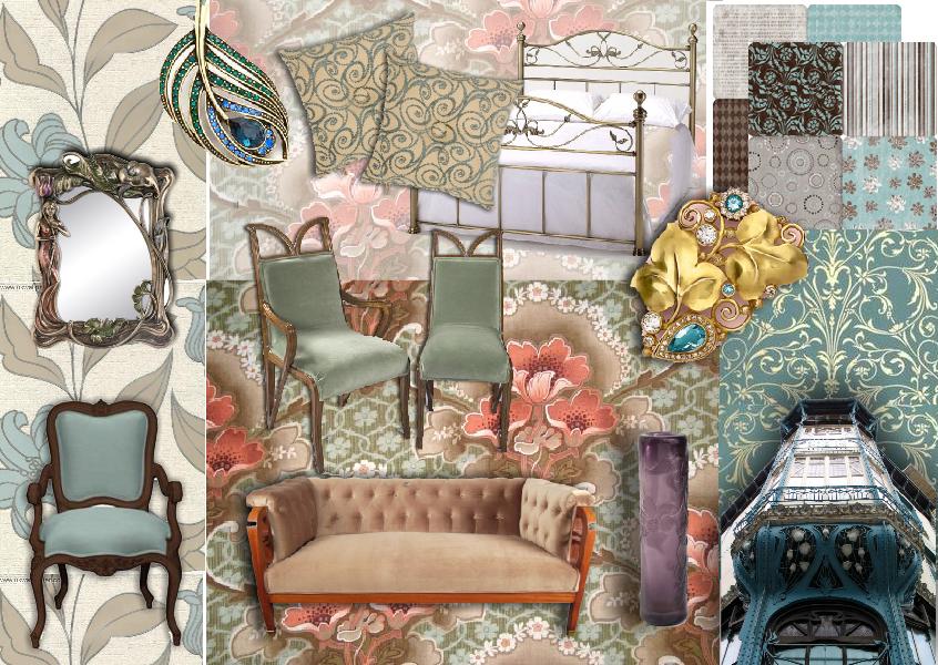
https://blog.sampleboard.com/art-nouveau-style-how-to-create-the-art-nouveau-look/ Examples of the muted pastels in pieces of furniture and interior decoration.
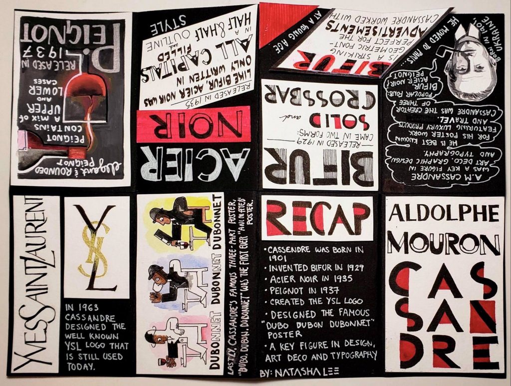
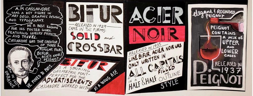
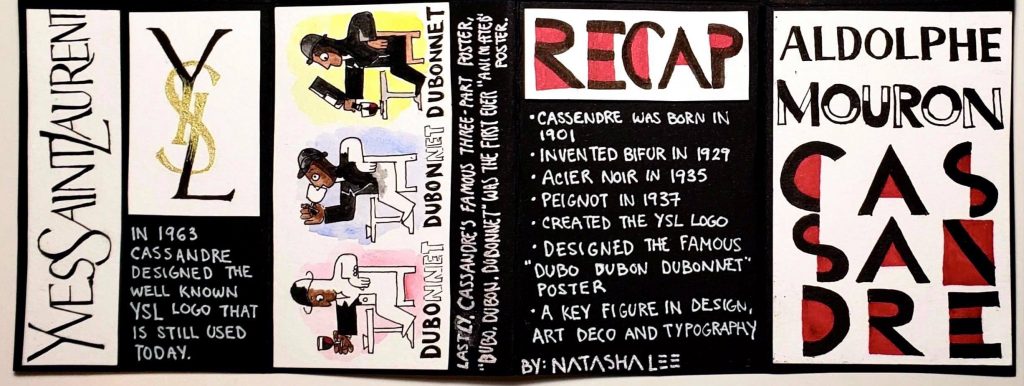
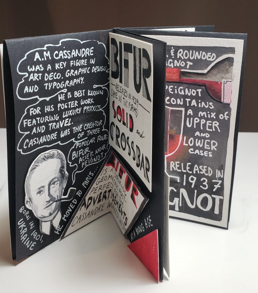
(Left to Right- Page 2, 3, 4, 5)(Left to right- Page 6, 7, 8, Title (1))
I found this zine project very fun and an exciting challenge to create. I chose to feature A.M Cassandre as the subject of my zine and got to learn a lot about his typography and poster work through my research. While I found much more information on his graphic design and poster work than on his typography, it was still interesting to learn about how he combined these two skills to create fantastic advertisements. One difficulty I found when creating my zine was fitting all the information I wanted to include onto a small page! I was able to find many interesting facts and stories about Cassandre, but when it came time to transfer my research onto the zine, I realized that I had to pair down the information to the bare points. While I could have cut down on the illustrations and large lettering, I tried to prioritize readability and visual intrigue over bombarding my zine with text. I chose to create a cohesive theme for my zine by sticking to a limited colour palette of black, white, silver, and red for the majority of the text. These were colours used often in Cassandre’s typography work, so it seemed fitting to create my zine using such colours as well.
For this project, I would give myself an 8/10. I am quite pleased with the graphic and bold style of my zine that reflects Cassandre’s work and incorporates examples of his work outside of just typography. I spent a lot of time ensuring that the flow of the information made sense and that it was captivating and fun to read. In retrospect, I wish I was able to incorporate even more information on his work and typography by making the size of my zine bigger. This way, I could have added more facts and given the reader an even better idea and appreciation of Cassandre’s work.
Fun fact: Everything in my zine was hand drawn or written! Nothing against printers- I just wanted to torture myself and give everything a cohesive hand made quality.
Adélaïde Labille-Guiard was born in Paris, 1749 as the youngest out of eight children. While her family never possessed any connections to the arts, Labille-Guiard started her career at the age of 20 when she was admitted into the male-dominated Academie Royale after much determination and persistence. There she studied alongside the more famous Élisabeth Vigée-Le Brun, whose work would be compared to Labille-Guiard’s, even long after they finished school together. While Vigée-Le Brun was much more socially active and commissioned to do many portraits of Queen Marie Antoinette, Labille-Guiard made her mark as the painter for King Louis XVI’s aunts. Her work is most distinguishable by the matte and solid backgrounds she painted, in contrast to the popular trend of surrounding the subject with objects that flaunted their wealth. Her work is very detailed and has an almost photographic quality to them.
In her painting of the Marquise de Lafayette, Labille-Guiard’s use of a plain and natural background truly brings out the subject. This reminded me of the Mona Lisa by DaVinci and how the figure can work cohesively with the background but still appear as the focal point.
Labille-Guiard was also a prominent figure in supporting women’s rights and female artists. She was a devoted art teacher and supported her female pupils, and hoped of opening an all-girls art academy of her own. Unlike Vigée-Le Brun, she welcomed the French revolution and gave donations to the movement. This support allowed her to stay in Paris even after the French revolution to continue painting.
Here we can see Labille-Guiard’s devotion to her education of female artists. With a lack of extravagant props and her eager pupils in the back, Labille-Guiard appears most radiant and modest in her workspace.
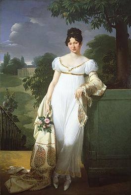
https://fashionhistory.fitnyc.edu/1800-1809/ Example of Neoclassical fashion
1800 was a revolutionary time in western fashion history. After the French revolution, the former stiff and cone styled dresses of the rococo era turned into more form-fitting outfits with very high waistlines. During this time, fashion, along with the arts, took on neoclassical inspirations. In their aim to reproduce looks from ancient Greece and Rome, women often mistakenly wore white, believing that classical fashion featured primarily white clothing. It was during this time that dresses became much looser with straight flowing skirts in contrast to their large and stiff forms from the previous era. Unlike the frivolous styles from before, natural beauty was heavily emphasized in fashion. Form-fitting clothes now outlined the natural body shape, and undergarments had to be altered to fit this drastic reduction of coverage.
https://en.wikipedia.org/wiki/Empire_silhouette Dress example
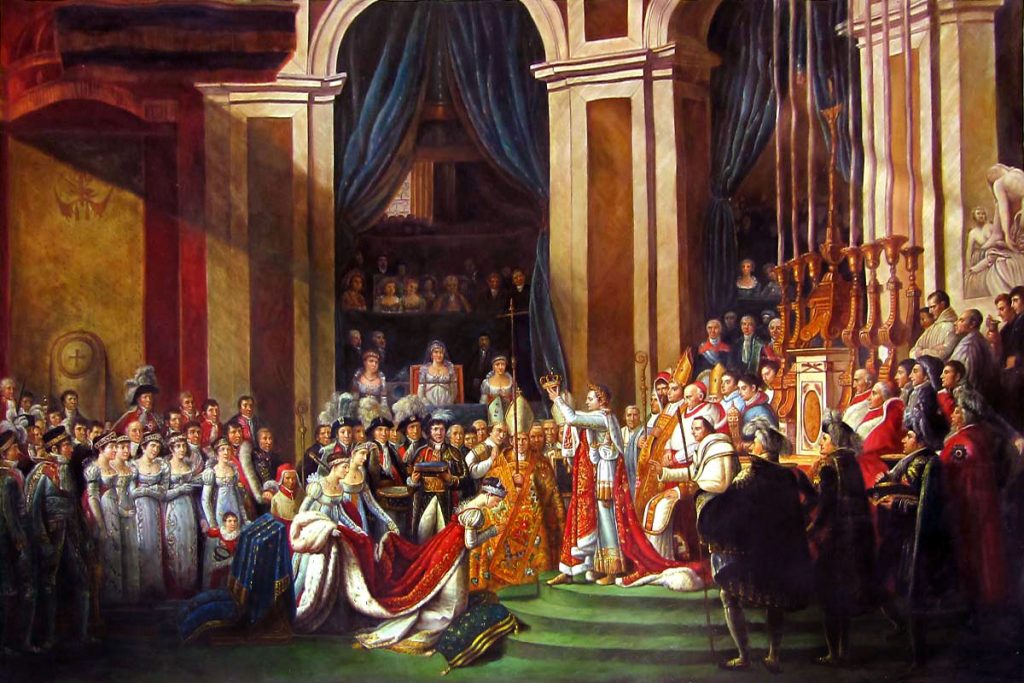
During this time, famous painters like Jaques-Louis David and Delacroix emerged to partake in the neoclassical trend. Just like fashion, art during this time drew inspiration from the Ancient Greek and Roman trends in aspects such as their scenes and costumes. This movement was based on the push against the previously frivolous traits of Rococo styles and held a more natural but still very impactful flare. Colour palettes noticeably reduced in paintings as the emphasis moved to the lines and forms of figures.
Important events such as the French Revolution and the rise of Napoleon were great inspirations to painters like Delacroix, who painted the famous “28th of July: Liberty Leading the People” in 1830. Along with David, who painted many prominent pieces commissioned by Napoleon, such as “Napoleon Crossing the Alps,” and the “Coronation of Napoleon.”
In this example of ground, the viewer’s eye first focuses on the man in the foreground but can also move to the background city scape, which plays a secondary role in this picture. This differentiation is a key component of the figure/ground rule.
Proximity Example:
I chose this example of the African Beat logo (Originally a gif) as my example for proximity. While the lines and dots are separate, our minds can group them together to picture the outline of Africa.
Similarity Example:
I was not completely certain if this is a good example, but upon first glance, I categorized this image as an example of similarity. By using the rule of similarity, the patches of varying colours helps to differentiate the different sections of the hulk. Without these similar patches of colour, the set of triangles would tell much less of a story and could not convey the same message.
This Art Deco themed poster by Mads Berg uses color very powerfully. In this poster, primary colors such as cyan, magenta, and yellow are paired to create a striking composition. Here, Berg uses an abundance of cyan in the dress and background, but which he contrasts with the orangy peach of the woman’s skin tone to create a striking yet visually appealing piece of artwork.
Shapes Example:
Shapes are skillfully used in this movie poster, designed by Sam Smith. Here, Smith has craftily created the contour of a bull out of many organic shapes, including the profiles of people and the repetition of wave-like forms. Paired with his powerful use of color, this design is very alluring and engages viewers.
Space Example:
In this cover for Linda Coggin’s Book “The Boy With The Tiger’s Heart”, designed by Levente Szabo, space plays a key role. Here, the use of negative space is cleverly used to cut out the form of the tiger while snaking through the form to also give the impression of stripes through the form of trees.
Giovanni Bellini was born in 1430, Venice, Italy, and was an influential painter who brought the Renaissance style of painting to his hometown. The Bellinis were an artistic family; his father Jacopo, was a painter along with his brother-in-law, Andrea Mantenga, and his older brother, Gentile. This background helped to pave the way for Giovanni as he greatly surpassed his relatives in his artistic career. Bellini’s most notable artwork features masterful use of sensuous colors and his studies in perspective and landscapes. While at the start of his art-making practice, he drew inspiration from the bible and used tempera, he transitioned later in his life to natural scenes in oil paint.
The Agony In The Garden- completed in 1465
One of his most famous paintings, The Agony In The Garden, depicting Christ praying in the Garden of Gethsemane, clearly shows his mastery of perspective, foreshortening and an incredible sense of colour.
Holy Allegory- completed in 1499
His painting, the Holy Allegory, caught my attention while I was researching this artist. The depth captured in this landscape is impressive, but even more, the precision of the geometric terrace in the foreground astounded me. The combination made for a piece of artwork that appears to be way before it’s time.
The Sacred Conversation- completed in 1505
Lastly, the altarpiece he painted in St Giobbe church, attests to his absolute skill in realism and perspective. From the architecture to the rendering of the figures, Bellini’s years of practice and perfection led up to this marvellous painting.