I spent about 12 hours working my Aldus Manutius Zine. I decided to take a very hand drawn, line heavy style that evokes the feeling of old illustrations and wood printings in books of that era. I Focused on the creating spreads that lead the eye naturally to the next bit of information, framing the text nicely and creating a colour scheme. The creative choices I made this zine where all based on function, and trying to effectively create what the rubric asked.
Attracting the eye
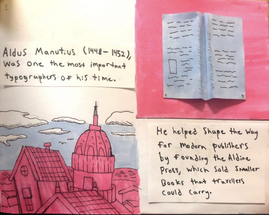
This first pages easily represents the thought process the best. Small amounts of text are placed carefully above and next to interesting illustrations. one of the most eye-catching pieces in the book is on the top of the right page, because that is where your eyes are most likely to rest after opening the cover. Small details like this may seem trivial but they really add up. All these decisions ended up really capturing people when I when showed off the zine when I had only had the illustrations done. People where invested, all because I put unique set piece in a place their eyes didn’t have to travel too far to see.
Leading the eye
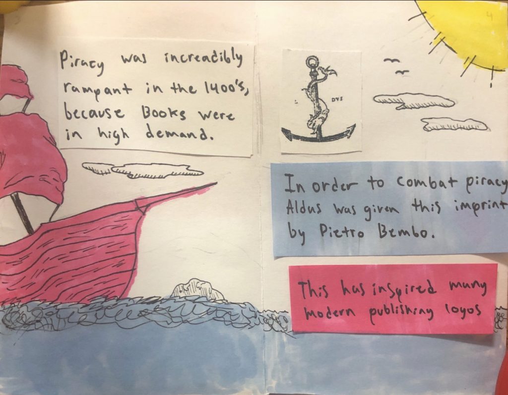
In this second spread, I included the pirate ship and placed the clouds in a way that would complement the text. Used the tip of the ship to point to the next valuable piece of information. I described it succinctly, so I don’t lose your interest.
All my design choices fit very well, I followed the rubric while being unique and not getting carried away with my own creative vision. I’d give my assignment an 8 out of 10, because while it may not perfect it provides what was asked for with no comprises.