Mentorship with Scott Strathern at Engine Digital
Phase 1
Listen Gather Define. For my mentorship project I decided to use one notebook so that I could go back through it and repeat the process for future projects. I will share pieces of it here.
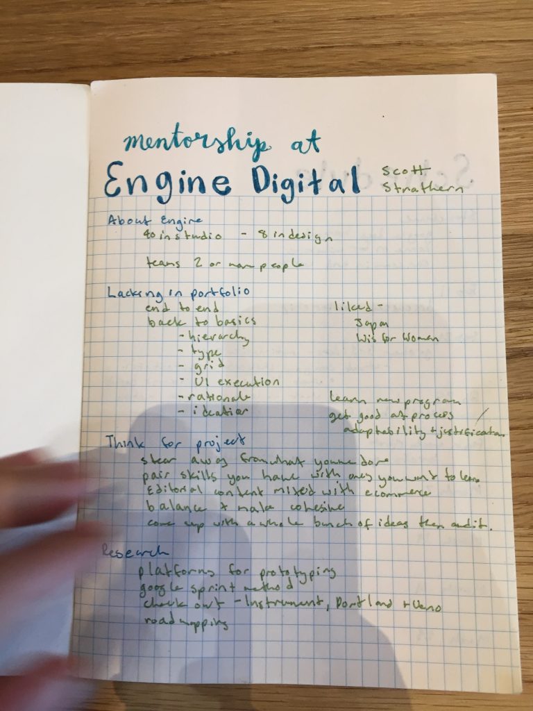
Scott and I jumped into things right away. In our first meeting we went through my portfolio and talked about the kind of projects that would add to it. We talked about how things run at Engine and I left with a clear list of things to think about when ideating for my project and a list of things to research including the google sprint method and road-mapping.
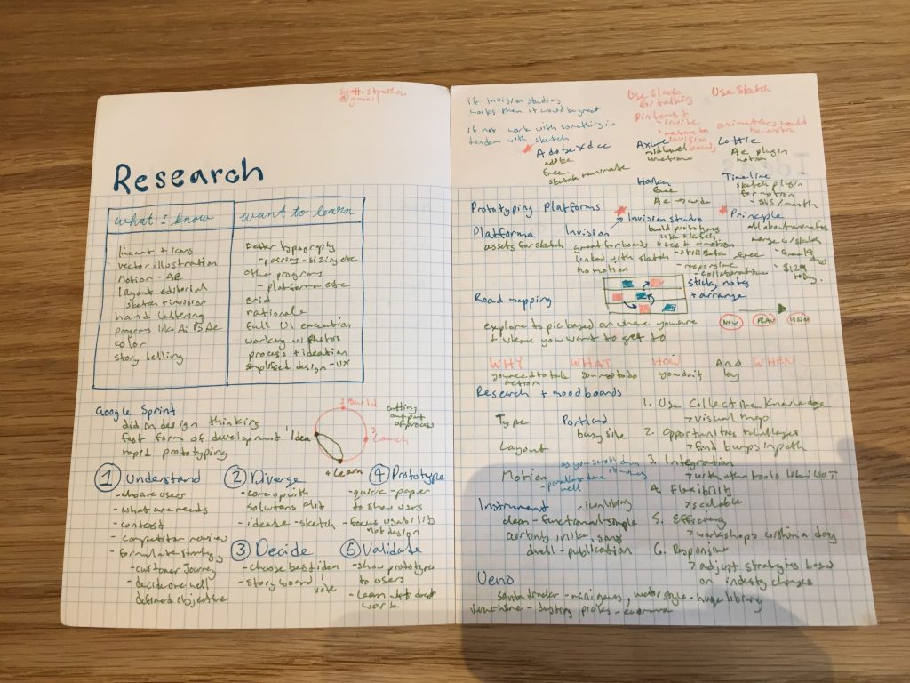
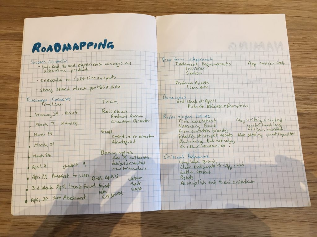
In our next session we went through my research and talked more about the kind of project I should try to do. We went through and created a road map of what we needed to accomplish and the time we had. We also went through what would make this project a success and the risks we might come up against along the way.
Phase 2
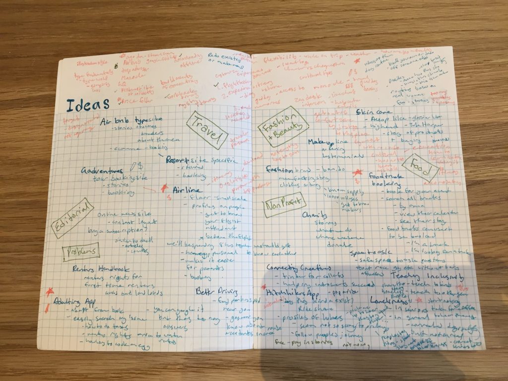
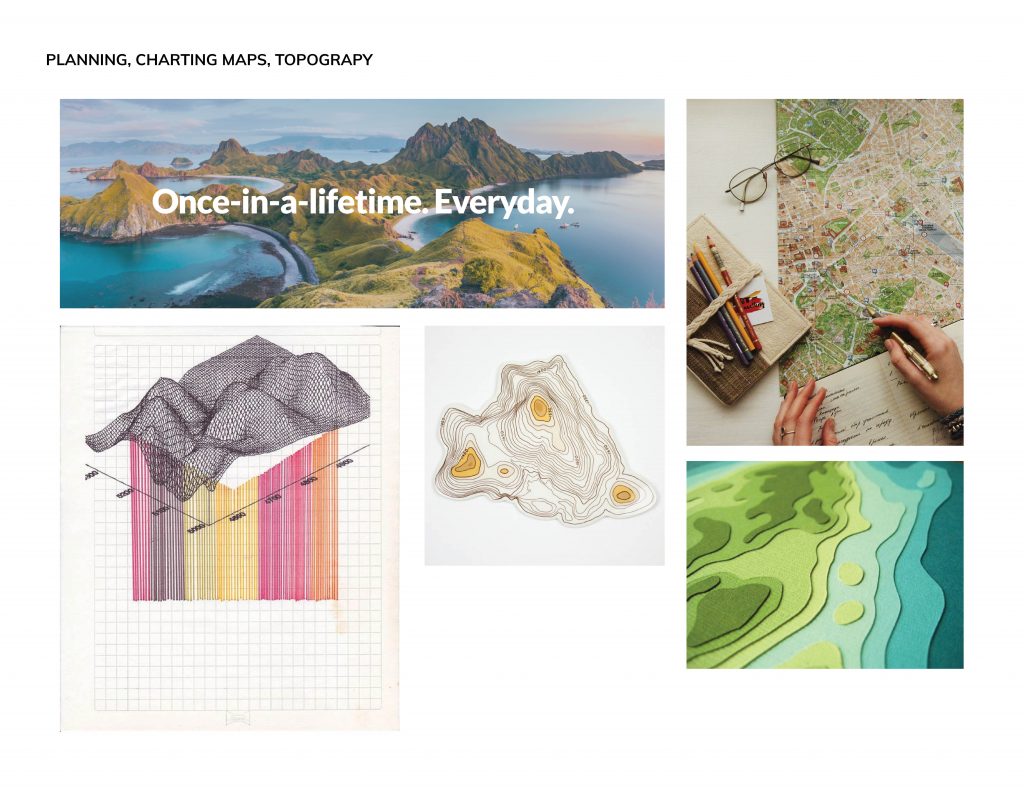
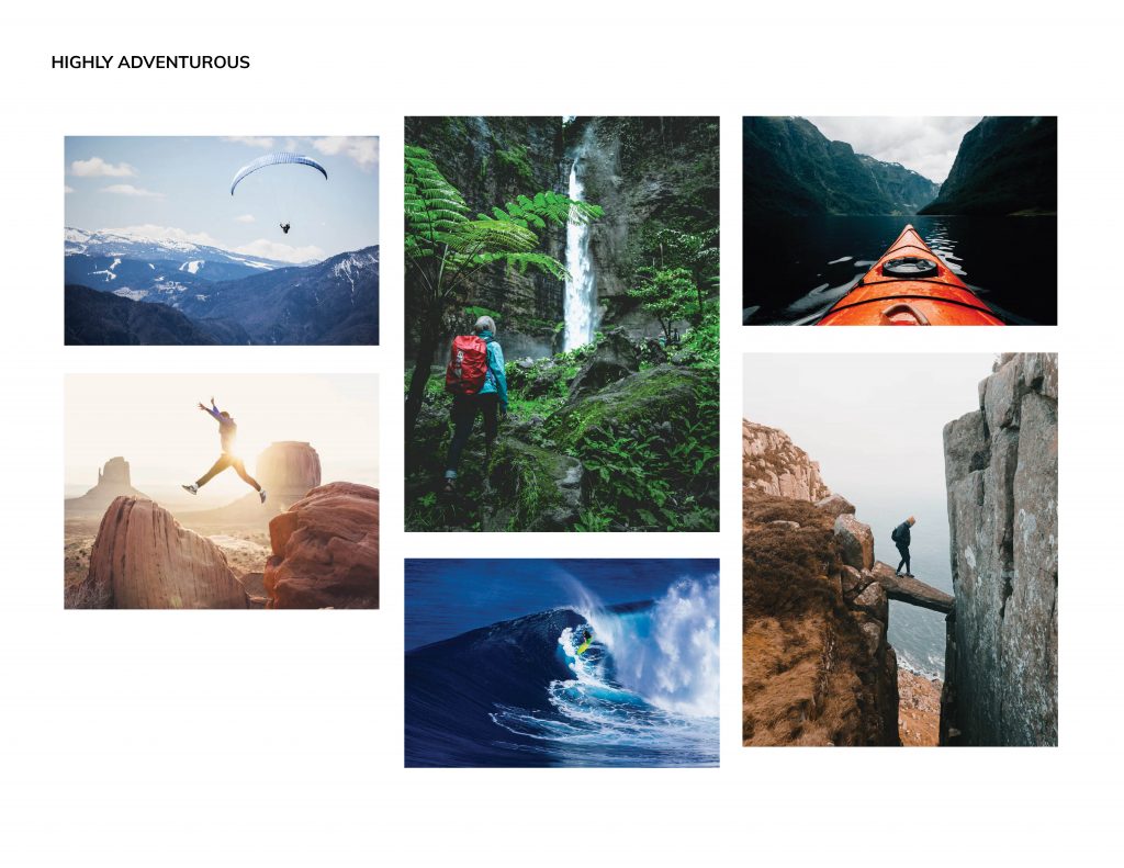
The next time I went into Engine I came with a giant list of ideas, we went through all of them and found that we were most excited about creating a travel app. We both have traveled a lot especially in Japan and felt that although there are a lot of tools out there now there are still a lot of pain points especially with itinerary building.
We decided to use slack to communicate outside of meeting up to share stages and research. Scott would often send me links to articles to read and things to research. I also shared progress examples. I went in to Engine at least once a week and we spoke on google hangout throughout the week to check in.
Phase 3
Brand
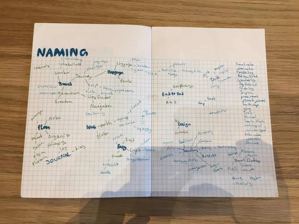
Our next stage involved coming up with a name for our app. I made a mind map to come up with names surrounding travel. Scott had also sent me resources on the kinds of business names that exist, I used this to spark some ideation.
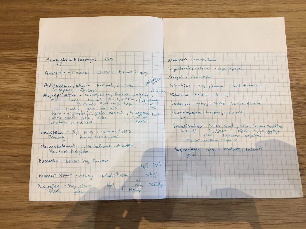
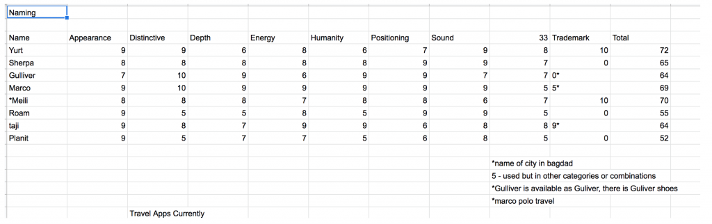
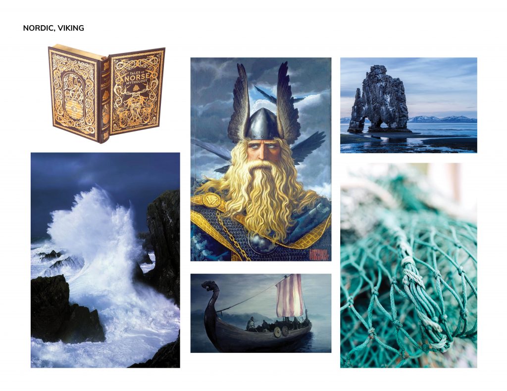
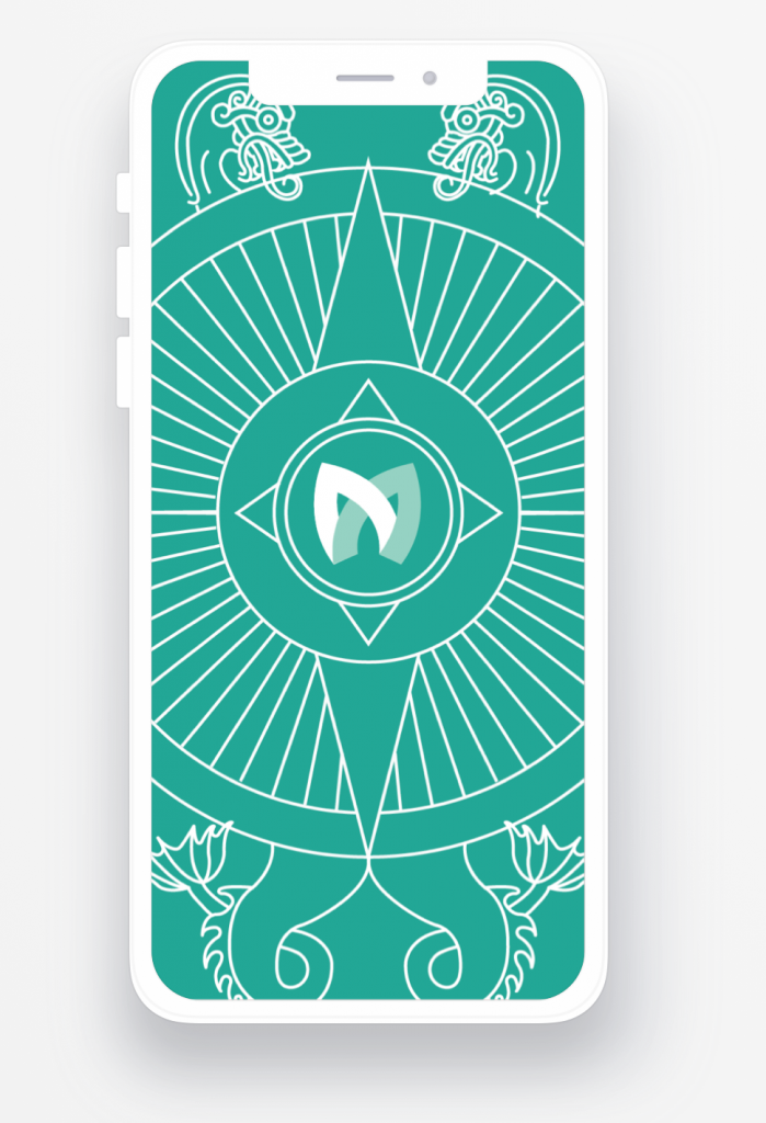
We then used the Igor naming method to go through my top names. We settled on Meili, Meili is the Norse god of travel, the name was unique, trademarkable, had a human quality and had that special spark with its connection to norse culture that opened up many avenues for illustration.
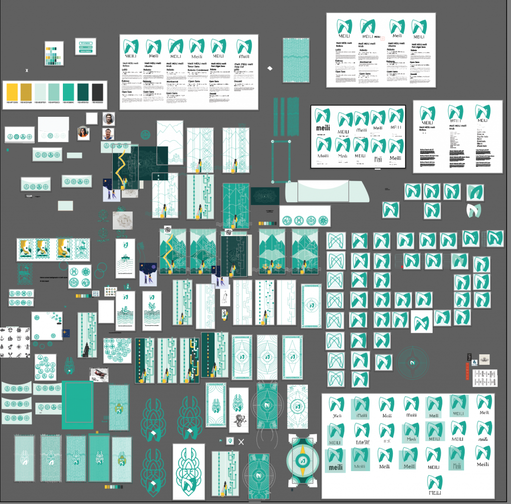
After deciding on a name I did moodboards for 4 concept directions and used those to create 4 logo directions.
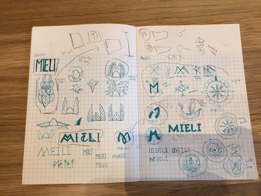
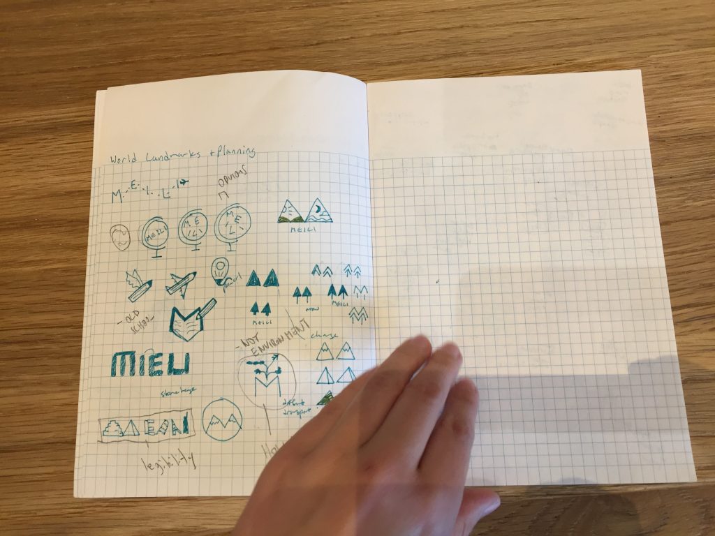
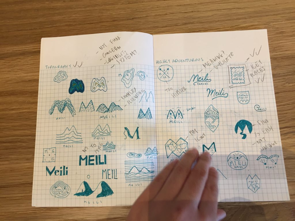
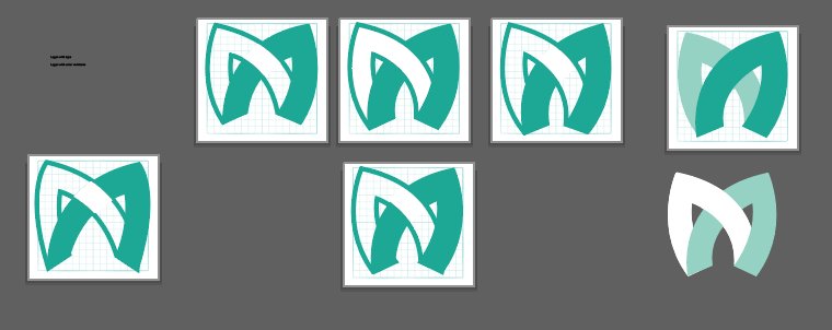
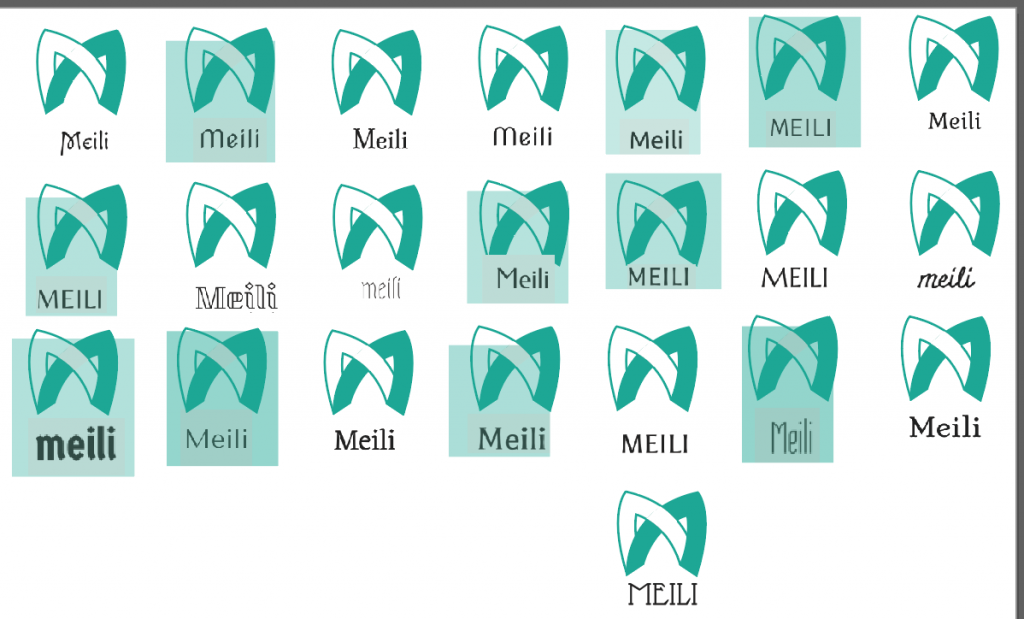
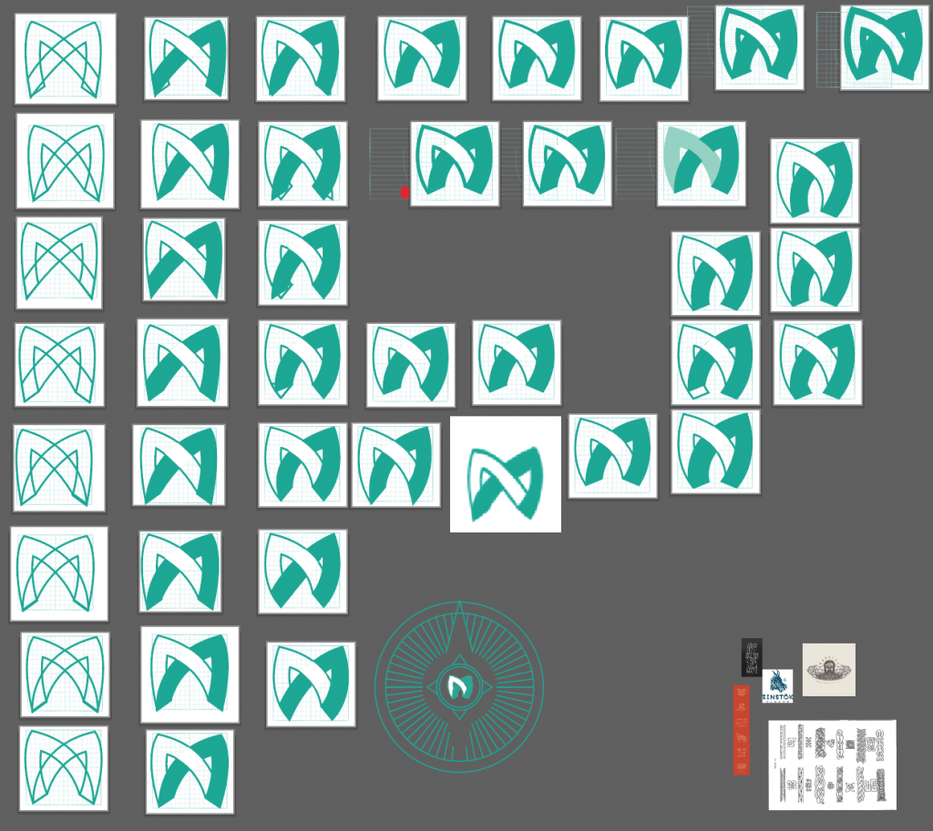
After choosing a logo direction there was a lot of refining that went down to make it work. This M comes from the norse braided pattern.
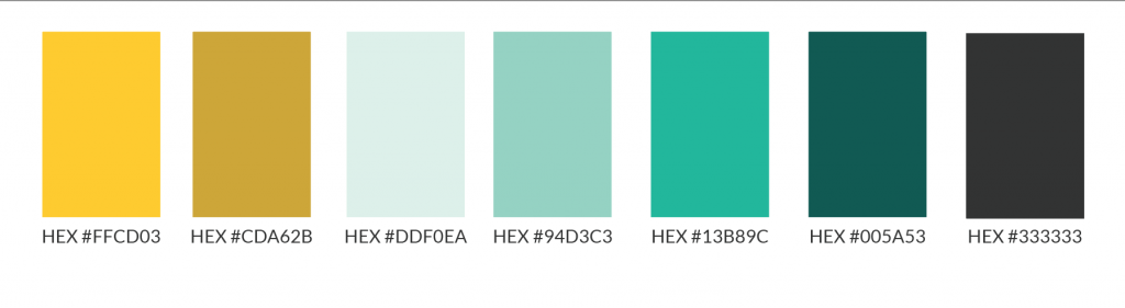
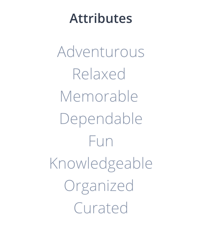
There was also a lot of refinement before coming to the color choices and brand attributes.
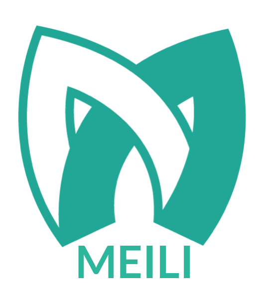
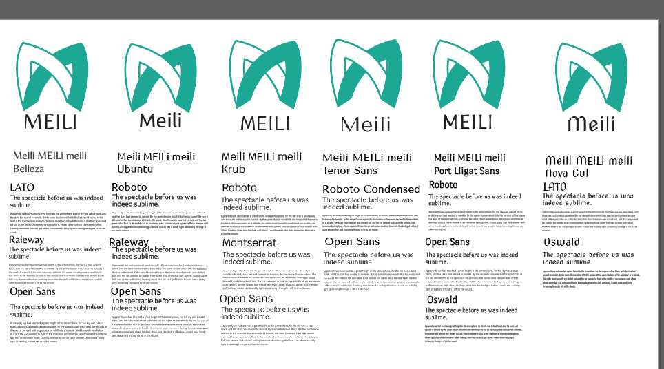
We settled on this logo with Lato for the wordmark. It complimented our logo by having a slightly nordic feel while feeling modern.
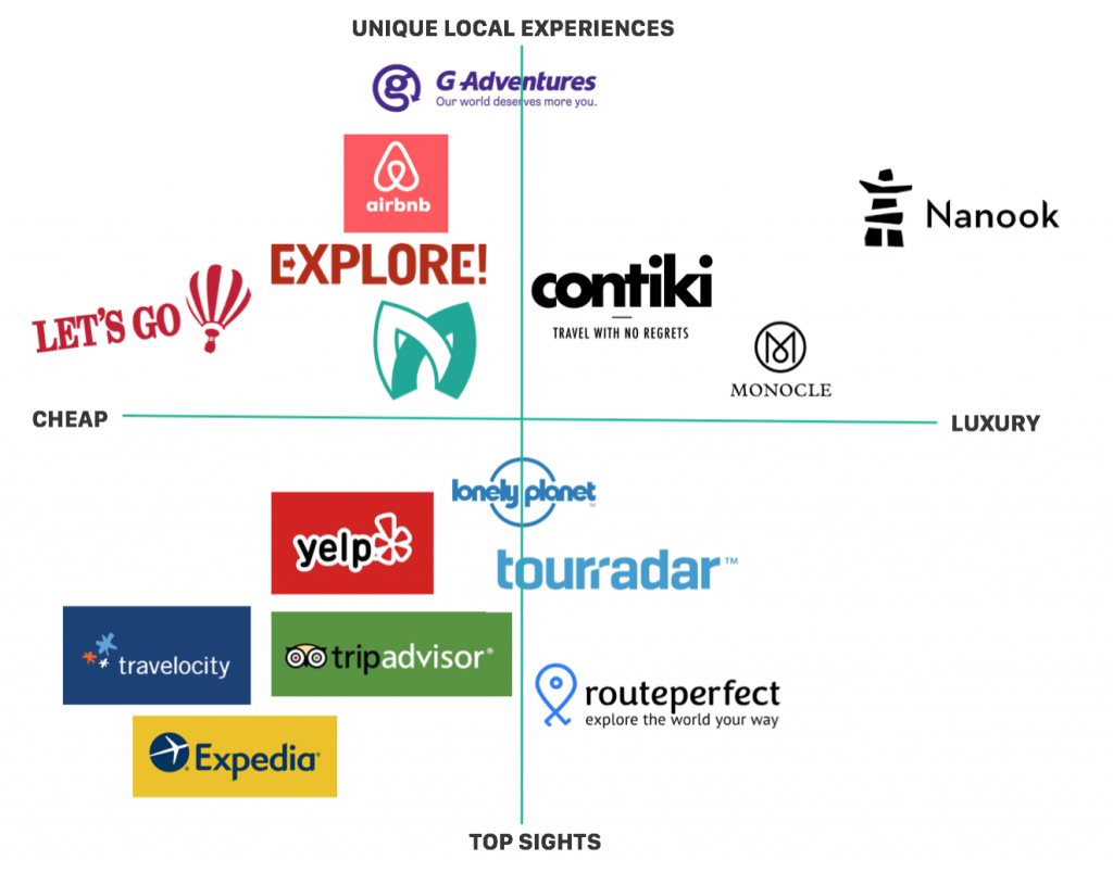
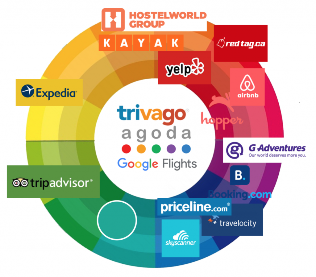
We completed brand positioning charts and a color wheel chart to find a unique space for us to fill. The opening in the sea green area was perfect for our brand.
User Experience
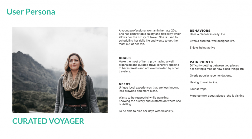
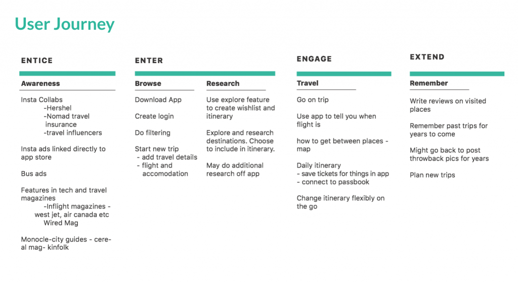
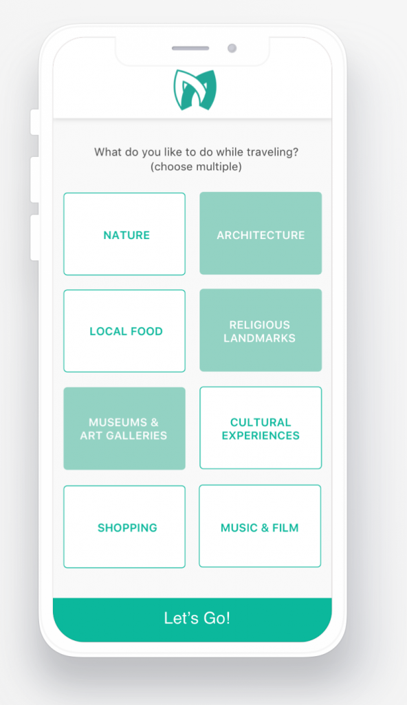
While working on branding we simultaneously worked on UX starting with building a User Persona and User Journey.
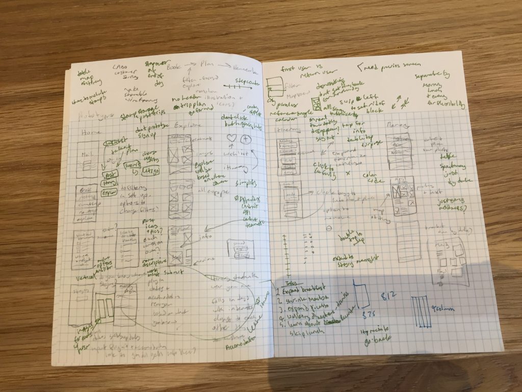
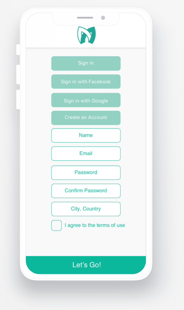
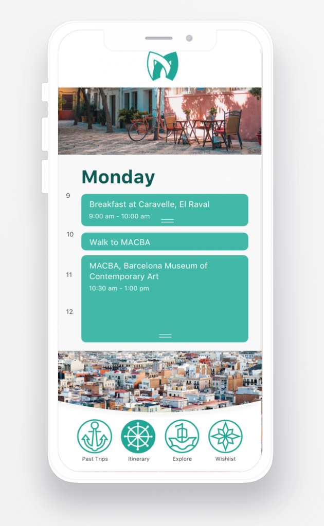
I then sketched out the user flow and what our prototype would look like.
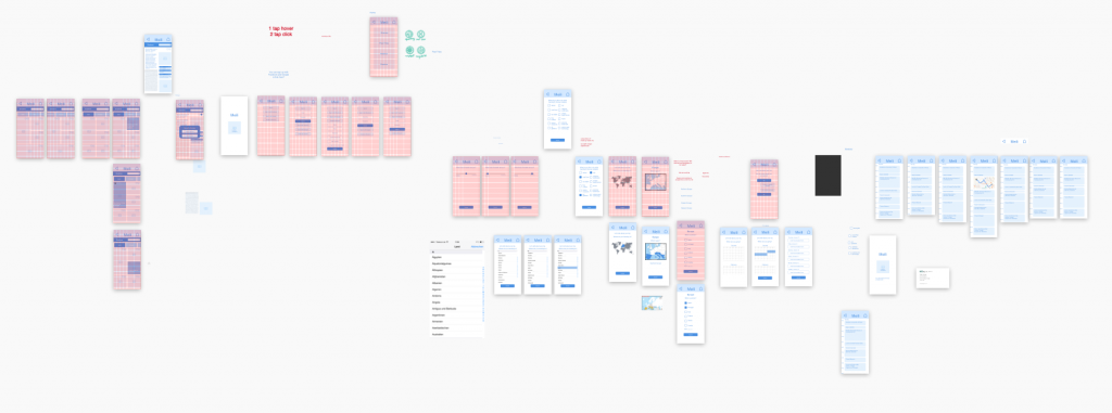
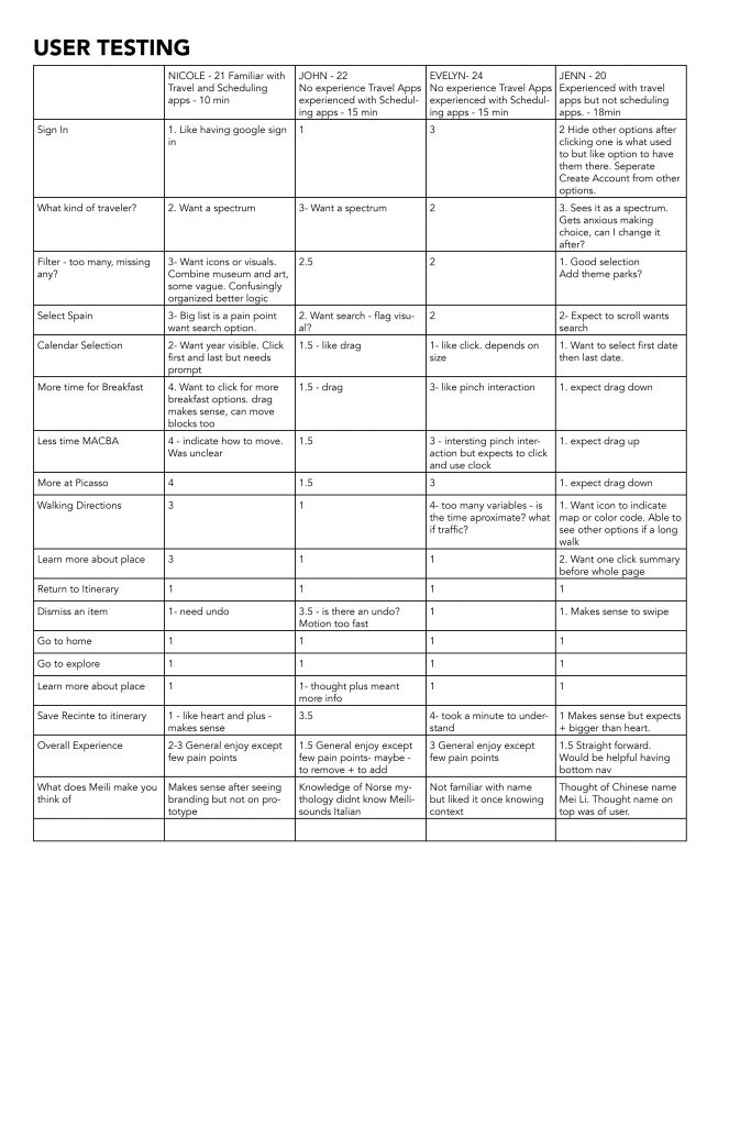
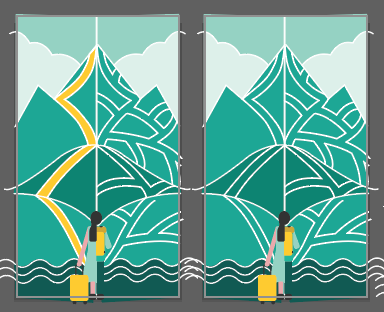
I created a lo-fi wireframe using sketch and prototyped it using Invision. I then user tested the process on 4 classmates and got some excellent feedback.
We looked at tons of other apps to figure out the motion and hierarchy we were looking for. The link below will show more of those screen grabs.
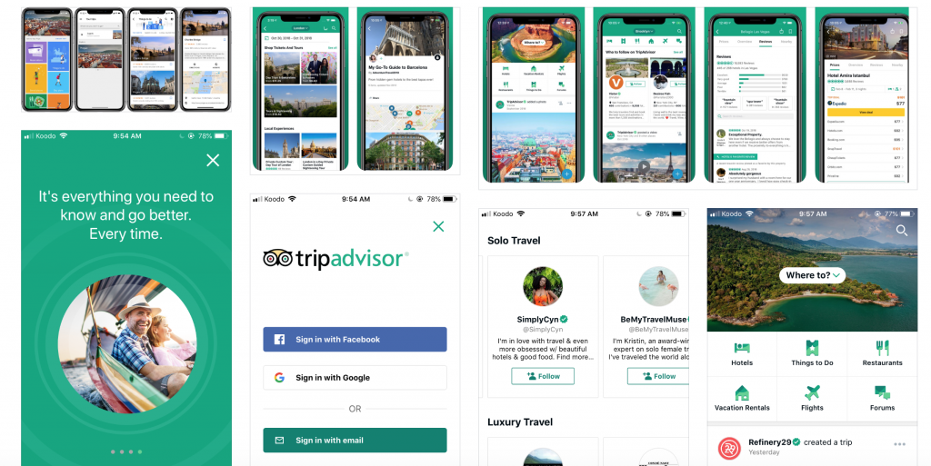
https://projects.invisionapp.com/boards/X53U71MHYCE/
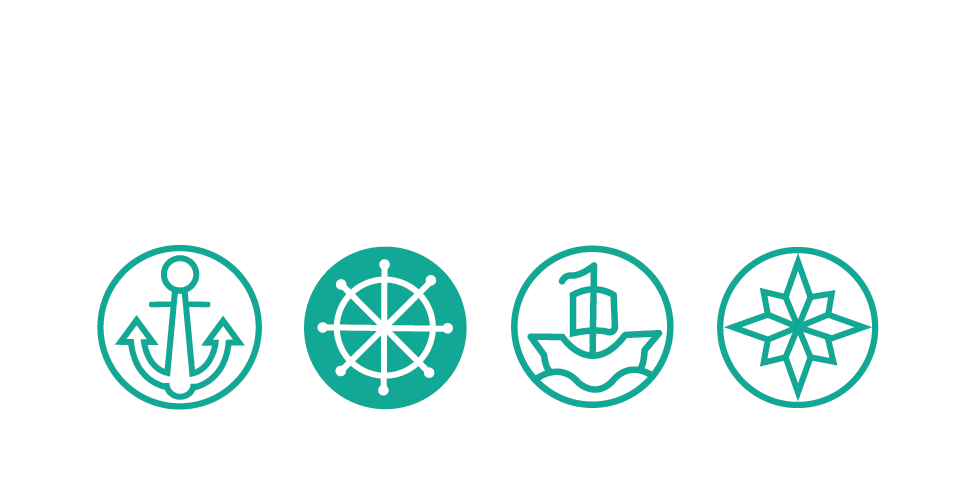
Illustration
Another huge component of this project was illustration. Scott was impressed by my illustration work in my portfolio and decided we had to include it in this project.
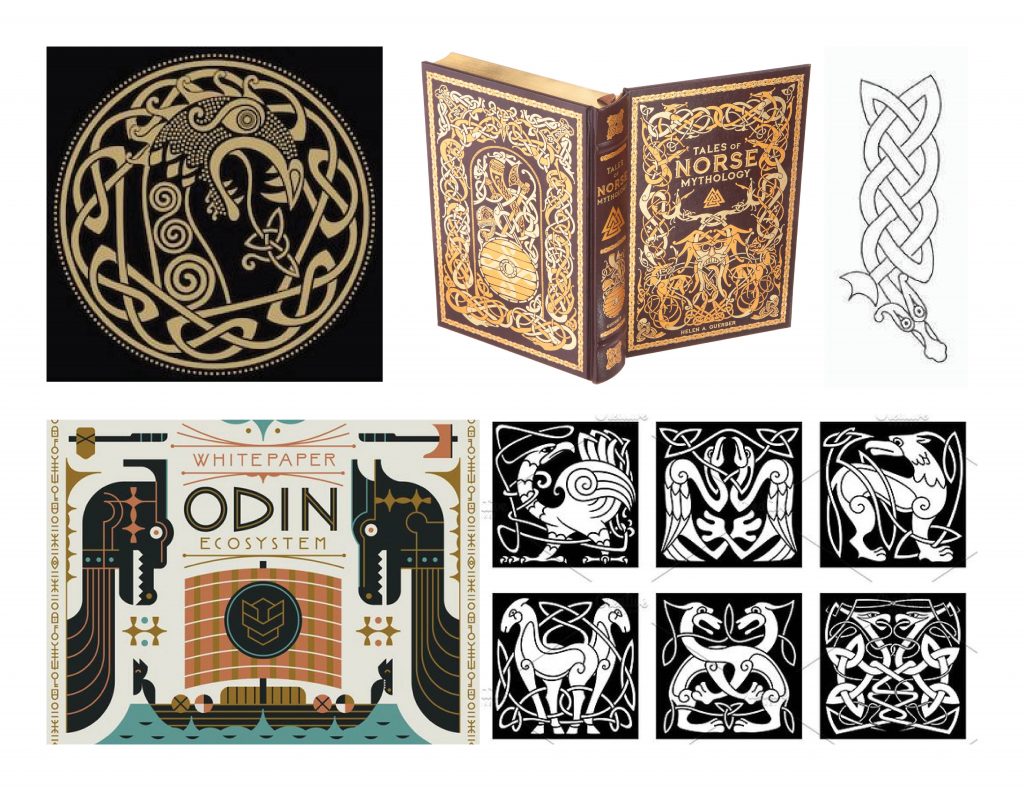
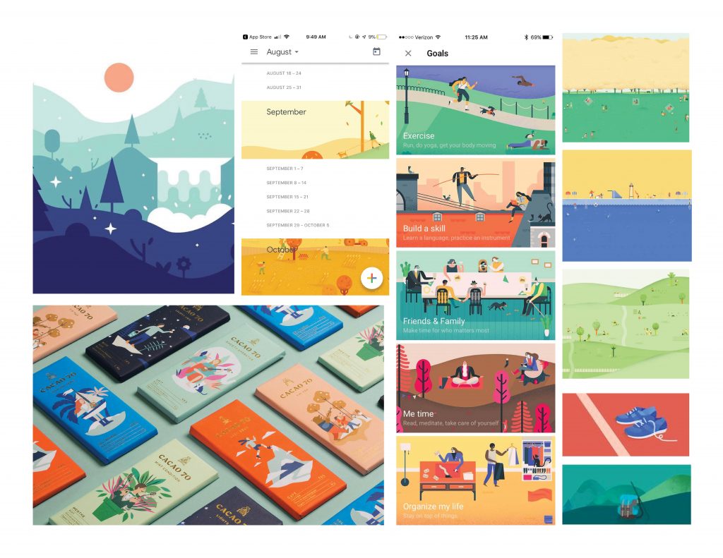
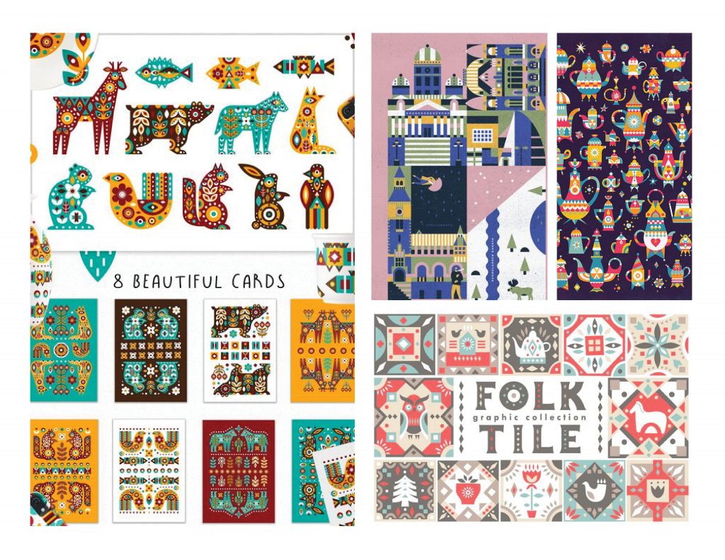
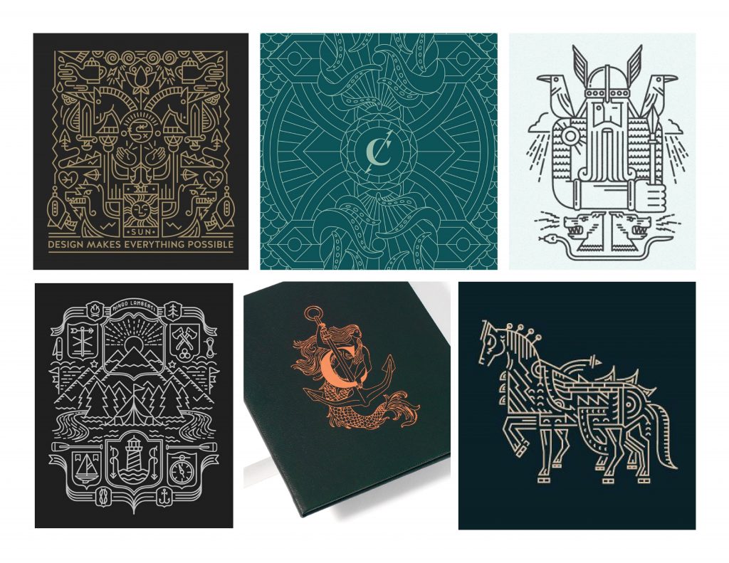
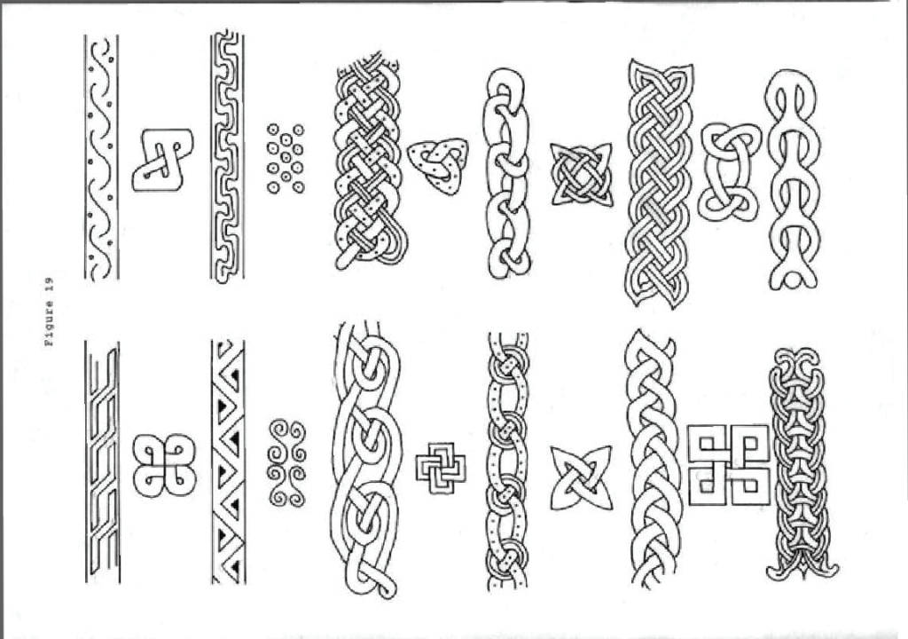
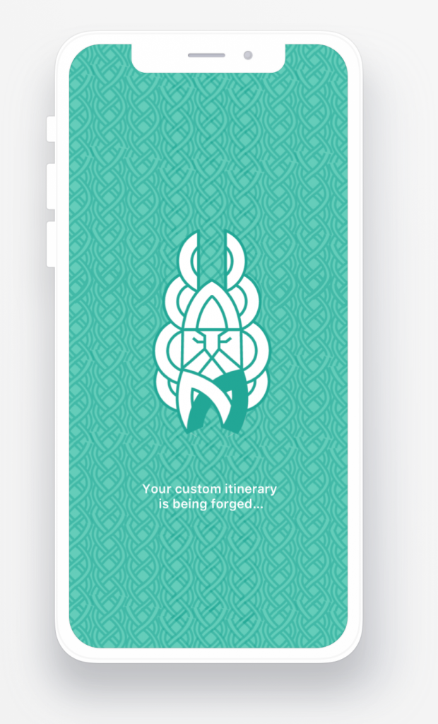
I made many moodboards on illustration styles and we decided to go with a monoline style while also incorporating patterns and images from nordic works.
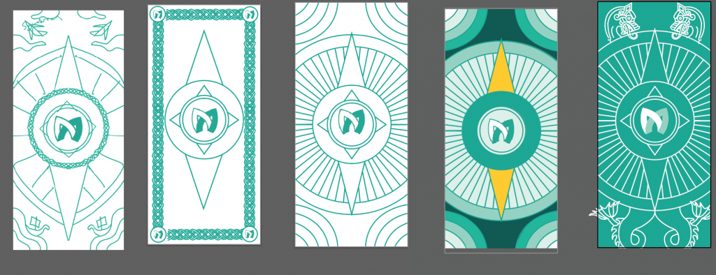
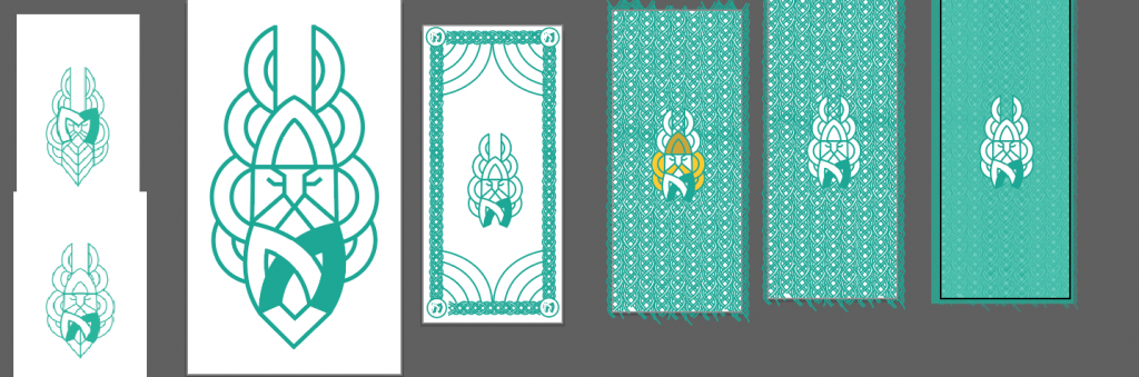
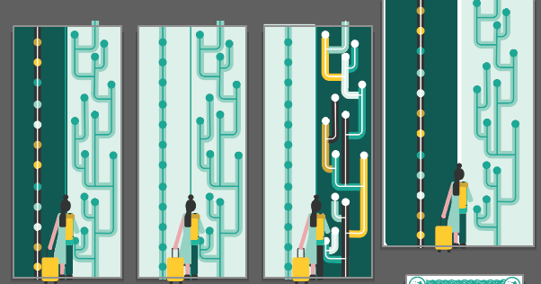
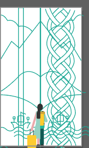
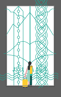
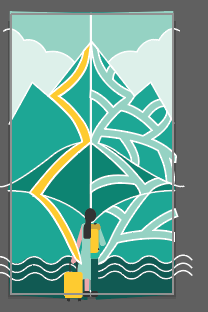
These are examples of some of the illustration evolutions.
Phase 4
At this point we had to narrow down what had to be finished and what we would like to get finished. We needed to refine the illustrations and apply our style board to the prototype. I designed the slide deck but then Scott helped me refine it more to make sure we included everything that we wanted to and that it matched the other work that we did.
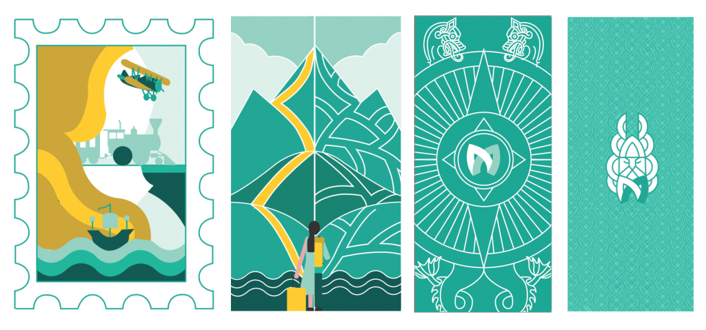
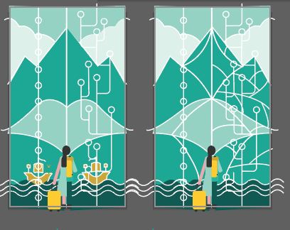
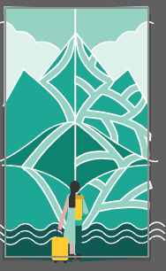
This is where the illustrations ended up.
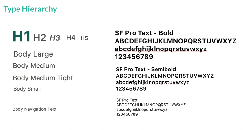
We chose San Francisco for our typography because it is the font used by apple for IOS so it is free and easily accessible and will update with
Final Prototype
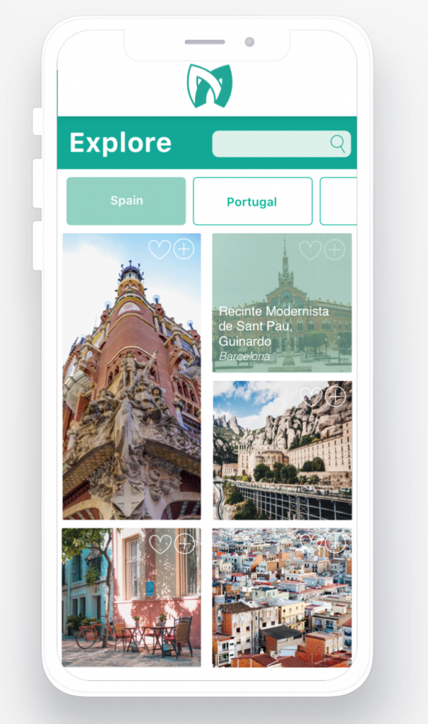
https://invis.io/MSRDPRJDZE2#/356369808_First_screen
Phase 5
118 Illustrator Artboards, 1 entire notebook and countless messages back and forth the project is finished!
I learned a lot, in talking with other students I found that Scott was a lot more hands on and involved than most. He was really a proper mentor and put a lot of his own time into this project by always being available for feedback. Scott definitely pushed me and the project was at times very challenging but that’s exactly the kind of challenge I was looking for and what we had decided on from the beginning. In the end I think we were both really satisfied with the project and partnership.
If we were to expand this project phase 2 would include:
- Collaborations with Herschel and Spotify as entry points to download.
- Promotional website, instagram and other marketing materials.
- Building out Wishlist and Memory Log components.
- Creating a “spontaneous” user journey.
I’m really proud of my work on this project. It ended up being a branding, illustration, UX and UI project and became the robust portfolio piece that I was looking for. I learned tons from Scott from the naming process to creating a cohesive style board and mostly about refinement. In the program we focus a lot on concept and don’t always get to the nitty gritty refinement stage. Scott went through each of my app pages with a fine tooth comb and that feedback is infinitely valuable. I would definitely recommend Scott as a mentor, for the right person who is ready to work their ass off.