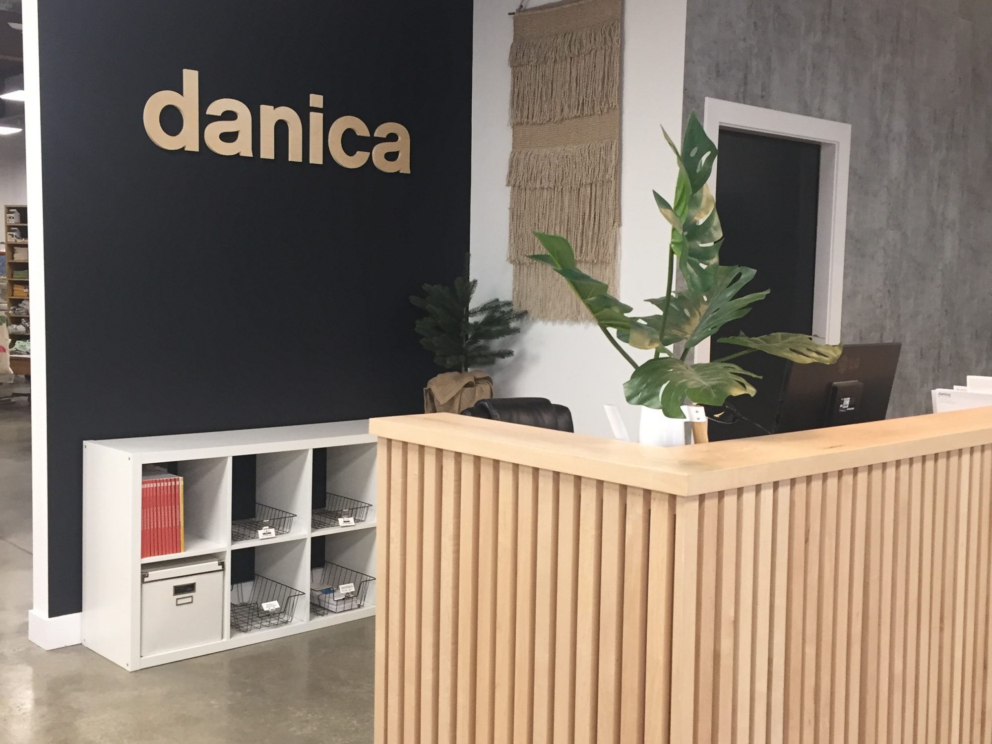
When I had my one on one with Asa she showed me the branding work she does for Danica and I was really impressed by the way the branding is applied across platforms and mediums. For example, she created an entire brand outline for the people who create the trade show booth. It’s all as detailed as possible so that they can create a booth that feels like Danica. That branding is also consistent in the office. The office space uses white, black wood, foliage and black ribbons. That way our showroom and tradeshow match. Danica’s products are so colorful and fun that they need to be shown in these clean spaces. It reminded me of a lot of the branding work we did with Gae when she wanted us to take elements from the logo and build out a whole series of branding patterns and applications. Also similar to the storefront and exhibit classes when we roughly showed what we wanted and what materials. To see a similar document and then the real-life application was really impressive. Once I knew about the branding I started to see it everywhere within the office, like finding easter eggs.
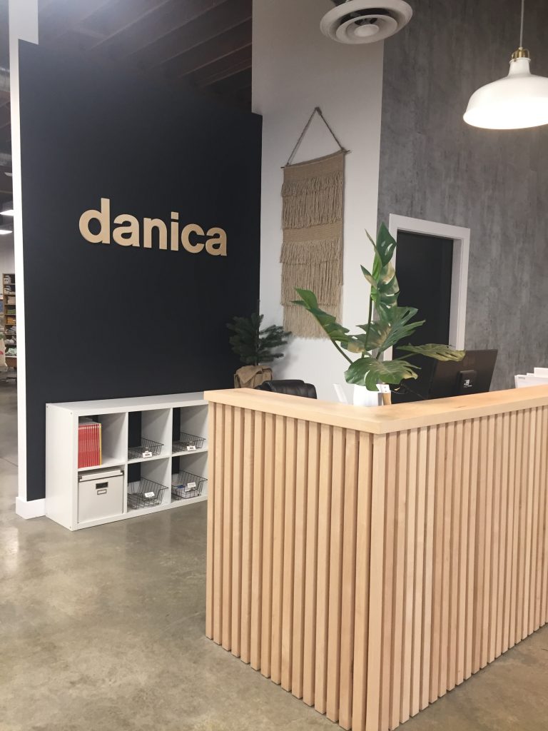
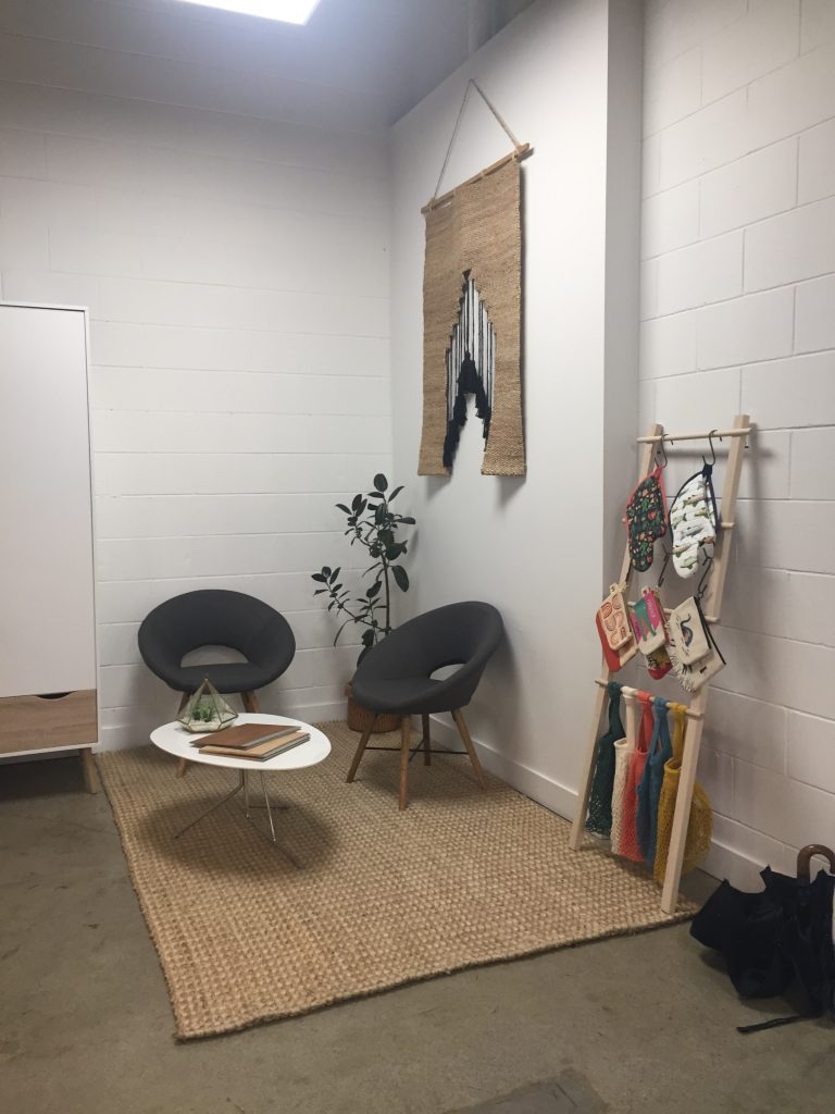
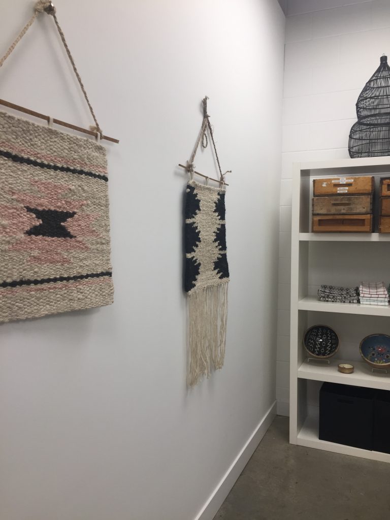
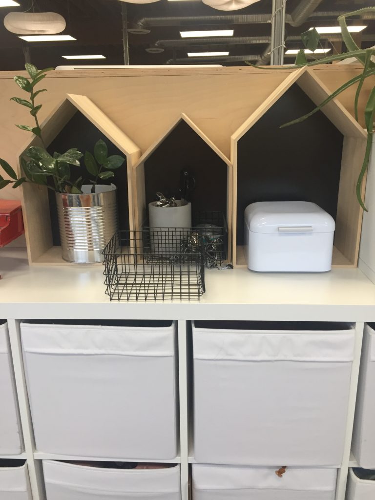
Honestly I have so much fun noticing all these little details I’m so impressed by the branding applications. This work was done fairly recently and is still being applied, the tradeshow booth is going to be brand new for Chicago. There is a lot of packaging work right now as they also scale it back and keep it consistent with this branding, white, black and kraft with the dot and ribbon elements.