Dorothea Tanning is an American-born surrealist painter. She graduated from the galleys Berg public high school in 1926 and started working at the local public library.
After college, she pursued an art career which took her to Chicago and New York. Tanning first discovered surrealist art at the Museum of Modern Art in 1936. She was a self-taught artist and was greatly inspired by Gothic and romantic novels. Her work over the years became much more sexual and abstract. As well as a painter she was also a well-known sculptor printmaker and writer.
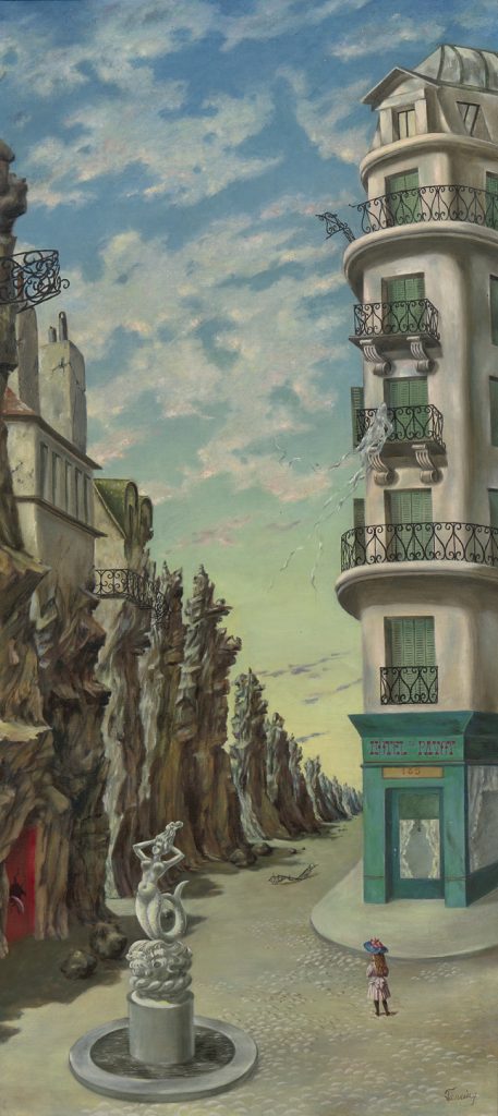
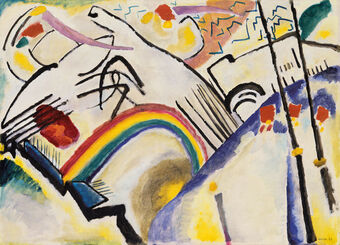
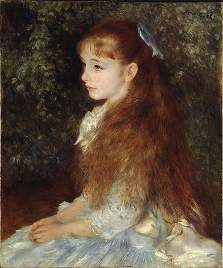
Birthday, 1942
I was particularly drawn to this artist because of the painting entitled birthday. I looked at it briefly and then quickly had to look again and as you keep looking at it it just gets weirder and weirder. The doors look infinite, I can’t tell if there is another door or a mirror behind the figure, her strange outfit and hair, and the strange Wizard of Oz creature.
One of the things I really like about surrealist art is that they paint a really strange world.
I really don’t like cubism/expressionist art. I have talked about my dislike of these art styles at great length in Jeff’s class (my opinions always seem to cause a bit of a stir.) Over the last couple of weeks, I have really tried to understand both of these art styles and find appreciation for them. I understand that this art style has changed the world and profoundly impacted so many people. At the moment, I don’t really know why I don’t like the style, it is not one thing in particular. I just don’t like looking at them. As an art student, I need to open myself up to different media, artworks, and methods. In PowerPoint 7, don’t particularly love the work of the artists that were shown. Because of my distaste towards the artwork that has been shown to me recently I have done a little bit of research on how to evaluate art. I understand that I do not need to love every style or artist. But I want to understand how to look at art thoughtfully and be able to articulate a grounded opinion.
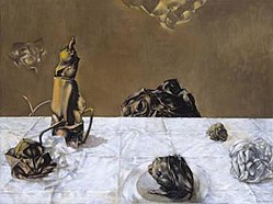
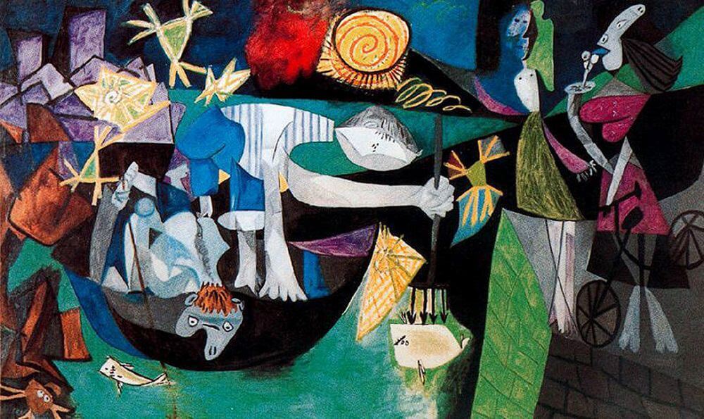
Night Fishing at Antibes, 1939 by Pablo Picasso
No Picasso, please
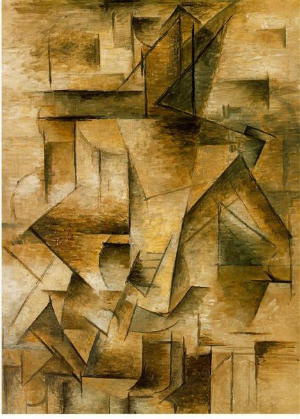
I find Picasso’s work very hard to look at. It is very busy and the colours look like they were chosen by a 6-year-old. I watched this video called “How to understand Picasso” while watching this video I started to understand that context is VERY important for these more abstract styles of art. In the video, the speaker talked about one of Picasso’s paintings called “Picasso’s Night Fishing at Antibes”. As the speaker explained how this paining is could be a representation of Picasso’s feelings towards the devastation happening in Spain around the time this was painted, I immediately understood the colours in this dark piece. The odd use of colour in Cubism and expressionist art has always made me feel uncomfortable. I see how events around Picasso’s life were represented in the colours. Another video I watched was called Cubism in 9 Minutes: Art Movement by Pablo Picasso Explained, the speaker talked about how in Picasso’s later paintings, he used less colour because he wanted the viewer to focus on the shapes. I really love the painting of a guitar player show because when I look at the shapes, I can just barely tell it’s a person. This painting makes me feel like I see the world through someone else’s imagination.
Le joueur de guitarre, 1910 by Pablo Picasso
Where to start
Next time I critique modern art, I will look to further understand the context, colours and shaped in the artwork as a starting point. There is a lot more for me to learn, but I think this is a good starting point.
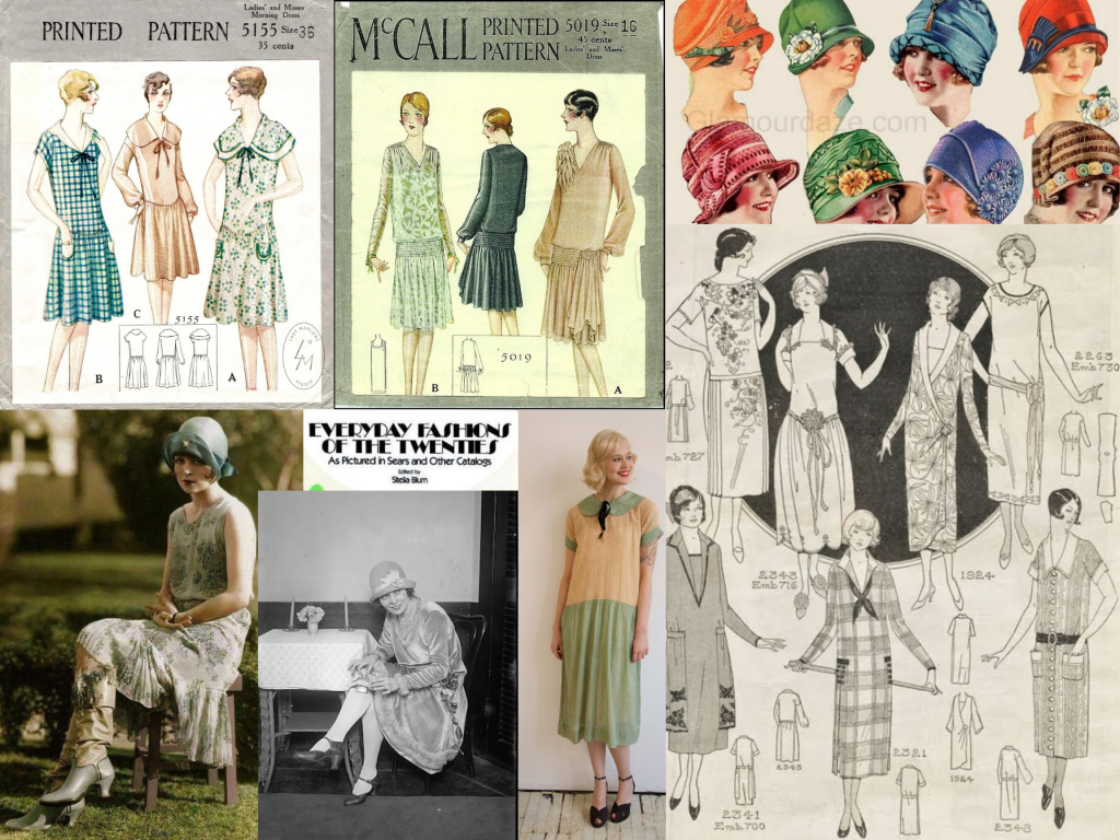
I was super excited to get started on this project of re-creating a 1920s envelope because I really love the way that figures were drawn around this time. It’s quite different from how I learned to draw figures because in all the examples I saw the women depicted had longer and larger arms as well as super tiny feet. Another difference I saw from drawing modern figures is the awkwardness of their positions, so I tried to re-create that style in my artifact. I also saw many examples that feature two solid-colored garments and one patterned garment.
The dress I designed for this pattern is something very typical of the 1920s. It features a drop waist and a collar. The figures are also sporting short heels and short hair which was reminiscent of the time. A detail that I found interesting is how sizing in early printed patterns was based on ages and not measurements. My pattern envelope would contain a size 20 pattern, which would be the average size of a 20 year old woman.
I am really unhappy with how my project turned out. I had originally gone a different direction and that was quite time-consuming. I had originally intended to do this entire project in coloured pencils, but the colours I had did not look very accurate. On top of that, the examples that I saw look like watercolours, so I chose to start again in watercolour. I didn’t have enough time to execute my ideas as cleanly as I wanted to. In the version I handed in, I had lightly indicated some outlines with pencil to mimic my reference photos, but with the layers of watercolour they got covered up so I opted for a fine liner to outline instead; I think that also worked out really poorly. Due to restarting, I had poor time management; I’m honestly happy that I am handing in anything at all. If I would give myself a mark I would probably fail myself for this project. I think I’m also upset because this is the first project that I haven’t been able to complete to my personal standards, but I can learn from this experience and just try to do better next time.
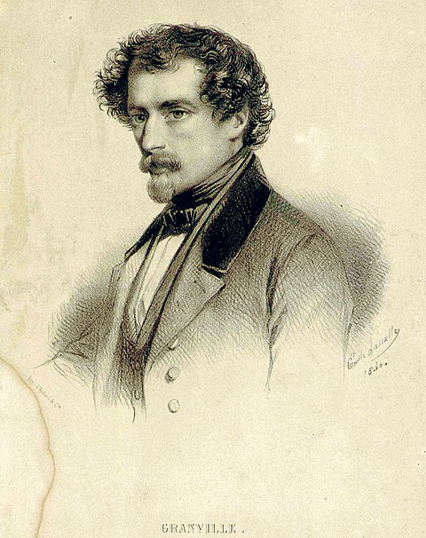
Jean Ignace Isadore Gerard Grandville, more commonly known as J.J Grandville was an artist born in Nancy in northeastern France in 1803. His family was very artistic and theatrical, so when Grainville was young his father taught him how to paint. He was also very skilled at wood engraving. The name Grandville was the stage name of Jean Ignace’s grandfather. When Grandville was 21, he moved to Paris and published a collection of lithographs called “Les Tribulations de la petite proprieté” and soon after published, “Les Plaisirs de toutdge, and La Sibylle des salons”. After that, he started illustrating for numerous periodicals in France. When censorship for caricature in literature was lifted J.J. Grainville turned to book illustration.
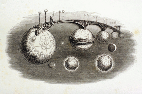
One of Gradvilles most famous drawings titled “Un Autre Monde”
His work
His work was unique because of its satirical and unrestrained nature. Lots of his illustrations were humans with animal faces. These drawings were extremely popular because of how human-like features of the animal faces were. “Metamorphose” is a series of 70 drawings that makes fun of the Paris middle class, he did this by drawing his signature style of human-like animals wearing human clothes. The series was his first claim to fame. He went on to create and illustrate a book entitled Les Fleurs Animées. One of his most famous pieces from the book is called Un Autre Monde. His work was very influential to the 20th-century surrealist artists and writers although his style was wildly copied over the years
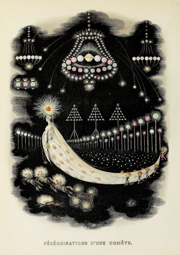
My favorite illustration by Grandville titled “The Wanderings of a Comet, from Another World”
Later life
Grandville‘s personal life was very sad, as he lost his wife and later his three sons all died under the age of five. He remarried and had a fourth son, but unfortunately went crazy and died at the age of 43. He never knew how influential his work would be.
Born into a family of artists, Pierre-Auguste Renoir was associated with the impressionist movement in his early career, and towards the end of his career developed a more technical style. He enrolled in drawing and anatomy classes at Ecole des beaux art in 1862. He also took painting lessons with Swiss painter Charles Gleyre. Renoir originally learned neo-classical style painting, he was influenced by Delacroix and Corote. Renoir did not particularly like the environment in art classes but continued to go.
Renoirs’ artworks are known for their vibrant light and saturated color. His work was mostly candid portraits of women and children, as well as female nudes, even though a critique and Le Figaro newspaper said that his figures looked like corpses.
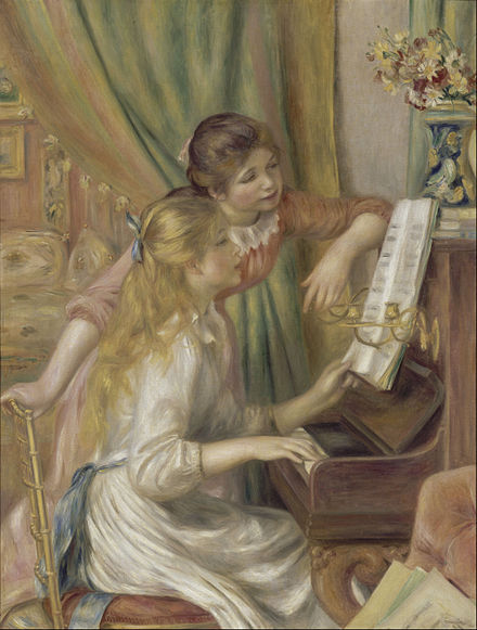
Throughout these classes, I find it really interesting that I am familiar with many of the works shown in class but have never given them a second thought. I chose to write my blog post about Renoir because the placemats in my house are his most famous painting Dance at le Moulin de la Galette.
I like some of Renoir’s art more than others, for example, I really like a Portrait of Irene Cahen D’anverse, because it reminds me of Carriera, it is reminiscent of the pastel luminescence and also Rubens because of the creamy skin. However, while I like the scene of girls at the piano I don’t particularly love the colors used in comparison to his other paintings. My favorite paintings Renoir created are the ones inspired by the bold colors of Delacroix.
I chose to create my design about blackletter because I really like how it looks. Out of all the typefaces I’ve seen in class blackletter is my favorite. I find it really interesting that it is a group of scripts as well as a style itself.
I had a lot of fun copying the typefaces for the titles of each page and as I was creating the zine I realize that my personal handwriting doesn’t have ascenders and descenders so for the writing portion I’ll exaggerate that by making the letters squished together (trying to mimic black leather but more legible). I was originally going to write about what each typeface looks like but I thought it would be better to write out the names in their respective fonts and write other facts instead. This was difficult because, in the present, there are so many variations it was very difficult to find an original.
Out of all the typefaces I talked about black glitter is still my favorite with texture are coming in at a close second.
I would give myself a 7/10 because Even though I sketched out multiple ideas for the front and back cover and pick my favorite I don’t think it really works as well as I thought it would. I think the front and back cover makes the design look very unappealing to read. I also really don’t like the spacing of some of the words because some words I had to separate into lines and I think it looks appealing but I think it’s difficult to read. I didn’t really think that that would be an issue I ran into so I’ll know for next time. I spent 5 hours total on this project.
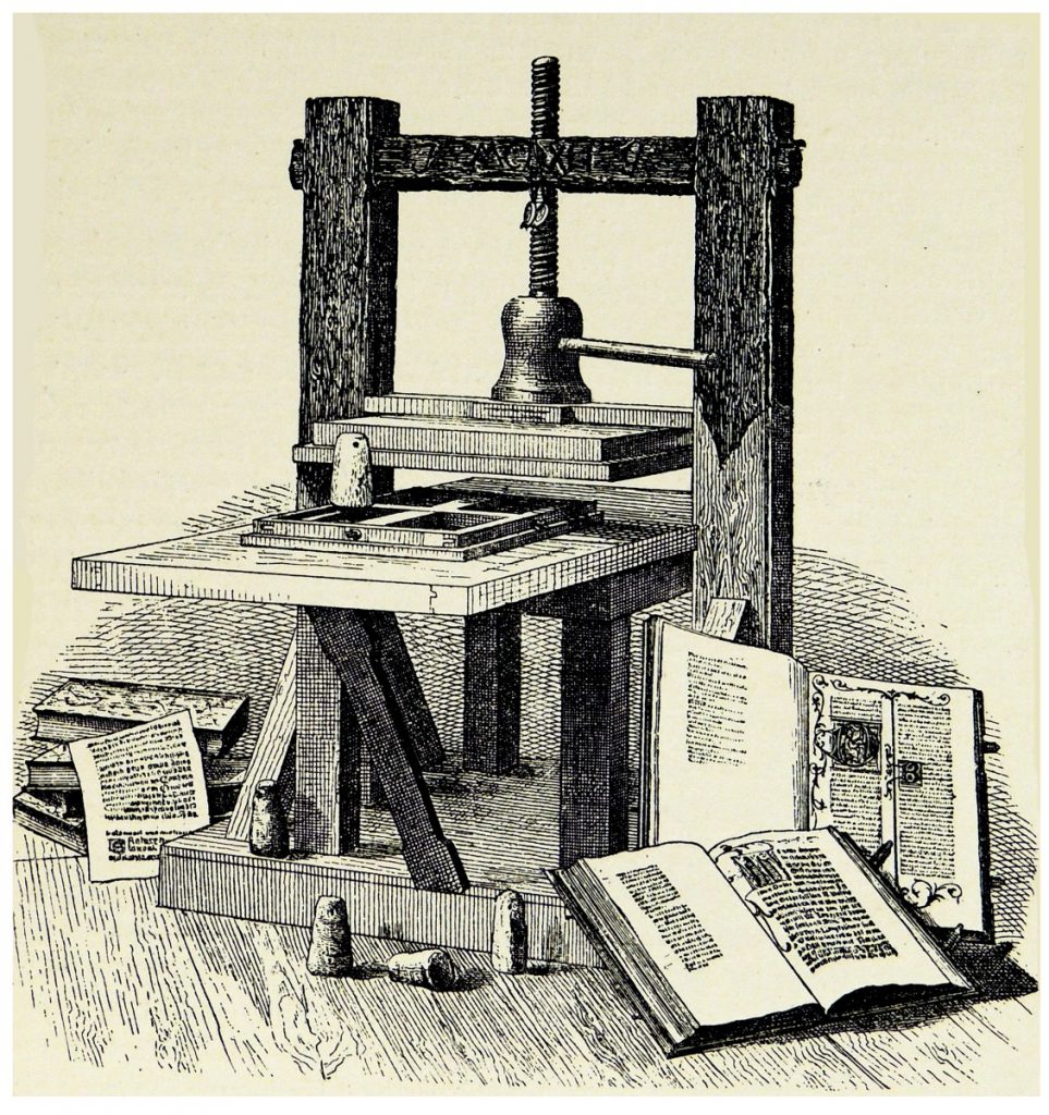
Illustration of a printing press – https://www.history.com/news/printing-press-renaissance
How world-changing events lose relevancy
It’s difficult to imagine the impact that certain events and developments have had if we didn’t experience them at the moment. For example, Covid-19 is the first major event that has impacted the lives of people my age and it will profoundly affect me for the rest of my life. It’s funny and interesting to think about how future kids will learn about Covid-19 from a chapter in their boring textbooks. They might be affected by the aftermath of the pandemic, but they will never understand the profound physical and phycological stress and feelings of living through the event. The printing press likewise had a huge impact on people that lived during that time, and I will explore that here.
The article I read was called “7 ways the printing press changed the world” by Dave Roos. I used this article as a jumping-off point for the aspects I found the most interesting. I also referenced the paper I read for my English class called “The Persistence of the Word” written by James Gleick, which talks about how writing came to be.
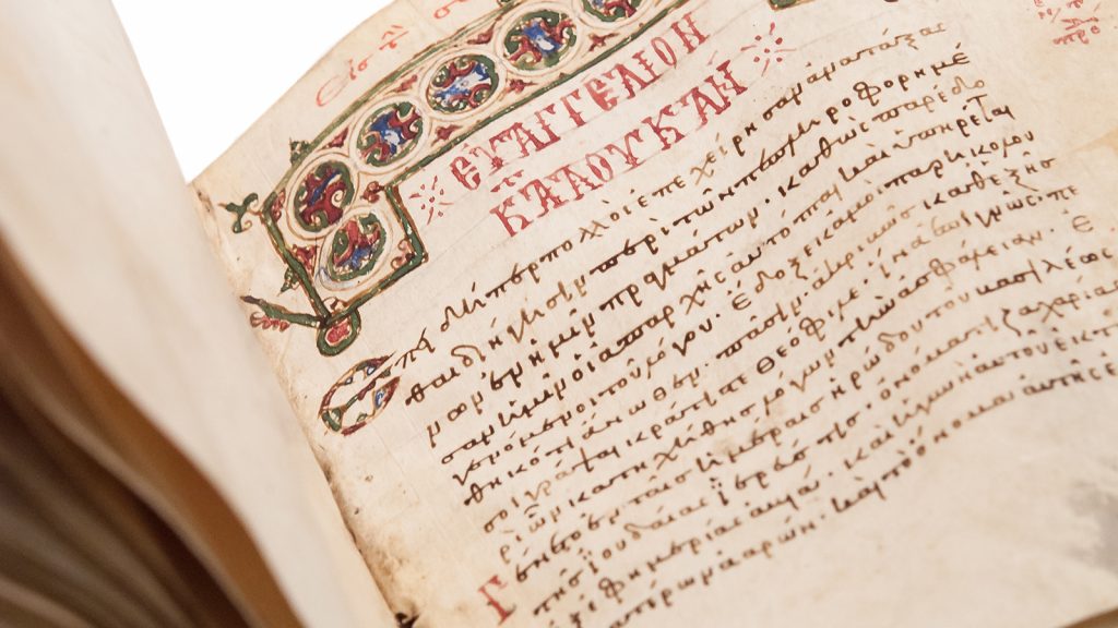
A medieval Greek manuscript of the four Gospels from The University of Athens – https://religionnews.com/2018/08/31/what-was-the-first-bible-like/
Thinking about writing
Gleick’s paper mentions how the creation of writing allowed people to categorize and analyze information. When the printing of the Bible started, it allowed people to all read the same information on a grander, more accessible scale. I found this really interesting because each person interacts with words differently. I imagine that people could, for the first time, discuss things that they read and their own interpretations. We still see that happening today in book clubs and on social media (even though it is a different medium)
Facts?
The printing press also allowed for the mass production of factual information by printing scientific books while information was still in development. You would not be able to update information after it had been printed. This would no doubt lead to incorrect information being distributed. In the present day, most information is found on the internet. Websites can be updated anytime, but unfortunately, information can be fabricated easily.
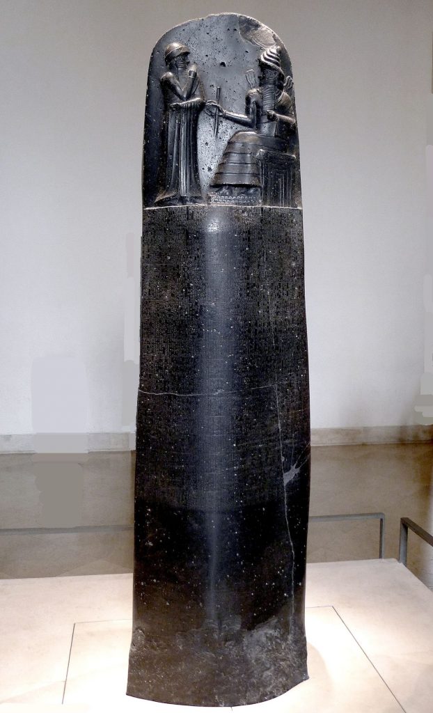
The connection between writing and social control has been exploited repeatedly. As we learned in class, Rule of law started with Hammurabi’s code. The Law was written out, but no one could read it. This was a form of social control because people could be penalized for offenses that they were unaware were prohibited. Another example of social control is how slave owners forbid slaves from reading and writing so they could not rebel. In the present, we are surrounded by bias information. Information no longer comes from a single source so it is difficult to discern what is accurate.
As printed writing became more widespread it gave way to different types of information. The misinformation that has misled people during the pandemic demonstrates that this power of influence can be used to positive and negative ends.
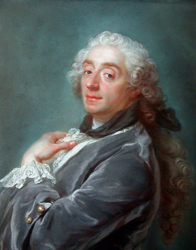
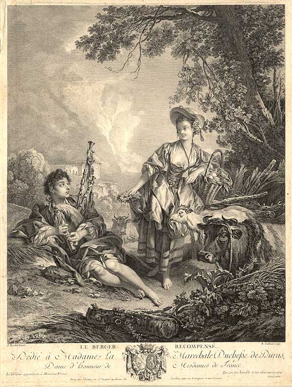
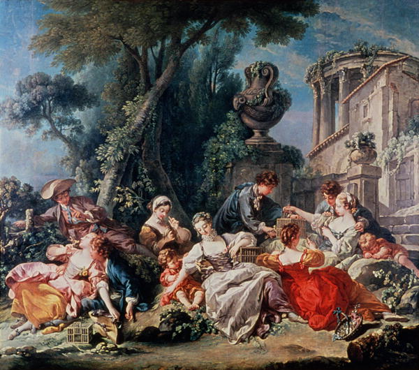
François Boucher was born in Paris in 1703. His father was Nicolas Boucher, a lesser-known painter. François studied art under his father for a while, then apprenticed with François Lemoynefor three months. As well as a painter, François was a talented engraver.
He worked for a famous engraver named J.F. Cars. In 1723 he won the Prix de Rome and traveled to Italy a few years later. He spent three years in Rome, north Italy, and Venice and with Franco-Italian fresco painters learning about late Baroque and Rococo art.
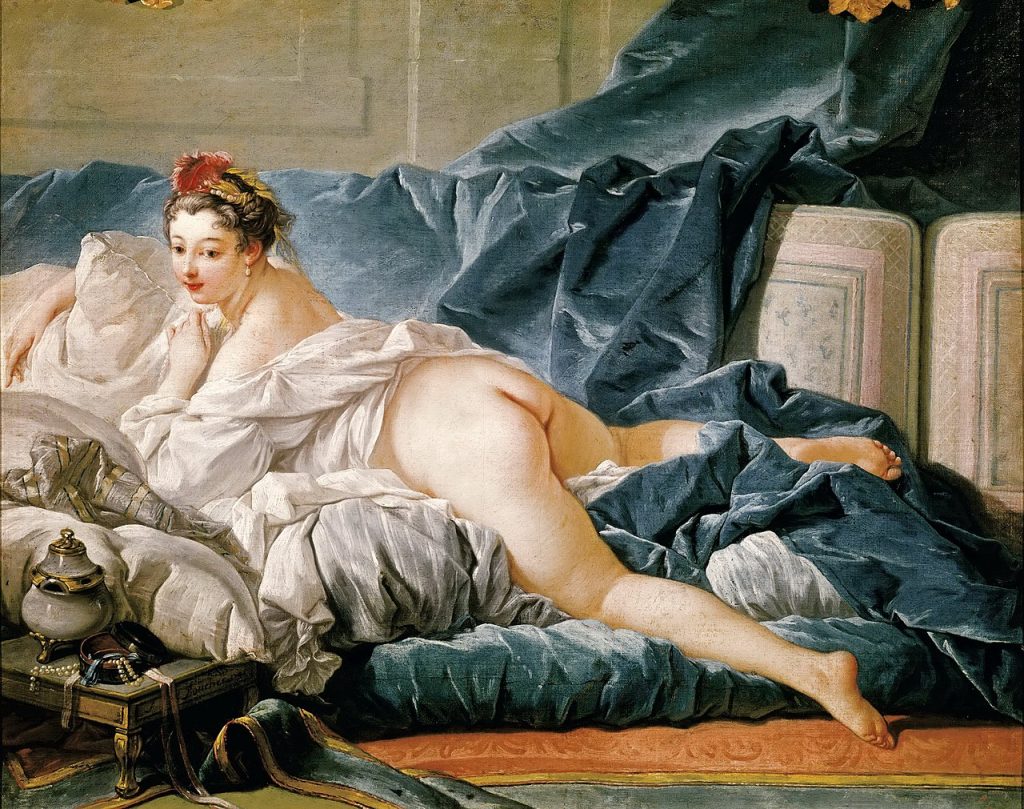
François Boucher was an incredible artist. He is most well known for his painting and engraving, but also created tapestries, as well as theater sets, and costumes. His work was heavily inspired by Peter Paul Rubens.François’s “Bird Catchers” has similar elements to Ruben’s “Massacre of the Innocents”. Even though the subjects are different, you can see the subjects are composed in a similar way; all in the center of the painting and intertwined. I think that François’ version is the happier version of Rubens’s piece.
He was also inspired by Antoine Watteau, with who he studied intensely and worked. François’ work is idyllic, tranquil depictions of classic, pastoral, and mythological scenes.
One of my favorite periods for fashion and art is Rococo. I adore the slightly erotic themes portrayed in the pastel colours and dreamy scenes. I love François Boucher’s work. My favorite piece is “The Love Letter”. I enjoy the women’s clothing, the little animals, and the composition.
Working on this project was overall a lot of fun and very interesting. I really like the topic that I chose because it was really cool to compare how each one of these women impacted the world differently and during different times.
I heard stories about Cleopatra growing up. I always thought that she was a seductress who played men to get to where she was. I now know that that is furthest from the truth. She was a very powerful and intelligent woman, who strategically fought her way two the top and had epic loves in the process. I really didn’t have any background knowledge of Queen Victoria and I was really saddened by her story. The fact that she lost numerous men over her life, and mourned them all for her entire life is very sad. Her portraits are very spooky, she looks empty. I love the story of Amelia Earhart. I love conspiracy/unsolved mysteries and Amelia’s disappearance is so fascinating. Out of all the women I talked about I am most familiar with hers. All of my background knowledge on Amelia Earhart was that she was a pilot and she disappeared. Upon further research, I was really struck by how much of an accomplished aviator she actually was. She was a true trailblazer and out of all three women I talked about women today owe her a debt of gratitude. I think how accomplished Amelia was and how comfortable she was in the air makes her disappearance all the more interesting.
I wrote my blog post with the hopes of shedding a little bit of light on some very powerful women throughout history. It was very difficult to write about such influential women because there is so much to say. I would’ve loved to delve deeper into their impact on the world and how they change the trajectory for women’s empowerment. I could have added more information about the life of Queen Victoria. The layout of my mood board could also be stronger. Moving the pictures and text boxes around is very frustrating. I would give myself a 7/10. I would like to give myself an 8 because I spent a lot of time on this project and I am really pleased with the results. I’m choosing 7 because realistically it needs a little bit more playing around.
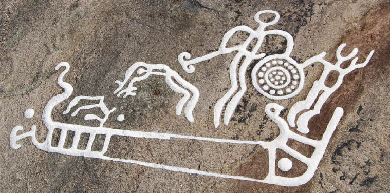
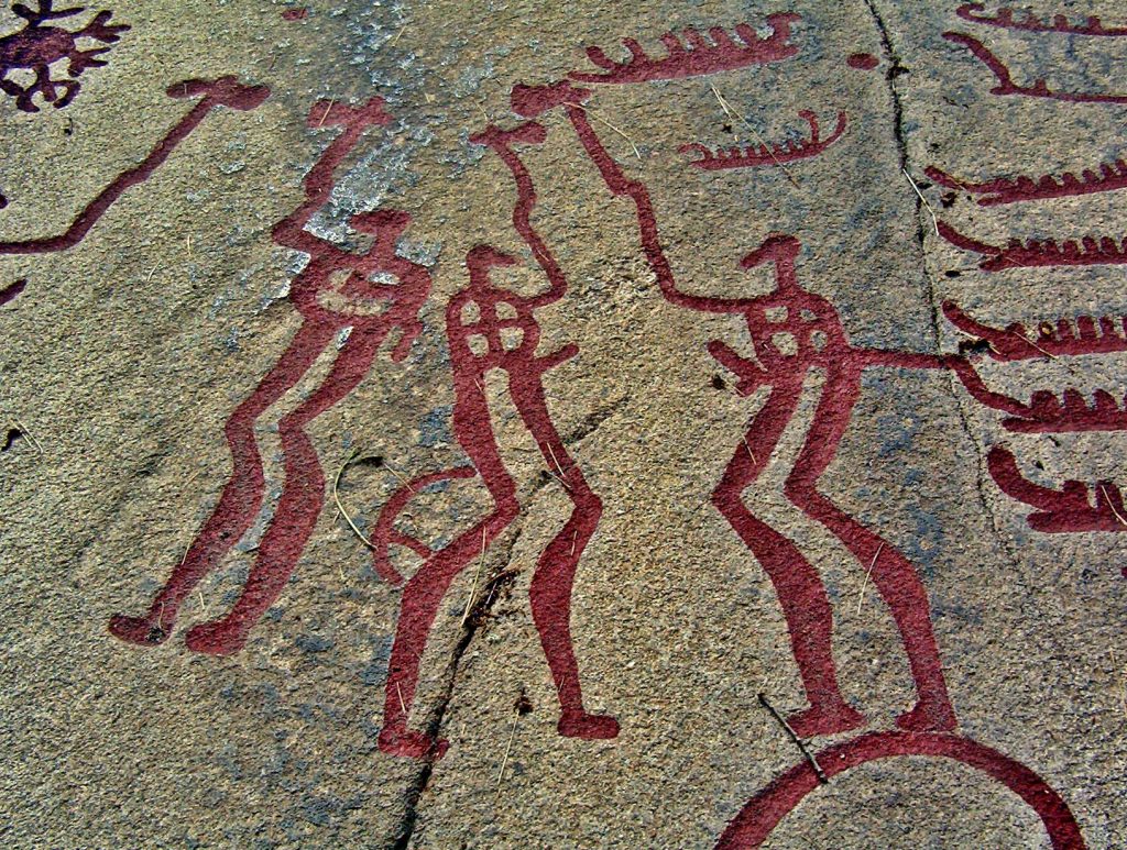
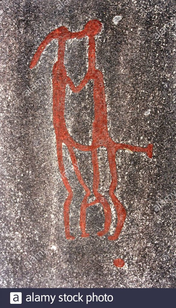
Sexuality depicted in Ancient rock art sometimes challenges how we think about gender, gender roles, and sexual orientation in the present. The article I read was called “Rock Art” from “The International Encyclopedia of Human Sexuality” on Credoreference.com. In some of the earliest known rock art, we see imagery representing or eluding to sexual practices. These images can be challenging to decipher as each style of art can differ vastly depending on the time they were created and where. Sexual rock art is rare but has been found all over the world. Based on ethnographic information, we can discern information that helps inform our understanding of the sexuality of early humans. I found this topic very interesting because some concepts surrounding sex have changed in the last 40,000 years, others have not. I always had the understanding that the world has changed so much, even in my lifetime. I never really thought about what has remained the same.
Ethnographic research shows that women have been drawn with stylized breasts and that genitals were often exaggerated. These ‘creative liberties’ are what initially drew me to this topic. Some of the first humans to ever leave marks on walls deliberately chose to represent themselves with these specific features altered. People still do that to this day. Sexual rock art with these same stylized features has been discovered in all corners of the globe: Australia, Asia, and Africa, just to name a few. These choices were all happening independently of each other.
What also shocked me was that “Depictions of sexual intercourse include male-female, male-male, …are widespread.” I find it very hard to think of a time where anything but Heterosexual sexuality was the norm. These ancient people had a different view of human relationships than what we have today. I realized evidence of Homosexuality has existed forever, in places like ancient Greece and Egypt. Evidence of Homosexuality in cave art also appears to be widespread around the world and independently of each other.
This article also talks about gender and gender roles. Men were often depicted with weapons and “exaggerated, erect penises”. This shows that the status of ‘warrior’ was intertwined with sexuality. In these ancient carvings, women were shown concerning fertility and puberty rites. There is also a possibility of a third gender. Men were drawn with a line between their legs and women’s genitals were shown with diamonds, two lines, and circles, but there is evidence of people with indicators of both types of genitals. The article asks, “Might figures with a line and a cupule between the legs represent intersex individuals or third gender “two‐spirits”?”. These questions surrounding gender norms are very relevant to conversations many people are having today.
I would love to delve deeper into this topic because this gives historical evidence and knowledge about topics that still affect people today. Rock art is so old that it is very difficult to put together a conclusive story. It takes a certain level of interpretation. I enjoyed reading this because I take comfort in the fact that LGBTQ+ people have existed forever.