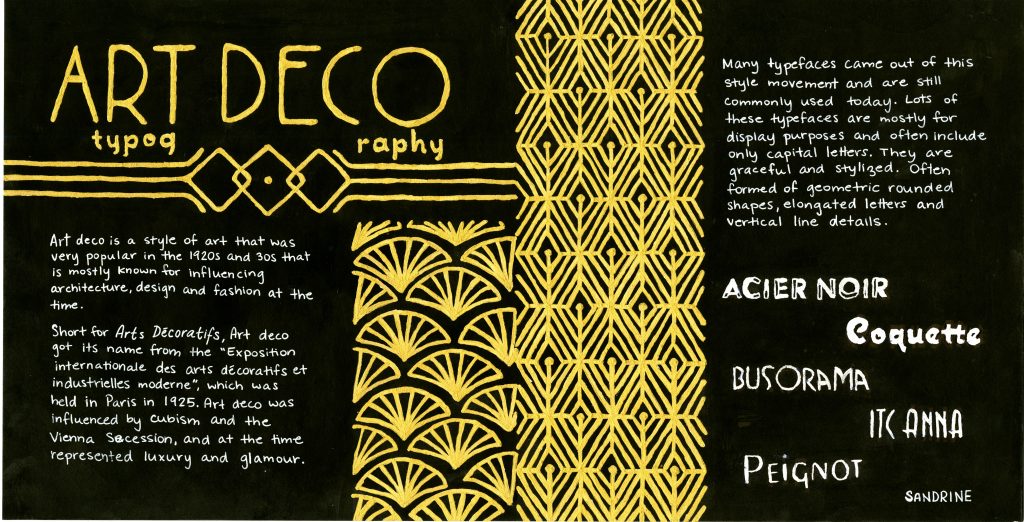
OKAY so I worked REALLY hard on this spread so I may be a bit biased but I think it’s really good.
I initially got assigned a front and back cover spread and was coming up with no good ideas, so I ended up trading spreads for a typography spread. I chose to do a spread on art deco style typography. A lot of what comes up in google images when searching art deco is gold patterns on a black background, so that is the direction I decided to go.
Since art deco wasn’t particularly known for its influence on typography, it was rather difficult to find much information and I felt some context on the art deco style would be helpful, so that’s what I put on the left side of the spread as an intro of sorts. On the left side, I gave a little bit of general info and characteristics of art deco typefaces and showed some examples of some common typefaces that are art deco style.
I got really ambitious and spent a LOT of time on this spread which was very tedious (and I spilled masking fluid all over the place in the process so that was fun), but I’m really happy with how it turned out.
Grade
I give myself a 9/10 on this spread. I’m really happy with the final product and think it fits together really well. I think there are a few things that could have been executed and thought out better. For example, I’m not sure that splitting up the word typography in the title works that well. It was a bit of an afterthought that I didn’t plan for an had to work with the space I had at that point.
Sources
https://www.fonts.com/content/learning/fyti/typefaces/art-deco
https://www.sessions.edu/notes-on-design/type-in-history-cassandres-art-deco-type/