Postmodernism in Europe: Louise Fili

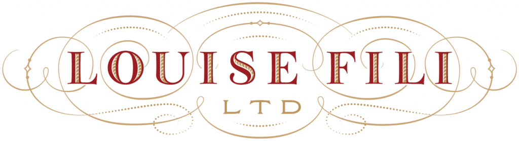
Although the Italian-American designer was born in America and never lived in Italy, Louise Fili lives out her Italian roots extensively through her work. Fili is known for her elegant use of typography. A leader in the post modern return to historical styles, her love for historical Italian type is evident. Heavily influenced by Italy, Modernism, and European Art Deco, Fili combines historical typography with modern colour and compositions to create beautiful book jackets, identities and packagings.

Restaurant identity for Pearl Oyster Bar

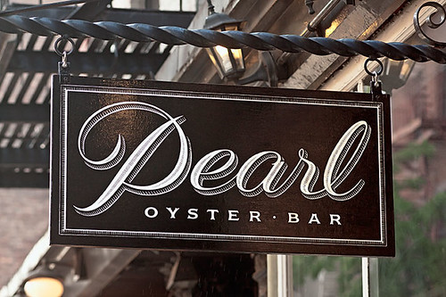
Louise Fili worked for Herb Lubalin for a couple of years, before becoming director at Pantheon Books where she designed close to 2000 book jackets. She opened Louise Fili Ltd. in 1989. Her studio specializes in restaurant identity, food logos and packaging, everything she is passionate about.

Tate’s Bake Shop packaging

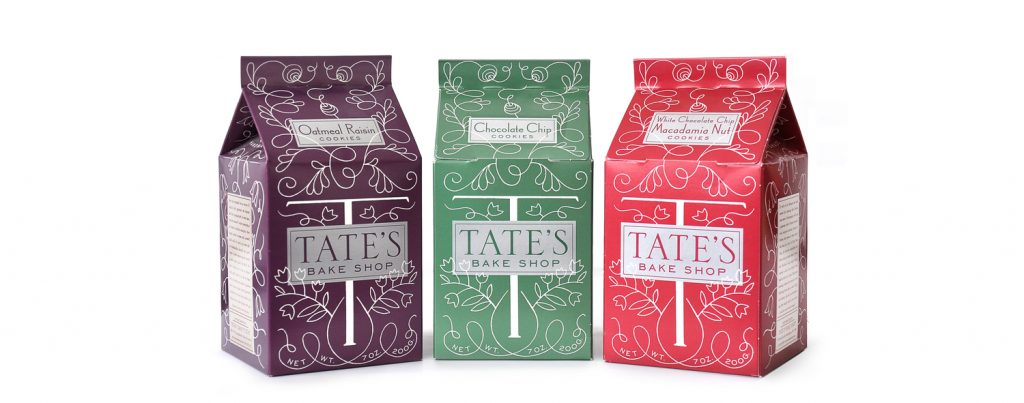
Louise Fili is without a doubt one of my favourite graphic designers. I love typography, and her work is BEAUTIFUL. Seriously, I’m obsessed.

Sources

https://en.wikipedia.org/wiki/Louise_Fili

Supergraphics Innovator: Paula Scher

The Public Theater poster

It’s hard to do Paula Scher justice within the parameters of a short 200 word blog post. One of the most influencial and successful graphic designers in the world, Paula Scher is commonly said to be “master conjurer of the instantly familiar.” Born in 1948, Paula Scher didn’t even know what graphic design was until her junior year at the Tyler School of Art & Architecture, where she originally went into illustration.

The New Jersey Performing Arts Center supergraphics

Scher is commonly known for major brand identity projects as well as her work on environmental Supergraphics. One of her most notable projects is posters she made for The Public Theater. Her supergraphics are massive installations that completely transform interiors and even exterior spaces. Scher’s extensive list of clients includes: Bloomberg, Microsoft, Bausch + Lomb, Coca-Cola, Shake Shack, The MOMA, and many many more.

I absolutely love Paula Scher and her work. Seeing successful and incredibly influencial women in design like Paula Scher is very inspiring and encouraging. I definitely look up to her. Not only is she a talented designer, I love her as a person as well.

Planned Parenthood supergraphics

Sources

https://www.pentagram.com/about/paula-scher

https://bpando.org/supergraphics/

Psychedelic Design Hero: Wes Wilson

Wes Wilson with some of the posters he designed, many of which showcase his signature style of typography.
“Are We Next?” Vietnam War protest poster.

Wes Wilson was born in Sacramento, California in 1937. An American artist most notably known as one of the leading designers of psychedelic posters, he invented a style that is now associated with the peace movement, the psychedelic era and the 1960s. Alongside Alton Kelley, Stanley Mouse, Victor Moscoso, and Rick Griffin, Wilson was one of the “The Big Five” San Francisco poster artists of the time. His style was heavily and obviously influenced by Art Nouveau.

His first posters was a Vietnam War protest poster titled “Are We Next?” caught the attention of Chet Helms, an important music promoter during the Hippie era of the 1960s. Working for Chet Helms and Bill Graham, Wilson made many posters for many well known psychedelic bands and concerts, including posters for The Beatles final concert at Candlestick Park in 1966.

Although the psychedelic style isn’t my favourite, I really enjoy the colours and colour combinations he uses in most of his posters. His use of typography is very unique and interesting, which I also appreciate.

Poster for The Beatles final concert at Candlestick Park in 1966.

Sources

https://en.wikipedia.org/wiki/Wes_Wilson

Advertising Art Director: Helmut Krone

Helmut Krone, the genius behind the well known 1960s Volkswagen Beetle ad campaign, was born in a german sector of Manhattan in 1925. He is considered a pioneer of modern advertising, which is especially evident when looking at his unique and effective ad strategy that is commonly used today.

Two of The Most Well Known VW Beetle Ads Created by Helmut Krone.

Krone worked for Doyle Dane Bernbach for over 30 years, where he worked on many other very effective ad campaigns, including the “When you’re No. 2 you try harder” campaign for Avis and the personification of Colombian Coffee, Juan Valdez.

The “Think Small” ad for VW, pictured above, was voted #1 campaign for all time in Advertising Age’s 1999 The Century of Advertising issue.

Helmut Krone’s wit and great ideas without a doubt made him an incredible advertising art director, which is admirable. I don’t personally find advertising particularly exciting, but I do feel that his ads are clever, effective and he is a great person to look to for inspiration.

Sources

https://en.wikipedia.org/wiki/Helmut_Krone