Survey 10: Typography Spread

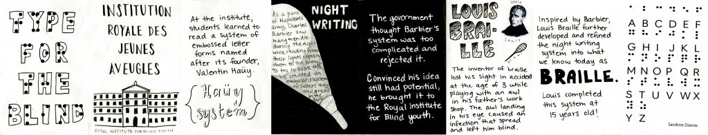
OKAY so I worked REALLY hard on this spread so I may be a bit biased but I think it’s really good.

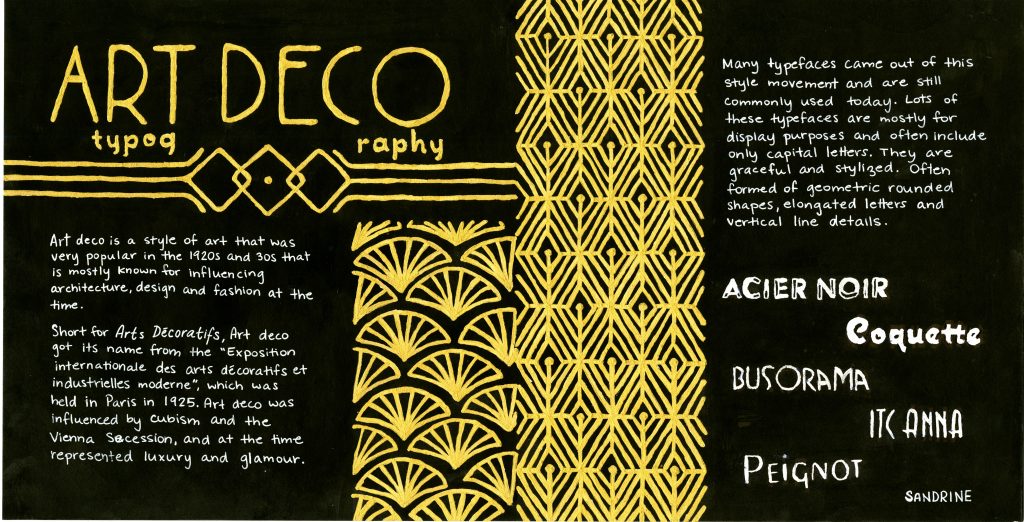
I initially got assigned a front and back cover spread and was coming up with no good ideas, so I ended up trading spreads for a typography spread. I chose to do a spread on art deco style typography. A lot of what comes up in google images when searching art deco is gold patterns on a black background, so that is the direction I decided to go.

Since art deco wasn’t particularly known for its influence on typography, it was rather difficult to find much information and I felt some context on the art deco style would be helpful, so that’s what I put on the left side of the spread as an intro of sorts. On the left side, I gave a little bit of general info and characteristics of art deco typefaces and showed some examples of some common typefaces that are art deco style.

I got really ambitious and spent a LOT of time on this spread which was very tedious (and I spilled masking fluid all over the place in the process so that was fun), but I’m really happy with how it turned out.

Grade

I give myself a 9/10 on this spread. I’m really happy with the final product and think it fits together really well. I think there are a few things that could have been executed and thought out better. For example, I’m not sure that splitting up the word typography in the title works that well. It was a bit of an afterthought that I didn’t plan for an had to work with the space I had at that point.

Sources

https://www.fonts.com/content/learning/fyti/typefaces/art-deco

https://www.sessions.edu/notes-on-design/type-in-history-cassandres-art-deco-type/

https://en.wikipedia.org/wiki/Art_Deco#Graphic_arts

Survey 7: Geopolitics Spread

When I read on the timeline handout that the Titanic sank during the time period I had been assigned geopolitics for, I immediately wanted to make a spread on the topic. I’ve always loved the Titanic!

My initial idea was to do a closeup cross section of the Titanic with explanations and illustrations of the various parts of the ship. Although that would have been cool, I think what I ended up doing fits into the geopolitical category much better.

The most important part of the Titanic is that the “unsinkable” ship sank, so I chose to portray a dramatic scene of the sinking. I struggled a bit with having enough space for the text while taking margins into consideration. I needed a fair amount of text because the story of the Titanic is generally known, so I wanted to add information that may not be common knowledge while still having the basic information.

The typeface I used for the title was the most popular font in 1912, the year the Titanic sank – I figured that would be relevant to the time period.

Grade

Overall I am quite happy with how the spread turned out. I would give myself an 8/10. I think the illustrations and design fit well together and the overall spread is nice. There are a few minor hiccups I don’t particularly love, like the word ‘tragically’ cutting into the side of the iceberg a little bit and the general lining up of text in some places could have been planned out better.

Survey 4: Typography Zine

When we first decided on the topic of braille for survey 4, I was excited to research and make a zine for it. As I started researching and brainstorming what I was going to do, I found it was quite difficult. The only thing I was sure of was that I wanted to incorporate braille into the zine in some way, but I obviously couldn’t make the whole zine in braille. I ended up only incorporating braille into the front and back covers of the zine. It was challenging to think of ways to incorporate images into the pages as to not have a zine that was exclusively filled with text.

Grade

In the end, I would give myself an 8/10 on this project. Throughout the project, I really wasn’t liking where it was going and really struggled to get the pages to a point I was satisfied with. Now looking at the whole thing together, I am actually quite happy with how it came together. There are just a few parts I would have liked to touch up and clean up a little bit.

Survey 1: Science Artifact

When I was initially assigned an artifact for survey 1, I was quite intimidated by having to find something I could make based on science in prehistory. There is very little we know about that time period due to the lack of ability to record anything before writing was fully developed.

We chose pottery as our research topic because I knew that that way I would have a concrete object I could make and could envision that being doable. I’ve made pottery on a wheel before, but I wanted to try my hand at the technique they would have used in the beginnings of pottery: coiling. Making the pot ended up being a lot harder and taking much longer than I had anticipated. but I’m happy with how it turned out.

As for the text accompanying my artifact, I had a lot of clay leftover, so I thought I could write the text in clay to keep the spread consistent. I didn’t really want to just type out the text on a white background like some of the spreads I found in the previous year’s history books.

I took both the pictures in the same place to keep the setting and lighting consistent.

Grade

I would give myself a 9/10 on this assignment. I’m really happy with how it all came together overall. I do think it would have looked even better to have a little bit of detail on the pot to go along with the decoration I put around the text, but by the time I thought of that the pot was long dry.

Yearbook Spread

The initial vision I had for my yearbook spread was very different from the product I ended up with. I had a hard time coming up with a composition I was happy with and felt portrayed an accurate picture of who I am. I also really wanted the whole spread to come together as one, as opposed to just being a bunch of elements thrown onto a page together. I jumped from idea to idea a few different times, starting over a couple of times, which is why it took me so much time to complete.

I chose to do my spread in watercolour because it’s a medium I really enjoy working with and am quite comfortable with. Working in watercolour also allowed my finished piece to resemble the general style of art I often like to do. I chose the colours mostly because they’re colours I like and think go decently well together. I put the elements I found most important in the top half of the spread: my name, portrait, words to describe myself, and my introductory statement. The other three, in my opinion, lesser important tidbits of information I placed along the sides. I changed the style of writing for my secret to making it smaller and placed it in the beam of the car’s headlights to imply the light revealing something that otherwise isn’t common knowledge or openly visible.

Grade

I would give myself an 8/10 on this assignment. I’m generally quite happy with the finished product, but there are a few things I could have done differently. Firstly, the car wasn’t supposed to be a central element of the spread. I think the size and way I placed it, as well as the lack of other visual elements, gives off the impression that I’m really into cars, which I’m not really. The car was only supposed to represent the 70s. By the end of the project, which is when I painted the background, I really just wanted to be done after having spent so many hours on it, so I didn’t spend as much time on it as I could have to make it look nicer. Lastly, I could have gone out of my comfort zone a little bit by actually giving myself a face.