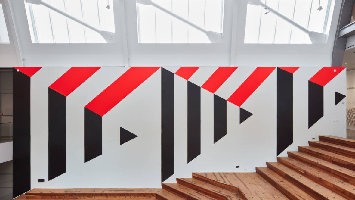
Barbra was total icon. She was a leader in super graphics and in the male dominated industry of graphic design.
She actually lost her first husband which made her move to Switzerland to study under Armin Hofman. She did this so that she could feed her daughters. She studied graphic design, landscape architecture and fine art. Her style was very Swiss Modernism meets groovy California beach culture. Her super graphics really showed that mesh of the two different design styles.
SuperGraphic
I think it’s a super creative way to decorate a very simple thing by painting the walls. It really makes the architecture as a whole because without it the interior would feel very empty. The style of California meets swiss modernism is very clever as well. It’s cool to see her apply her roots and what she learned in Switzerland.
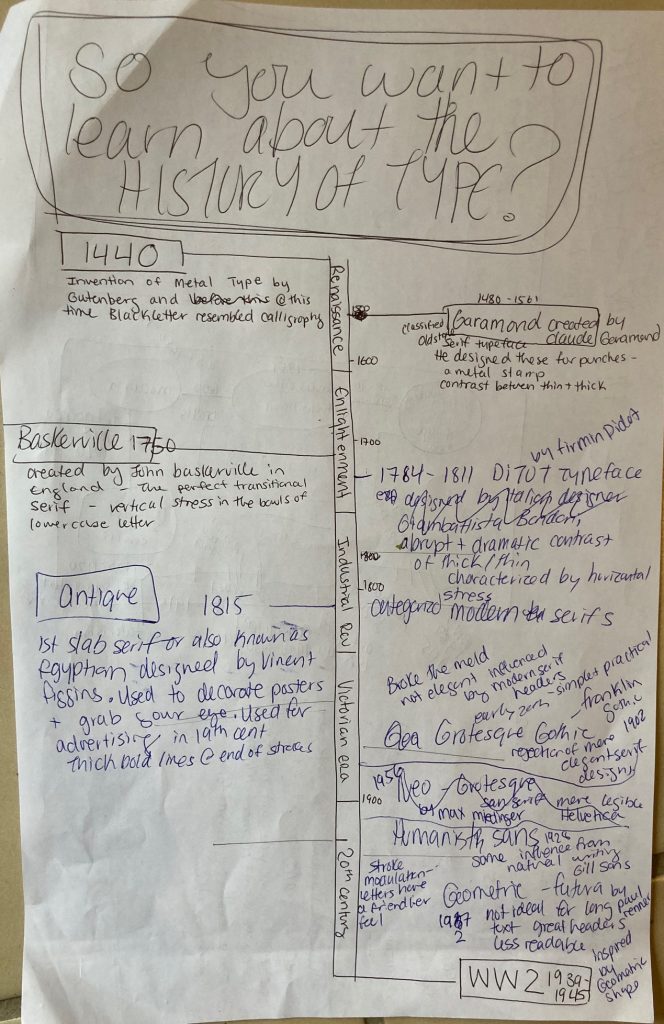
I wanted to give this project a fun name that explained what the infographic/timeline was about. I decided on my fonts for the type categories and drew a simple and effective timeline to show when the type was made. I also added information about each typeface.
I do not know the name of these designs, but you start with a question and then you move through the design following the arrows and with every move, you make either with a “yes or a no” you move around the design. I was inspired by that to draw lines connecting the type to the different information boxes. I also wanted to showcase the ways that the different typefaces looked so I printed them out for a more exact look.
I would give myself a 7.5 /10. I made most of the graphics connect to the very history of type and included key movements throughout art history. Starting with Gutenberg and the printing press, to a poster promoting a product with a Slab Serif Font used in advertising, and then I showcased the more Modern look of the Bauhaus and the change in type and the design rules they were breaking. I think that the Art nouveau girl could have been tied in better if I had connected her or the drawing its self into a more type-specific art nouveau event or design rather than just as a design/advertising element.
References:
Didot family. (2017). In Encyclopaedia Britannica, Britannica concise encyclopedia. Britannica Digital Learning. Credo Reference: https://ezproxy.capilanou.ca/login?url=https://search.credoreference.com/content/entry/ebconcise/didot_family/0?institutionId=6884
typography. (2018). In P. Lagasse, & Columbia University, The Columbia encyclopedia (8th ed.). Columbia University Press. Credo Reference: https://ezproxy.capilanou.ca/login?url=https://search.credoreference.com/content/entry/columency/typography/0?institutionId=6884
Cook, J. W. (2014). printing in the Renaissance. In J. W. Cook, Encyclopedia of Renaissance literature (2nd ed.). Facts On File. Credo Reference: https://ezproxy.capilanou.ca/login?url=https://search.credoreference.com/content/entry/fofrl/printing_in_the_renaissance/0?institutionId=6884
Garamond, Claude. (2018). In P. Lagasse, & Columbia University, The Columbia encyclopedia (8th ed.). Columbia University Press. Credo Reference: https://ezproxy.capilanou.ca/login?url=https://search.credoreference.com/content/entry/columency/garamond_claude/0?institutionId=6884
serif. (2006). In P. H. Collin (Ed.), Dictionary of publishing and printing (3rd ed.). A&C Black. Credo Reference: https://ezproxy.capilanou.ca/login?url=https://search.credoreference.com/content/entry/acbpublishing/serif/0?institutionId=6884
Sandberg, B. (2013). Printing press. In C. Clark Northrup (Ed.), Encyclopedia of world trade: from ancient times to the present. Routledge. Credo Reference: https://ezproxy.capilanou.ca/login?url=https://search.credoreference.com/content/entry/sharpewt/printing_press/0?institutionId=6884
The industrial revolution hit Europe hard, and a heavy hitter known as James Watt put the ‘industrial’ in the revolution. He patented the steam engine in 1769. He also designed a new engine in 1776 “that exhausted the steam from cooling into a separate condenser where the vacuum now formed”(De La Pedraja, et al). Not having to cool or heat the cylinder saved fuel although it did call for a heavier machine. He pretty much pioneered the manufacturing of iron and steel and steam. And with the steam engine, anything was possible.
Ultimately, the Industrial Revolution and in particular the steam engine lead to the means of producing goods more quickly and efficiently and offered alternatives to human and animal power. Some people call it the age of mass consumption, but where would we be without the technological advancements of the engine. The industrial revolution raised the standard of living in almost every part of society. Though some people did become worse off due to the technological advancements because the machinery put a lot of people out of work. The machinery required fewer people to operate it and created more than ever could be done by humans, throwing lots of people into different fields and killing some craft.
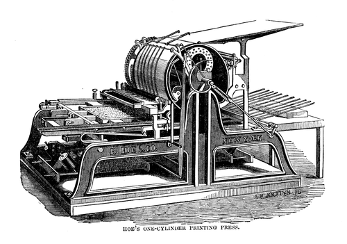
An example of the efficiency of the new machinery that the steam engine kicked off was in printing technology. The steam press was invented in 1814 and it made 1,100 impressions in an hour and the cost was half.
Rotary printing press invented by Richard Hoe.https://en.wikibooks.org/wiki/High_School_Engineering/The_Industrial_Revolution#/media/File:Hoe’s_one_cylinder_printing_press.png
Up until this revolution the only printing that was done was incredibly time-consuming and could only print 100 copies if that, and most of the time it still took human power to fill in the blanks. People were using etchings and engravings for illustrations in books, but there was nothing as sophisticated as the steam press.
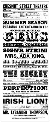
Poster for the Chestnut Street Theatre in Philadelphia, 1854. Collection of Philip B. Meggshttps://www.britannica.com/art/graphic-design/Neoclassical-graphic-design
This invention quickly escalated design. Artists used to be the designers of the world. Creating these beautiful works of art, and now the common folk could. Regular people were hired on to create posters and prints to advertise the mass-produced goods that were being made. They had no artistic flare and actually thought that since it was so cheap to print that they may as well get as much writing done on the one poster as possible. This lead to really busy designs that people would read over, or not read at all. And thus the spiral effect of design continued- and different texts in different widths were used as headers or to grasp someone’s attention. Designers (common folk at that time) had to figure out what was the most important part of the poster.
Resources:
Bush, G., & BUSH, G. (2000). Advertising. In P. Finkelman (Ed.), Encyclopedia of the United States in the nineteenth century. Gale. Credo Reference: https://ezproxy.capilanou.ca/login?url=https://search.credoreference.com/content/entry/galeus/advertising/0?institutionId=6884
Science and technology. (2001). In P. N. Stearns, & W. L. Langer (Eds.), The encyclopedia of world history (6th ed.). Houghton Mifflin. Credo Reference: https://ezproxy.capilanou.ca/login?url=https://search.credoreference.com/content/entry/hmencyclwh/science_and_technology/0?institutionId=6884
Hills, R. L. (2000). Engines: steam. In A. Hessenbruch (Ed.), Reader’s guide to the history of science. Routledge. Credo Reference: https://ezproxy.capilanou.ca/login?url=https://search.credoreference.com/content/entry/routhistscience/engines_steam/0?institutionId=6884
De La Pedraja, R., & PEDRAJA, R. D. (2000). Steam power. In P. Finkelman (Ed.), Encyclopedia of the United States in the nineteenth century. Gale. Credo Reference: https://ezproxy.capilanou.ca/login?url=https://search.credoreference.com/content/entry/galeus/steam_power/0?institutionId=6884
The Baroque period was an exciting and new time to be alive, especially for those who were of noble blood and enjoyed wearing uncomfortable extravagant clothing, but also for those who felt the desire to move away from the power of the churches. For in this era which is known as the “enlightenment” period people from all walks of life began to have more freedom. An example of this is for artists, they were able to start creating for their own pleasure and not just for the churches. There was more wealth distributed throughout the country and therefore more artists could survive off of commission from wealthy patrons. One of those patrons being the one and only, SunKing.
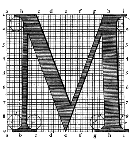
Louis XIV was a ruthless leader and he believed that his word was law. Although he did do some great things for France. One thing that he did was commission scientists to invent a new type known as the Kings Roman. It took them 10 years to create this completely geometrically calculated type. This type is still used today…which is pretty amazing.
Kings Roman Typography
Okay, so what. He did a couple of good things for France as a country and actually all in all he was a fair ruler. But did he have to be so war hungry?
Louis XIV: The SunKing
He brought France to the height of its power and dominated the rest of Europe. He created many laws, and advanced politics and due to the brilliance of his court became known as the Sun King. But its no doubt that he was still a pompous arrogant leader.
WAR HUNGRY
Louis XIV went to three major wars in his life. One the War of Devolution in (1667-1668). A triple alliance made France back out of Spain and give back the land, this is known as the Treat of Aix-la-Chapelle. This did put the Dutch Republic in France’s black book. Which lead to isolation in France’s Foreign affairs.
This lead to what’s known as the Franco-Dutch War (1672-78). France and a couple of other countries went against the Dutch Republic. Not to go into too much detail, but everyone wanted power back then and they always had a reason to go on fighting. After a while, though everyone gets sick of it and comes to a new treaty. France took over Franche-Comte and the Spanish Netherlands, making France Europes strongest power.
A decade later, the Nine Year War happened. This included many players who all came against France. France was the most powerful monarch in Europe but due to the wars and his short temper and bad behaviour, this all lead to the deterioration of his military and political dominance. He crossed too many people and had to pay for it. Due to all the wars, France was coming to an economic crisis. So the countries at war negotiated and Louis accepted William 3 of England. Soon after another conflict arose and this lead to the final war, the War of the Spanish Succession.
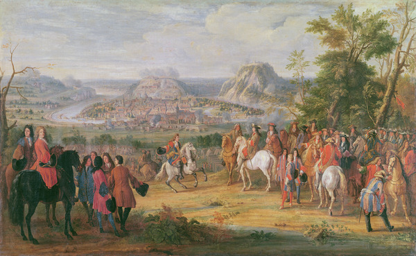
XIR473636 Louis XIV at the Siege of Besançon in May 1674 (oil on canvas) by Martin, Pierre-Denis (1663-1742); 72 x 116.7 cm
Citations:
Louis XIV. (2017). In Encyclopaedia Britannica, Britannica concise encyclopedia. Britannica Digital Learning. Credo Reference: https://ezproxy.capilanou.ca/login?url=https://search.credoreference.com/content/entry/ebconcise/louis_xiv/0?institutionId=6884
The monarchy made Majestic (1598-1789). (2010). In P. F. State, A brief history of France. Facts On File. Credo Reference: https://ezproxy.capilanou.ca/login?url=https://search.credoreference.com/content/entry/fofbf/the_monarchy_made_majestic_1598_1789/0?institutionId=6884
Encyclopedia of the age of revolution and empire (1750 to 1900). (2016). In Facts on File (Ed.), World history: a comprehensive reference set. Facts On File. Credo Reference: https://ezproxy.capilanou.ca/login?url=https://search.credoreference.com/content/entry/fofworld/encyclopedia_of_the_age_of_revolution_and_empire_1750_to_1900/0?institutionId=6884
Gombrich, E. H. (1966). The story of art. New York: Phaidon Publishers; distributed by Oxford University Press.
Louis XIV, King of France. (2018). In P. Lagasse, & Columbia University, The Columbia encyclopedia (8th ed.). Columbia University Press. Credo Reference: https://ezproxy.capilanou.ca/login?url=https://search.credoreference.com/content/entry/columency/louis_xiv_king_of_france/0?institutionId=6884
Louis XIV at the Siege of Besançon in May 1674 (oil on canvas). (2014). In Bridgeman Images (Ed.), Bridgeman images: The Bridgeman Art Library. Bridgeman. Credo Reference: https://ezproxy.capilanou.ca/login?url=https://search.credoreference.com/content/entry/bridgeart/louis_xiv_at_the_siege_of_besancon_in_may_1674_oil_on_canvas/0?institutionId=6884
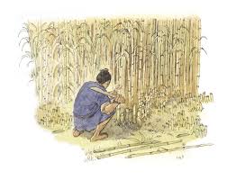
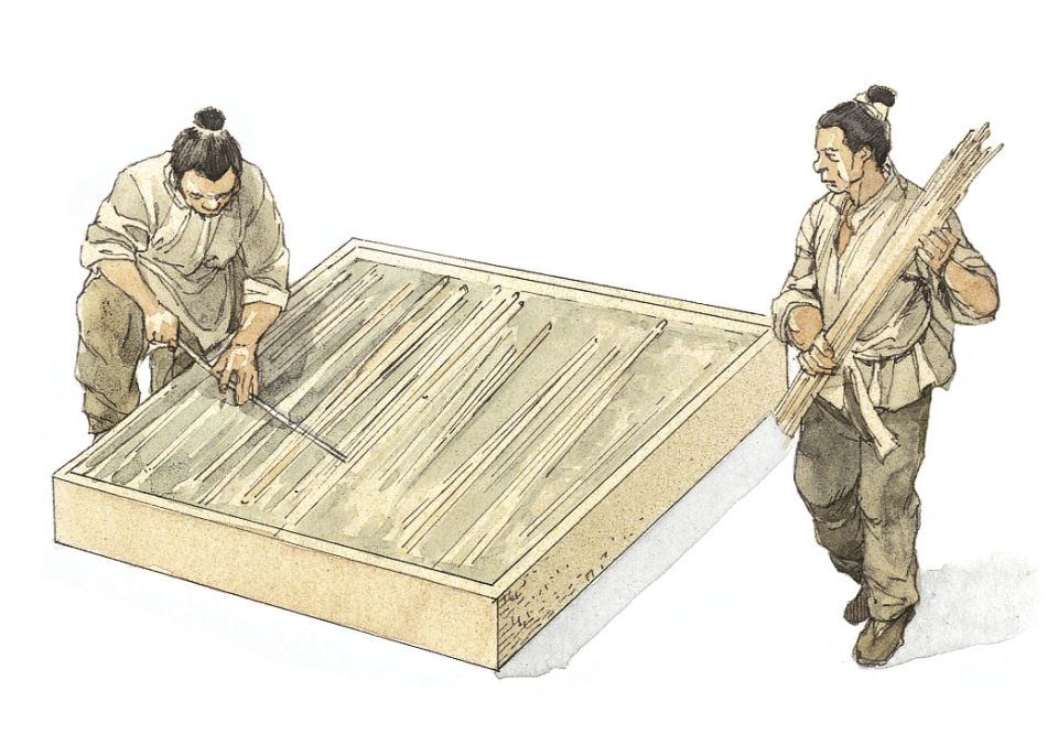
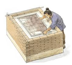
Western and Middle Eastern civilizations started slowly writing on surfaces such as wood, bamboo, stone, bone, pottery, and cloth. Around 3000 BCE the Egyptians began making papyrus “paper” by pulping the flesh of the papyrus reeds. While In the East, China had invented paper made from the pulp of bamboo in 105 BCE.
According to Chinese tradition, Cai Lun invented paper by improving upon previous techniques and developed a process in which a variety of materials could be used. It was discovered that fibers could be formed into a thin sheet on a screen. He worked with numerous fibers mixed with water in a large bin, washed, soaked, and beaten to a pulp. He then submerged a four-sided bamboo-framed cloth screen in the bin and lifted it, catching all the fibers on its surface. When dried and pressed with a covering mold, the thin layer of fiber became paper.
Bamboo paper was soft, smooth, white, and durable and was favoured by Chinese artists and calligraphers in the Tang Dynasty Era. Chinas well-kept secret of paper-making technology was introduced to Vietnam and Tibet in the third century, to Korea in the fourth, and to Japan in the sixth. Paper was incredibly important for China because the government needed to keep records of religion, trade, and inventory; and the more complex those systems became the more there was a need for paper.
Typography
The Evolution ofType In The East
In 1800 BCE writing appears in Asia. The origin of writing comes from China. It was called the Chiku-wen (bone and shell) script because of the engravings on shells and bones. As the legend goes, the writing system in China was created by Cangjie, a servant of the Yellow Emperor, the system was made up of logograms which represent words and phrases, but this way of writing was not adopted all over China. There were many branches of writing that were all different creating a lot of confusion throughout China.
Fast forward to 200 BCE, Chinas Emperor Qin Shi Huang ordered a new writing style to be created, that would spread through all of China and be adopted by all. This writing style is called Chen-Shu which means “regular”. It is crazy when you think about it, but that was created a very long time ago and it is still the writing style that is used in modern-day China.
Some details about Chen-Shu, it has 40-50,000 characters but most people in China only know a fraction of those characters and they just learn enough to get by. Chen-Shu was also the foundation for other countries to create their own script form it, like the Korean alphabet.
I planned the layout of the spread to have the characteristics of an old map. I wanted it to be a map about myself and where I come from. The tone of my spread reflects my personality of being playful and the rustic colours to portray myself as an “old soul”. It is antiqued but playful. I achieved the rustic brown colours by dabbing old tea bags all over the spread and then baking it in the oven. I planned for the title of the map to be my name and the legend to explain a little bit more about myself.
It feels obvious to me, but it probably isn’t to others, but the theme of the map is based on old miner maps from my area. My family has collected tons of them. Mining in this area was an important part of New Denver’s history and how it came to be, it was predicted to be the next Denver, Colorado (that obviously didn’t happen) and to date, the tiny little town tucked away in the mountains is slowly becoming more of a ghost town day by day. I think it is an important piece of its history to share.
The map its self is an important part of the spread due to the visual representation of where my home is and where the old mining town is. I also added myself in a drawing pointing down at New Denver trying to showcase where I literally was on the map.
7.5/10
I think that I could have taken more time on the title. I made a couple of spelling mistakes that do come off as messy. I think that writing was my biggest challenge with this assignment.
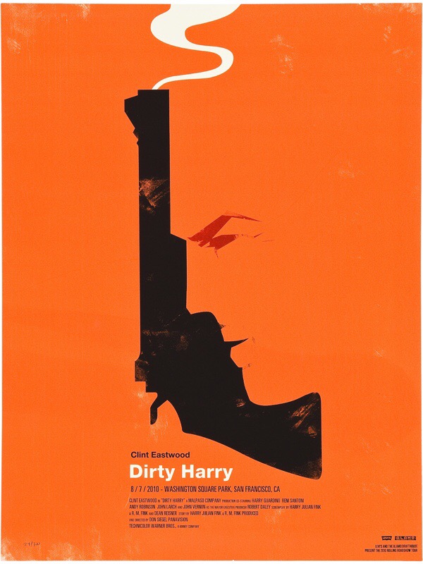
In this poster, Saul Bass has used the Gestalt Theory principle of Figure/Ground. This principle states that as humans we separate foreground and background elements so we understand what it is that we are seeing. The viewer can manipulate/flip the figure/ground relationships, in this case, its the gun and the man’s outline, this is also known at “multistability”.
This logo by Dimitrije Mikovic is a good example of the Gestalt Theory Principle of Closure. Closure happens when there is a break in a design element, but our brains continue to perceive the image anyways. The viewer can see this upon looking at the break in the mountains, which actually helps to show the features and make the mountain look more rugged, and in the breaks, there is the shape of an airplane.
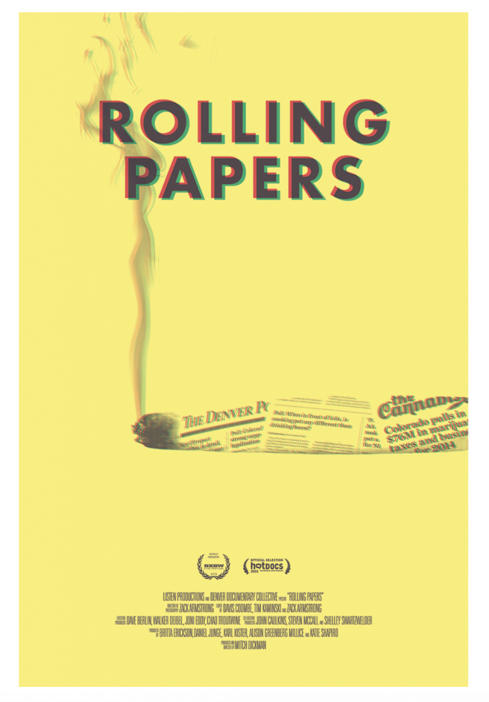
White space is the empty area around or within a design. It allows the elements to breathe. Without whitespace, designs can come across crowded and not as powerful. This design Rolling Papers by Ellen Bruss Design is an example of the use of good whitespace.
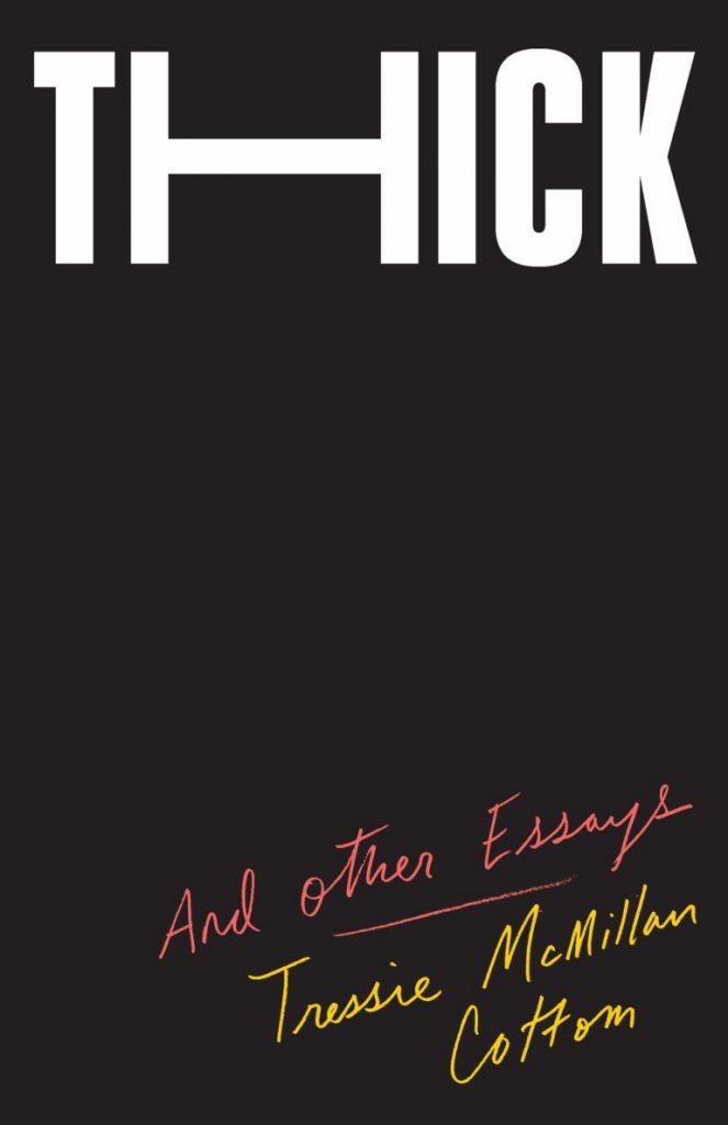
Oliver Munday
Size is the relationship between the area taken up by two or more elements. In the book cover “THICK” the “H” has been stretched to create this dramatic effect to the viewer. The stretched “H” helps showcase the title of the book visually.
Allan Espiritu, Kevin Kernan
Texture as a design element, is the quality of the surface of the design. In this design, by Allan Espiritu & Kevin Kernan, the texture is a very important element that they have used. Without the change in texture you wouldnt be able to see the text although it is still very subtile.

/cdn.vox-cdn.com/uploads/chorus_image/image/58189369/cc2a2790646381af98e00478536e605d.0.jpg)


