Yearbook Spread

I planned the layout of the spread to have the characteristics of an old map. I wanted it to be a map about myself and where I come from. The tone of my spread reflects my personality of being playful and the rustic colours to portray myself as an “old soul”. It is antiqued but playful. I achieved the rustic brown colours by dabbing old tea bags all over the spread and then baking it in the oven. I planned for the title of the map to be my name and the legend to explain a little bit more about myself.

It feels obvious to me, but it probably isn’t to others, but the theme of the map is based on old miner maps from my area. My family has collected tons of them. Mining in this area was an important part of New Denver’s history and how it came to be, it was predicted to be the next Denver, Colorado (that obviously didn’t happen) and to date, the tiny little town tucked away in the mountains is slowly becoming more of a ghost town day by day. I think it is an important piece of its history to share.

The map its self is an important part of the spread due to the visual representation of where my home is and where the old mining town is. I also added myself in a drawing pointing down at New Denver trying to showcase where I literally was on the map.

7.5/10

I think that I could have taken more time on the title. I made a couple of spelling mistakes that do come off as messy. I think that writing was my biggest challenge with this assignment.


Visual Research: Gestalts Theories

In this poster, Saul Bass has used the Gestalt Theory principle of Figure/Ground. This principle states that as humans we separate foreground and background elements so we understand what it is that we are seeing. The viewer can manipulate/flip the figure/ground relationships, in this case, its the gun and the man’s outline, this is also known at “multistability”.

This logo by Dimitrije Mikovic is a good example of the Gestalt Theory Principle of Closure. Closure happens when there is a break in a design element, but our brains continue to perceive the image anyways. The viewer can see this upon looking at the break in the mountains, which actually helps to show the features and make the mountain look more rugged, and in the breaks, there is the shape of an airplane.

Visual Research Of Design Elements

Ellen Bruss Design

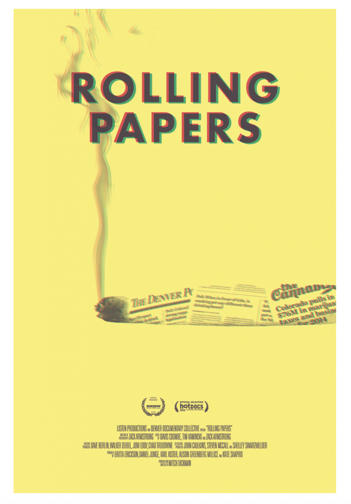
White space is the empty area around or within a design. It allows the elements to breathe. Without whitespace, designs can come across crowded and not as powerful. This design Rolling Papers by Ellen Bruss Design is an example of the use of good whitespace.

Oliver Munday

Size is the relationship between the area taken up by two or more elements. In the book cover “THICK” the “H” has been stretched to create this dramatic effect to the viewer. The stretched “H” helps showcase the title of the book visually.

Allan Espiritu, Kevin Kernan

Texture as a design element, is the quality of the surface of the design. In this design, by Allan Espiritu & Kevin Kernan, the texture is a very important element that they have used. Without the change in texture you wouldnt be able to see the text although it is still very subtile.