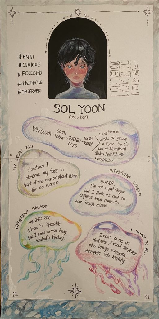
My yearbook spread contains images reminiscent of the ocean, my favorite: waves, jellyfishes, and stars. The goal was to remind the main character of a fairy tale book set in the ocean. My portrait illustration gives a blurry aesthetic image by mixing white acrylic and used various colors for jellyfishes to create a mysterious image. For my yearbook media, I used watercolor, acrylic, and Prisma colored pencils. It took more than 8 hours because I spent much time on portraits and backgrounds.
I decided to work on the theme first because I thought it would be efficient to choose a theme before deciding on a layout. The theme will be a fairy tale book and a character sheet in the novel that adds to my taste. The direction was vertical because I wanted the viewers to feel different. Therefore, when drawing the layout, I paid attention to the movement of the gaze. I intended people to become interested in me by placing my portrait illustration in the middle to catch the eye, five keyword hashtags, and simple introductions around it. Below, I wrote down my answers to specific situations and let people know who I am.
I will give myself 8 out of 10. I am satisfied that I could express the aesthetic image and the color I want through my illustration. However, the detailed drawings focused on the page below rather than the top, so the eyes keep downward. Unfortunately, it was unbalanced, but the time to expressing myself was significant.