- Direction
ACC CINEMA FUND Poster
Asia Culture Center, 2019
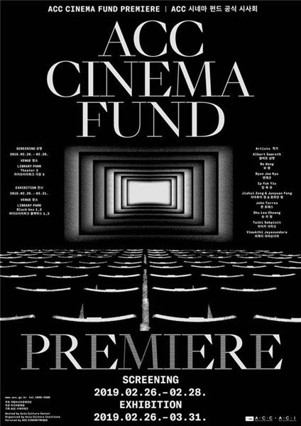
This static and dynamic ACC Cinema Fund poster touches our eyes in the middle. The screen sucking into the middle in the layers makes us feel like we are gradually entering the movie screen. As it is a movie fund premiere, it is a design that increases expectations for experimental films that transcend time and space. It visualized ‘immersion’ really well by using directional design elements.
- Line
《說時 TIMEFLIES》 系刊 Vol.14
MCU Commercial Design Department, 2016
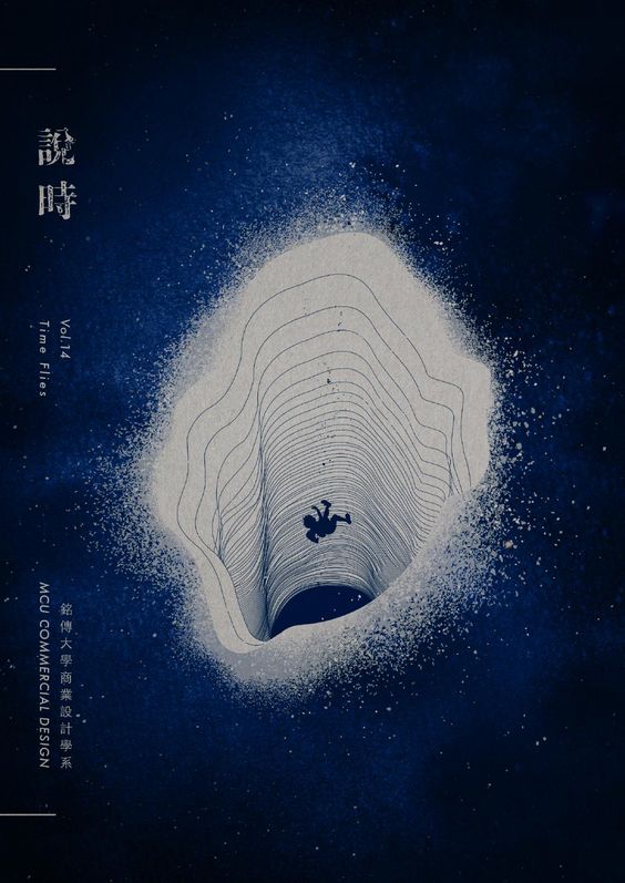
Under the theme of Time Travel, the book cover is reminiscent of a black hole using line patterns. It expresses a cliff heading to the abyss by narrowing the line’s curvature and spacing even though there is no coloring. It is a design that made us know that only a good line pattern can also give this depth. In addition, the design becomes more attractive by contrasting the scale of the falling child and the vast black hole.
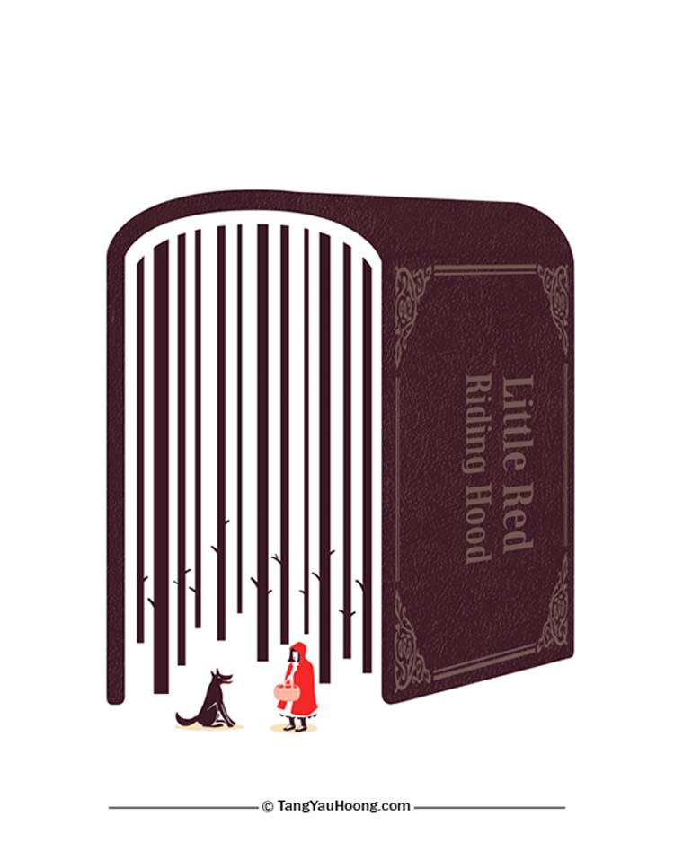
- Space
Little Red Riding Hood
Tang Yau Hoong
+
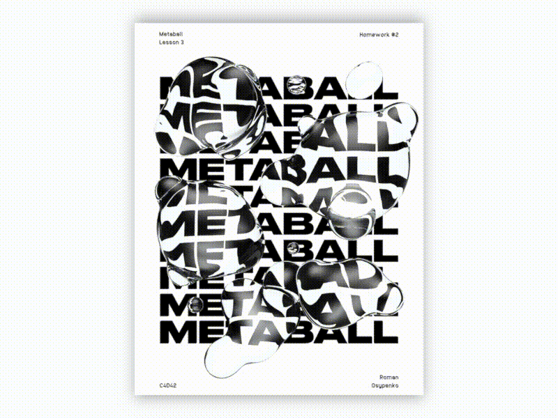
- Shape (3D)
Metaball Animation Poster
Roman Osypenko