For this typography poster assignment, it took over 4~5 hours to design and 5 hours to research and make it.
Overall, I wanted to make my poster has a good information convey layout as an infographic poster. So I was really struggling with “how to make it simplified, modern, but stand out with proper amount of texts?” after the research.
It’s an infographic but also has a timeline, so I had to consider where the viewer’s eyes are going and how to make them follow the typographic history that we learned.
So I came up with zigzag layout and different dimension so that people can follow the timeline and looks like this poster has a specific design.
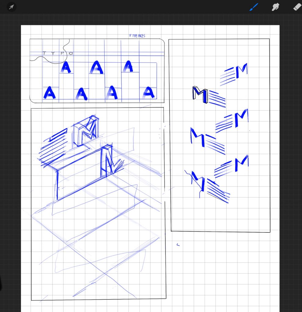
However, I changed the design because I thought this layout was less readable, and it wasn’t easy to draw all the writings with various perspectives like my ruler.
From here, I invested a lot of time thinking. Sometimes I suddenly think of a good multi-line, but it was difficult for me at that time. It wasn’t easy to consider the most effective information, design, and the flow of viewers’ gaze. But after a long time of thinking, I was able to complete my poster.
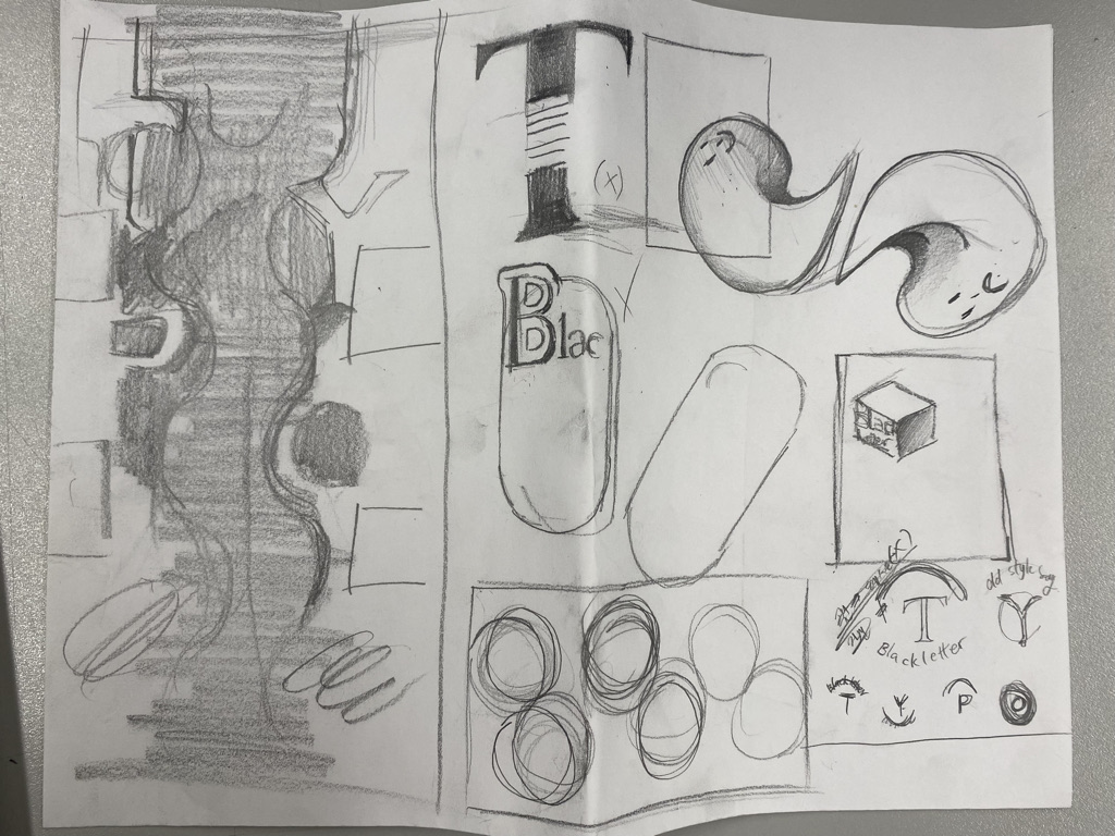
One of the media that effectively deliver information is magazines. Magazines use aesthetic layouts, but they function properly as text. So I applied a unique layout to the magazine theme. There is a curve in the subtitle, but it is still readable, considering the viewer’s eye movement. I wrote the article straight so that viewers can read it easily. People can naturally read the title and the body next to it along the curve. For the background I colored abstract random gradients, which is the recently popular design source, to look like a magazine.
So I will give 9/10 for my typography poster.